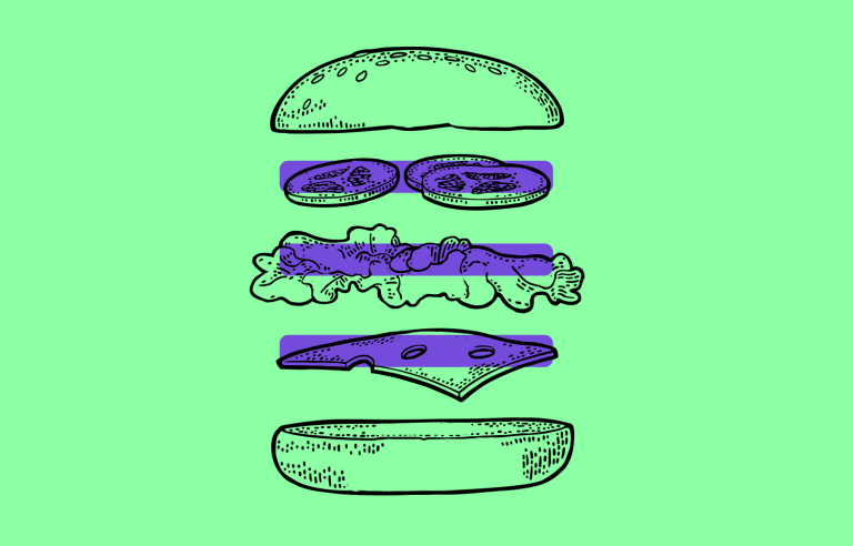
Is there still an appetite for the hamburger menu? In this post we look at modern examples and UX tips
There’s a thin line between love and hate. The hamburger menu has come under a lot of heat in the past few years and its use is still debatable to this day.
Nevertheless, this ubiquitous icon has now achieved an omnipresence that could almost be on a par with that of the magnifying glass for searches and the gear icon for settings.
Prototype fully-interactive web and mobile apps with hamburger menus
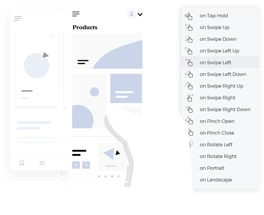
But just how did such a hotly contested icon end up becoming so popular in UI design? More importantly, should you be using it in your next designs and how? These are the questions we’re going to explore in this guide.
Afterward, you should have a more solid idea of when to use hamburger menus when the time comes to bring out your wireframe tool. Tuck in!
No, it’s not a menu from your favorite burger joint. In the world of design, the hamburger menu is that simple icon made up of three horizontal lines you often see in the top corner of apps or websites. This little symbol has become a go-to way to tuck away extra options or navigation items, helping keep screens clean and clutter-free.
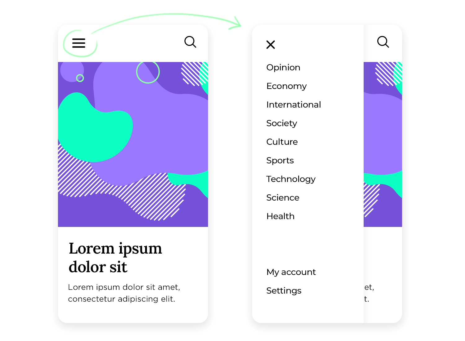
The idea is simple: when users tap or click the hamburger menu, a side or dropdown menu appears, revealing more options that would otherwise take up valuable screen space. It’s a handy solution for mobile devices and smaller screens, where every inch of space matters. But how did such a basic icon become so popular in UI design? Let’s take a quick trip back in time.
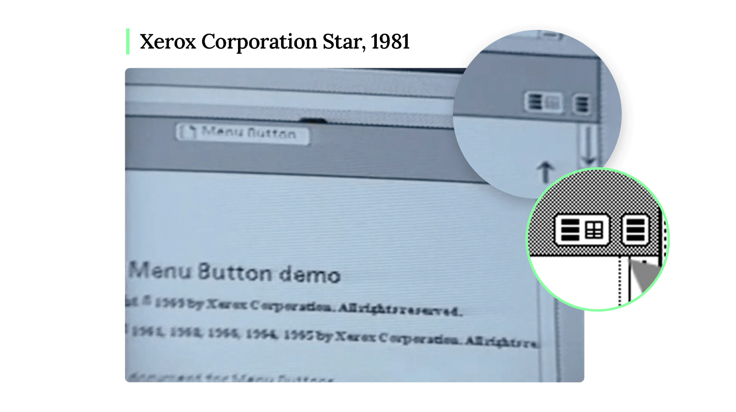
The story of the hamburger menu starts in the 1980s when Norm Cox created it for the Xerox Star personal workstation. The idea was to use this icon to open a list of options. Little did he know, this simple design would become legendary. Over time, the hamburger menu gained its quirky name and grew into one of the most well-known icons in the design world, alongside the magnifying glass for search and the gear icon for settings.
Fast forward to the mid-2000s, when smartphones began taking over. With mobile screens being much smaller than desktop monitors, designers were searching for ways to maximize space, and the hamburger menu came to the rescue. It allowed UI designers to “stash away” less important options, helping mobile apps and websites stay neat and easy to use.
But not everyone loved it. Many designers criticized the hamburger menu design for being a step backward, arguing that it added an extra click or tap for users to access important information. Some even wished it had stayed in the 80s!
So, what’s with all the criticism? One big reason is that using a hamburger menu can increase something called interaction cost. That’s just a fancy way of saying it adds an extra step to the user’s journey. When users have to click or tap to open the menu, it slows them down compared to traditional top-bar menus, where all options are visible right away.
Another concern is discoverability. When important options are hidden behind a hamburger menu, users might miss them altogether. Imagine you’re running a website where a key action, like contacting customer support, is buried in a hidden menu. Users could easily overlook it, and that can hurt your conversion rates.
However, it’s not all bad news for the hamburger menu. Despite its criticisms, it has one major thing going for it: it’s a widely recognized mental model. People have become so familiar with the icon that they instinctively know what it does – open more options. Plus, depending on the app or website, it can be a great way to save space and keep the design simple.
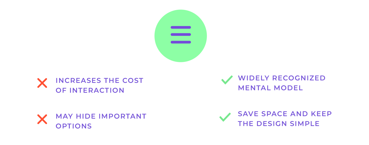
One of the main criticisms of the hamburger menu is that it adds an extra step for users, whether it’s a tap, swipe, or click. This additional action creates what designers call interaction cost. In short, each extra step takes time and effort, which can make the overall experience feel slower or more complicated.
But before we completely write off the hamburger menu, let’s take a step back. In design, especially when we focus on the user, it’s important to keep an open mind. Sure, the hamburger menu increases interaction cost, but in certain situations, this trade-off can actually be worth it. Let’s explore why.
One big reason to keep the hamburger menu in your design toolkit is that it has become a well-accepted mental model. At this point, most users instantly recognize the icon and know exactly what it does. There’s no need for long explanations, people see those three lines and understand that tapping them will open more menu options.
It’s also important to remember that not every app or website is the same. What works for one design might not work for another. The hamburger menu can be a great solution, depending on how much space you need to save and how crucial certain features are to the user experience. In some cases, keeping secondary features tucked away behind a hamburger menu helps keep the interface clean and less cluttered, which can lead to a better overall experience.
Prototype fully-interactive web and mobile apps with hamburger menus

When it comes to deciding whether to use a hamburger menu, context is key. It’s not just about following trends but about understanding the needs of your users, the type of device they’re using, and the navigation challenges you’re trying to solve. Let’s check some scenarios where the hamburger menu shines and how it fits into UI design.
With mobile-first design, space is limited. Small screens mean you can’t pack in too many options upfront, which is why the hamburger menu is a lifesaver. It’s perfect for tucking away less important features while keeping the key stuff front and center. That way, users can focus on what really matters without getting lost in a sea of buttons and links.
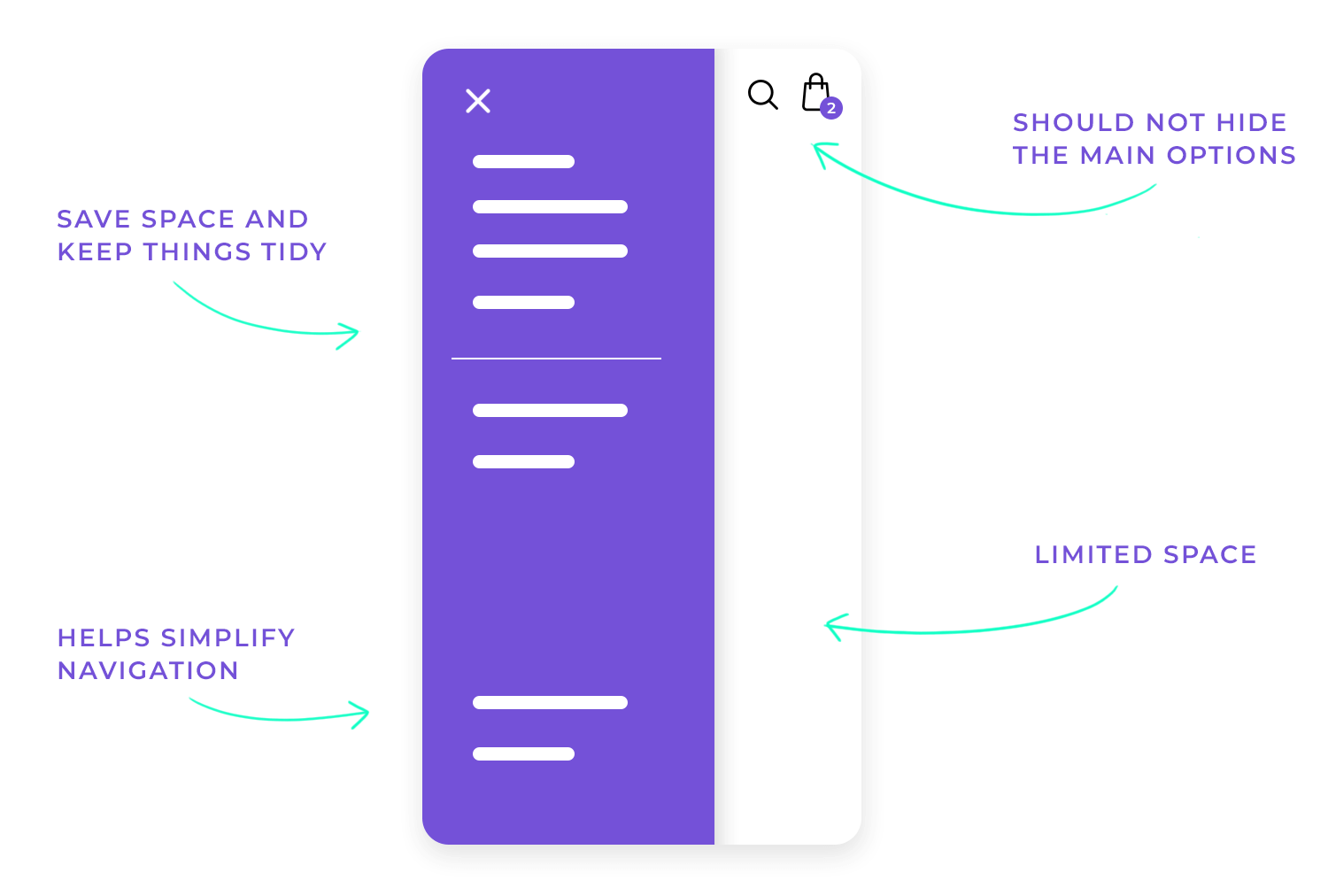
One of the reasons the hamburger menu works so well in mobile navigation is that it helps keep things simple. It organizes deeper layers of information without cluttering the screen, allowing users to tap into what they need only when they need it. It’s all about making mobile navigation easy, clean, and less overwhelming.
On mobile, the hamburger menu is almost a no-brainer, but on desktop? Well, it depends. Desktop screens give you way more space to work with, so you might not need to hide things away like you do on mobile. You can use traditional top bars or side menus for core navigation. But if you’re going for a super clean, minimalist look, or you want to keep the design consistent across mobile and desktop, the hamburger menu can still come in handy.
You might choose to use a hamburger menu on the desktop if you have lots of secondary options that don’t need to be visible all the time. For example, features like account settings or help pages can be hidden, while more important actions stay visible. It’s about reducing the clutter without sacrificing functionality.
While the hamburger menu is popular, it’s not your only option. Depending on your design, other navigation patterns could work even better. For example, tabs give users instant access to key sections and are especially useful when you need to show multiple options without overcrowding the interface. And bottom navigation bars are great on mobile, as they keep all the important stuff right within thumb’s reach.
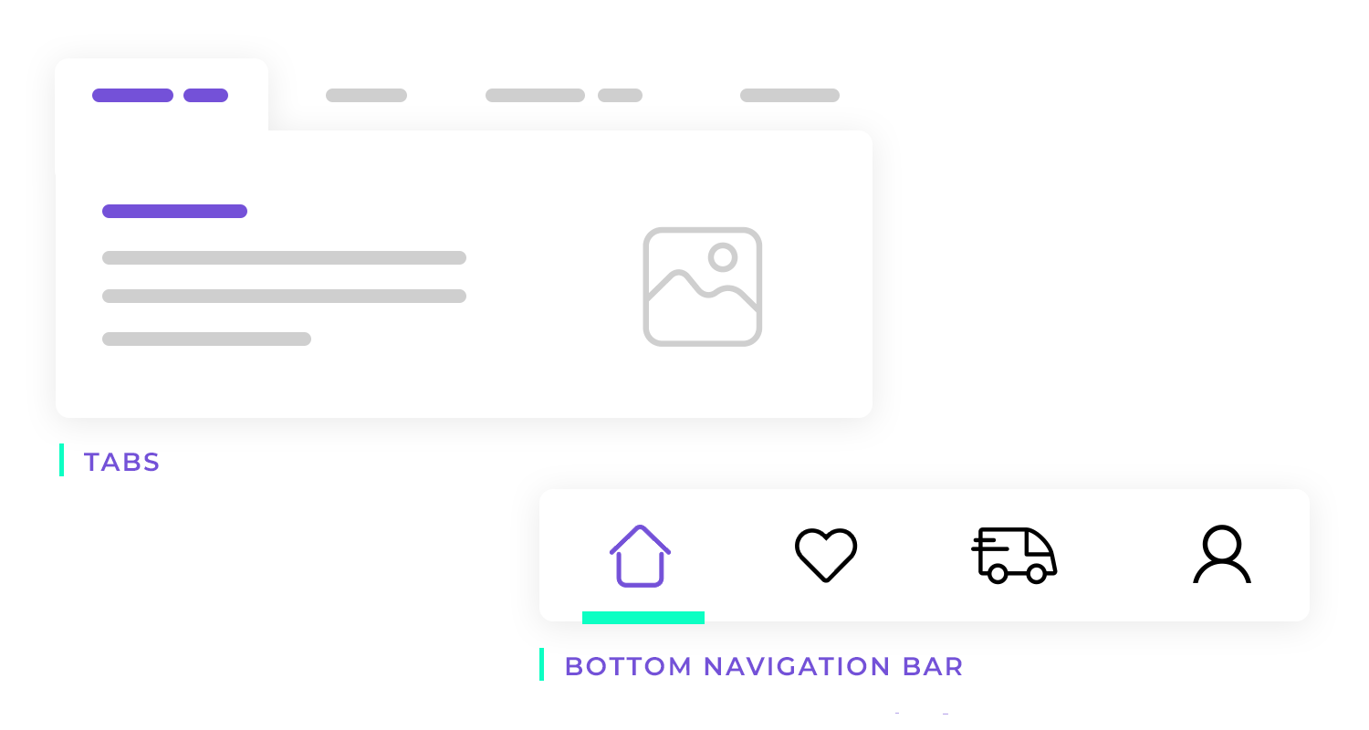
Each navigation method has its pros and cons. The hamburger menu saves space, but it does add an extra step for users. Tabs give quick access but might crowd the screen, especially on mobile. Bottom navigation makes it easy to navigate on mobile, but doesn’t work as well on desktop. It’s all about choosing the best tool for the job, depending on what works for your users and your design.
You shouldn’t use hamburger menus if the options, settings or features that it would conceal are important or central to the user experience. The general rule of thumb is that they are visible either on a top-bar or fixed tab bar. The reason for this is that the options should be open to direct discovery and shouldn’t therefore be hidden by a hamburger menu or stowed away.
Furthermore, imagine the user already has to make quite a few clicks that are central to the user experience or the goals of the website. It’s natural that you would want to reduce that extra step that comes in the form of a click or a tap wherever and whenever you can to reduce the interaction cost as a whole.
The last thing you want to do is place a hamburger menu in an area where it would interfere with a device, like the iPhone’s native navigation elements. This would make for terrible usability, as most users are used to navigating using these native options.
When you’re designing a hamburger menu, it’s about more than just deciding where to put those three lines. You need to think about the user experience, making things clear, and how it all fits with the overall design. Let’s walk through some key principles, best practices, and UX tips to make sure your hamburger menu is both easy to use and works smoothly.
The hamburger menu should be easy to spot and even easier to use. This means ensuring that users immediately recognize the hamburger icon and understand what it does. The menu should be straightforward, users shouldn’t have to guess how to navigate through it. If you keep things simple, the experience will be smooth and intuitive for everyone.
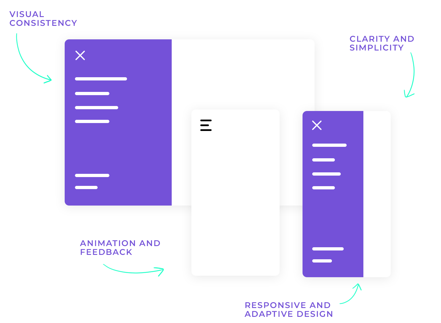
Consistency is key. The hamburger menu and its contents should visually align with the overall design aesthetic of your app or website. Whether it’s the icon itself, the colors, or the animations, everything needs to flow together. Plus, it’s important that the menu remains consistent across different pages to avoid confusing users.
Your hamburger menu should work just as smoothly on a tablet as it does on a mobile or desktop. That means designing with adaptability in mind. As screen sizes change, the menu should adjust seamlessly to ensure it’s always accessible, no matter the device.
Smooth transitions when opening and closing the hamburger menu can enhance the user experience. A gentle animation can help users understand that they’ve triggered an action, while visual feedback, like a color change, can indicate they’ve interacted with the icon. It’s those small details that make a big difference.
When it comes to where to position the hamburger icon, the top-left and top-right are the most common options. Each has its own logic: the top-left aligns with natural reading patterns for left-to-right languages, while the top-right can be more thumb-friendly for mobile users. Whichever you choose, make sure the icon is always visible and easy to access.

You’ve got options! Some designers stick with the standard three lines, while others create custom icons that better fit their brand. Regardless of which you choose, ensure the icon is large enough and has enough spacing around it so users can easily tap on it, especially on mobile. The last thing you want is for users to miss it or struggle to hit the right spot.
Once the menu is opened, it’s important that the items inside are organized logically. Group related items together and prioritize user-centered design by displaying the most relevant options first. A clear hierarchy will help users find what they’re looking for faster.
Making your hamburger menu accessible to everyone is crucial. This includes ensuring it’s navigable by screen readers and that labels and ARIA tags are used correctly for assistive technologies. Don’t forget about keyboard navigation, focus states should be clear so that users can navigate the menu without a mouse.
Sometimes, it’s worth adding a label like “menu” next to the hamburger icon, especially for users who might not immediately recognize it. Testing the icon’s recognition with different user groups can help you decide whether a label is necessary.
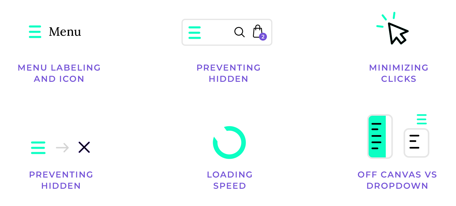
One of the biggest drawbacks of the hamburger menu is that it hides important navigation options. To combat this, consider combining the hamburger menu with visible navigation links, a hybrid approach. This way, key features stay in sight, while less frequently used items can still be tucked away.
Reducing the number of taps or clicks users need to make is essential for a smooth experience. Make sure that frequently used sections are quick to access, either by placing them prominently or allowing users to get there in as few steps as possible.
Small animations, like subtle hover effects or a quick bounce when the menu opens, can enhance the user’s experience. These microinteractions make the interface feel more interactive and responsive, adding a bit of personality to the menu without being overwhelming.
Speed matters. Ensure that your hamburger menu opens and closes smoothly without any delays, especially on slower devices. Optimizing your animations and keeping performance in mind will prevent frustrating lag for users.
The hamburger menu can take different forms, like a slide-in (off-canvas) menu or a dropdown. Both have their pros and cons. Off-canvas menus can feel more immersive, while dropdowns are quicker to interact with. Test out both styles to see which one fits your design better, but always keep user ease in mind.
Prototype fully-interactive web and mobile apps with hamburger menus

We’ve established the ways in which we can please and displease our users with the hamburger menu. Now let’s look at a few examples of some of the most popular apps on the market that feed us the hamburger!
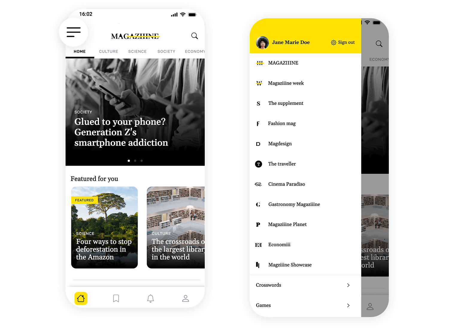
This app uses a left-hand hamburger menu to keep things tidy. It opens with a tap, showing different sections, each with an easy-to-spot icon. The user’s profile and quick Sign out option are right at the top. Extras like Crosswords and Games are at the bottom, keeping the main options clear. The hamburger menu makes navigating the app simple and clutter-free.
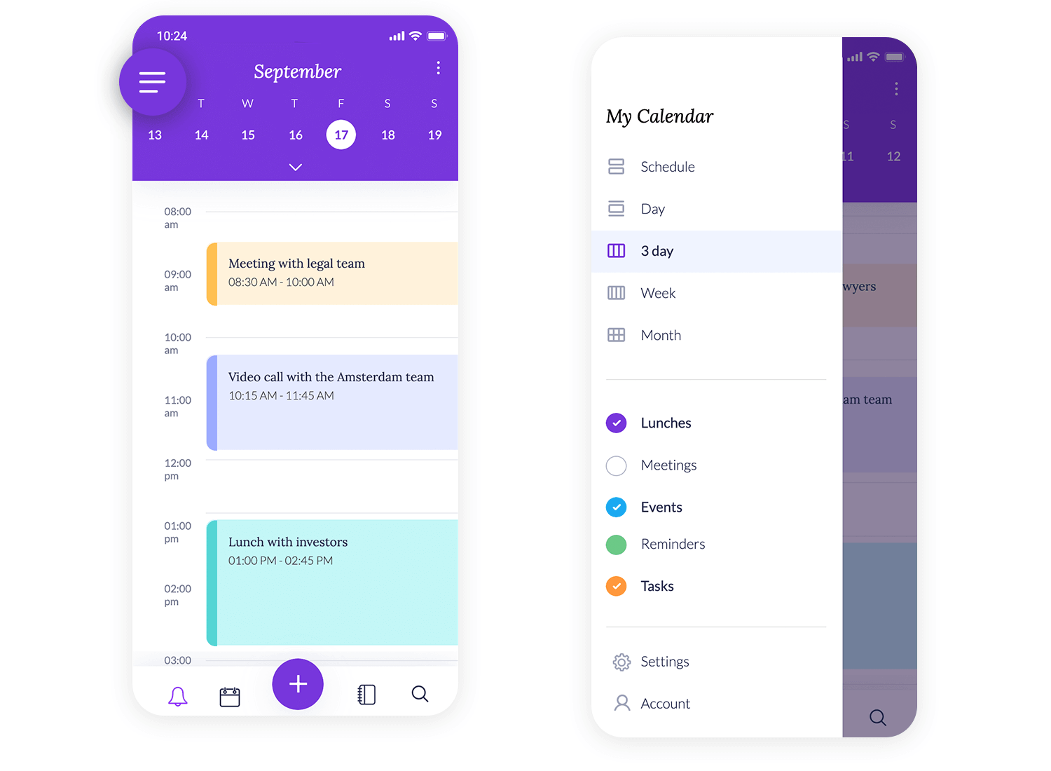
This hamburger menu makes navigating this app super simple. With just a tap, you can switch between views like Day, 3 Day, and Month. It’s all laid out in a way that makes managing your schedule a breeze, with color-coded sections for Lunches, Meetings, and Tasks. Plus, Settings and Account are right there at the bottom, so everything you need is just a tap away.
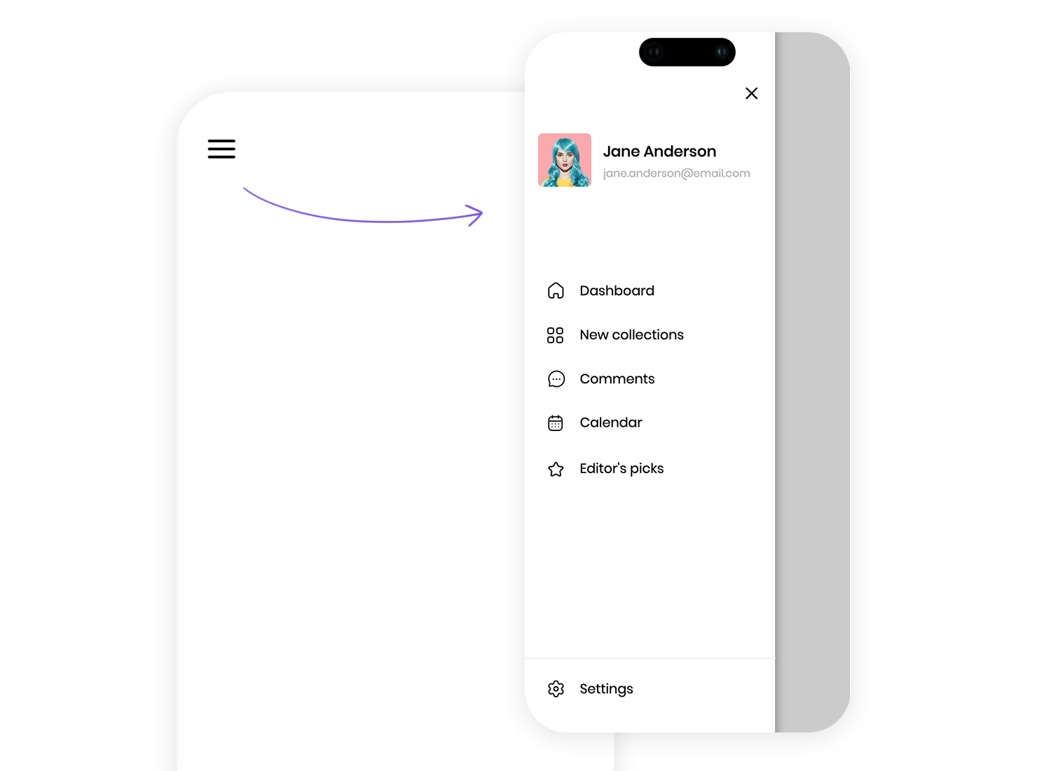
Looking for smooth navigation? This hamburger menu keeps everything within reach. You can quickly hop to the Dashboard, browse New collections, or check your Calendar. Your profile is featured right at the top, adding a personal touch, while options like Editor’s picks are neatly tucked at the bottom. It’s a clean, organized way to access all the app’s key features without any clutter.
Ecommerce giant, Amazon’s app, is a great example of a popular ecommerce using the hamburger menu. The designers at Amazon have done their research and understand what the user is looking for as soon as they open up the app.
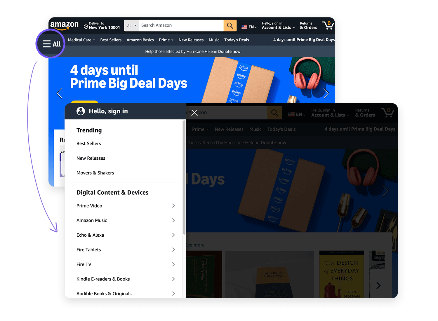
One of the first elements the user is presented with is a search bar to find the product they want, or they can keep scrolling down through the app to browse recommended products for them based on their previous purchases or wishlist items. Oftentimes, updating payment details, checking Wishlists or order tracking is secondary, yet still seems somehow intuitive under the basic hamburger menu.
The fastest messaging app on the market, Telegram also manages to put the hamburger menu to great use.
Apart from the instant messaging interface as the user opens up the app, everything else is stored under the hamburger menu at the top left of the screen. Options such as new groups, Secret Chats, New Channel, Calls and Saved Message can all be found here.
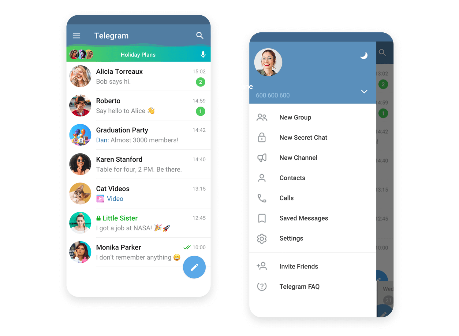
There’s something about the immediacy of arriving at the messaging interface with minimal distractions that seems so immersive. Like with Amazon, the fact that there were no menu options anywhere else, makes navigating to the hamburger menu for most tasks immediately intuitive.
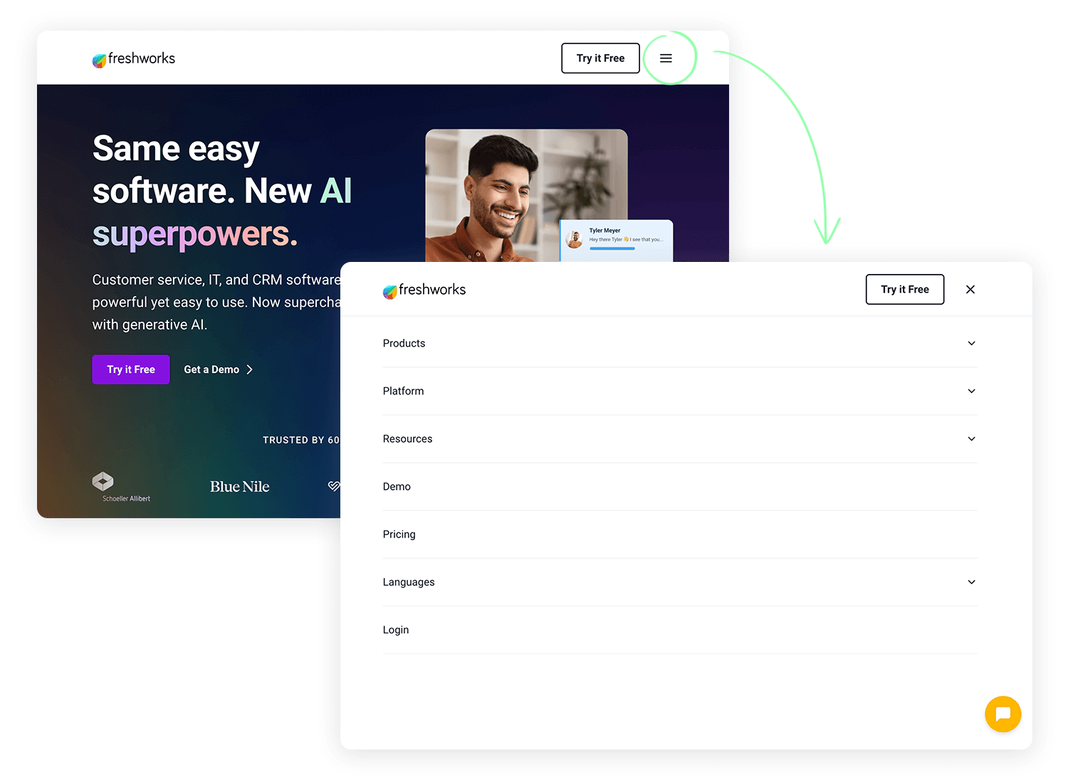
Freshworks keeps it simple with a hamburger menu at the top right, making navigation easy. A quick tap opens up all the options you need without cluttering the screen. It’s a clean and efficient way to keep the focus on their message while giving users easy access to explore more about their AI-powered CRM tools.
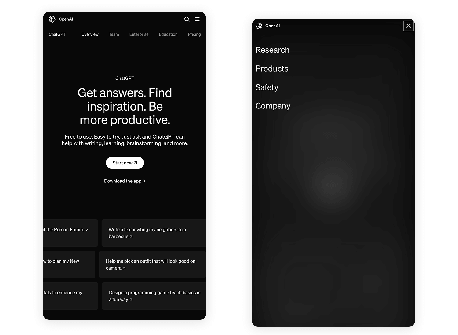
This hamburger menu sits quietly in the corner, ready to give you access to all the important sections in a clean and simple way. It’s a sleek, no-fuss way to keep things minimal while making sure you can easily navigate to what you need. Perfect for users looking to jump right into ChatGPT’s productivity tools.
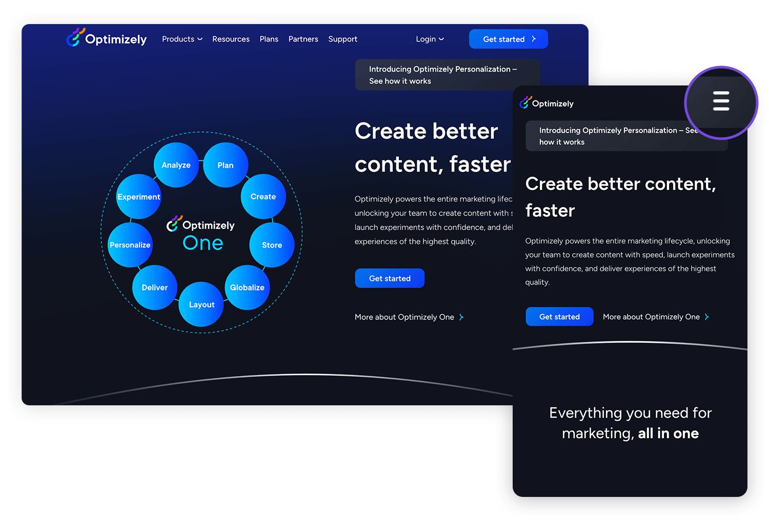
Optimizely keeps things sleek with tis hamburger menu tucked neatly at the top. One quick tap opens up a world of options without taking you away from the main focus – experimenting and personalizing your content. The menu helps maintain a streamlined design while ensuring you can access key features whenever you need them.
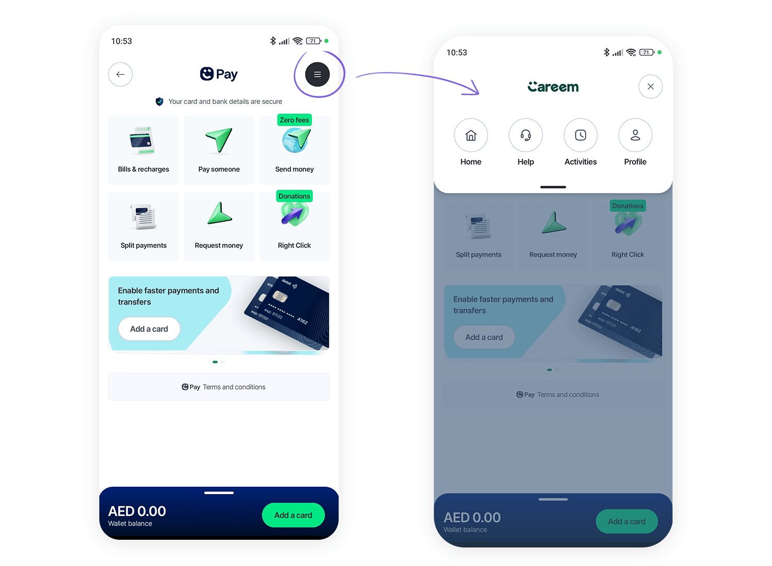
The Careem app uses its hamburger menu to keep everything organized and easy to find. Positioned in the top right, it opens up access to all of Careem’s services. This design keeps the home screen focused while offering quick access to every option with just one tap, making navigation easy and smooth.
LinkedIn’s app takes a rather unique approach to the hamburger menu as well. Rather than combining the icon with the text “menu”, they place their menu in the typical top left-hand corner but combine it with the user’s circular LinkedIn profile picture.
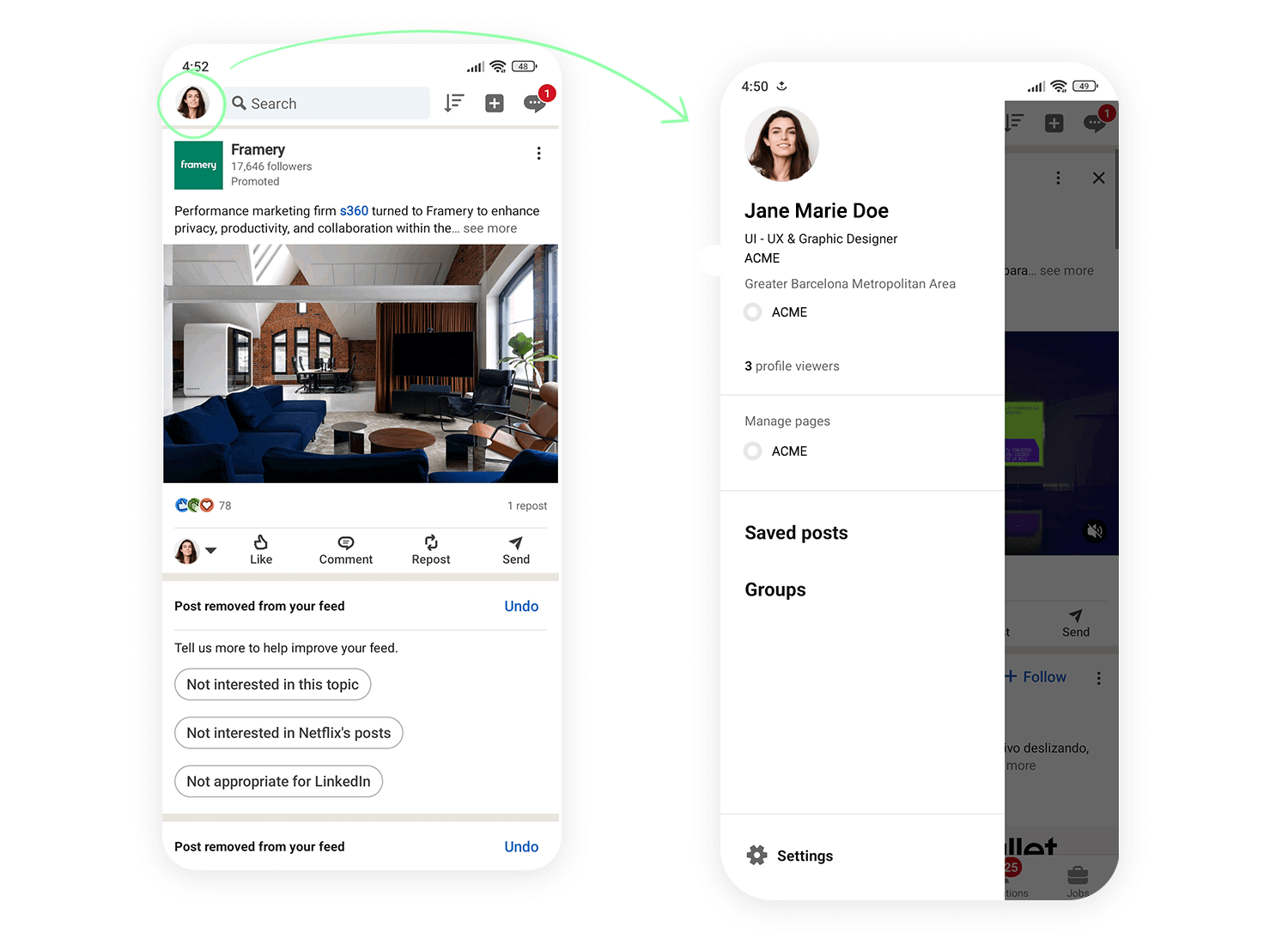
This immediately demonstrates to the user that there are options that are directly related to the user’s account and profile directly under the menu.
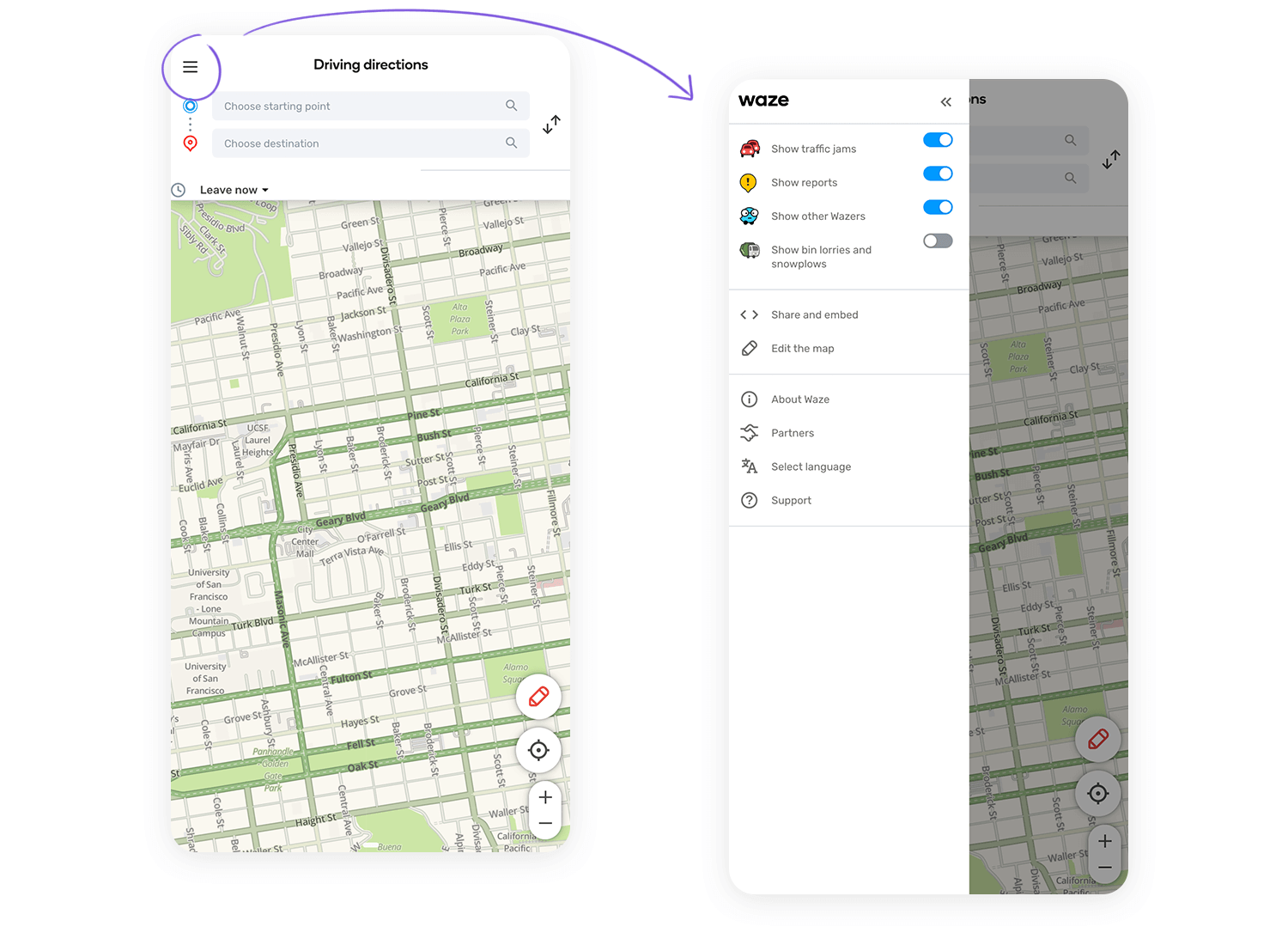
Waze keeps it straightforward with a hamburger menu that’s easy to spot in the top left. One tap and you get access to everything you need, from routes to settings, while keeping the map clear for navigation. It’s all about making sure you stay focused on the road with the right tools at your fingertips.
Just like Dropbox, the Google Drive app makes showing the user all their most recent files a priority. Whether they were created with Google Docs or Google Sheets, it’s clear they show the user what they’re probably looking for first.
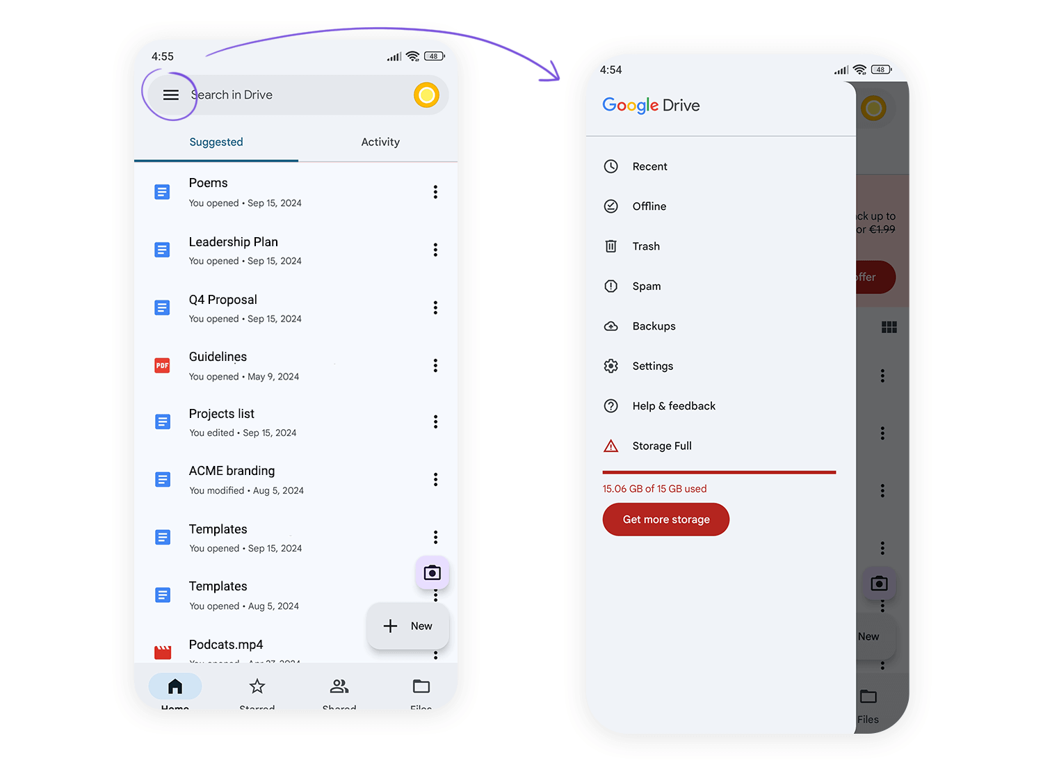
The rest of the secondary navigation options are hidden out of the way behind a hamburger menu, such as Recent, Offline, Bin, Notifications, Backups and other similar options, such as Settings.
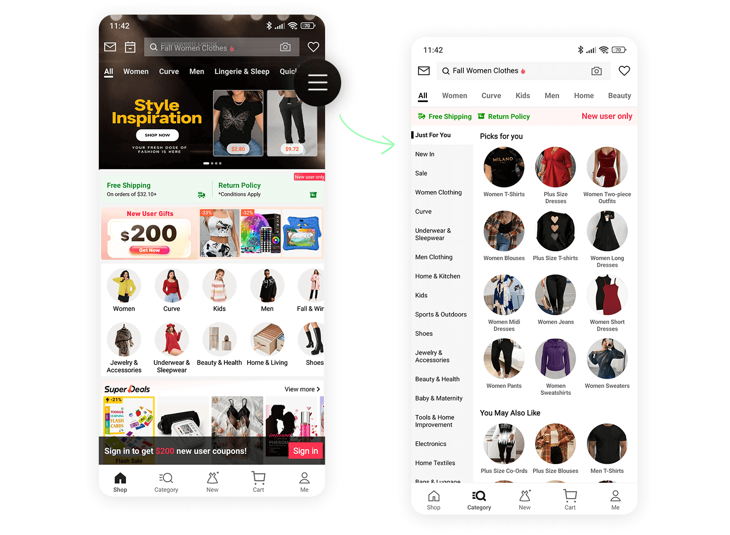
Shein is another example of a hamburger menu that keeps things simple. Tucked away at the top right, it gives you quick access to their categories. Just a tap opens up a world of fashion, while the main screen states focused on sales and special offers. It’s all about making shopping easy without overcrowding the page.
Now it’s time to check out how some of the big names in web design have tackled the issue of the hamburger menu.
When scaling down their website to smaller resolutions, Shopify is clever in choosing to hide most of their navigation options behind a hamburger menu which they place to the top right of the screen.
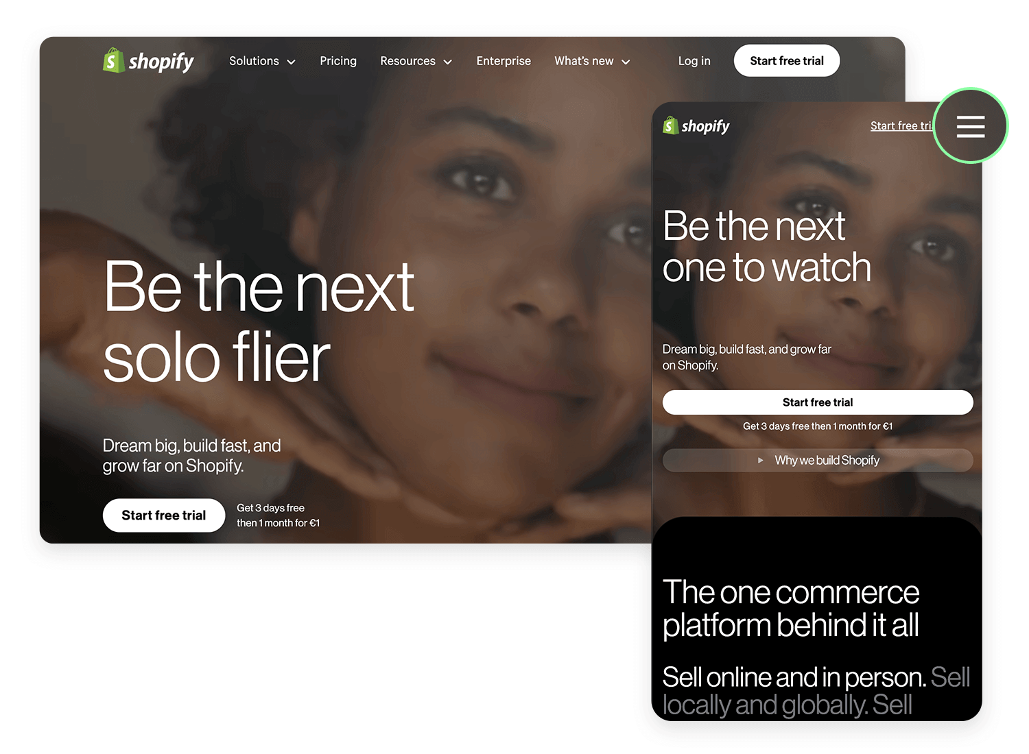
This is because the user is most likely to view the website version of Shopify before setting up an ecommerce site, even when browsing with a mobile device. The hamburger menu’s location at the right of the screen means it doesn’t obscure the logo on the left and leaves the user with one main task: to sign up and start a free trial!
Github, the most popular software development platform, scales down their website nicely and also uses a hamburger menu to strow the dashboard, pull requests issues and marketplace out of view. Why?
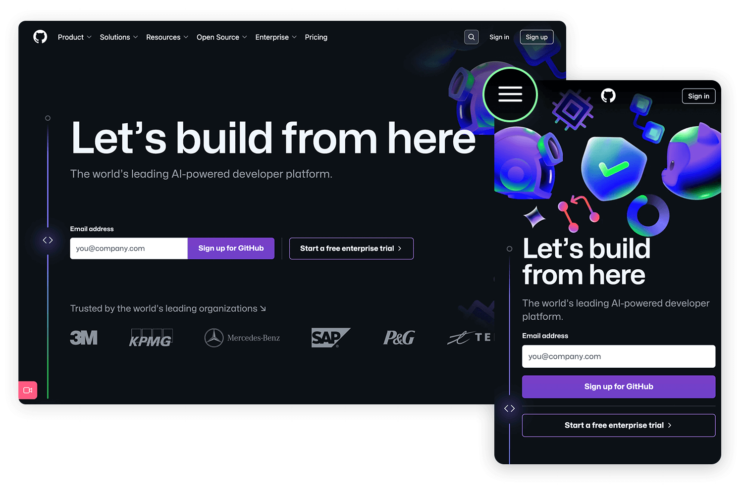
The main features of their homepage also tend to serve as the core navigation: “explore GitHub”, “Read the guide” “Start a project” and “Create a repository” are all call to actions to get the user to enjoy the main functions of the website.
We’re including NBC News in this list because they seem to apply the less orthodox method of including a hamburger menu on the desktop version of the site. As the site scales down to smaller resolutions, you’ll see they retain the same hamburger menu. But that’s not the only reason we chose this example.
NBC comes at the hamburger menu from the unique angle of user experience combined with journalism. On the menu top bar, they include the categories with stories that users are reading the most, and then bundle the less important categories into the hamburger menu.
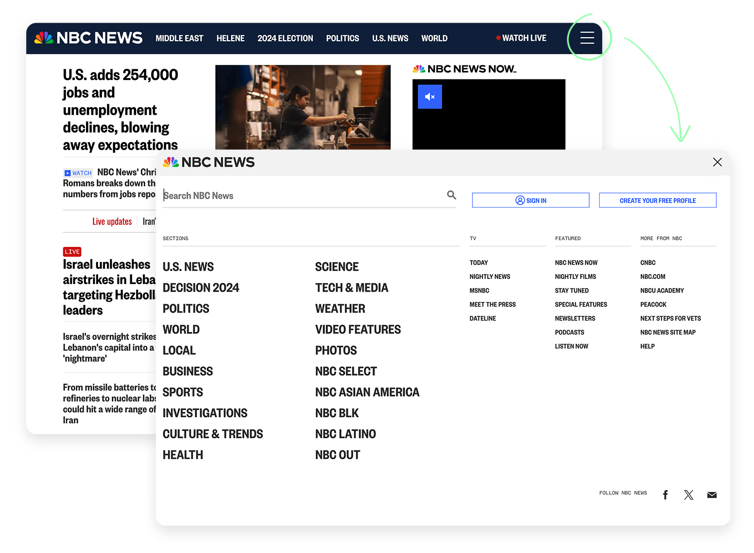
The clear order of preference for these stories starts from left to right. This preference becomes further evident as the website compresses to smaller resolutions, with one or two more options being hidden behind the hamburger menu, leaving just the three most important categories.
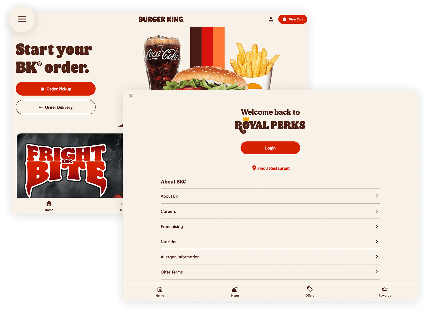
Burger King’s hamburger menu is all about making your order quick and easy. With one tap, you can explore the menu, check out offers, and find rewards. It keeps the focus on the delicious burgers upfront while letting you navigate smoothly to everything else you might need.
Starbucks does a clean job of scaling down their website to mobile devices. On the desktop version of their website, we can see the menu options like rewards, gift cards, find a store and sign in.
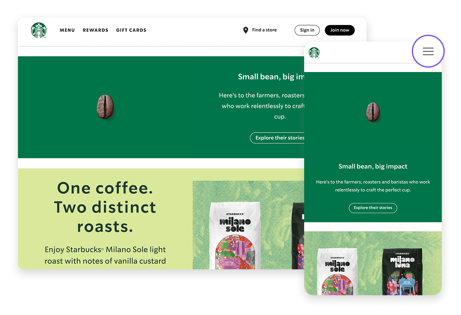
Yet on mobile, all of this is tidied away into a hamburger menu. And not to any apparent detriment to the user, who might be about to enter a starbucks store. Instead of wanting to see rewards, gift cards or sign in to their account, it’s more likely they’ll want to see what’s on offer that day, which is the main content they see on the succinct mobile version.
Prototype fully-interactive web and mobile apps with hamburger menus

Even though the hamburger menu is a favorite in app design, it’s not the only way to organize your navigation. Depending on your app or website, there are some other options that might fit better and make navigation even easier.
If you’ve only got a few key sections, tabs can be a great choice. Everything is laid out right in front of the user, making it quick and easy to switch between content. No digging through layers of menus, just a quick tap and you’re there.
For mobile users, bottom navigation bars can really make a difference. They sit right at the bottom of the screen, keeping important options within thumb’s reach. This makes navigation fast and effortless, especially on larger phones.

Similar to the hamburger menu, side menus slide in from the side but can be a bit more visible. A simple swipe brings them out, which is handy if your app has a lot of categories to explore. It keeps things accessible without overwhelming the screen.
If your app focuses on a single key action, like adding a task or starting a message, a floating action button (FAB) might be perfect. It’s a single, bold button that floats at the bottom, making it easy for users to get things done with one tap.
At the end of the day, the right choice depends on your design and how you want users to move through your app. While the hamburger menu is great for saving space, these alternatives offer more visibility and direct access to the most important features.
So, should you use a hamburger menu in your next design? As with most design choices, it really depends on two key things: the type of app or website you’re building and who your users are.
Should the menu go on the left or right? There’s no one-size-fits-all answer. It’s all about understanding how your users interact with your app and what feels natural for them.
In the end, it’s about making sure your users can find what they need easily. Whether you use a hamburger menu or a different option, your goal should always be to make their experience as smooth and intuitive as possible.
PROTOTYPE · COMMUNICATE · VALIDATE
ALL-IN-ONE PROTOTYPING TOOL FOR WEB AND MOBILE APPS
Related Content
 We see dropdown menus everywhere. But what makes a good dropdown? What changes when designing for mobile screens? We got the full run-through for you!13 min Read
 UI design examples that bring some serious inspiration. From parallex scrolling to delicate animations - this list has it all to get you inspired!8 min Read
 We created a list of the top UI design principles that capture some of the most interesting faces of digital design. Check them out!10 min Read
