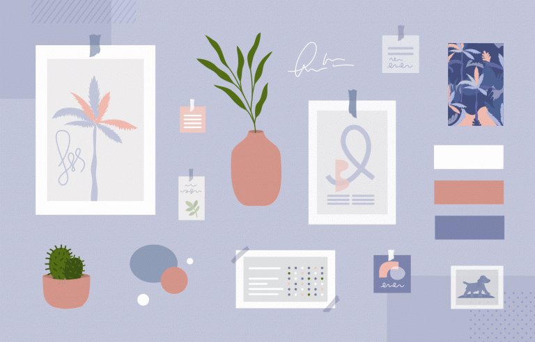
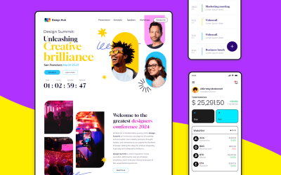
Not sure how to present your UI design ideas? Check out these mood board examples to see how to capture an idea in seconds
Ever been able to picture something but not put it into words? Trouble getting the client to see inside your creative brain? No problem, Justinmind’s prototyping tool is here to help with some mood board examples!
Design your Mood Board with Justinmind. It's Free. Unlimited projects!
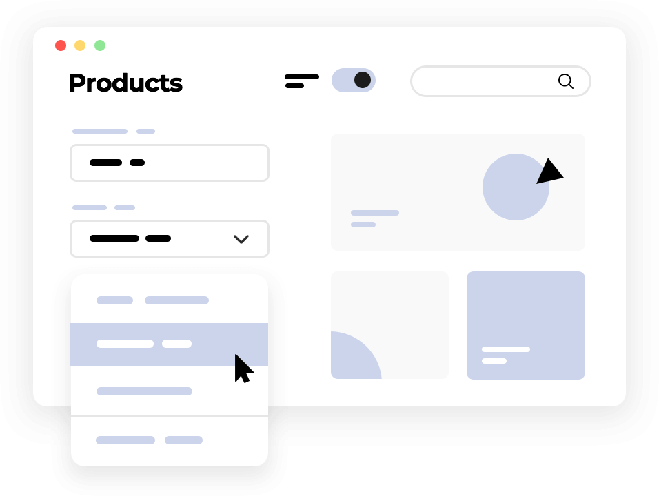
In this post, we’ll look at how you can save your own and everyone else’s time by putting together a quick mood board instead of giving hour-long presentations. We’ve also thrown in some great inspiration and some of the best mood board creators online. Tap into that right hemisphere today!
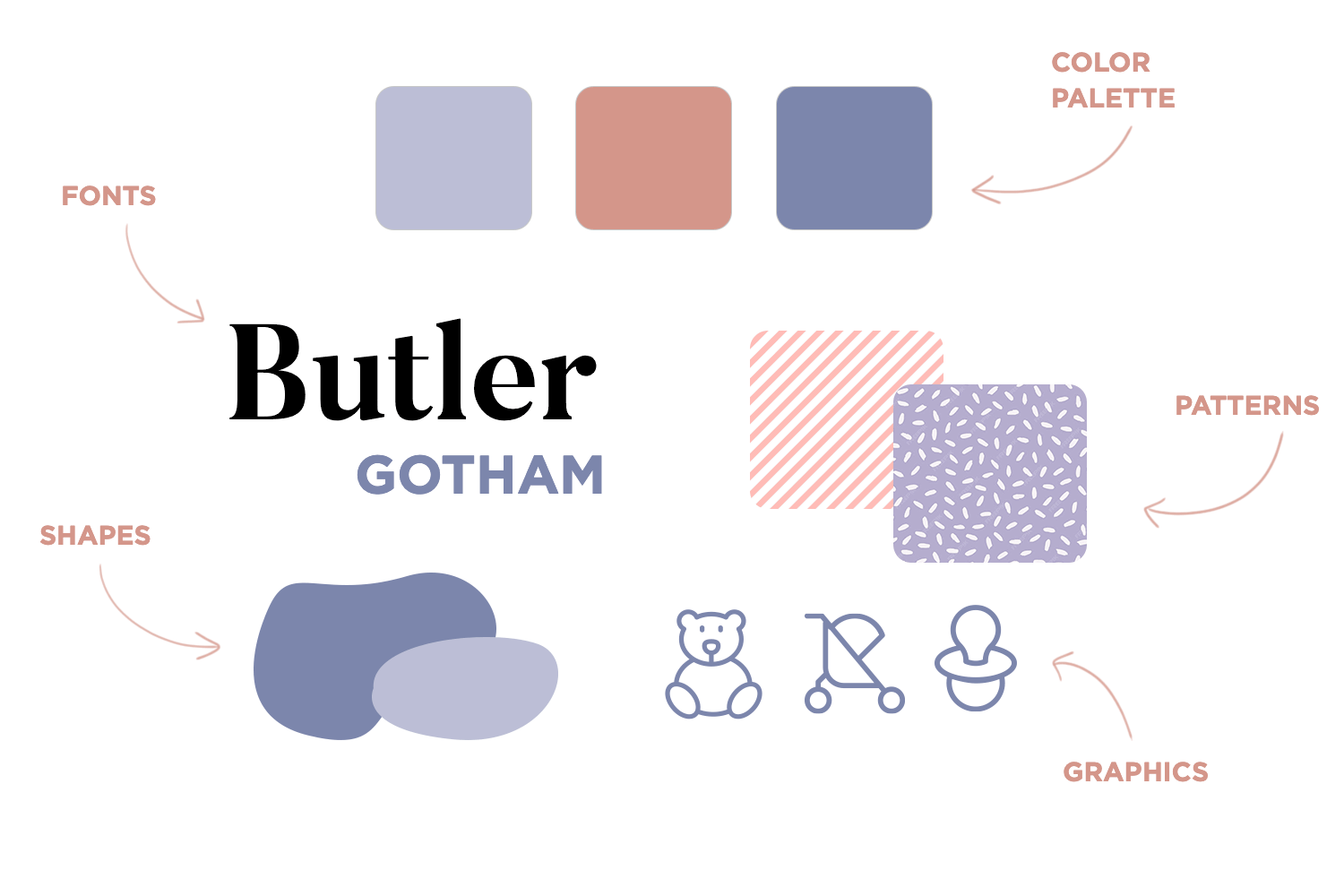
Graphic designers, interior designers, as well as UI/UX designers often use mood boards to convince clients of the look and style they’re going for. This is because mood boards make it easy to instantly communicate the ideas and inspiration behind a future design.
Mood boards generally contain a collage of the following elements:
- Color palette
- Patterns
- Fonts
- Images
- Shapes
- Graphics
It’s like the old saying goes: “a picture tells a thousand words”. Mood boards are an effective method of communication in the design industry because they manage to go beyond mere words.
You can present mood boards to the following types of people:
- Clients
- Stakeholders
- Product teams
- Design teams

The great thing about mood boards is that, apart from being purely creative pursuits, they also have a legitimate business goal. As well as achieving buy-in from colleagues and stakeholders, from a marketing standpoint, they help you focus more closely on your user personas. Each mood board you create will reflect their lifestyles, likes, hobbies, jobs etc.
The first thing that you have to decide on before you even start to put a mood board together is what medium it’s going to take. For a website or app UI, both physical and digital mood boards work.
However, each type has its own pros and cons. Most of the time, when in the design process for an app or website, you’ll be putting together digital mood boards for the simple fact that the resources are easier to find and they’re easier to share online. Here are the main differences between the two types:
Physical mood boards can be a collage of whatever materials you can get your hands on that have a recurring theme.
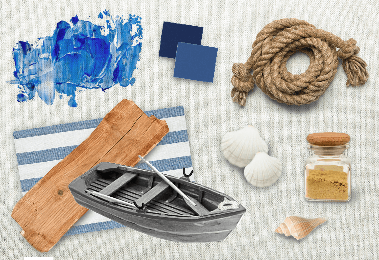
If you were thinking of creating a UI mood board with a nautical theme for both an app and web design, you might look at including real rope or twine, a smattering of seashells, a jar with sand, various shades of marine blue and bright colors along with wood. You might include some imagery of ships and oceans.
"...if it’s going to be on a website or an app, all it has to do is instill the feel of that digital product."
Along with these items, you could even throw in some more web-based items like font and shapes, for which you could use a pen, pencil, charcoal or even a paintbrush. However, with physical mood boards, you’re restricted to what you can get your hands on in a given space of time.
You can use the following items as a canvas for a physical mood board:
- Paper
- Corkboard
- Wall
- Moleskin
- Scrapbook
When it comes to digital mood boards, the job is a little easier. Sure, it’s not tactile, it can’t hold scents or anything like that. And it’s true that something on the screen can’t be felt quite as physically powerful. But then, if it’s going to be on a website or an app, all it has to do is instill the feel of that digital product.
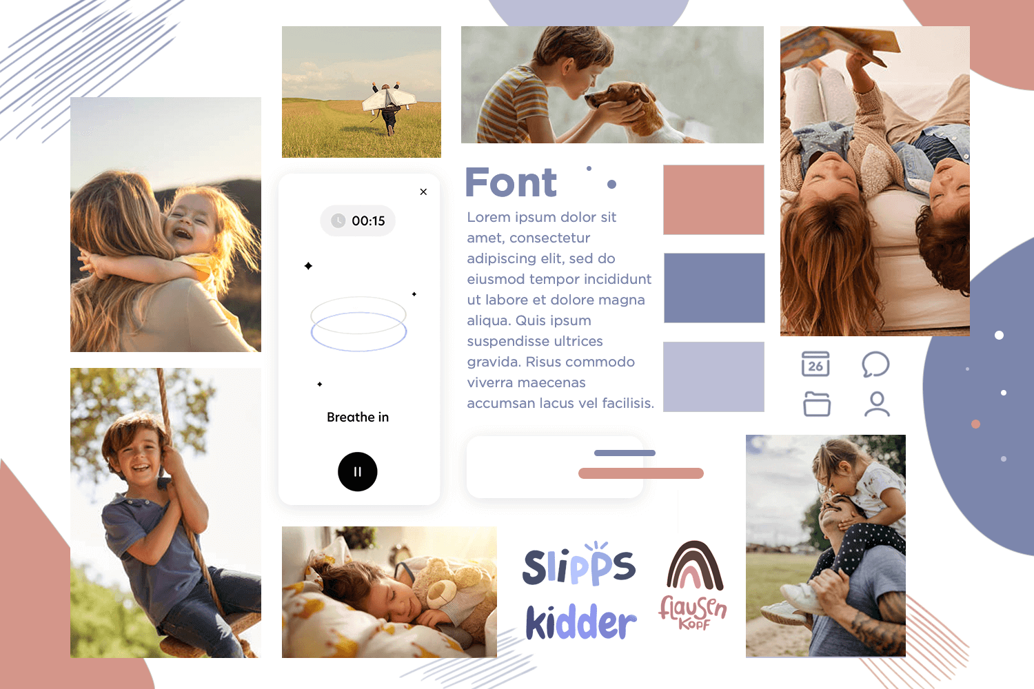
"Establishing the appropriate theme and vibe of your mood board implies carrying out user research beforehand..."
Indeed, for the modern designer, there are many pluses to digital mood boards. You don’t need to spend time and money gathering physical resources – everything can be sourced from the desk. Of course, best of all is that you can share them instantly with colleagues who are anywhere in the world.
To put together your digital mood board, you can use the following:
- A mood board design tool (like the ones below)
- Photoshop
- Illustrator
- Sketch
- A folder on your computer
This one is obvious. You can’t design an app or website without knowing who it’s going to be for. So why design a mood board for that app or website before knowing your audience? Establishing the appropriate theme and vibe of your mood board implies carrying out user research beforehand and creating some user personas.
Once you know your audience and have pinned down whether you want to go digital or physical, you then have to decide on what theme you’re going to go for.
Does it need to be regal, formal and classy; is it for a jewellery website or a law firm? Or perhaps it’s for a fashion website or a children’s coloring app? For a data-heavy dashboard design? Deciding on a theme early on is important for consistency.
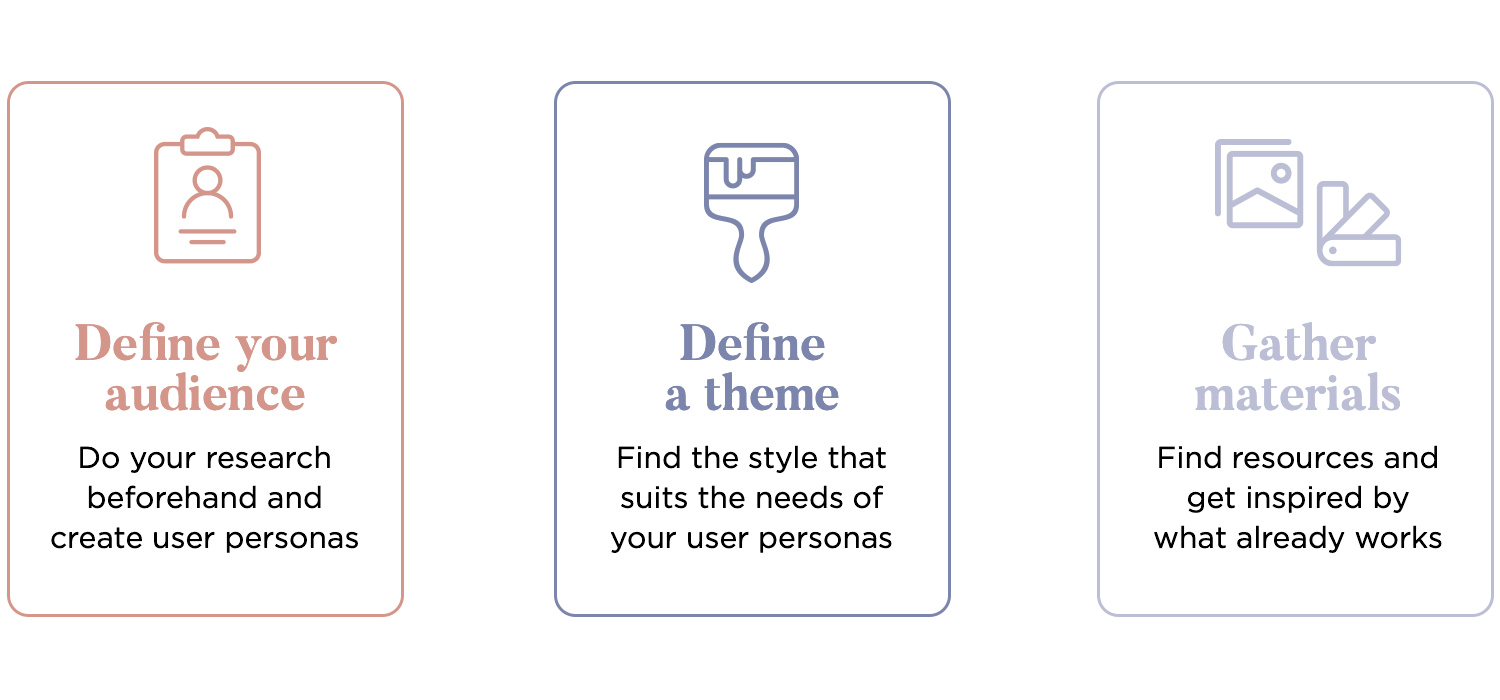
Start looking for resources that will help you define aspects like imagery, patterns, font and color. Don’t be afraid to take inspiration from similar products that already exist on the market, providing they’re successful. See the designs they used to capture their audience. Many designers include whole or sections of screens from similar apps or websites in their mood boards.
If it’s a digital mood board you’re creating, you’ll be gathering most of your resources from the web and sites like Dribbble, Instagram, Pinterest or Canva. But you can also scan documents like magazines, journals, books and even physical items like shoelaces or rope – only your imagination is the barrier!
Design your Mood Board with Justinmind. It's Free. Unlimited projects!

If you’re looking for even more design inspiration, don’t miss out on our list of UI design examples.
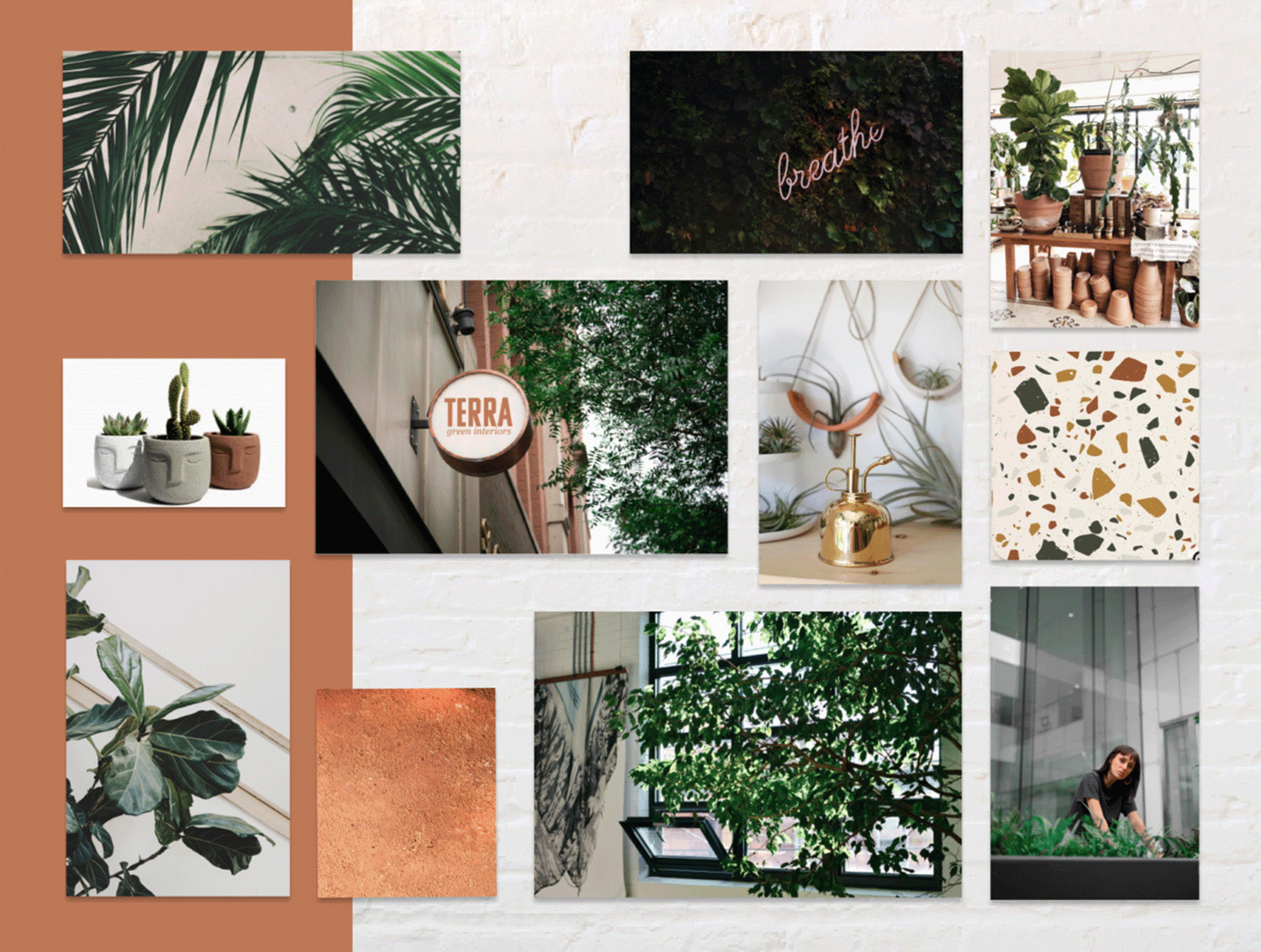
This mood board for an urban plant boutique is a perfect blend of modern and natural vibes, with earthy tones and vibrant greens. It combines natural textures, sleek fonts, and beautiful botanical illustrations to create a fresh, eco-friendly feel. This mood board is a great example of how cohesive visual themes can tell a compelling brand story and make a website feel welcoming and engaging. You can even smell the nature!
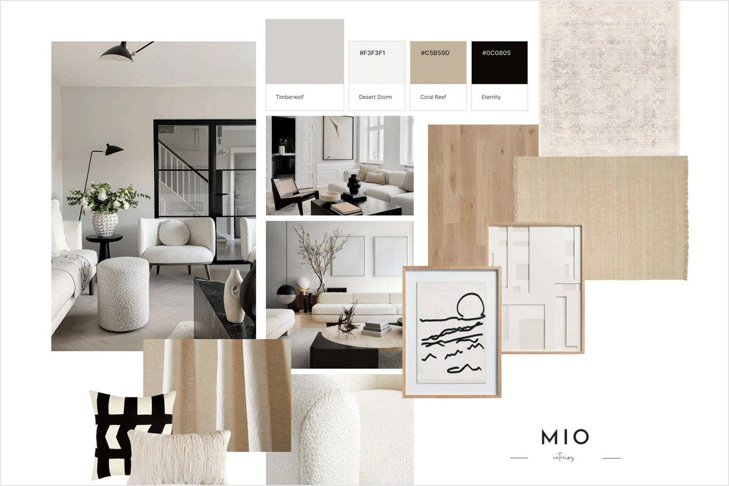
This trendy fashion moodboard created by Teresa Camp features a stylish mix of muted pastels, bold typography, and chic patterns. The elegant combination of soft colors and modern design elements creates a sophisticated and contemporary feel. UX and UI designers will find this mood board inspiring for crafting websites that exude elegance and modernity, effectively communicating a brand’s fashionable and trendy identity.
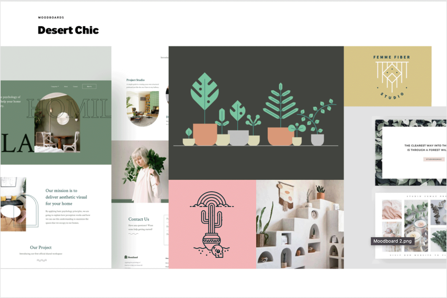
A popular one among UX and UI designers is this desert chic mood board for a minimalist design concept that showcases a clean, modern aesthetic with its earth tone color palette and typography. An airy uncluttered feel is created with the strategic use of white space and simple geometric shapes.
Designers will appreciate how this mood board highlights the beauty of simplicity, making it an excellent example for creating elegant and functional websites. It serves as a kind reminder to keep it minimal.
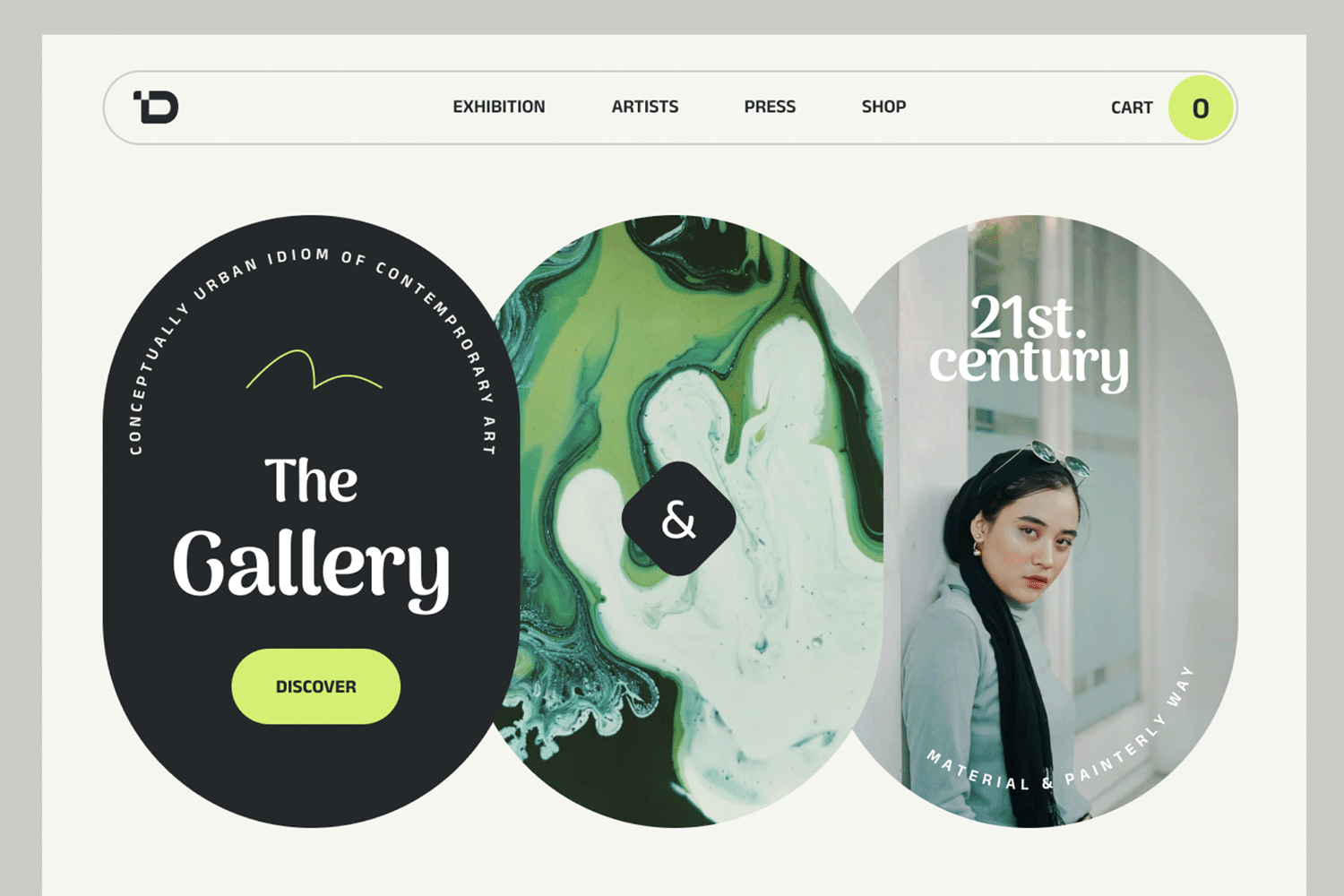
Atakan Kalkan created this striking mood board for an urban art gallery. The colors used are reflective of urban life, with some black and green hues mixed with an eggshell white background color, mimicking nature versus abstract.
They have achieved a cohesive contemporary feel mixing these colors with modern typography and an image of an artist with a unique and minimal sense of style. It’s a striking blend of elements that reflect the gallery’s modern ethos, making it an inspiring reference for designers seeking to infuse urban energy into their projects.
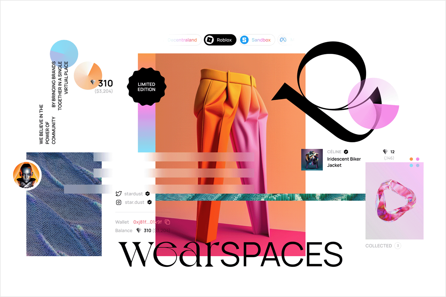
WearSpaces comes to life through its dynamic and modern design, perfectly capturing the essence of a fun and innovative virtual marketplace for digital wearables. Users can easily discover and purchase items in immersive 3D spaces, navigating with their avatars.
The app’s key visual elements feature sleek, minimalist graphics and a sophisticated color palette of cool blues and neutral tones, giving off a professional yet creative vibe. The user interface is intuitively designed, offering smooth navigation and parallax scrolling to enhance readability and keep users hooked, giving it a fresh and contemporary feel.
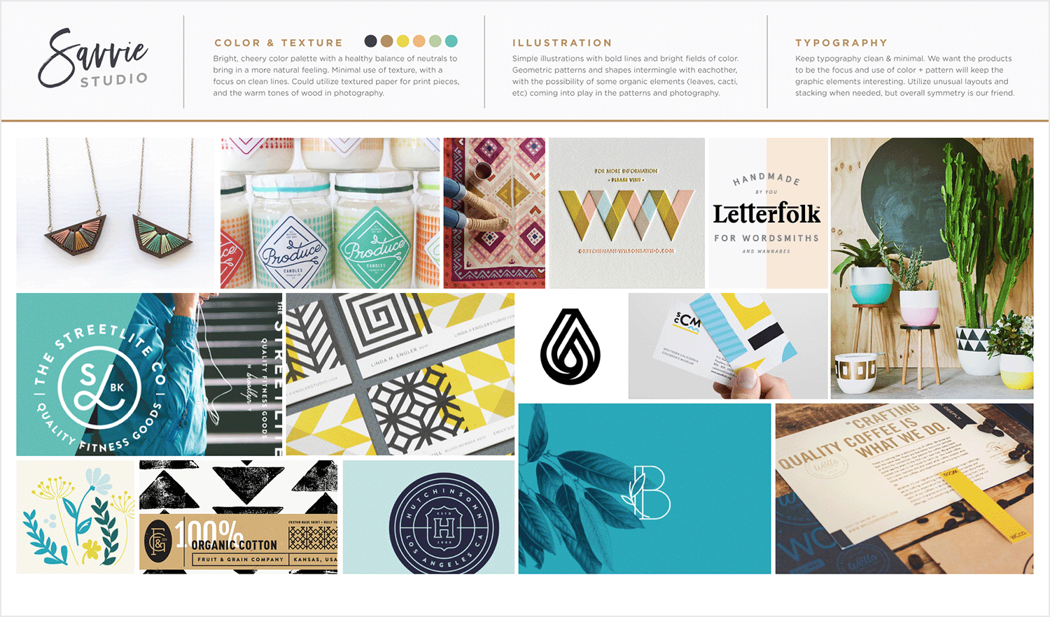
Featuring a lively mix of colors, this playful mood board by Emily Holt captures a vibrant and dynamic spirit. The mix of striking hues and whimsical shapes and elements is perfect for brands looking to convey a fun and engaging personality. It’s a brilliant example of how energetic design can create a memorable user experience.
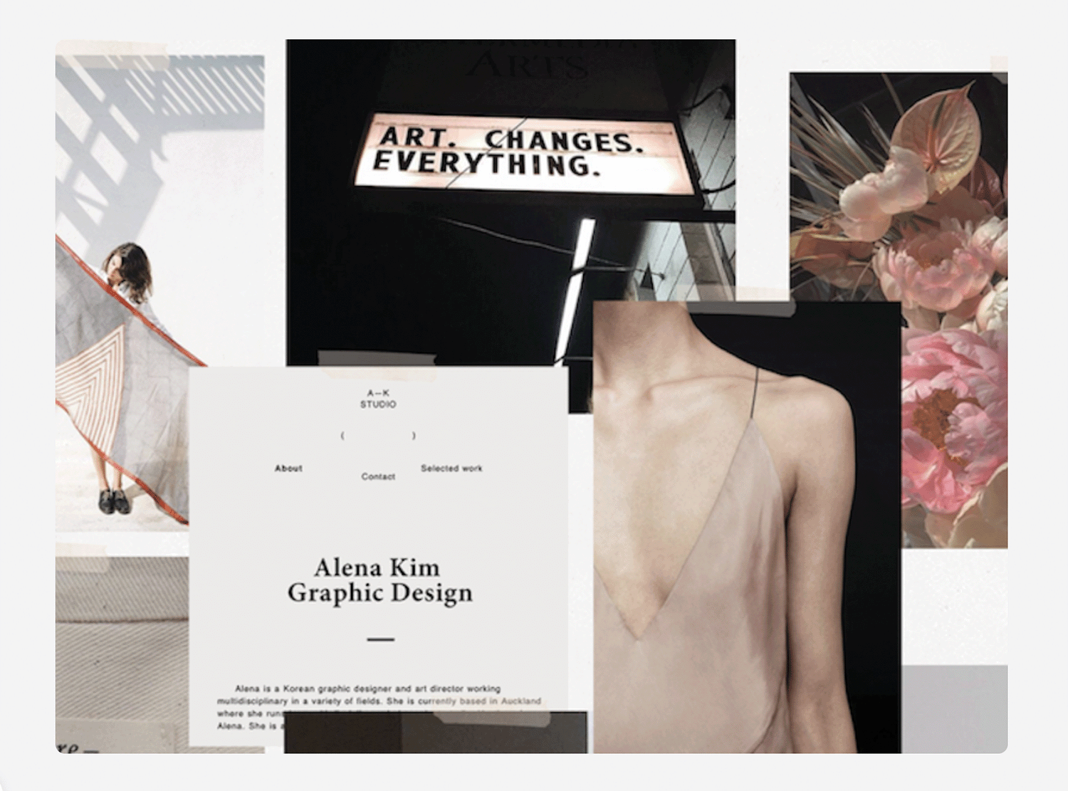
We love this graphic designer website mood board that Morgan Brewer created with a theme inspired by Monday mornings. It features dark tones and melancholic images, like a rose-colored bouquet against a black background, to evoke a somber yet sophisticated mood.
Morgan enhances this theme with classic typography and ample white space, giving the design a balanced and breathable feel, just like how you would want your Monday mornings to start!
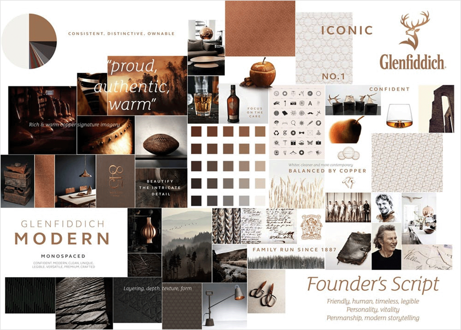
Whisky tones are the name of the game in this Glenfeddich website mood board design by the creative team at Purple. The various shades of that rich gold evoke the strong flavors of their premium spirits. From warm caramel to deep amber, the palette tantalizes the senses.
They have thought of every element down to iconography that matches the timeless elegance that perfectly aligns with the brand’s heritage. It’s a meticulous curation that immerses visitors in the luxurious world of Glenfeddich, capturing the essence of their esteemed whisky collection.
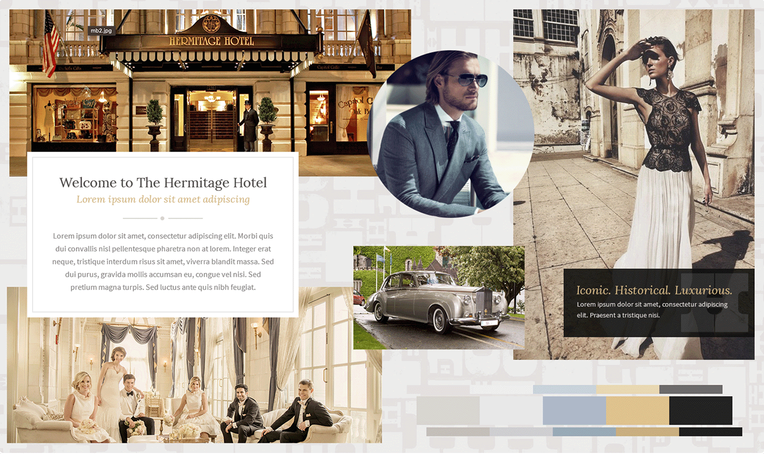
Luxury and style are the themes for this Heritage Hotel website mood board. The color palette displayed in the lower right corner highlights the use of pastel colors that touch on these themes in the most elegant of manners.
Designers selected images of the hotel and its potential clientele to further reinforce the allure of the brand. They have also used classic typography reminiscent of Victorian-era letters, like those in Bridgerton, making you feel as though you are reading a letter straight from Lady Whistledown herself!
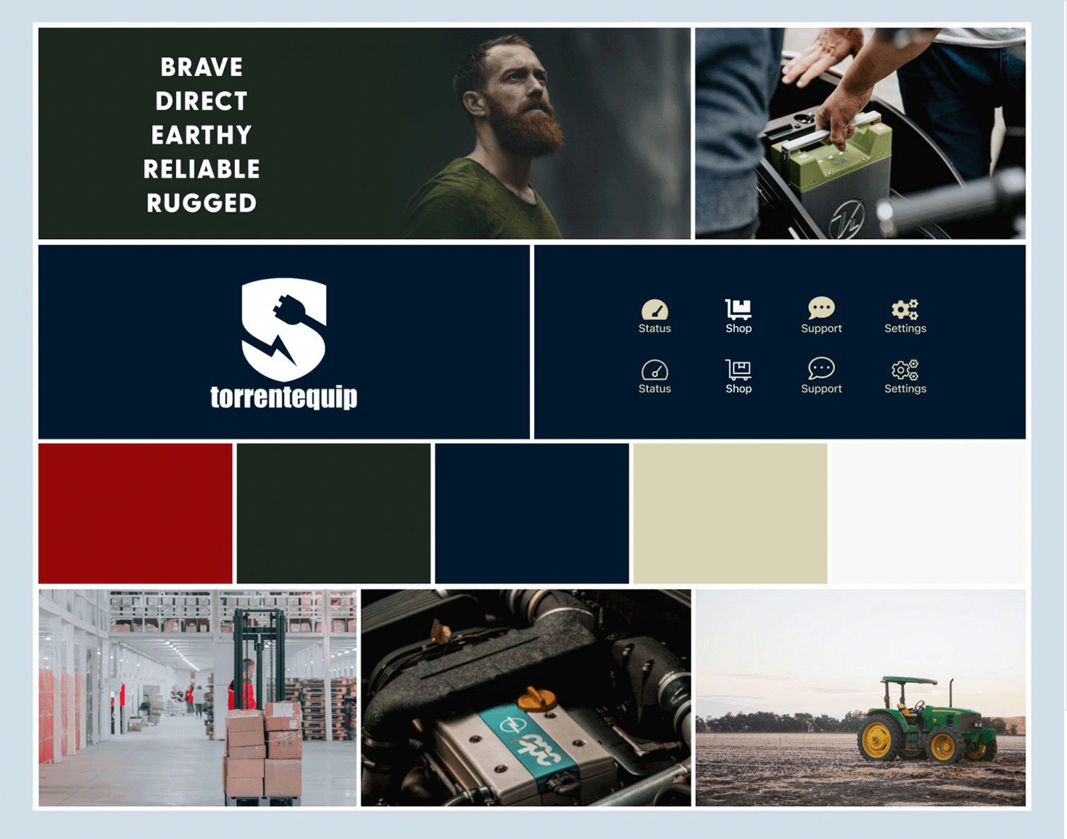
TorrentEquip‘s mood board exudes an aura of strength and reliability, perfectly capturing the essence of the brand. The font style is bold and straightforward, evoking a sense of confidence and no-nonsense attitude. Each image underscores the themes of dependability and resilience, appealing to the practical and hard-working target audience.
The color palette is a blend of earthy and industrial tones, creating a grounded and trustworthy vibe. It’s easy to imagine TorrentEquip’s brand personality as a modern-day Viking—a fearless explorer who ventures into the toughest terrains with unwavering bravery and a trusty set of tools.
This Terracotta mood board example on Behance is a great illustration for an ecommerce website to encapsulate the brand and feel.
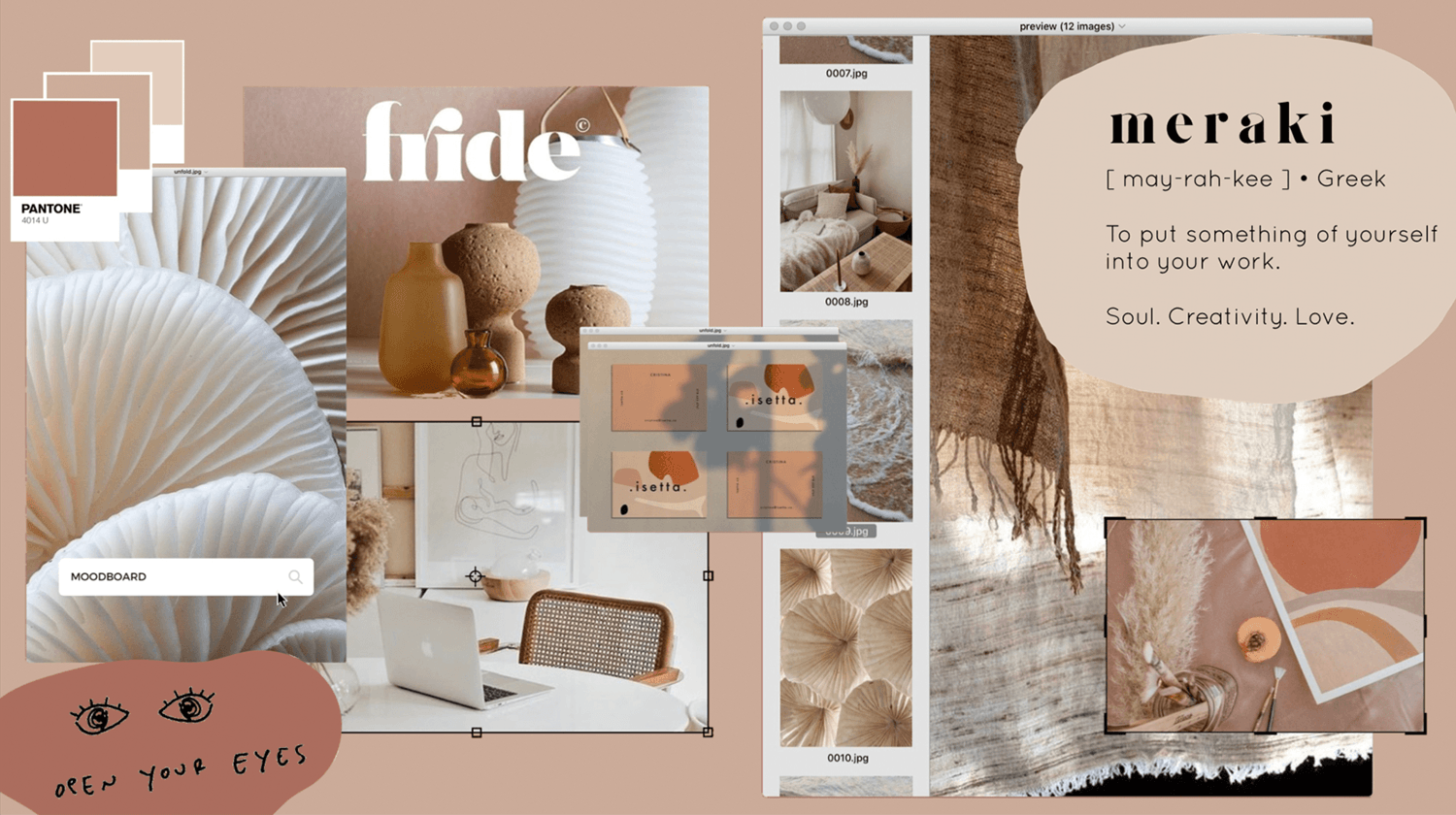
This moodboard uses a collage of images showing modern interior decor against a salmon background, along with some playful fonts, in addition to a few random UI elements to give it the feel of a website.
This style tile mood board example posted by Mat from Denver on Webflow is a brilliant style tile that can be used as inspiration to convey not just the fonts, color scheme and imagery of a website, but also the emotion.
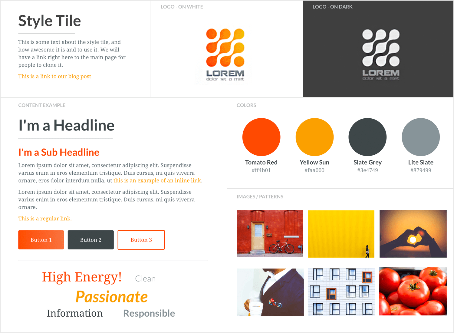
In this mood board example, the images help give sense to the color of the elements in the UI and some of the different fonts spell out the words that these colors are thought to invoke, such as high energy, passion, as well as qualities such as clean and responsible.
Close Market is a website mood board example by Abdus on Dribbble that is supposed to convey the color palette, font, spacing and imagery for the website of an organic food store. And he does that rather well with beige-brown, green and graduated black color squares that match the color tones of the chard in the photo.
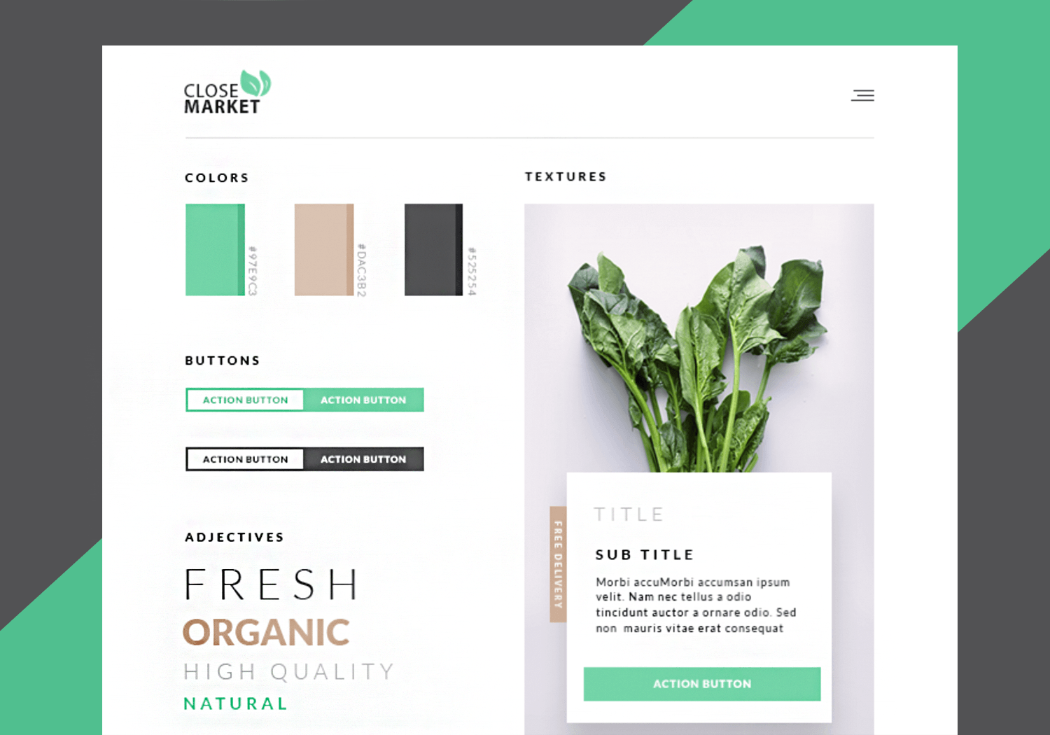
He also conveys the idea of a clean interface with the use of copious white space between the elements, that also creates a clean look, as if to reflect clean living. This shows that website mood boards don’t merely need to be a collage of elements and images: you can also use white space design as one of those artistic elements!
Nicolas J. Engler created a brilliant mood board example for a graphic designer portfolio and posted it on Dribbble. It gives the perfect idea for the playful, creative theme and arty theme of the online portfolio.
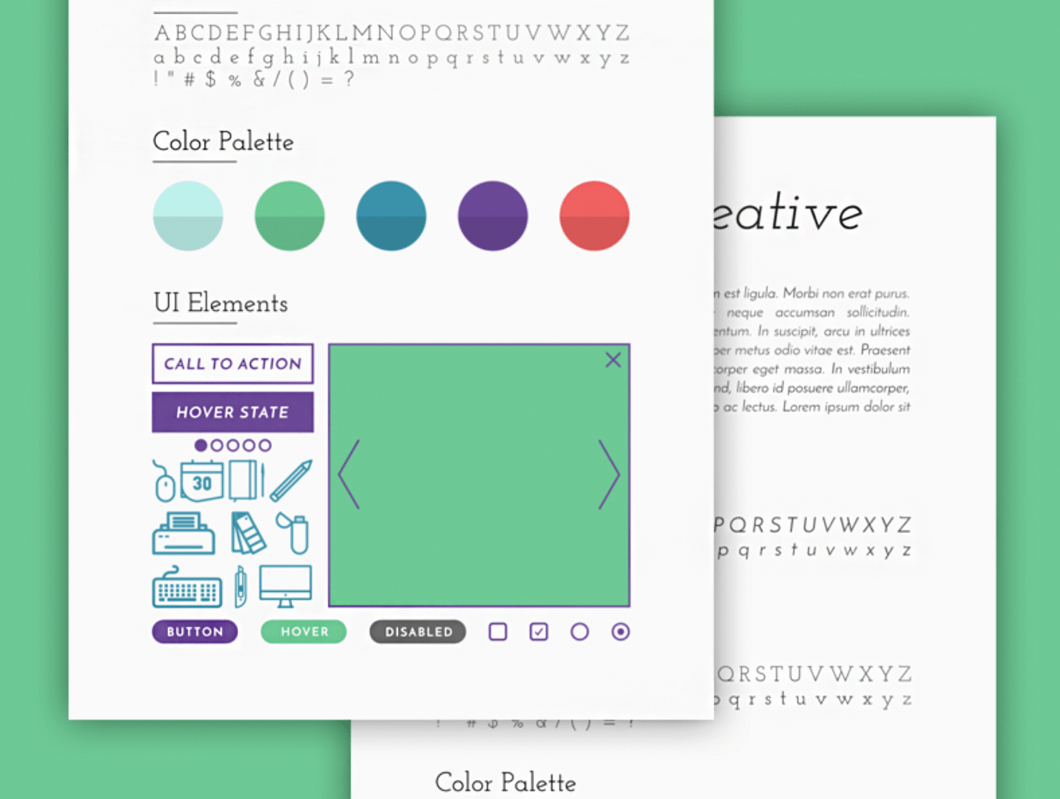
It shows the color palette, the alphabet of the intended font, as well as the images that help add a playful touch to the pastel color scheme.
Ladybossstudio.com presents an elegant mood board example that perfectly demonstrates the look for a sophisticated fashion blog, clothing, furniture or ecommerce store.
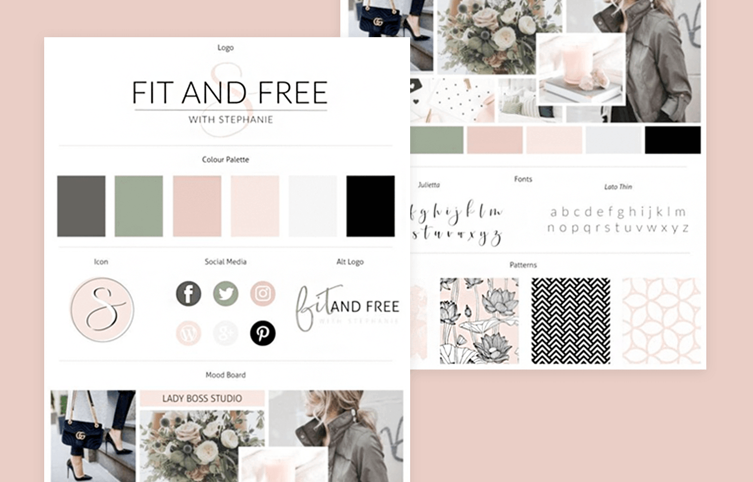
The patterns that will be used for the website UI are clearly demonstrated by the images of upholstery patterns; there are floral patterns both in these as well as actual flowers in the images. Fonts as well as the social media buttons are also demonstrated in this mood board example.
This Dellarose brand mood board example, put together by kidsroomsets.top, was done so in an attempt to find a color to match a turgid green marble floor, presumably that of a shop. In the end, it was done quite well, combining with bronze to give the effect of rose gold and shades of beige, pastel green, grey and black.
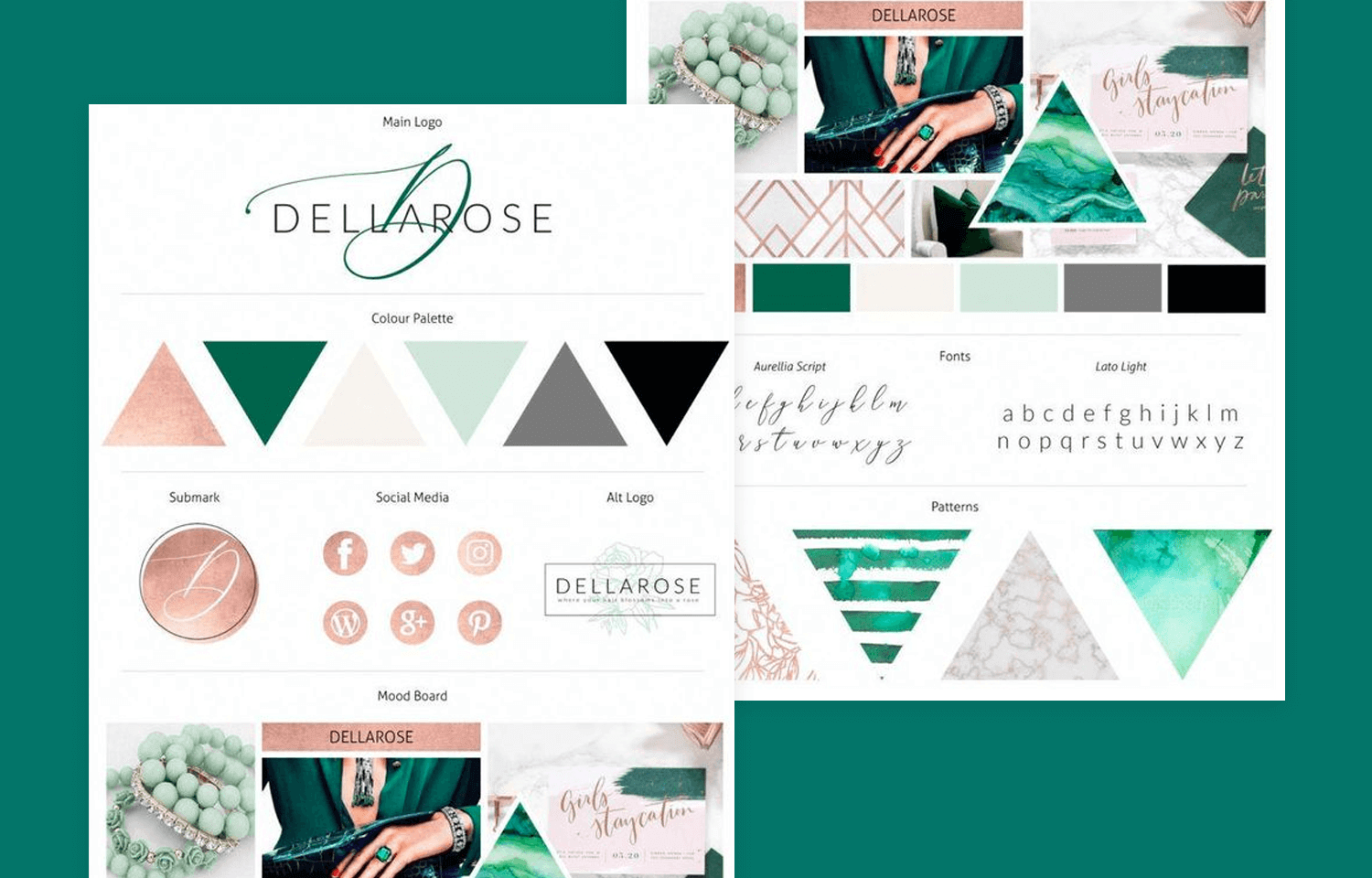
Even the social media buttons are rose colored. But this mood board example doesn’t just leave it there, however: it also plays around with shapes to give the angular affect of crystals.
A great example of a Canva mood board, also found on ladybosststudio.com, helps perfectly illustrate a UI with the sea as a recurring theme.
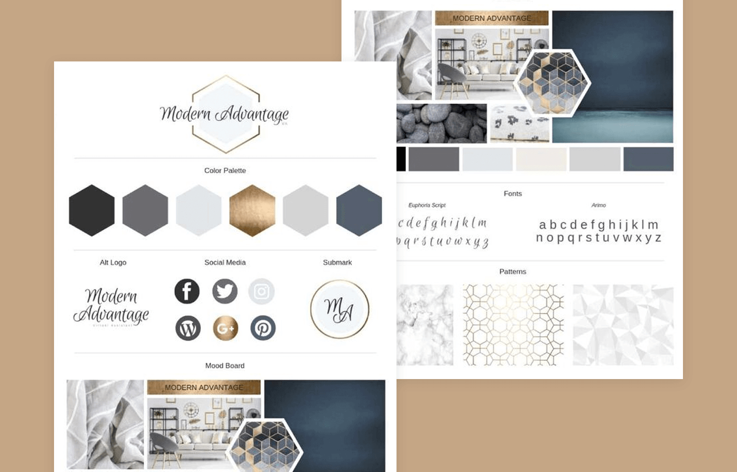
The images of a pre-stormy sky above turquoise waters and smooth pebbles help the designer devise a complementary color palette, along with angular hexagonal patterns as a cross between the straight lines of a horizon and the angular edges of the pebbles.
We dig this minimalist mood board example devised by Chris Plosaj because of the simplicity it conveys, in addition to the “cohesive aesthetic”. It shows a lot of detail about the style of a website’s UI design, without going all Jackson Pollock on it. Learn more about creating a minimalist website with our post.
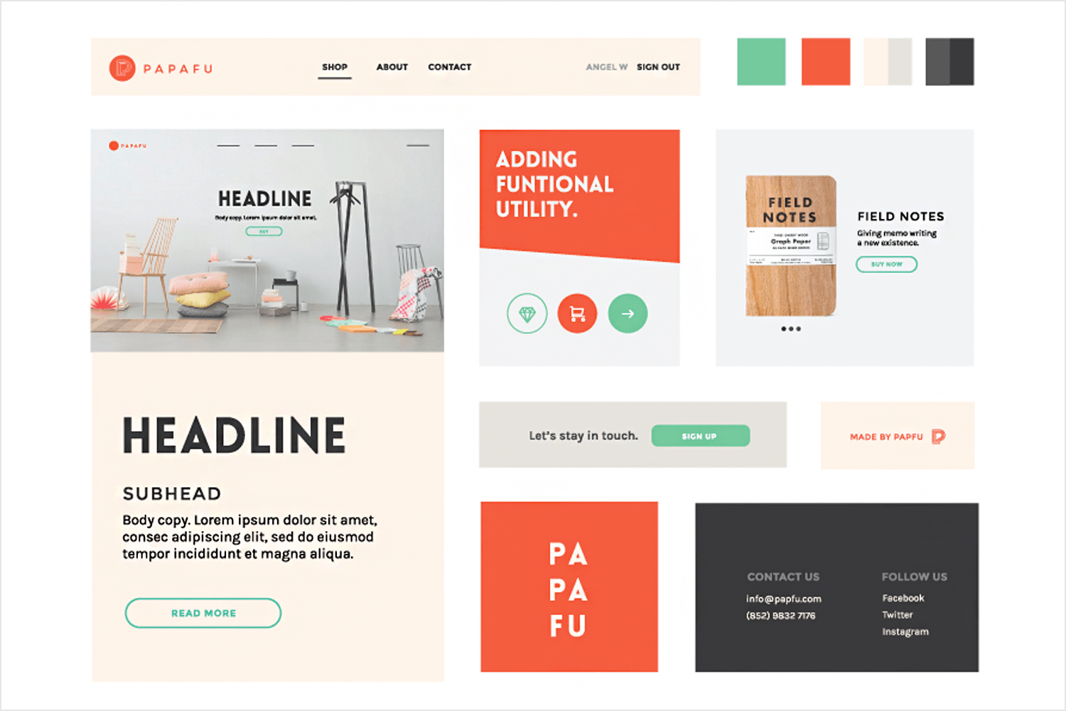
This board keeps it real and on-point, which may be good, depending on who you’re presenting to. Here the basics are communicated: minimalist imagery, colors and fonts.
Alubiadesign have pinned a nice rustic mood board example by natural desert landscapes. What we like is the huge focus on a soft color palette and minimalist design based on the sparsity of deserts.
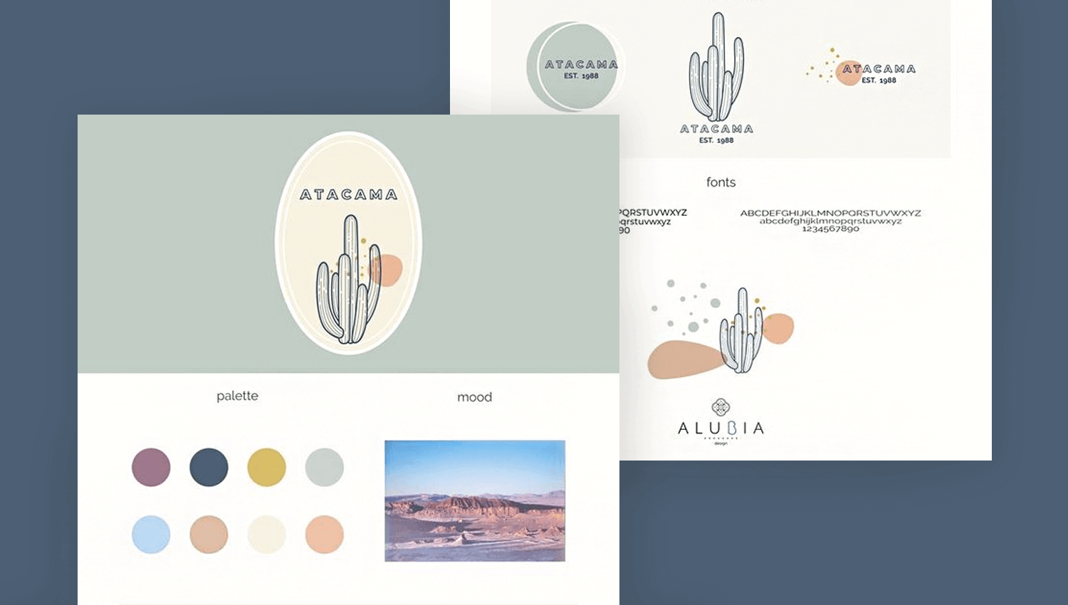
We also dig the way they use their mood board to experiment with different branding logos and fonts. This would be a great idea for initiating a discussion in a presentation and getting input from team members and stakeholders.
Design your Mood Board with Justinmind. It's Free. Unlimited projects!

Kate, a designer with a blog called kurlycreative.com shows off a sophisticated, feminine mood board example with a color palette for a website that’s aimed at female entrepreneurs.
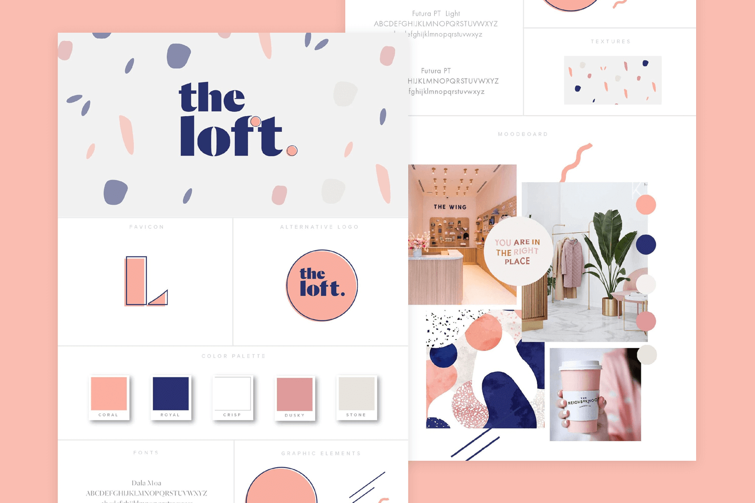
What we particularly like about this mood board example is the way the designer uses it as an opportunity to really experiment with the aesthetics of shapes, fonts and the full range of the chosen color scheme.
This pattern mood board is a little different to the others on this list because it solely sets out to highlight color, patterns and vibe. The designer here, Ernest Asanov, is going for a nautical theme revolving around beach holiday feel and inspired by youth femininity.
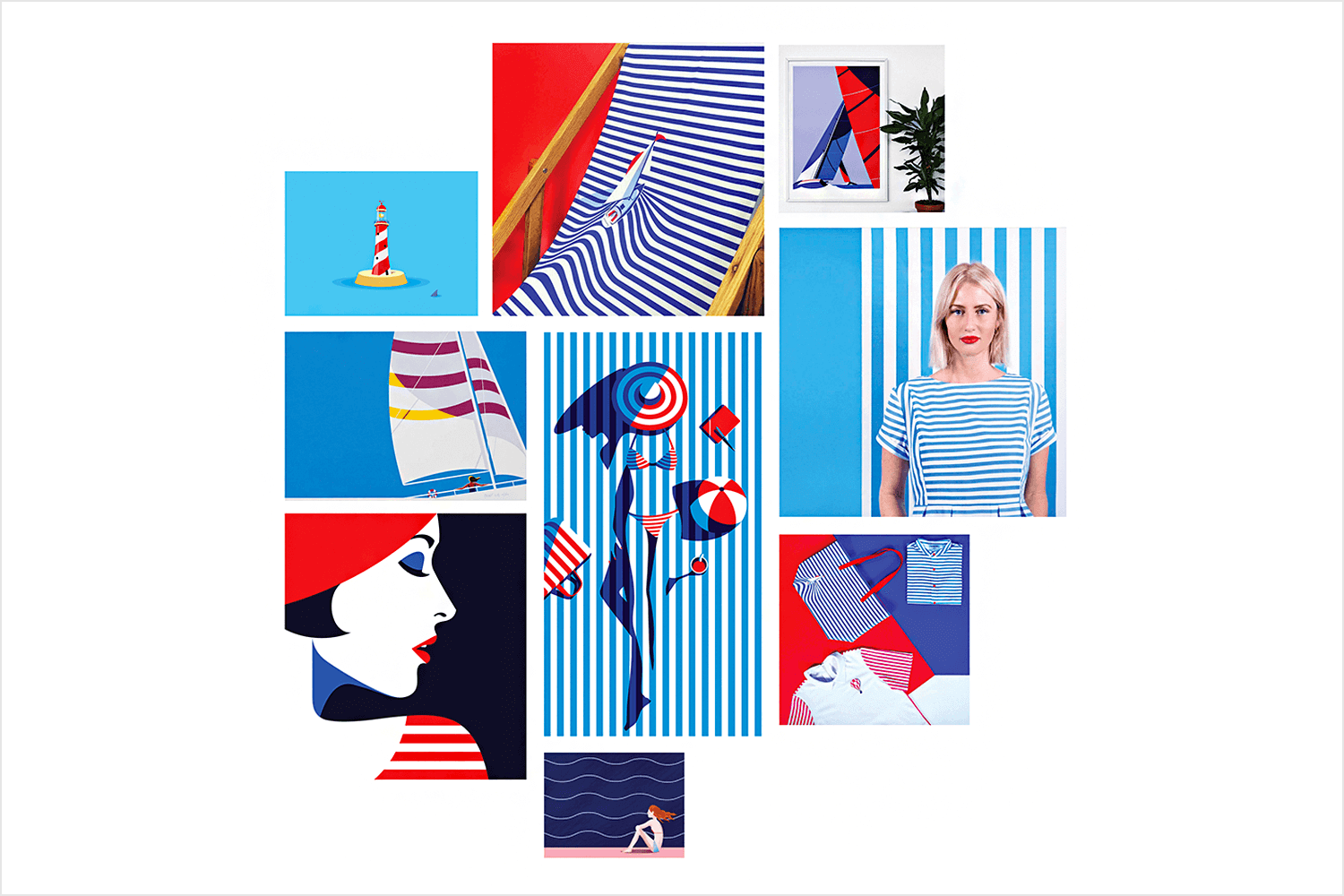
A contrasting palette of reds, whites and blues, along with plenty of stripy patterns help set the course for the design of a potential website, alongside the clearly contrasting circular, wavy and angular patterns.
However, while inspiring and eye-catching and suitable for graphic design, it would be a somewhat primitive and abstract way to kickstart the design on a website. Including a few more practical elements like font, perhaps along with some UI elements would be the next step.
To provide a contrast with the previous mood board example, this striking website mood board example is a more practical kick-starter with more tangible UI elements such as buttons, directional arrows, fonts and map markers. The color palette is clearly defined with a warm mix of orange and brown, to contrast with some cooler greys and blues.
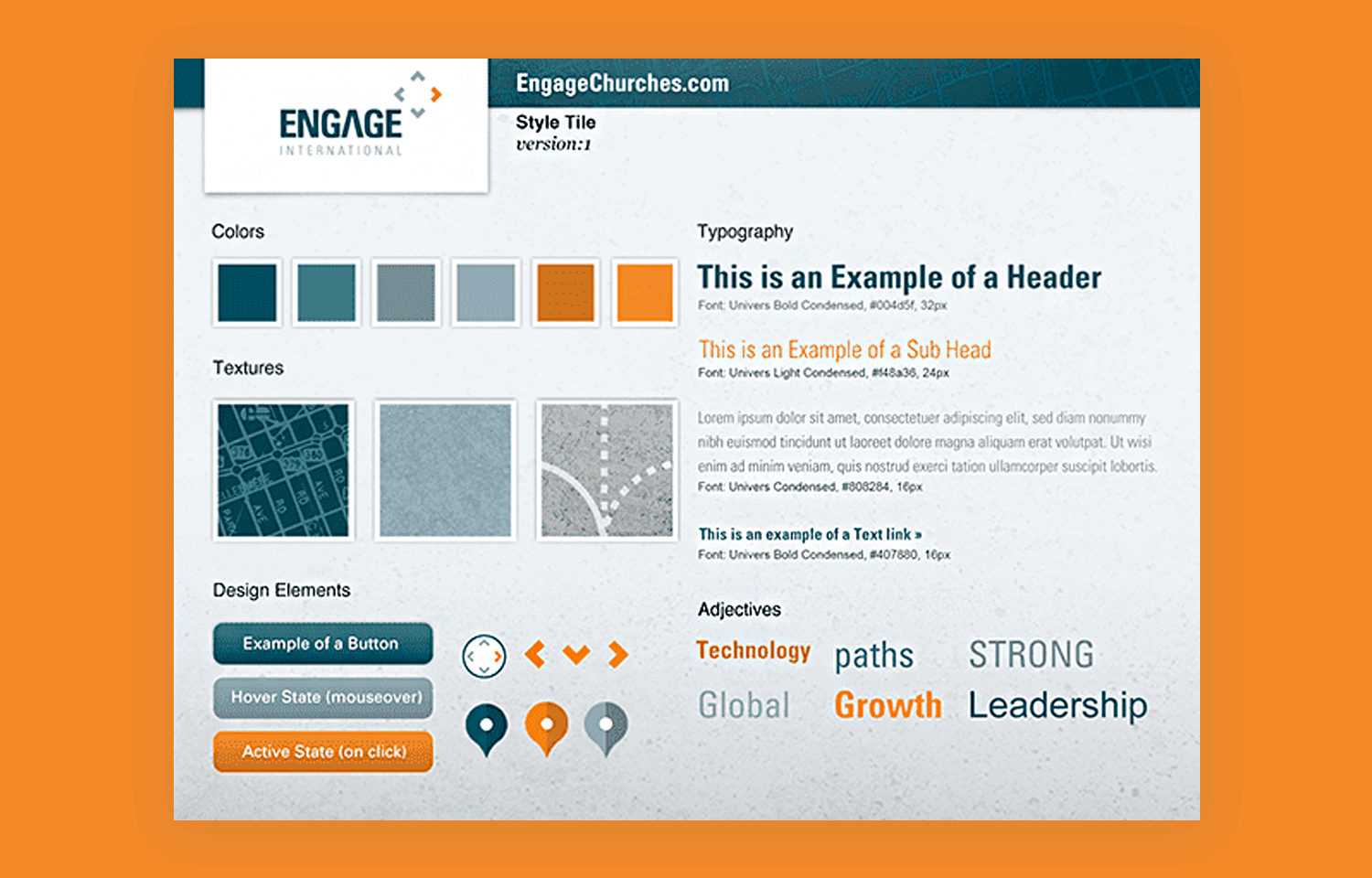
One thing that stands out about this example is that the designer also uses adjectives to set the tone of the board, such as “growth” and “leadership”.
Another very practical website mood board example and one that aims for simplicity, is the style tile below. Instead of being a collage of resources and elements thrown together, this board lays everything out neatly and in an orderly manner. You’ve got the color palette and images and adjectives on one side to set the tone, along with practical elements like typography and button styles to the right.
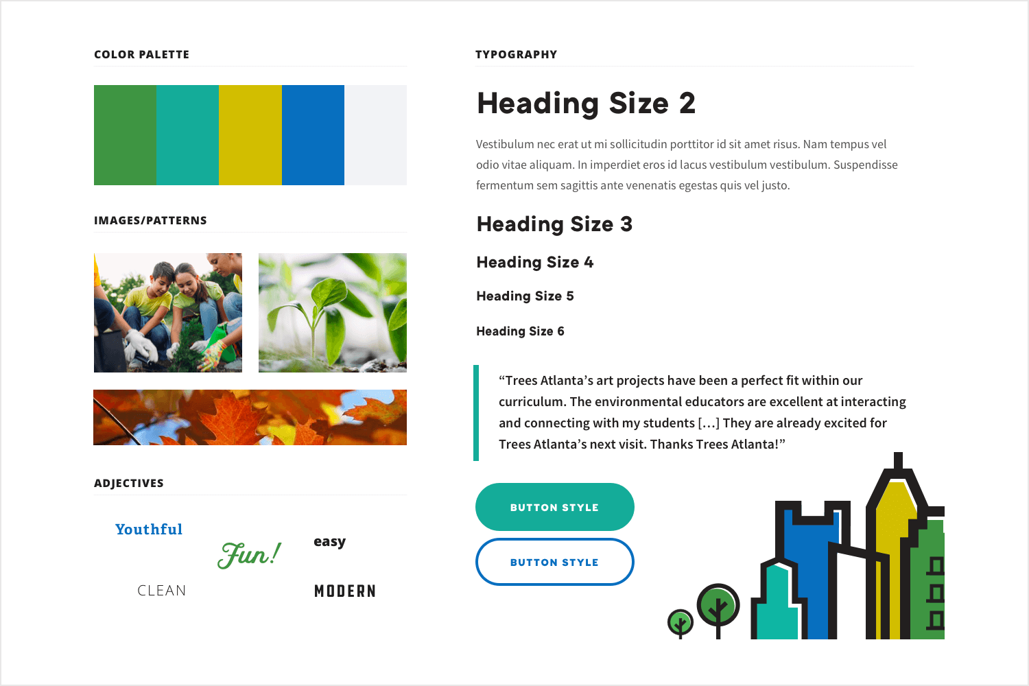
Apart from being practical, this board also very clearly demonstrates its natural theme with earthy colors and pictures of shoots and autumnal leaves. It’s perfect as a kick-starter for a website mockup.
The physical mood board example below could be the perfect primer for a website’s design. With this board, the designer here has pooled together photos and clippings from magazines, while also randomly juxtaposing different letters and numbers to showcase the font ideation.
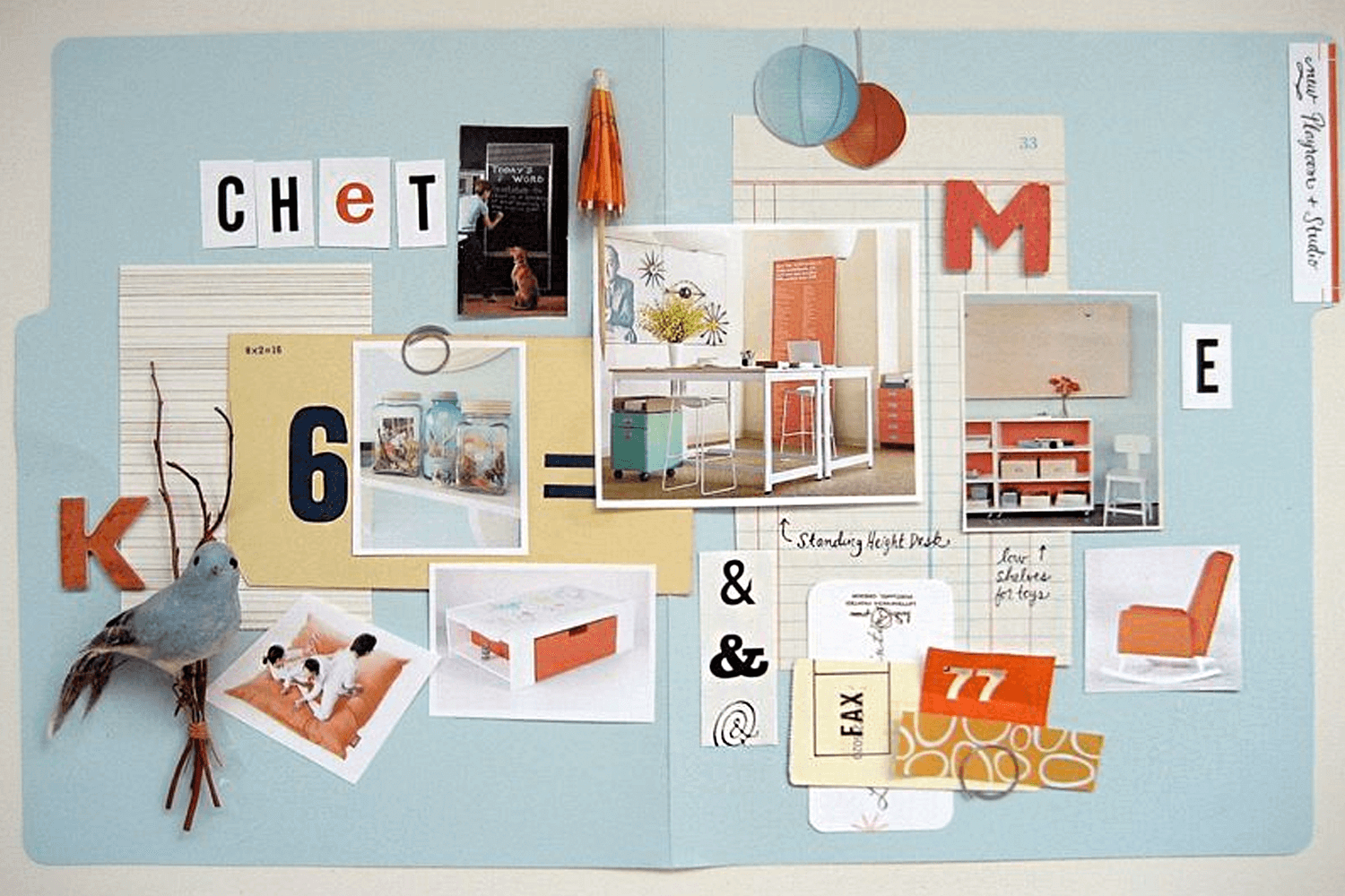
Neat patterns and a clear color scheme reign throughout. The topic of the website, along with the UI could be inspired by neatness while adding in the rustic twist of nature. For example, it might conjure up a home decor website or an ecommerce.
And, of course, what better way to inspire the latter than to have a tactile board that can be present in the office?
Lastly, this brand identity mood board example from Daria Volyanska attempts to invoke the emotions of a therapy clinic using a combination of color, powerful imagery and, interestingly, a simple phrase. Most mood boards try to use as little text as possible, often opting for lorem ipsum to depict font, and for adjectives to establish a vibe.
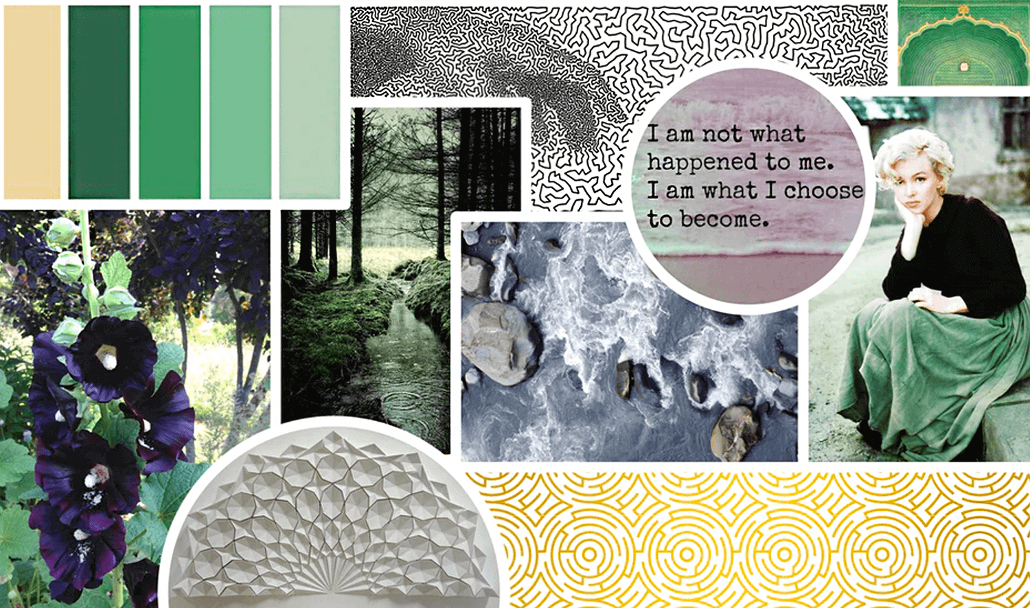
However, this small, powerful phrase is unimposing. It also brings together the bittersweet feeling that the imagery and colors help to create the brand identity.
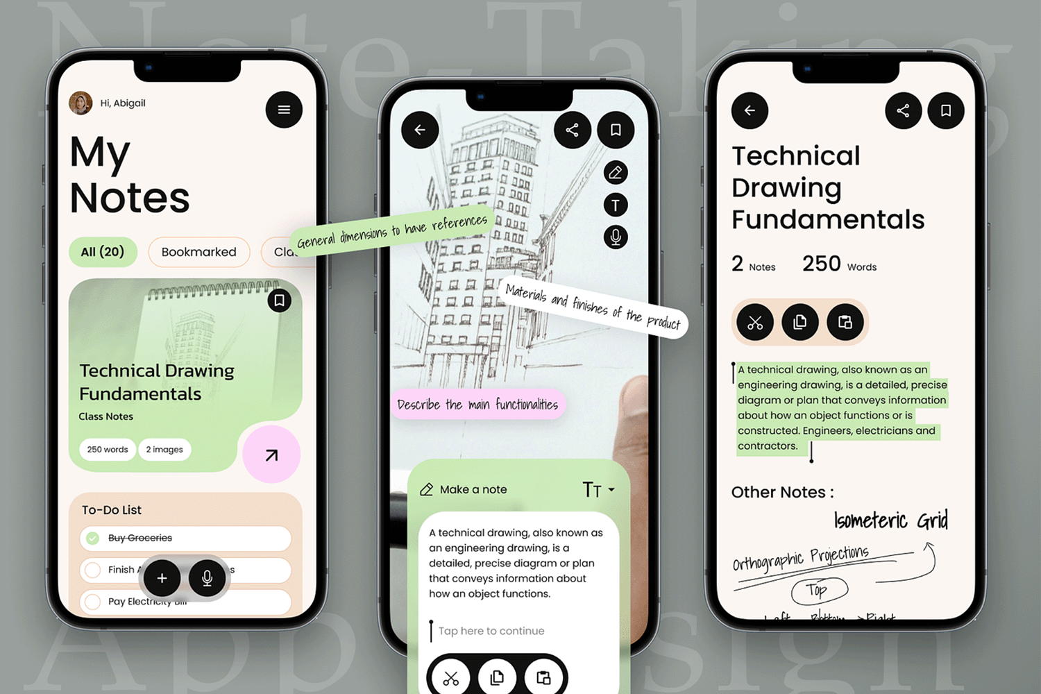
This example of a note-taking app for technical drawing incorporates all the elements to help developers visualize better what is to be expected of them. From font style, to icons, to buttons, it is clear as day what service this app provides and how it will be showcased. Not to mention the pastel color pallet that allows for prominent information to be seen first. 10/10 if you ask us!
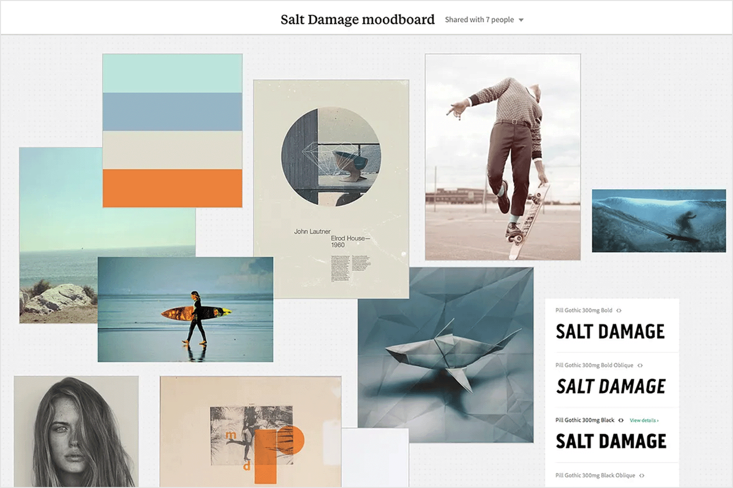
Surf aesthetics always win. Always. There’s nothing like immersing yourself in ocean blues and having your brand reflect that calm, cool, and collected vibe—necessary when battling against a 3-meter wave at the Jaws surf break. This Salt Damage mood board example features a serene color palette, diverse typography, and ample white space, all complemented by surf-related imagery. It captures the essence of the surf lifestyle, making your brand feel as refreshing and exhilarating as the ocean itself.
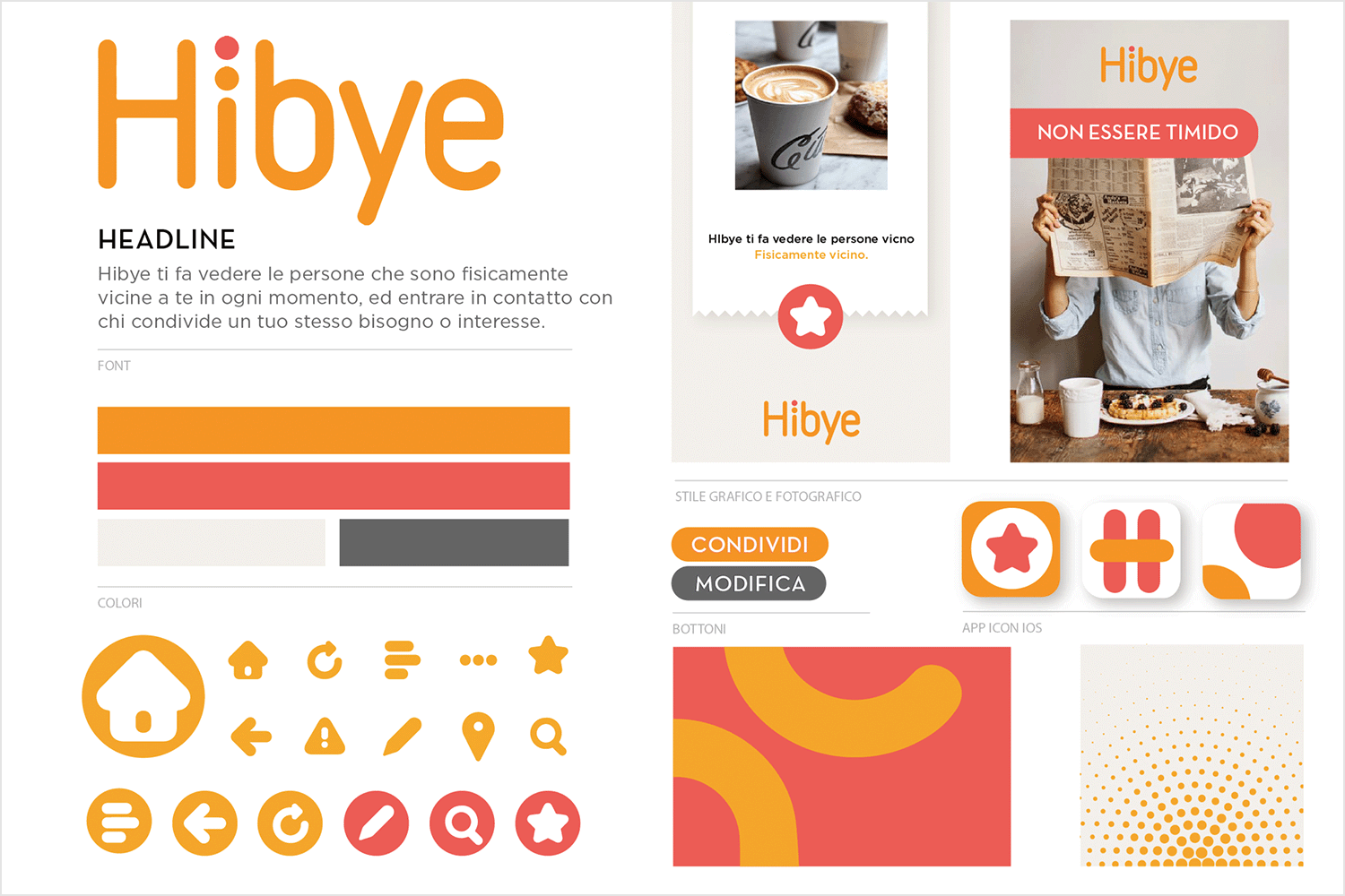
This mood board for a new service app effectively communicates a design direction that is both modern and user-centric, focusing on clarity, ease of use, and visual appeal. It serves as an inspiration for creating an interface that is not only aesthetically pleasing but also highly functional and engaging for users.
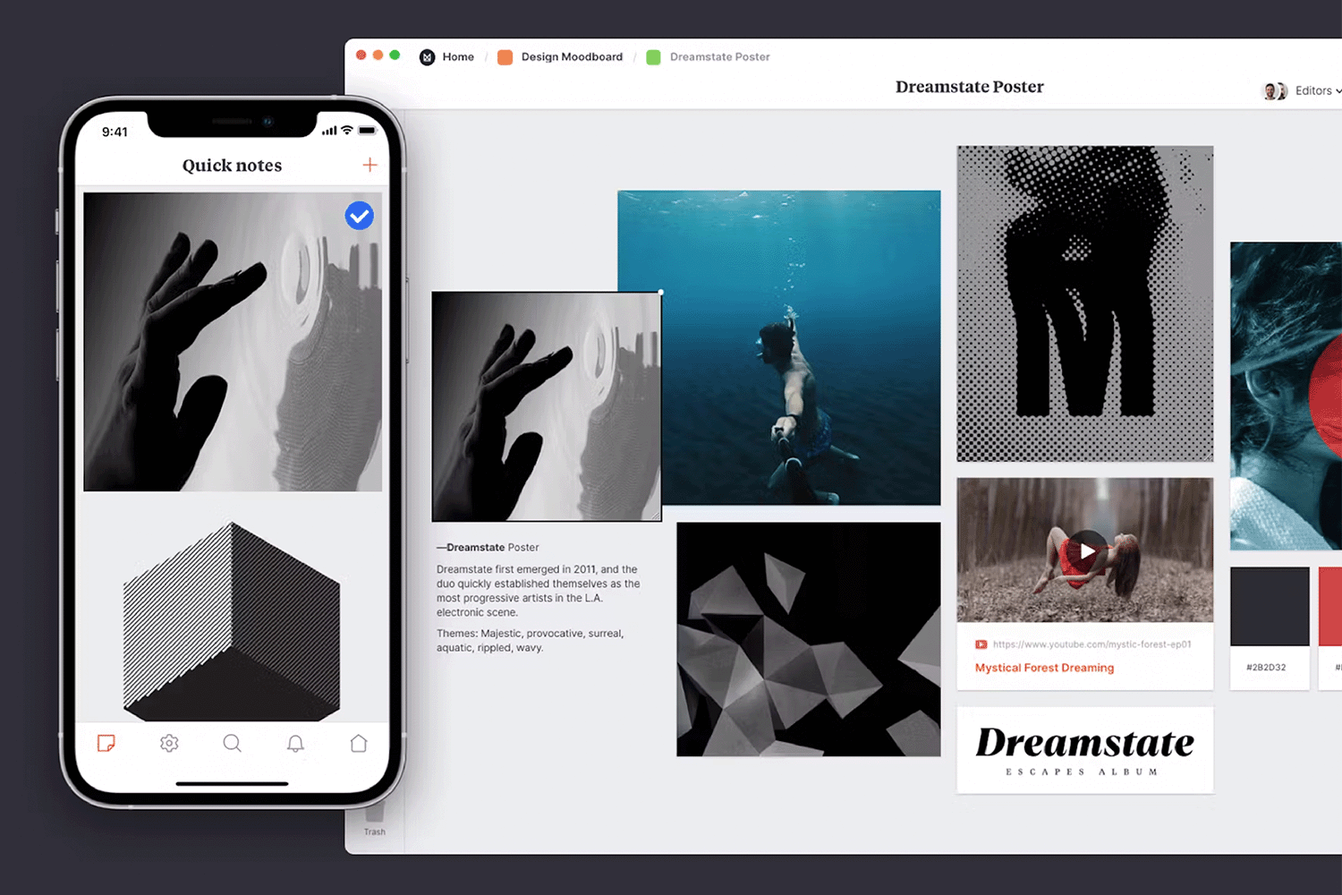
Dreamstate indeed. The surreal images mixed with the somber tones of black, gray, and blue transport you to a world where reality is twisted and reproduced to invoke feelings of disorientation and deep reflection.
The touch of red brings us back to the here and now, allowing us to continue with our user journey after an intense moment of existential dread. Who am I? Why am I? Oh, yeah! Thanks, red, for snapping me back to reality. I’ll buy that product now.
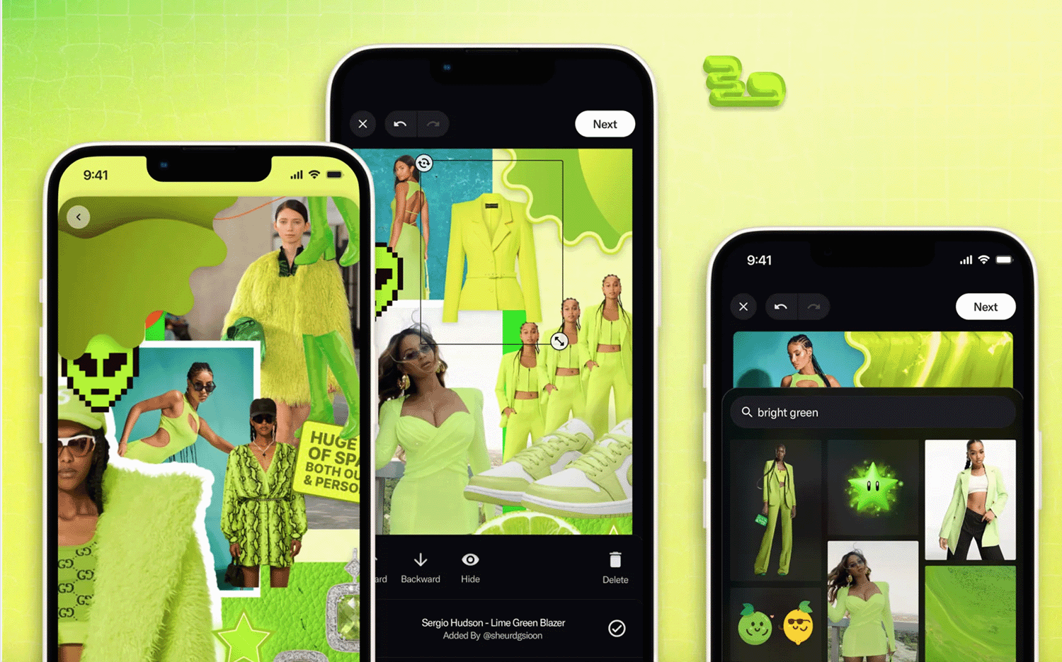
Here we have two different types of inspirational mood boards for apps in one! How lucky! The first screenshot is your typical board layout, with cutouts from magazines, postcards, and signs put together to perfectly showcase the vibe curated by the designers behind this mean green masterpiece.
As we move to the other two screenshots, we can better visualize the functionality of this mood board designing app. Modern, fresh, and funky.
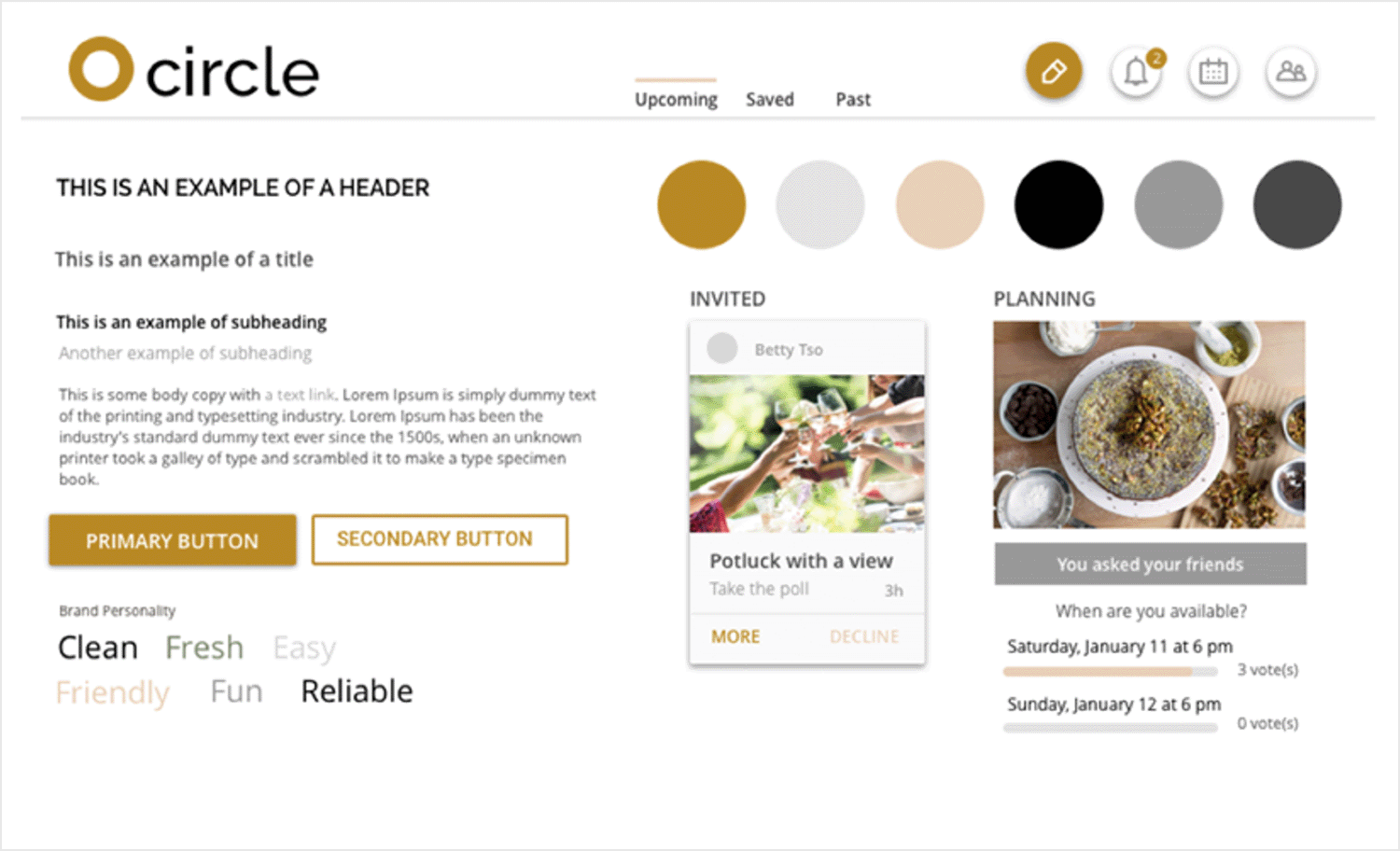
The mood board for Vicky Sagia’s event coordinating app, designed during Whitespace’s Idea to Prototype Class, exudes a refined and vibrant aesthetic. The fresh color palette features teal, turquoise, coral, and navy. Clean, sans-serif typography ensures readability and elegance, complemented by high-quality images that convey joyful moments.
Sleek buttons and minimalist icons enhance intuitive navigation, while subtle patterns add depth without clutter. Overall, the design balances sophistication and approachability, making the app visually appealing and user-centric for stylish event coordination.
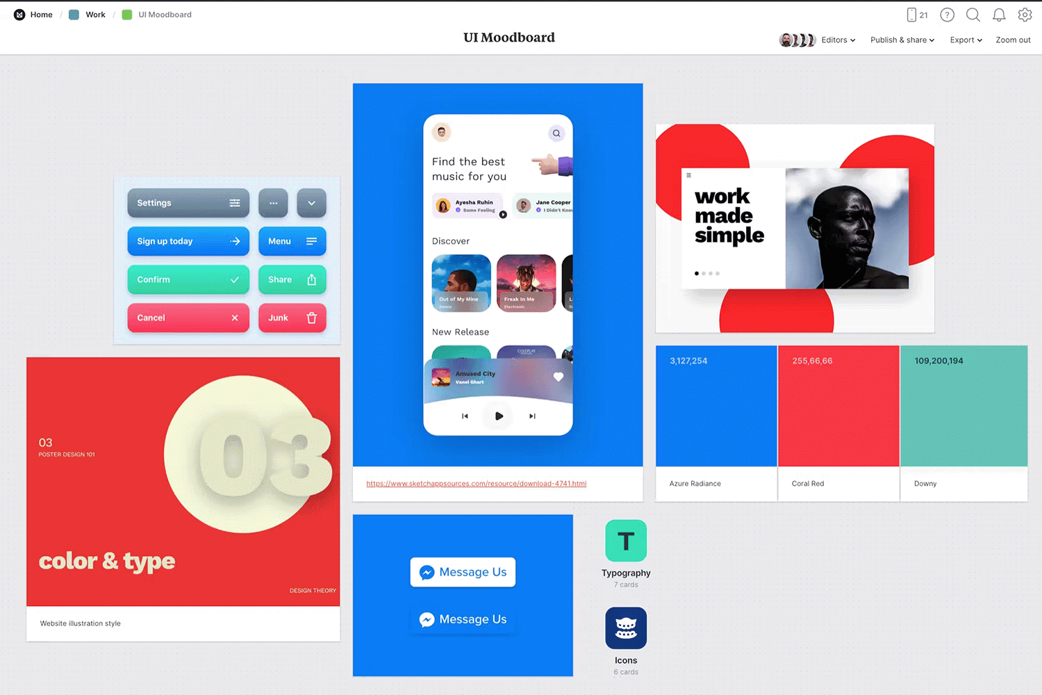
Times are changing, and so are mood boards. Gone are the days of collages on paper. Now you can add anything from gifs to CTA buttons when it comes to UX and UX and UI mood board inspirations. In this example we have an idea of what the icons will look like, as well as the three primary colors to be used, and a screenshot to illustrate how all these elements can come together to produce a fully functional and fun-looking interface.
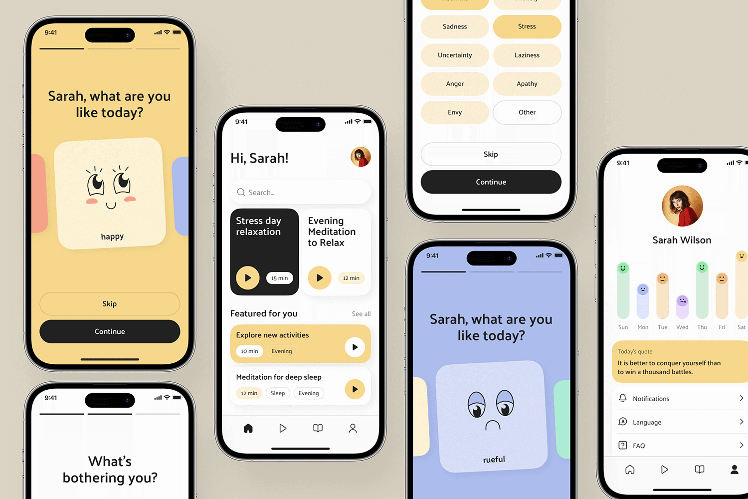
Self care in this political climate is a priority. Sarah needs to get it together to be able to live her day-to-day without having the weight of the world on her shoulders. Sarah needs an app. Lucky for her, the lovely people at Ronax have come up with a great design for an app she can navigate easily, even as tears uncontrollably cascade down her face!
This mood board illustrates the many features of this service, including a calendar that tracks her moods throughout the week. Sarah can feel the emotional support she desperately seeks within a matter of seconds. Good for her.
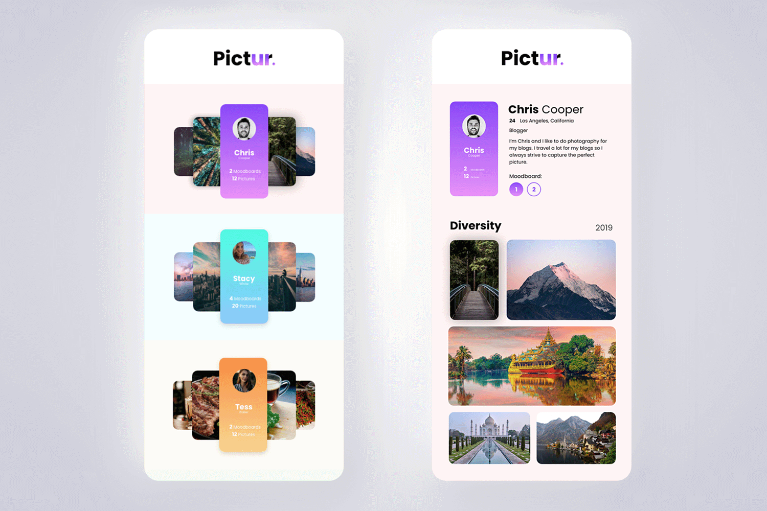
The UI design for “Pictur” showcased in this mood board exudes a modern and vibrant aesthetic, perfect for a photography-focused app. The design features a dynamic color palette dominated by rich blues and bright accents, creating an inviting and visually appealing interface.
The clean, sans-serif typography enhances readability and lends a contemporary feel to the app. High-quality imagery is prominently displayed, highlighting the app’s focus on visual content.
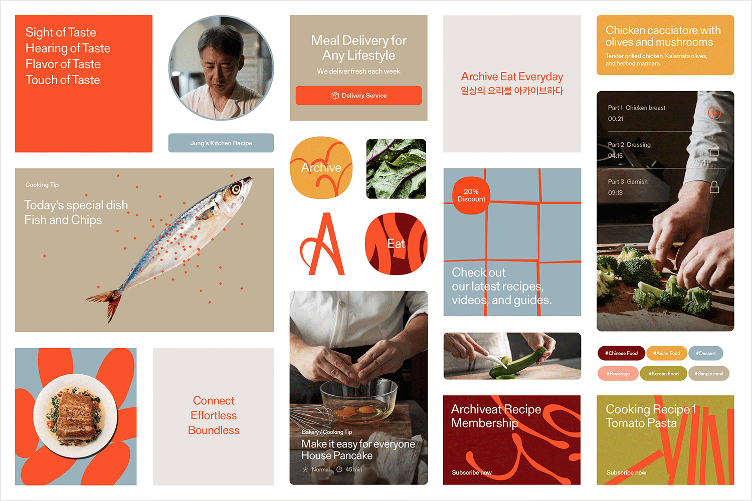
The app Archiveat is designed to deliver the latest cooking content and personalized recipes through easy-to-consume videos, along with a subscription service for recipe-linked cooking boxes. The primary color palette symbolizes the joy and appeal of cooking, while secondary colors are derived from essential global ingredients. The typography used ensures harmony between Korean and English while focusing on the culinary content.
Alliwalk.com features a great iOS app mood board example that’s centered around the idea of helping commuters escape from the drudgery of being stuck on public transport for longer than they care to be.
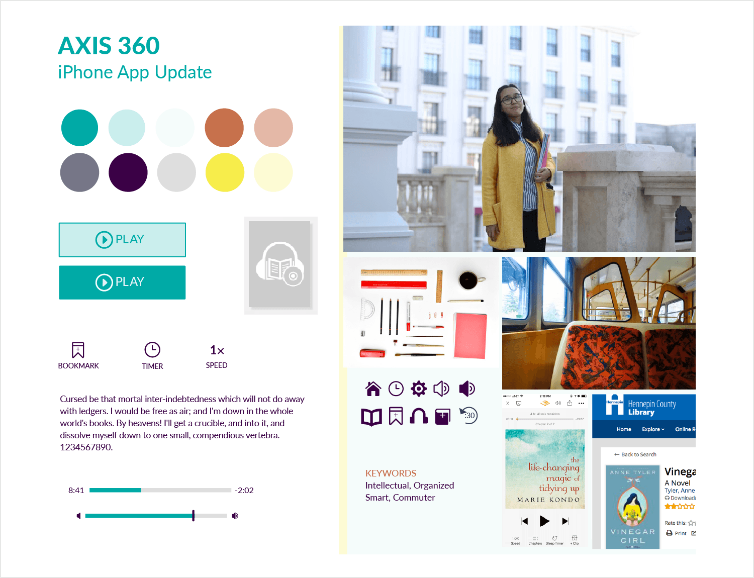
One aspect about this app mood board example that stands out is that the elements and fonts are based around an iOS update. The chosen color palette also matches that of the selected images which are based around public transport.
This trip planning app mood board example compiled by Kiowa Alumno and shared on Dribbble stands out by powerfully conveying the style and personality of the app, but with surprising restraint and simplicity.
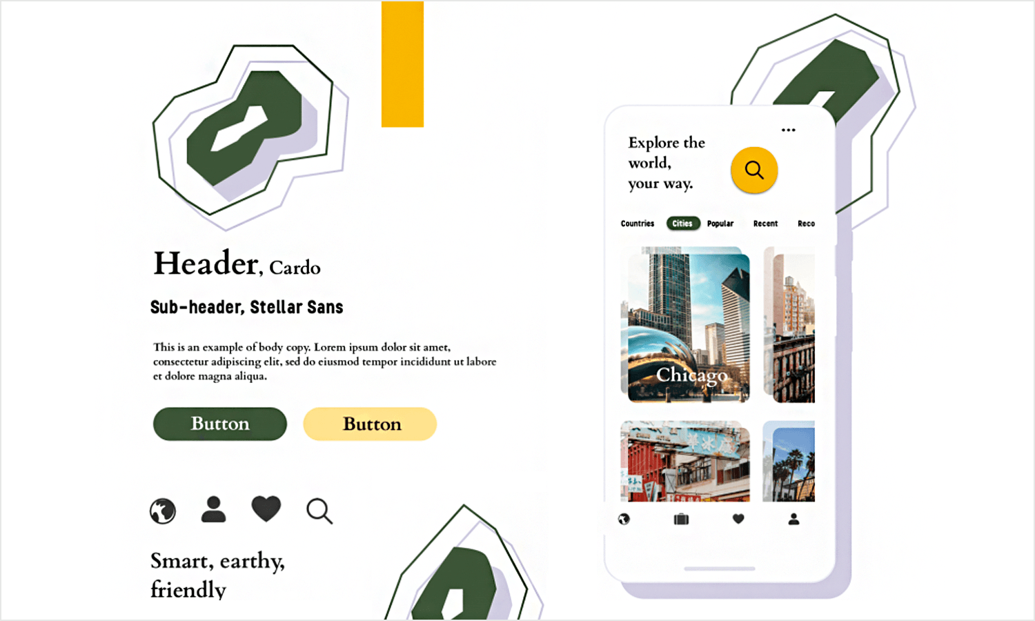
There are only a few but wisely selected colors in the scheme and the fonts are limited. The general shapes and outlines that will be present in the app are indicated in the background patterns.
Design your Mood Board with Justinmind. It's Free. Unlimited projects!

Sharada Krishnamurthy shares a dating app mood board example and what we immediately fell in love with is the wonderfully compiled pastel color scheme.
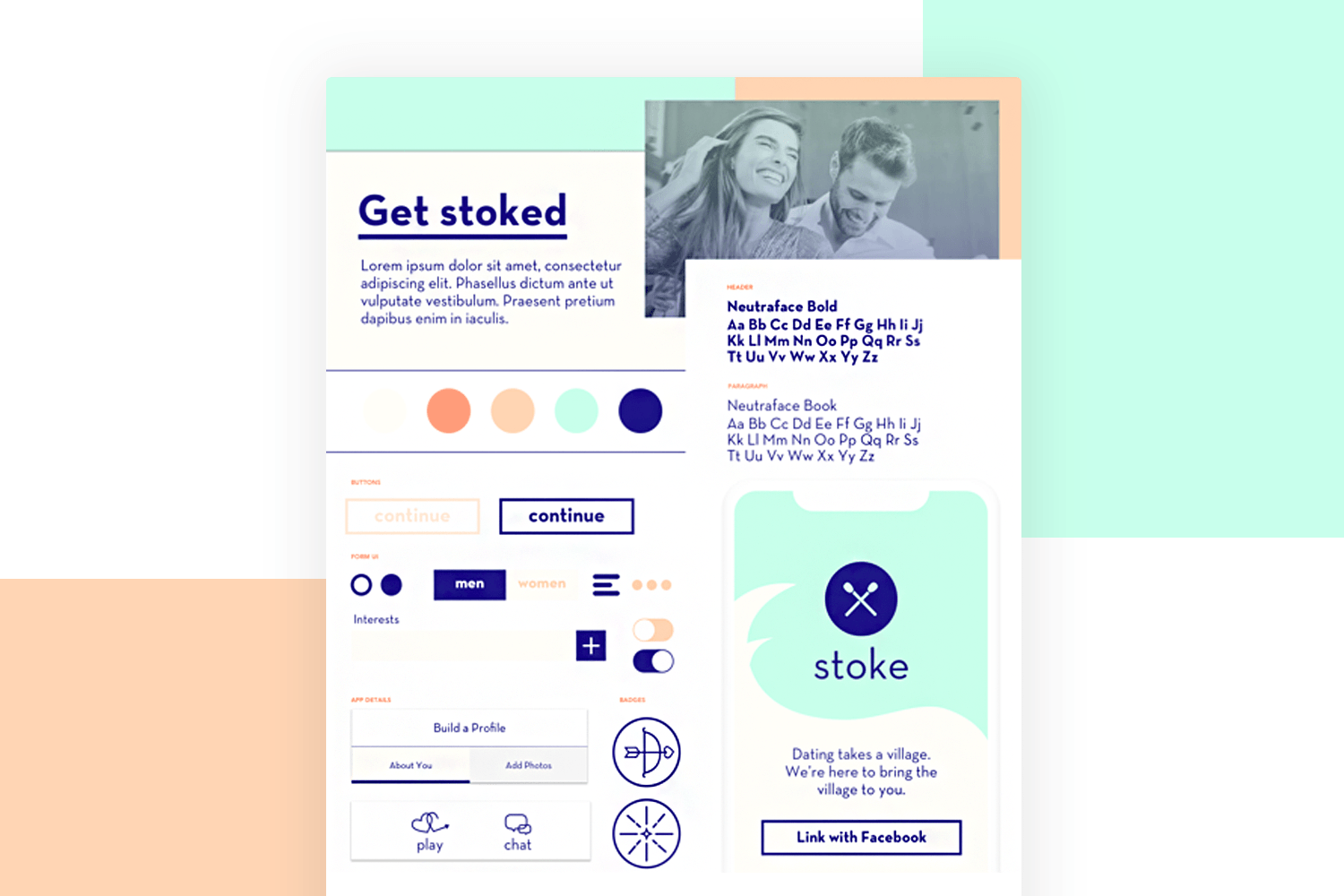
It helps to add a calming effect to the design, while also showing off the app’s potential personality with the element styles and fonts.
This UI pattern mood board by Simon Phillips and his team is a slightly more developed mood board example with less experimentation with colors and patterns (although a color scheme is present) and more focus on trying out different types of UI patterns, components and elements.
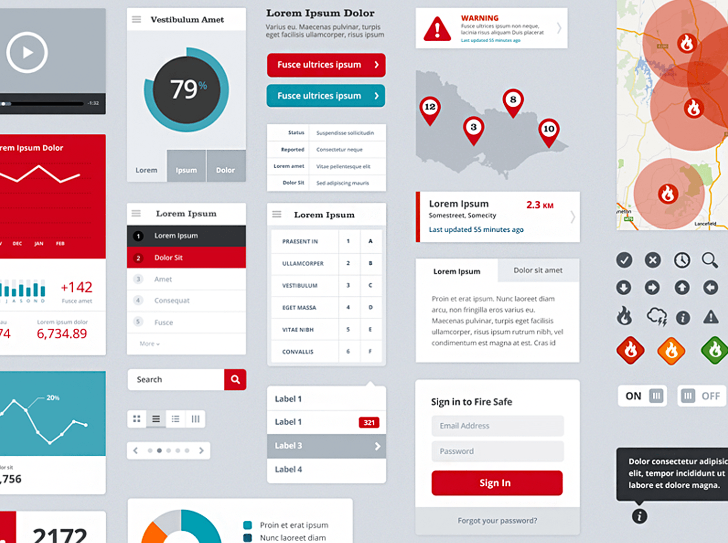
Their task was to find a way to show different variations of data visualization for an analytical app.
Joanna Katsifaraki on Dribbble offers up something a little different by not only providing a colorful app mood board example, but also the mockup of her Shoe App. we’re treated to a collage of bold colors and striking imagery, all of which cleverly manage to be captured with the app interface.
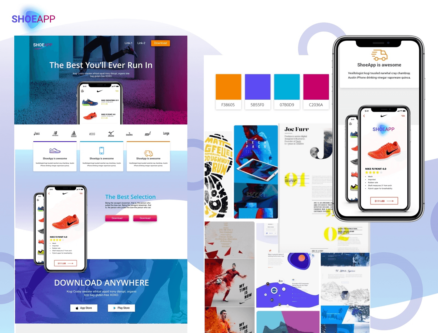
We chose to include this mood board example on the list because it shows the natural progression from mood board to app.
This app mood board example from Miro is actually a template and does a pretty good job at showing how you can convey the idea, personality and theme of a potential app. It has all of the defining elements that will be used in the final app, such as punchy cartoon vector images, a clear-cut color palette, along with a demonstration of the font and the different weights that will be used for it throughout the app.
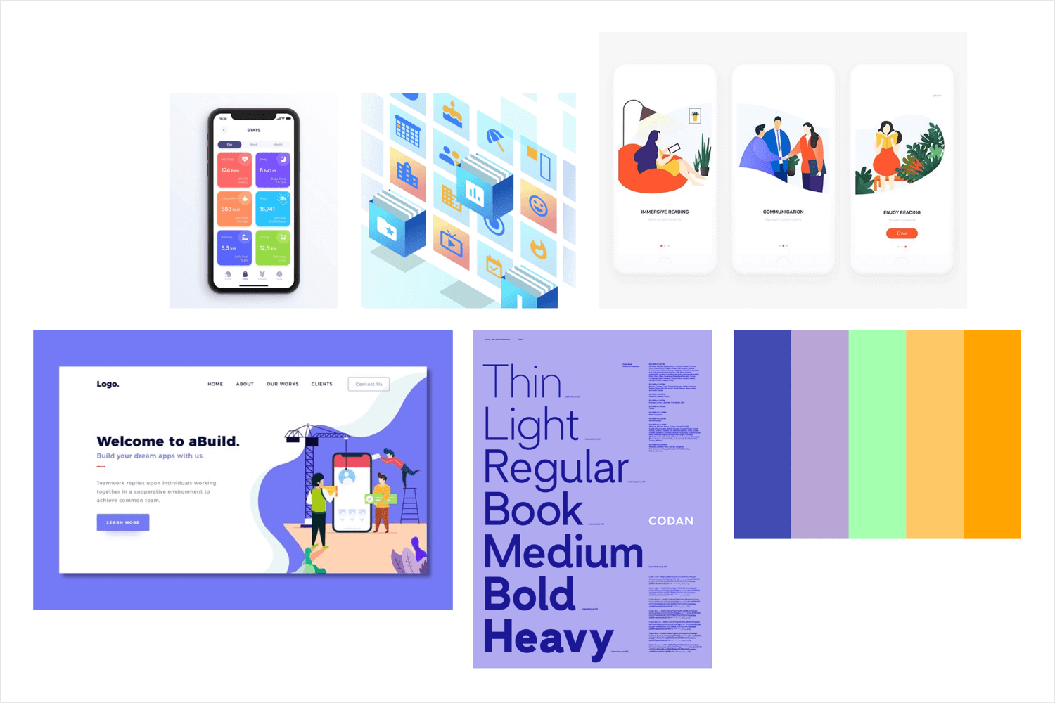
But this app mood board template also goes the extra distance by conveying alternative possible touch points for the product by including a website landing page and a starting screen out of the app.
For an app that has recording one’s mood as one of its core features, the below emotional mood board does a pretty good job, using vector iconography and imagery of expressing emotions.
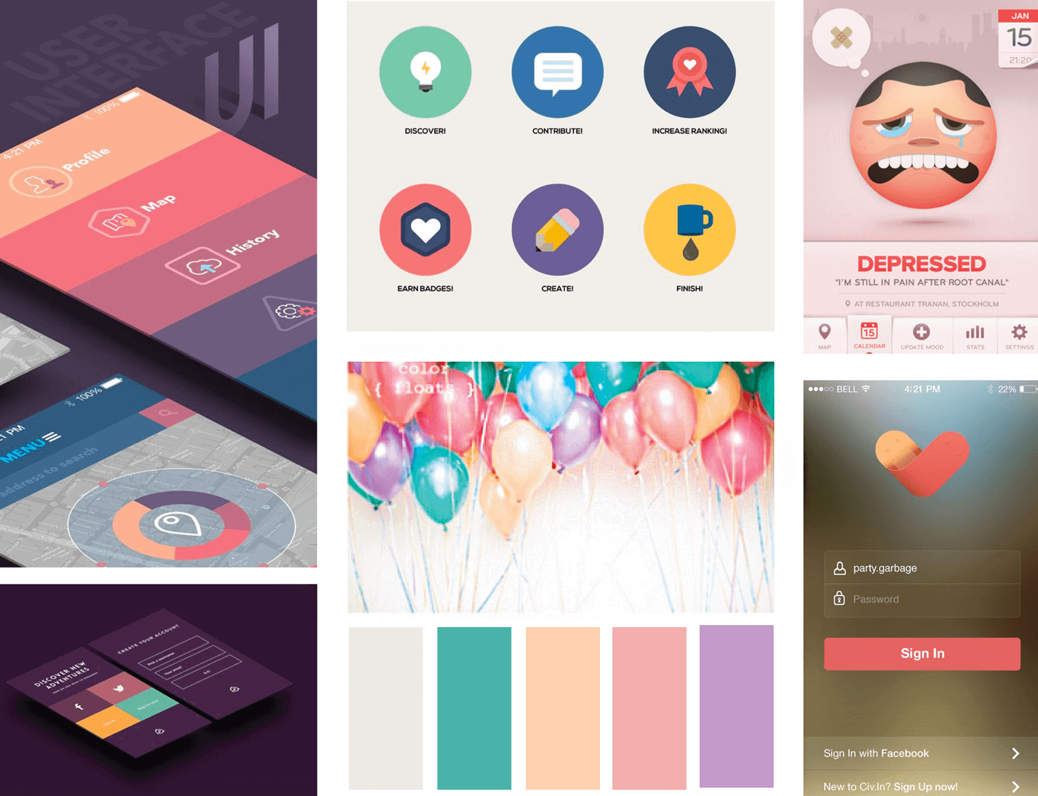
Simple, flat icons, along with sharp lines and a clean and neat layout are the designing factors of this app on top of a simple sans serif font. A lot of detail is given to the potential visual impact of such an app.
Hijim Nam put together this app app UI mood board for a fitness coaching app called Personal Gold. Throughout her example, she uses the mood board to demonstrate how she came up with the theme, character and visual design of the app with her client using research based on five similar apps in the industry.
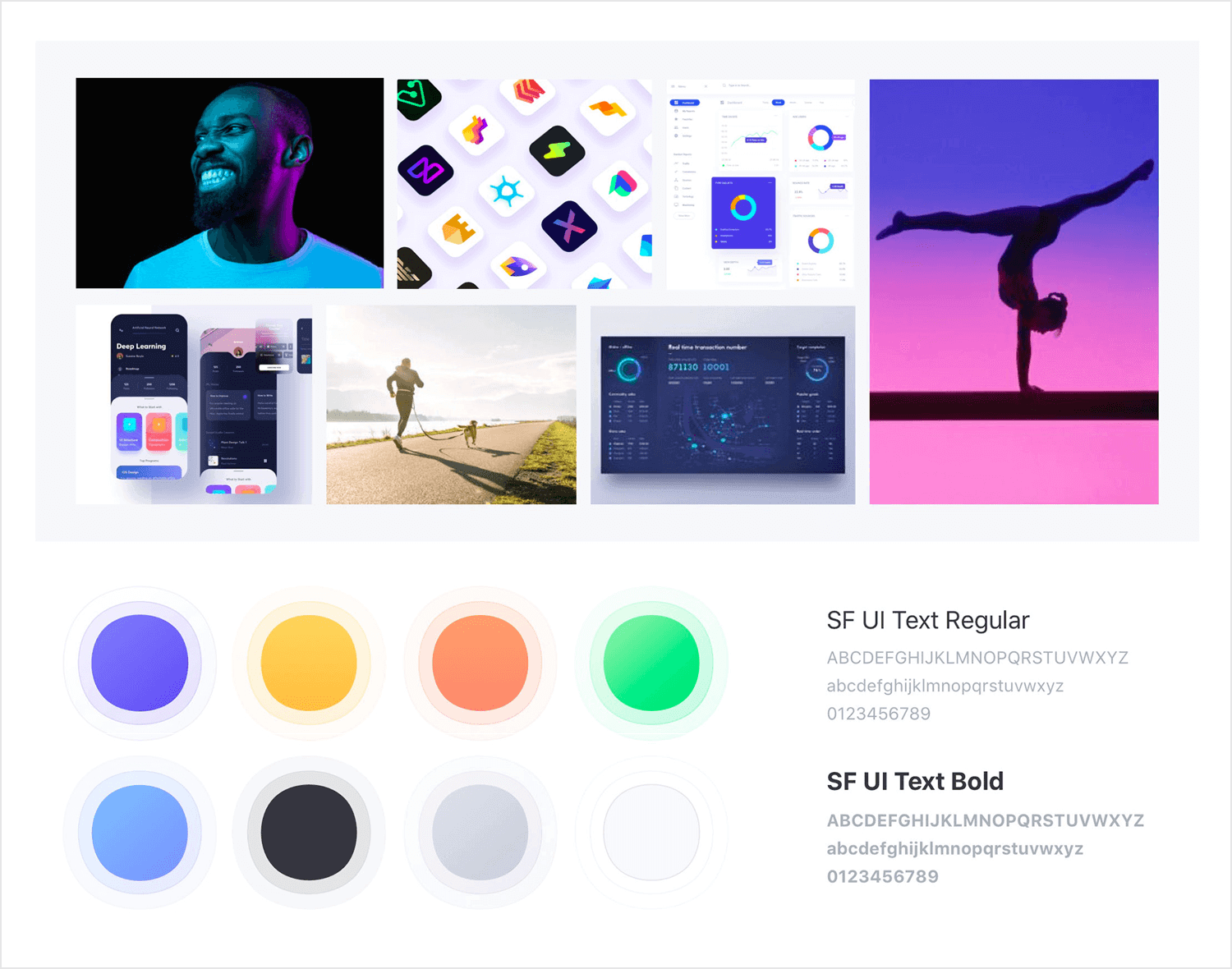
Hijim managed to develop a recurring color theme and use supporting imagery that reinforced the adjectives “cheerful”, “sporty”, “effective” and “trendy”. The iconography, along with the app and dashboard concepts also reflect these adjectives.
Rahul Goradia uses this example of a design system mood board to demonstrate how they can help us devise and launch an entire UI design system. He includes a general mood board of powerful images that help to set the tone and the style of the app, alongside a clearly-marked color palette. The overall feel of the mood board is trendy and intellectual.
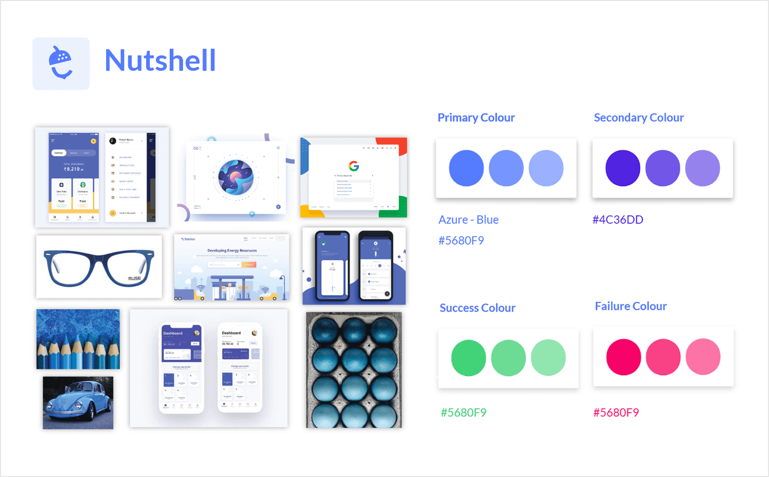
In his article, Rahul writes about how creating a mood board helped him to establish a color palette with primary, secondary and tertiary colors, while establishing a contrasting success and failure color scheme. He then went on to establish shadow tones, font styles and finally, UI elements, all stemming from the original mood board that he put together.
A slightly different example from all of the rest on this list. This mood board by itCraft shows us that the most important aspect to bear in mind when putting one together is always the audience or users. At the end of the day, the mood board is not for ourselves or the client, but always the end user.
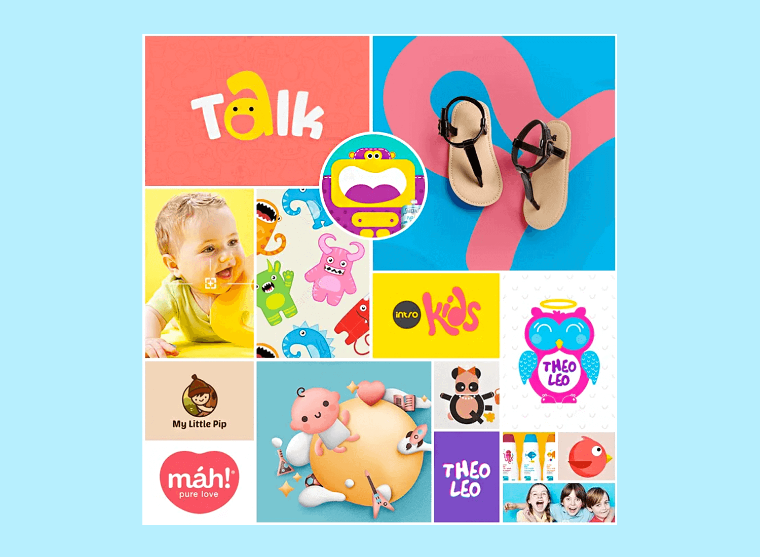
In this example of a mood board for a children’s story posting app, we can see how the designer found inspiration from other products and other designs. She put them all together in a collage to establish a playful color scheme, font and element outline.
Design your Mood Board with Justinmind. It's Free. Unlimited projects!

What designer hasn’t heard of Canva? Canva lets you throw together business cards, presentations and even resumes and make it look like it took you hours. And of course, the same is also true when using it as a mood board creator!
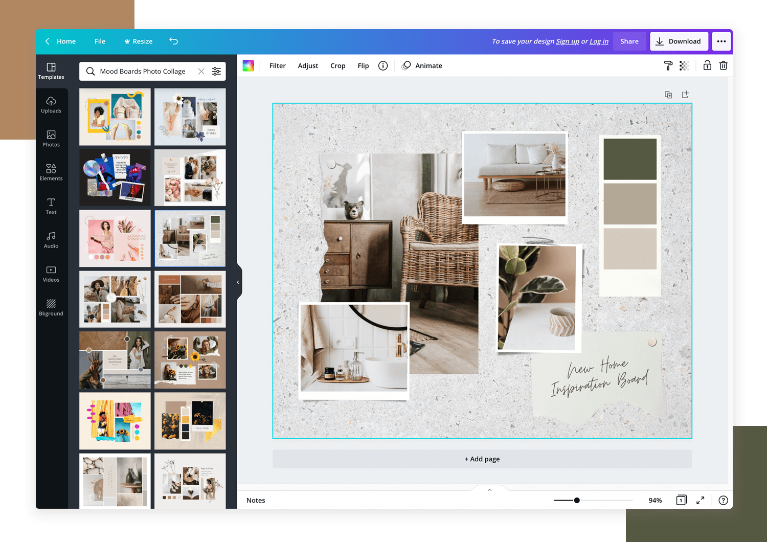
With thousands of images and assets available in their repository, as well as template layouts and the ability to upload your own images, putting together a website mood board in Canva is hassle-free!
- Pricing: choose from Free, Pro ($10 monthly) and Enterprise ($30 monthly)
For a quick and easy mood board creator, head to Pinterest. It has everything you need to throw together an eye-grabbing, thought-provoking montage to get your clients thinking about your design angle.
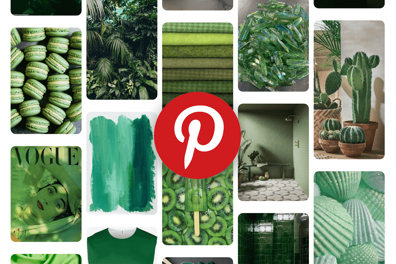
Search through their database to find the perfect assortment of color palettes and striking imagery!
- Pricing: free
With Niice you can create a nice and private space for your collection of images. You’ll be able to drag and drop to start instantly compiling a choreography of complementary photos and vector images.
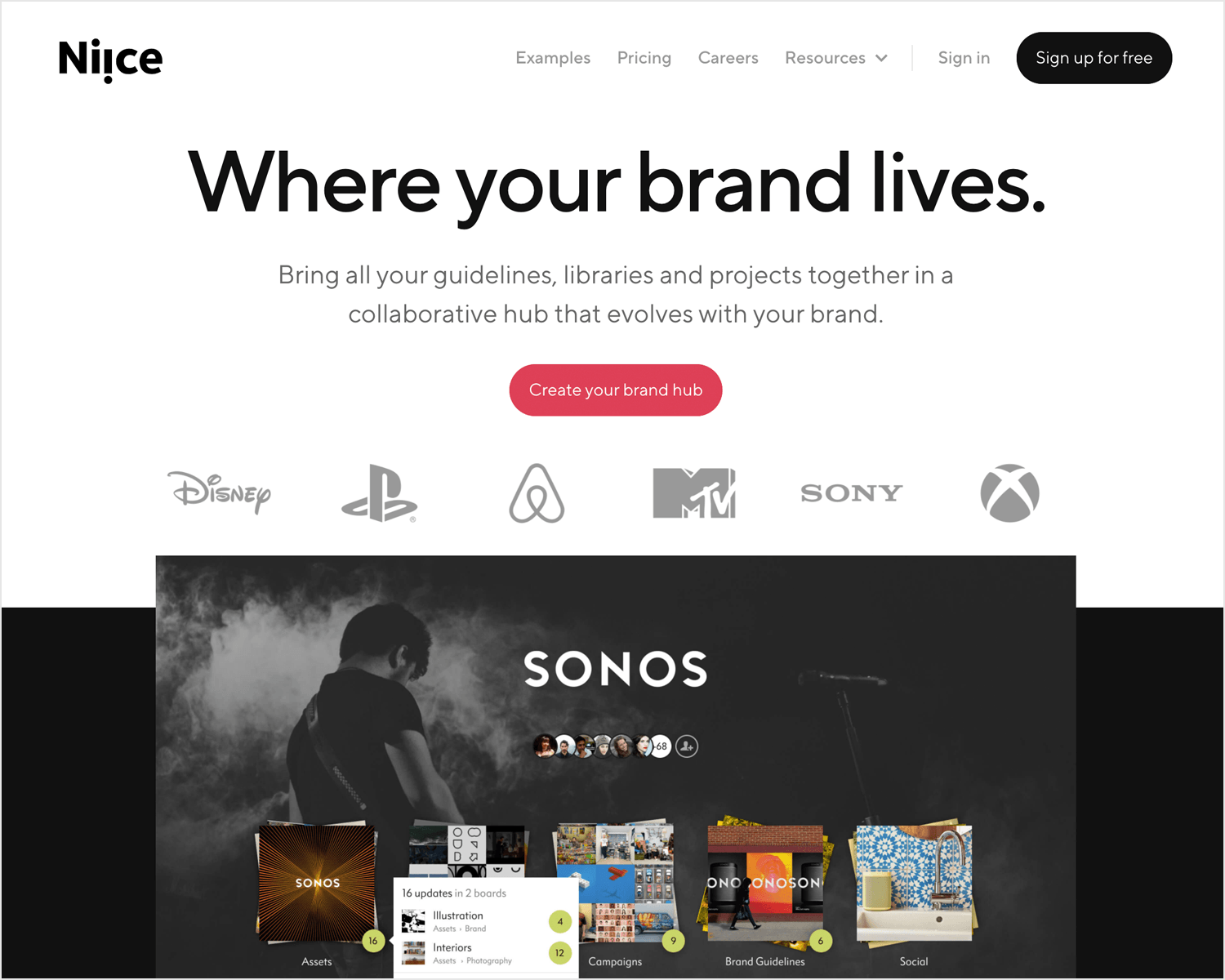
However, one feature that sets this mood board creator apart from the rest is the Chrome extension that allows you to grab any images you discover while browsing through the web.
- Pricing: free
What we like about the Milanote moodboard creator is that, apart from the fact you can run it on any web browser, you can use as many different levels of hierarchy and layers to create your website moodboards.
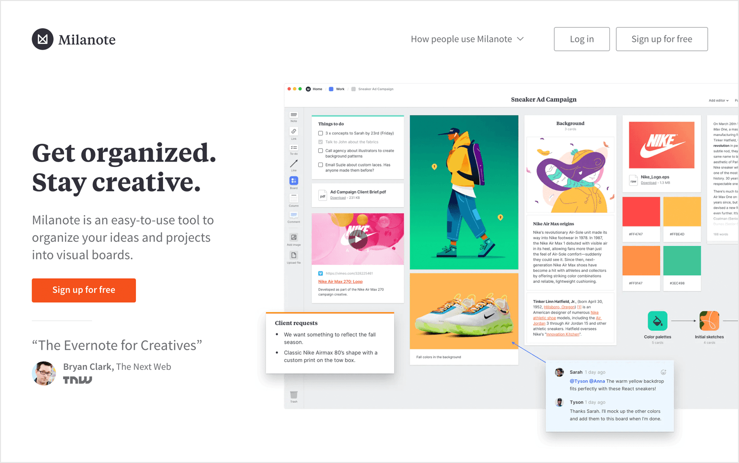
It’s also a great tool for collaboration – you can share your moodboard remotely with whoever you like, while receiving comments and feedback!
- Pricing: Free and Professional ($10 monthly)
Sampleboard is a moodboard creator with a user-friendly interface that lets you sign up to a creative community to get inspiration, much the same way as Pinterest.

You can share any website moodboards you design with the Sampleboard on social media while also being able to import them into documents and presentations. What we like about Sampleboard is that you can share your mood boards in just a click!
- Pricing: get a free trial, then $12 per month
Mood boards can help you convey the concept of a UI’s intended graphic design much more easily and eloquently than words can. They can help show how you intend to incorporate all the abstract qualities pertinent to a website or app’s branding, such as:
- Look
- Feel
- Emotion
- Personality
Lastly, a mood board isn’t just useful for getting your design ideas and inspiration across to others. It can also serve as a style guide for you and anyone else working on the project to make sure the result is true to the original idea.
Communicating UI design ideas isn’t easy. Mood boards project your creativity in a visual way, letting you get back to what you do best: designing. They also serve as a useful style guide as you work. Here are some great examples and tools for your next brainstorming session!
PROTOTYPE · COMMUNICATE · VALIDATE
ALL-IN-ONE PROTOTYPING TOOL FOR WEB AND MOBILE APPS
Related Content
 We see dropdown menus everywhere. But what makes a good dropdown? What changes when designing for mobile screens? We got the full run-through for you!13 min Read
 UI design examples that bring some serious inspiration. From parallex scrolling to delicate animations - this list has it all to get you inspired!8 min Read
 We created a list of the top UI design principles that capture some of the most interesting faces of digital design. Check them out!10 min Read
