Need a cool way to display testimonials on your website? Try to not copy these 15 awesome testimonial examples!
What’s so great about your company? What makes you unique? You could probably provide brilliant elaborate answers or quick one-liners on your website as to why your company is the best in the world.
Start designing new websites today. Enjoy unlimited projects.

Great start. But that alone probably won’t cut the mustard. Why? Because consumers have an infinite source of options online for their every need. And as such, wooing their attention isn’t that simple. Especially not when every Tom, Dick and Harry claims to be offering the best service in town.
For a potential user or consumer to choose your service, a great deal of trust comes into play. Testimonials can play a big part in helping you earn that trust. However, if you’ve never done them before, or if you’re doing a website redesign not knowing where to start is normal.
That’s why we’ve collected some of the best testimonial examples from around the internet to crank the inspiration meter to full. We’ve also provided some pointers on how to get started today!
A testimonial is a statement from a previous or current client in which they share their opinions of your service. Fairly simple, right? It’s like a review, only shorter and sweeter. Testimonials are a valid form of social proof that can inspire trust and confidence at a glance – something which is necessary with the short attention spans of users nowadays.

BrightLocal’s consumer behavior report (2017) found that, of all the people who participated in the study, only about 3% said they don’t trust online reviews. In comparison, about 85% of them said they trust reviews like personal recommendations. As testimonials are short, at-a-glance reviews, it’s easy to see why they’re so important.
However, in order to make the best use of those testimonials which you will have poured your heart and soul into getting, you need to design them in a way that does them justice and helps capture the attention of your website visitors.
Let’s take a look at some of the best ways to design your testimonials.
When testimonials with your website prototyping tool, you should think of the following best practices as guidelines rather than rules. As with anything in design, rules are always set in stone until someone breaks them and starts a new trend. It happened when we saw flat design introduced as an opponent of skeuomorphic design.
Whether you follow all these guidelines or not when designing your testimonials, the most important thing, like with anything in UI/UX design, is that you test it. Design your testimonial or testimonial page with a prototyping tool first. Then see if your testimonials reduce bounce rate and increase session duration. Try some heatmap testing to see if your testimonial design is captivating and engaging your users.
Before testing, though, the best thing is to get it done first! Here are some tips to help:
Start designing new websites today. Enjoy unlimited projects.

Firstly, we need to cover the basics. When putting together a testimonial, we should always include as many details as possible about the client. Try to always include the name, their title and their company. A picture is always a great way to boost these qualities. Adding a human face to your testimonial always tends to resonate with users even more.
In addition to that, ensure your testimonial covers the fundamentals that new users might be interested in, such as how the problem was solved and how fast, etc. Don’t just include random quotes that say “I love this company”.
When we have the important details covered, we need to ensure that the testimonial itself, whether it be text or video, is as short and sweet as possible.

The whole point is that the testimonial gives the user the social proof they need to come away with at a glance, which makes it different to a review. Which brings us on to our next point:
While “textimonials” (see what we did there?) work, videos are always an extremely powerful way to leverage storytelling when it comes to other clients and can be seen as further social proof when you see a happy customer talking.

Make sure you only use authentic testimonials – it could come back to bite you later if someone discovers you used a fake testimonial. It has the potential to strip you of all credibility and cause more harm than good to your reputation. Furthermore, if your clients don’t wish to give their names, just use their initials instead, rather than making up a name.
Always try and choose the optimum place on your website to include your customer testimonials.
Large, well-established companies often don’t include them on their homepage because there’s already sufficient social proof of their quality. Sometimes they’ll dedicate a separate landing page to testimonials.
Newer, smaller companies and startups, on the other hand, often choose to display their testimonial designs on their homepages to capture attention and inspire trust immediately.
Start designing new websites today. Enjoy unlimited projects.

Slack is a great example of how simplicity can sometimes be the most effective route in demonstrating your social worth. They open up with a big statement about how many companies use Slack for communication purposes, followed by a link to their customer stories.

Adorning that section is a quote that draws you in and demonstrates the extent of slack’s reach in the market. The quote is also affixed with the name of the customer, their position and the company they work for, along with a picture of the customer in their work environment.
Here’s why we love Hootsuite as a testimonial example: its design dissected the testimonial page into three different sections – one for each of the three big reasons to use their services. These reasons are brand building, social media management efficiency and revenue growth.
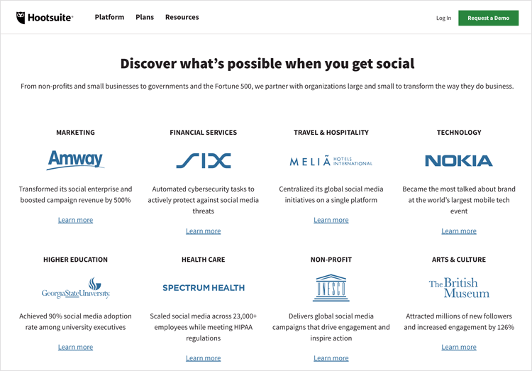
Hootsuite rose to the challenge by listing out known brands that offer the visitor their own case study, each narrowing down to the benefit in the section. Each testimonial works as a link to another page, where the actual case study is presented in great detail including statistics and real data.
Basecamp likes to play around a bit and challenge the status quo when it comes to testimonial design rules. Often, it’s considered best practice to use an image, a video or other media asset to adorn the testimonial. Yet this Basecamp testimonial example flies in the face of that rule in a very noticeable way.
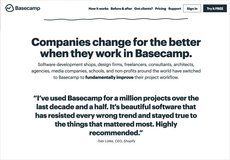
They don’t do anything extraordinary – they simply display the quotes from their clients in large, bold, centered text that stands out for your attention. That’s certainly one way of doing it!
Kissmetrics made it onto this list because they’re a great example of the types of testimonials you often see on many modern web page designs, especially in the tech industry, which is a combination of text and images on cards in a slider widget.
The slider helps grab the users’ attention, and lets them explore further testimonials if they wish, without taking up the rest of the page with a grid.
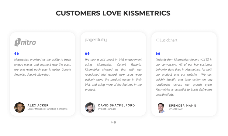
We also like how kissmetrics went the extra distance in their testimonial and included the logos of their clients on each card.
Start designing new websites today. Enjoy unlimited projects.

Bizzabo knows that great design speaks volumes. This testimonial example shows how your creativity can place even more importance on the testimonials themselves. The center of our universe? How clever.
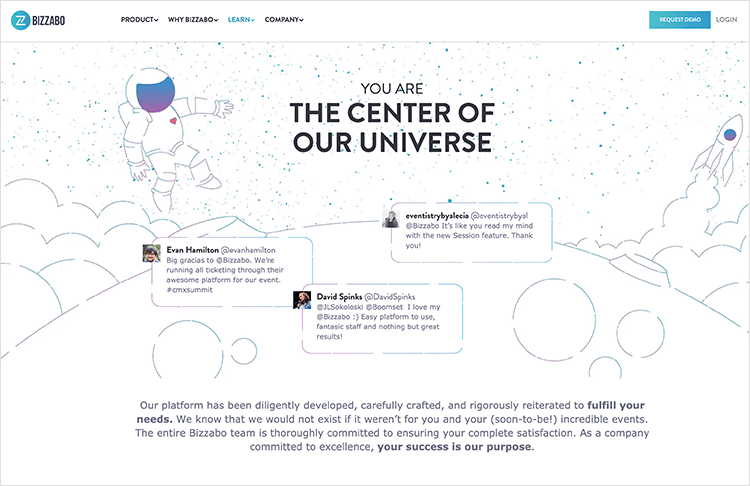
What stands out apart from the great use of illustration and copy, is the use of testimonials straight from social media. Platforms like Twitter are a great way to keep an eye on what people say about your brand, and can be powerful when used as social proof.
Bizzabo also offers visitors several case studies on that same page. It’s the best of both worlds!
Proactiv were proactive when taking advantage of the real social proof that testimonials can offer a company in their particular niche. What better proof do you need, both socially and visually that a skincare treatment works, than photos of the customer/patient?
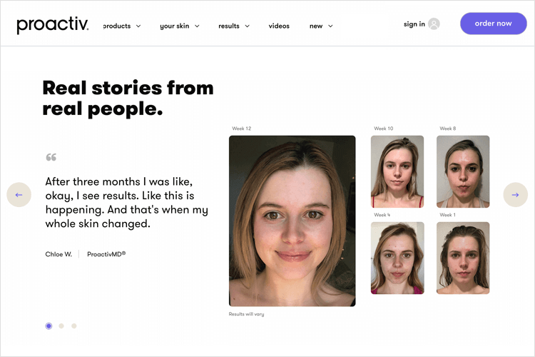
In this testimonial example, there are several images of the different stages of a client’s skincare treatment next to a larger photo of the smiling, clear-skinned result.Next to this happy-go-lucky imagery is a quote from the person in the photo saying how the treatment made them feel.
Content marketing agency, Brafton, have opted to display some of their largest clients’ names on their homepage testimonials along with large logos, followed by a text quote, followed by the client name, position and company.
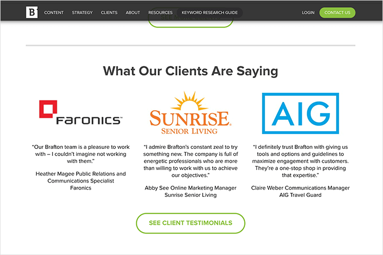
This order draws the user in using the optimum visual hierarchy, first the logo to grab attention, followed by what the person in that company was saying. If the user is sufficiently captivated, a big green CTA tempts them to read more testimonials. We like that style!
styleSeatstories is a testimonial page design by Megumi Tanaka on Dribbble that showcases an interesting approach to layout. In this case, she uses photos of the client, along with their name and company, with speech bubbles for their testimonials.
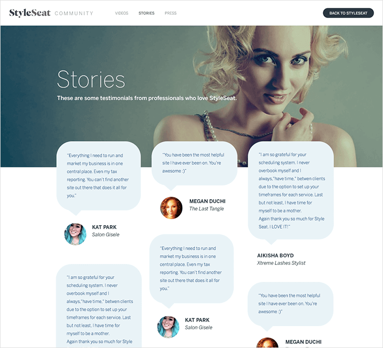
All of the testimonials are arranged in grid format and mixed in a visually appealing collage, with the quotes of varying lengths providing a medley of different shapes and sizes on the page, drawing the user in further.
Letting company, Bungalow, makes it onto this list with their clean and colorful testimonial design. Smooth pastel colors, coupled with large images of happy, smiling clients make the user feel at ease. The pictures are arranged in grid format along with the relevant quotes in adjacent grids.
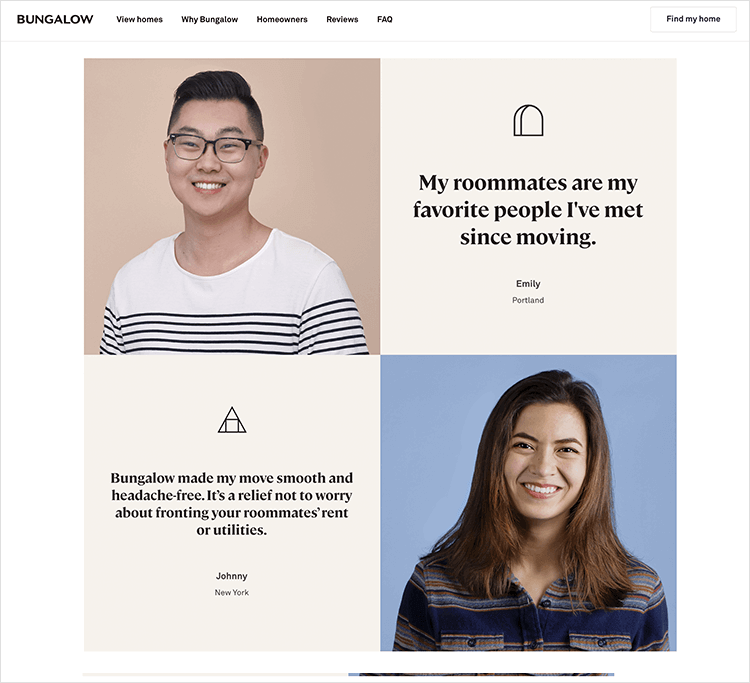
This is a great example of how you can leverage testimonials and social proof to both show off your UI design skills and establish your brand color palette, style and character even more.
This testimonial UI design by Neil Pearce on Dribbble is an interesting take on the use of cards to display satisfied customer quotes. They go for the typical text, image and name combination, but also add in an extra dimension: color.
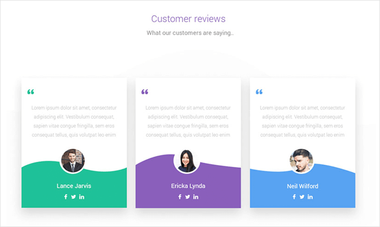
The use of color in this testimonial example isn’t random either. It serves as a way to distinguish each testimonial and as a way of helping the user to memorize each testimonial they saw. Coding aids the memory, according to a study by the National Library of Medicine.
Start designing new websites today. Enjoy unlimited projects.

Zoom is a great example of how to grab a user’s attention immediately with a testimonial. They place a large image slider with images displaying different clients’ offices, with a play button to indicate that it’s a video.
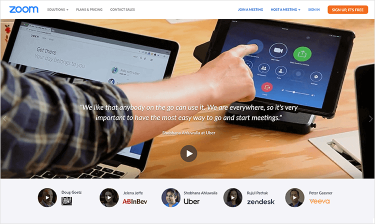
The video then plays with youtube and shows different clients operating in their offices with Zoom to help them fulfill their day-to-day needs, while upbeat (but not distracting) music plays in the background. This video testimonial on Zoom is a great way of using story telling in your user testimonials to draw the user in and create a feel-good vibe.
Thumbnails of further customer video testimonials are displayed beneath the video encourage the user to explore other clients’ use and experience of Zoom.
Shopify shows how you can create a video testimonial that doesn’t just look like an ugly thumbnail.
This video testimonial example, which you can see directly on their homepage, consists of a picture of smiling clients in their work environment, alongside a quote from them, their company logo and a CTA to play the video.
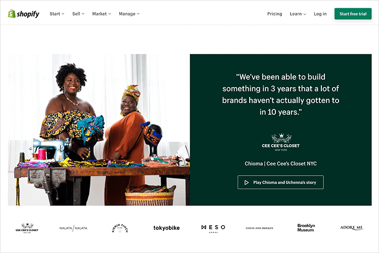
The text is displayed in white font against a dark green background which emphasizes the Shopify brand. The brand logos of other notable businesses that use Shopify’s hosting services are shown below the video testimonial widget.
In a banner that changes among five testimonials from different customers, Hotjar’s video testimonials are a lesson in testimonial presentation and general design.
With a touch of creativity in the presentation of the client’s picture, we can all appreciate the brand identity shining through this simple design. The brief testimonial is already enough to catch the eye, but those who are intrigued or curious are free to follow the small button to watch a full interview with the client that works as a case study.
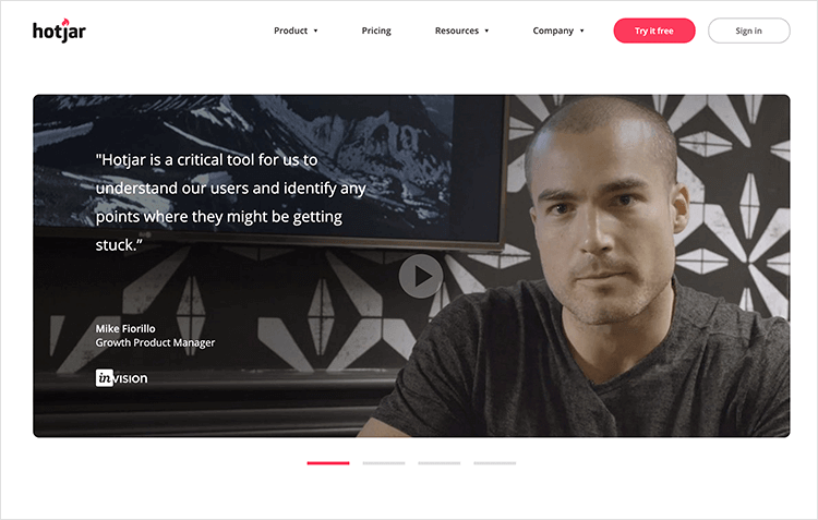
People are placing more importance on video testimonials as they are an easy way to add emotionality to your testimonial as opposed to a few lines listed on your webpage. Note that all the testimonial videos are short – not one of them surpasses the two-minute mark. Even with a video that brings the visitor into the story, lingering too long will lead to loss of interest.
Here’s why we love Codecademy and included it in our list of testimonial video examples. When you first get to the page, you see a video that contains testimonials from three alumni. Each student goes into why they needed to learn code, and how Codecademy was able to help them reach their goals.
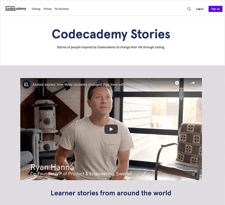
The video makes it easy to convey emotion and all that comes with it. This enables visitors to identify with the ex-students in their search of success or happiness, and make a connection with the service the company offers. The initial video is slightly longer than average – reaching about two minutes and a half.
Enable is an example of how even a simple testimonial video thumbnail can look good if placed appropriately on the page. Their thumbnail element features rounded edged padding, meaning that the outlines don’t five off the typical jarring look of square video thumbnails. Each video calls the user in with some teasing text about how customers came to choose their brand.
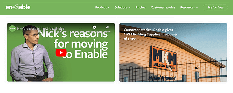
What we like most of all, however, is the strategic placement of these video testimonials right below where they place their services card grid. Proof to back up the claims!
These testimonial examples go to show you that they can vary in their impact depending on how you present them. You want a testimonial page that will allow the visitor to identify themselves with your customers, showing them that you’ve dealt with the same issues they face today during your career.
You also want a testimonial display that allows for emotion and brand personality – make it yours by adding your own touch to the layout. Your testimonials can be large in the form of case studies or brief in tweets – the important thing is that they are genuine and paint a picture of what you’re like as a professional.
PROTOTYPE · COMMUNICATE · VALIDATE
ALL-IN-ONE PROTOTYPING TOOL FOR WEB AND MOBILE APPS
Related Content
 We see dropdown menus everywhere. But what makes a good dropdown? What changes when designing for mobile screens? We got the full run-through for you!13 min Read
 UI design examples that bring some serious inspiration. From parallex scrolling to delicate animations - this list has it all to get you inspired!8 min Read
 We created a list of the top UI design principles that capture some of the most interesting faces of digital design. Check them out!10 min Read

