Hotel website designs need to be accommodating and look the part to convert users into clients. We’ve rounded up 13 examples for a little inspiration!
A website for a hotel or resort is not much different than an Ecommerce website. In fact, the end goal is absolutely the same – you have a product you want to sell, and you have to sell it in the best light possible. So what do potential clients look for when it comes to hotel website design?
Design a website that converts. Unlimited projects.

The old adage that first impressions count definitely holds true to hotel web design. To understand how users might perceive your website, you have to put yourself in the shoes of the traveler.
Think of the main things you look for when booking a hotel: photos of the rooms, the grounds, the surrounding areas. You’ll probably be curious about its location – is it in a convenient place? Is it close to public transportation or interesting attractions? How’s the room availability and what’s the going rate?
It pays to make the practical information as easy to find as possible in your hotel website design – people feel a sense of accomplishment when they can get things done quickly and easily. They won’t get bored and will be more likely to book a room with that hotel if the planets align and the prices and availability are good.
Above all, your hotel website design needs to be accommodating. In this post, we’ll highlight 13 of the best hotel website designs out there and give some pointers on what all hotel web designs should include – some from the very beginning of the website prototype. We’ll also go through some tips on how to take hotel and resort web design to the next level.
Before we look at the 13 best websites, let’s first look at what the must-haves are for any great hotel website design.
As your hotel web design is, in theory, very similar to an ecommerce website, you’ll want to deploy similar techniques, which are:
- Showcasing the product: plenty of beautiful, pixel-perfect and high resolution images of the hotel and its location
- Easy navigation – make sure the user can quickly find the information they need. Consider they might need to find information about the hotel’s location, room availability, or whether or not a deposit is required
- Clear marketing: make sure each room and service your hotel offers is highly visible and not hidden in a maze of different pages
- Responsive design – this should be a given for any modern hotel website design nowadays
Now that we’ve got the basics covered, let’s look at some more elements that can really help your hotel website design stand out from the crowd. Think of it as being your elevator pitch – it must sell all the best parts of the hotel in the minimum time possible.
Design a website that converts. Unlimited projects.

Having panoramic photos of landscapes of the hotel grounds can serve as a great hero image or background photo for your homepage. But you can be creative here – a carousel slideshow of the grounds, the location and the rooms also works like a charm in hotel website design.
You might even think about working in some parallax scrolling, with a static image in the background and relevant images or text superimposed over the top, as the user scrolls.
Next, and an absolute must for hotel website design, are clearly visible reviews and ratings. What’s more, according to TripAdvisor, reviews can make a difference. One of the best ways to incorporate this feature into your design is to have star ratings, reviews and testimonials from past clients.
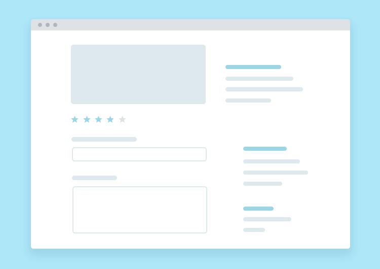
Image by Zach Walsh
Star ratings make it easy to quickly analyze whether previous clients were happy. They can also draw users into reading positive reviews. Another idea is to include eye-catching quoted testimonials alongside the star ratings or reviews in your hotel website design.
It goes without saying that CTAs should always be visible. Many great hotel website designs put the CTA to book a room in the top right corner of the page and leave it fixed there as the user scrolls. Don’t make potential clients have to search for the “book now” button, they might get frustrated and bored, regardless of how beautiful your hotel website design is. Even while you’re still working from the prototyping tool.
Another encouraging factor to include in your hotel website design is to display the people who represent your main customer demographic.
If you’re a hostel, it may have a positive psychological impact on your users to display an image that depicts someone similar to themselves, such as a young backpacker. Or if you’re a luxury hotel, a business traveler in a suit, or a bride and groom.
Design a website that converts. Unlimited projects.

Without further ado, here’s a roundup of the 13 best hotel and resort web designs. In this list, you’ll find everything from boutiques to apartment rentals.
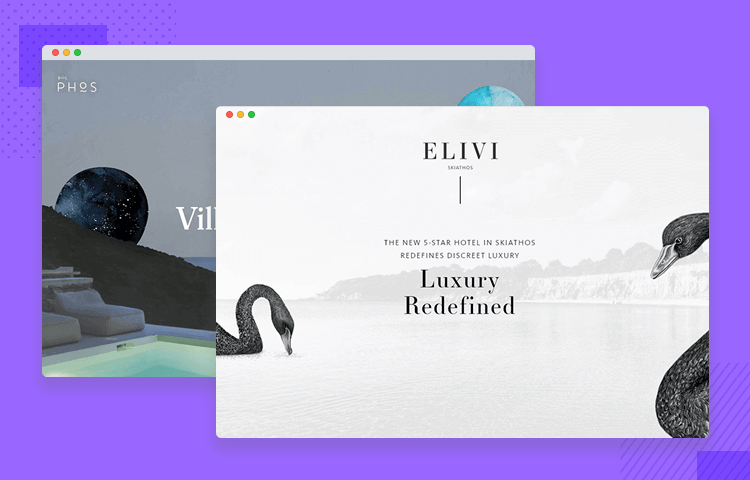
Some hotel website designs are so good they go beyond the simple functionality of reserving rooms or providing information about accommodation. Phos Villas’ hotel website design is one such example.
Through dazzling parallax scrolling and exceptional storytelling, Phos Villas provides a mini tour of the Phos region along with an audiovisual party for the eyes.
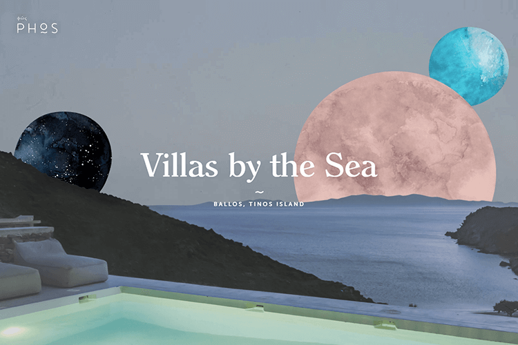
The homepage of this hotel website design boasts a surrealist approach. Images of the Phos landscape are decorated with spheres that look like planets, circling the sky with each image change. The user can then scroll through this parallax journey, finding out more information about the villas on offer and the region itself.
Conscious Hotels is a chain of eco hotels throughout Amsterdam. This chain’s website has a lot of information, therefore it needs to allow the user to find what matters most to them quickly. And that’s exactly what its hotel website design achieves, via some well-thought-out design wizardry.
Its website homepage features a navigation breadcrumb menu on top of a hero image of an eco bar, alongside a CTA and language selector with country flags. These buttons practically jump off the screen at you – which helps.
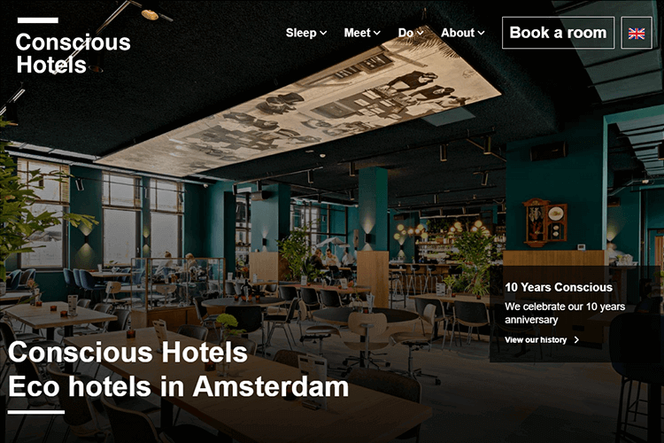
What makes these buttons a winning feature is that, as you scroll further down the screen, the menu becomes fixed against a white background. This means you can always book a room, change language or look at other options no matter where you are in scrolling.
Note: Fixing an element or menu to the screen as the user scrolls the page is actually a basic form of parallax scrolling and is often used in hotel website design.
The next part of the screen, when scrolled down, showcases four clickable cards displaying their different hotels with copy screaming out at you to click on them. Occasional movement of images or text helps keep things fluid and interesting, while not overwhelming the user.
This hotel website design is a great example of how engagement and usability combine for great UX.
When a website is busy loading due to lots of audiovisual effects, it can be nice to have something in that limbo for the eyes to look at – otherwise it feels like your time is being wasted.
Hôtel Particular Montmartre do a great job of this in their hotel website design with a splash screen outline of a palladian building while the page loads. It serves as a confirmation that the website does work and also as a clue as to what they’re about to witness.
When you arrive at the homepage, large font fills the center of the screen and echoes brutalist design and unfilled text that immediately draws you in to the images below. Their hotel website design is meant to be flashy, it’s meant to grab your attention.
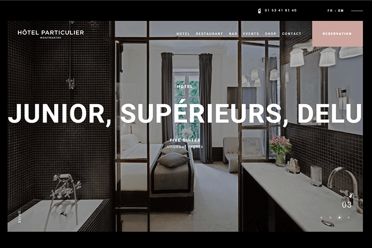
A CTA and a language button are clearly visible on the homepage, which is a carousel showcasing all luxury rooms. The user can switch between images using radio buttons to find the room they want. Scrolling down the page, you can see great storytelling in effect, providing details about the restaurant, bar and various suites available, along with photos of the location in Paris.
Not only is this hotel website design appealing, but it organizes its information hierarchy in a way that the user sees all the important information first, but if needed, can take a visually enriching tour to convince them. Then it’s just the price that’s the deciding factor!
Le Mirabeau’s hotel website design boasts some amazing, captivating homepage graphics. It consist of two photos merged together that switch, panorama style, from an overview of the city in the valley to the hotel’s façade. The way the transition is done makes it look like the view of the city is reflected in a pond outside the hotel. Top marks for stunning audiovisual design!
Le Mirabeau’s hotel website design also make great use of an interactive cursor with a spotlight following it around the screen, like a torch shining on the façade at night (it’s nighttime in the image), and in the landscape image, like ripples on water.
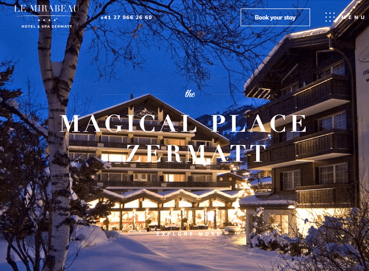
Further down the page, they use carousel images to show the various packages on offer like their spa and gourmet restaurant, along with their rooms. A menu button on the main navigation menu that stays fixed as you scroll, takes you to a simple list of all services on offer, along with contact details, for those looking for fast information and less fancy.
Even if the hotel weren’t impressive, their hotel website design certainly is!
Design a website that converts. Unlimited projects.

As you scroll down the page of Bellevue Syrene’s well designed website, you’re offered a nice storytelling journey with captivating photos of the landscape and the gulf of naples. Throughout the storytelling, this hotel website design makes makes great use of overlapping elements, with decorated font crossing over high resolution images.
Throughout the storytelling scrolling experience, this hotel website design invites you to click on buttons beside images to change them, or to just let them change automatically. They slide over with a nice transitional effect to the right.
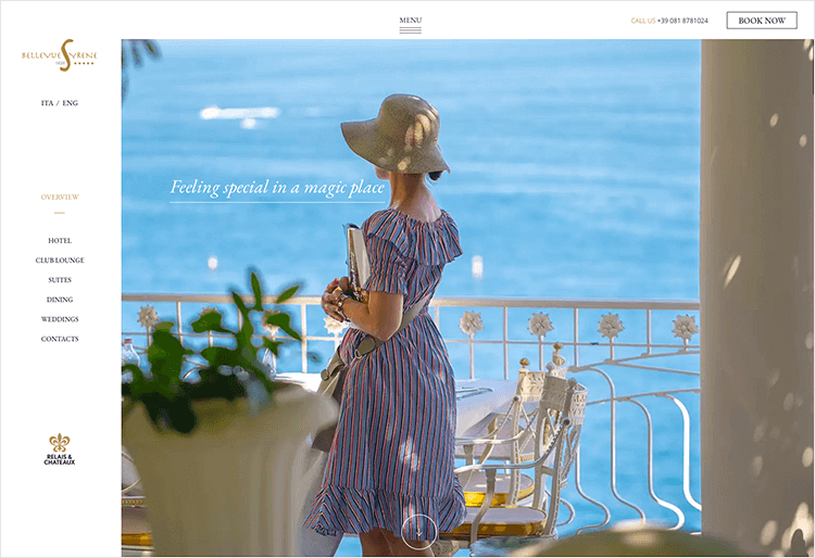
The interesting part is that they have a spinner with a number in the center. This shows what number image is displaying and how long is left to load the next image. You can tap “breakfast, restaurant”or “bar” to display the next image manually.
This exquisite, yet functional hotel website design lets the user explore and discover all the website has to offer at their own pace and leisure.
The Resplendent Ceylon’s resort web design brings you to a homepage that treats you to a high resolution, silent video. It displays aerial footage of a tropical landscape, luxury accommodation, seashores and luxury breakfasts being prepared. Alternatively, the user can select the button “watch full video”as soon as they land on the page, allowing them to see a more detailed elaboration of the background video.
Above the video image are menu breadcrumbs for more information about ceylon tea trails, special offers, tented lodge and more. The user can then scroll down the homepage to see a simplified map of the area, with tasteful cartoon images of all the sights and attractions of the tea island.
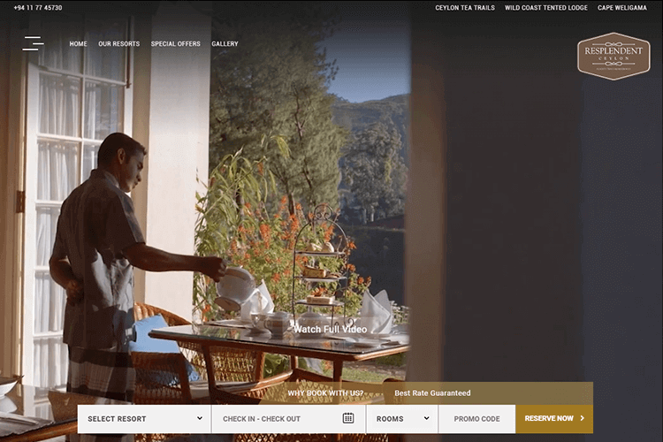
As you scroll down the page, there’s a fixed component letting the user select the resort and rooms they want, select check in dates and enter promo codes. Hitting the reserve button takes them to a simple form to fill in their name and email with a clear price breakdown into net and tax, before entering card details. We were surprised at how quickly you can reserve a room here!
This resort web design is a great example of how you can merge stunning design with great usability.
The Sol Beach Club do entertaining hotel website design like pros. As soon as you land on the homepage, jungle sounds start playing in the background, with leaves rustling and bird chirping. There’s a button you can use to switch the sound on and off, with the amusing copy “welcome to the Jungle” and “back to reality”.
You immediately get the impression you can find lighthearted, fun holidays on this website. Not quite the backpacker-hostel type, it’s aimed primarily at the adventurous, adult millennial population, something which is evident from the images.
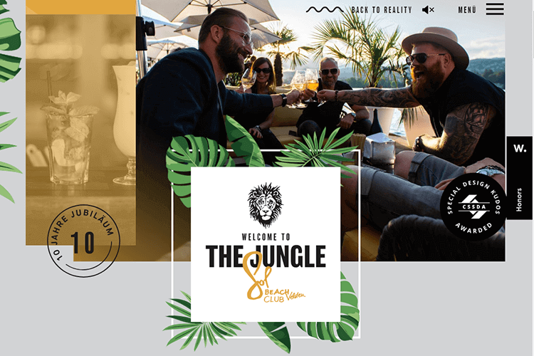
Bold fonts and a lion logo make for a nice, in-your-face, refreshing hotel website design. Bold background prints such as palm leaves are visible against a grey background. They also make great use of parallax scrolling – as you truck on down the page, sushi and chopsticks slide onto a plate.
On the same page there’s a carousel you can click through to see images of various staff, such as the sushi chef, along with the bio, giving you the impression they’re real friendly guys. We give this hotel website design a full score for marketing.
Casa Cook markets itself as being a remote hinterland, a place to relax and disconnect. And its resort web design is no different.
Immediately grabbing your eyes and pulling you in are the amazing, high resolution rustic images of a dark timber deck, with wicker parasols, palms and captivating white font.
When you scroll down, you’re treated to captivating copy that describes, in storytelling fashion, everything about the resort and the rooms on offer. It feels like the idea is to make the user slow down, relax and go into discovery mode as soon as they land on this website.
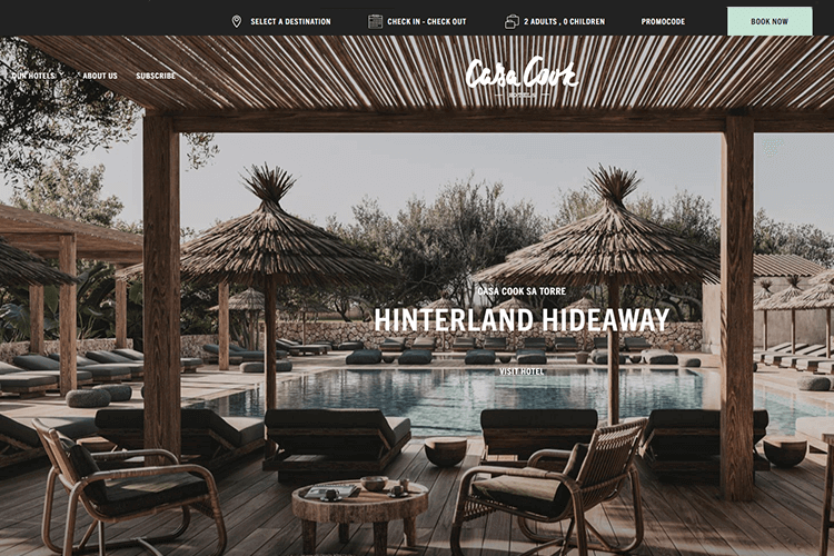
Further down, you’re treated to images of a beautifully remote Mallorcan countryside, simple cuisine with fresh produce, along with geographical and cultural information about the area.
But these guys are also about business. As soon as you land on the homepage there’s a “Book Now” CTA in turquoise that contrasts nicely against a black background and the brown timber in the images, almost making it seem like shallow water off the shore.
Schweizerhof Zermatt’s hotel website design does things no differently. They make use of a nice cursor design in the form of a dot that follows the cursor around the screen, making ripples against a pixel perfect, sun-washed landscape of zermatt’s lush ravine.
What we really liked was the very business-like and helpful CTA button at the side of the screen, like a vertical bookmark that opens out when you hover over it, allowing you to select a room, restaurant or spa.
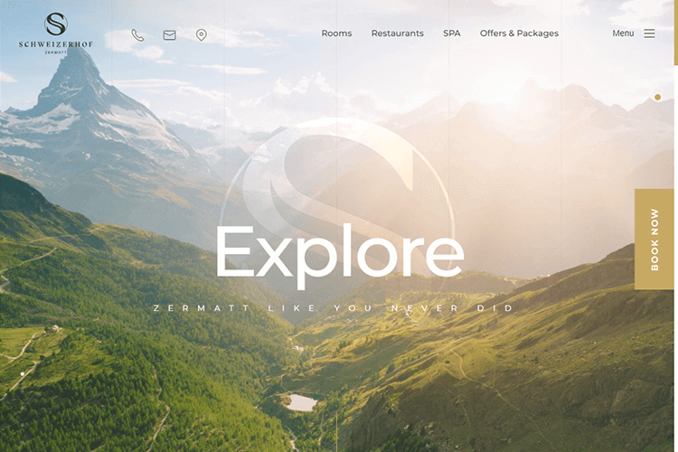
Scrolling further down the page takes you through a mix of background sketches of mountains, birds, houses and deer, with captivating, poetic copy and images of their plush rooms. We really like how, like with many great hotel website designs, they made use of this entertaining storytelling technique to showcase the best of their services, such as the rooms, the food and their packages.
Design a website that converts. Unlimited projects.

Samsara Ubud’s resort web design keeps things simple…and beautiful. This website uses a large aerial photo of the Samsara resort, surrounded by a tropical forest and inviting the user to scroll down to read “The Story’.
They then go on to showcase their product by discussing the resort, elaborating on the villas available and drawing you in with simple, but creative copy. They create variation in their scrolling experience by changing each paragraph background, with white font against a balck background and vice versa.
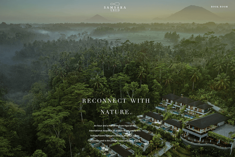
Even the fixed menu and CTA buttons change color from black to white depending on the color. This resort web design is a very good example of how to draw the reader in, using both copy and visual design.
Imagine trendiness or hipsterness had an essence or spirit. The Michelberger’s hotel website design would probably be a digital embodiment of that essence. Intentionally simple, the landing page consists of nothing more than a scrollable page with each section flowing into a different color of the rainbow.
As you scroll down, you move through large, brutalist-style words that fill the screen, such as “rooms”, “restaurant” and “what’s on”. Click on any of these and they take you through to the relevant landing page. What we like about this feature is that, unbeknownst to the you (the user), you’re actually going through a list of all the services they have on offer, but in a more entertaining way. That’s clever marketing.
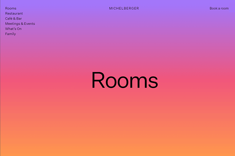
Each language page you navigate to has but one bold color background, is covered with sans serif font, photos of all the rooms and has zero ornate decoration. You can still see the list on the left and the current section you’re in as part of the navigation hierarchy.
We give this purposefully simple yet creative hotel website design top points for usability!
The Lake House is a luxury lodging in Australia that also provides activities such as cookery courses, a rustic country restaurant and outdoor activities. And it really gets its hotel website design right.
As soon as you land on its homepage, you’re treated to a carousel of images, from its gardens of organic vegetables, its health spa, to its rooms and scenes from its cookery classes. You can also navigate freely through these images using radio buttons on the bottom.
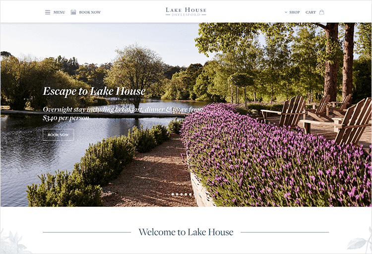
Each photo on the carousel has a CTA button, letting you reserve a room, book a class or a spa session or table at their restaurant. Not only are they showcasing the best of what they have to offer immediately, they also make it a breeze for the user to immediately find and avail of their services.
Scrolling down, you can see poetic and beautifully illustrious copy describing the daily activities at the lake house. If you scroll down even further, you can see all upcoming events such as art exhibitions, cookery classes and wine tasting. Probably best of all, from a marketing point of view, is a section showcasing all their latest awards to give weight to the prestige of their hotel website design.
A nice touch is that they also make appeals that might matter to most people such as “save the Lake Daylesford geese”.
We like the way that Elivi Hotels have really brought out their color scheme with their hotel website design. They’ve gone for a classical, artistic and tasteful appeal to their website using nature as its main inspiration.
We also like the clear language button and Book Now CTA button on the top left corner. The cursor is a round circle that follows the cursor around, simultaneously dragging the two geese and the image at the top of the screen, giving the user a three dimensional effect and really blurring the gap between what’s natural and what’s digital, providing the user with an experience of nature that’s real before they even get to the hotel.
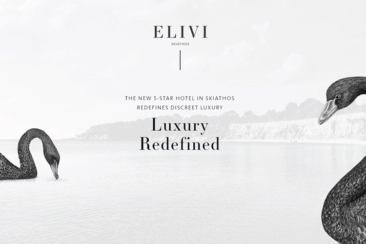
Throughout their hotel website design, they use a collage of overlapping images, typeface and CTA buttons, to add a casual, relaxed feel to what is a luxury hotel surrounding.
In general, when it comes to spectacular hotel website design, we’ve been seeing some common UI patterns:
- Having a background photo, panoramic image or carousel diagram showing off the hotel, resort or location
- Storytelling using parallax scrolling, with a fixed CTA button to book rooms
- CTA button in the top right corner of screen
- A clear language select button for international audiences
- Subtle animation throughout the page, or background video on the homepage
The above is just a summation of some of the shared qualities that the hotel web designs we’ve mentioned have in common. They’re not, however, a guarantee to success which depends on many factors, such as your site’s page speed how usable your website is, how likable the content is, along with the obvious issues of price and location.
If you’re going to use visuals and ornate graphics, then pagespeed needs to be at an absolute optimum and you’ll need to provide something for the eyes to focus on while your site loads. Consider using an interesting splash screen and perhaps an indicator of how long left your site has left to load.
When it comes to great hotel website design, the jury is really out there on what to do. The main thing is that you showcase the best experiences the hotel or resort has to offer and that the user can easily navigate to the information they need.
PROTOTYPE · COMMUNICATE · VALIDATE
ALL-IN-ONE PROTOTYPING TOOL FOR WEB AND MOBILE APPS
Related Content
 We see dropdown menus everywhere. But what makes a good dropdown? What changes when designing for mobile screens? We got the full run-through for you!13 min Read
 UI design examples that bring some serious inspiration. From parallex scrolling to delicate animations - this list has it all to get you inspired!8 min Read
 We created a list of the top UI design principles that capture some of the most interesting faces of digital design. Check them out!10 min Read
