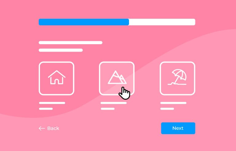
Creating effective surveys is key to getting valuable feedback. Whether you want to understand customer satisfaction, employee engagement, or market trends, designing the right survey can be tough.
That’s where this guide comes in! We’ll show you how to plan your survey, write easy-to-answer questions, and create a user-friendly design. Plus, we’ll give you examples of great surveys and recommend the best tools to use.
Design awesome surveys that users will love to answer
By the end, you’ll know how to make surveys that people want to fill out and that give you the info you need. Let’s get started on making awesome surveys!
Designing a survey starts with solid planning. Imagine you’re about to build a house. You wouldn’t just start laying bricks without a blueprint, right? The same goes for surveys. Here are the key steps.
First, you need to be crystal clear about why you’re creating the survey. What do you hope to learn? Are you trying to understand customer satisfaction, gather feedback on a new product, or maybe get insights into employee engagement? Defining your objectives will guide every other step in your survey design process.
Next, think about who will be answering your survey. This is your target audience. Knowing your audience helps you tailor your questions so they are relevant and engaging. For example, if you’re surveying college students, you’ll use different language and examples than if you’re surveying retirees.
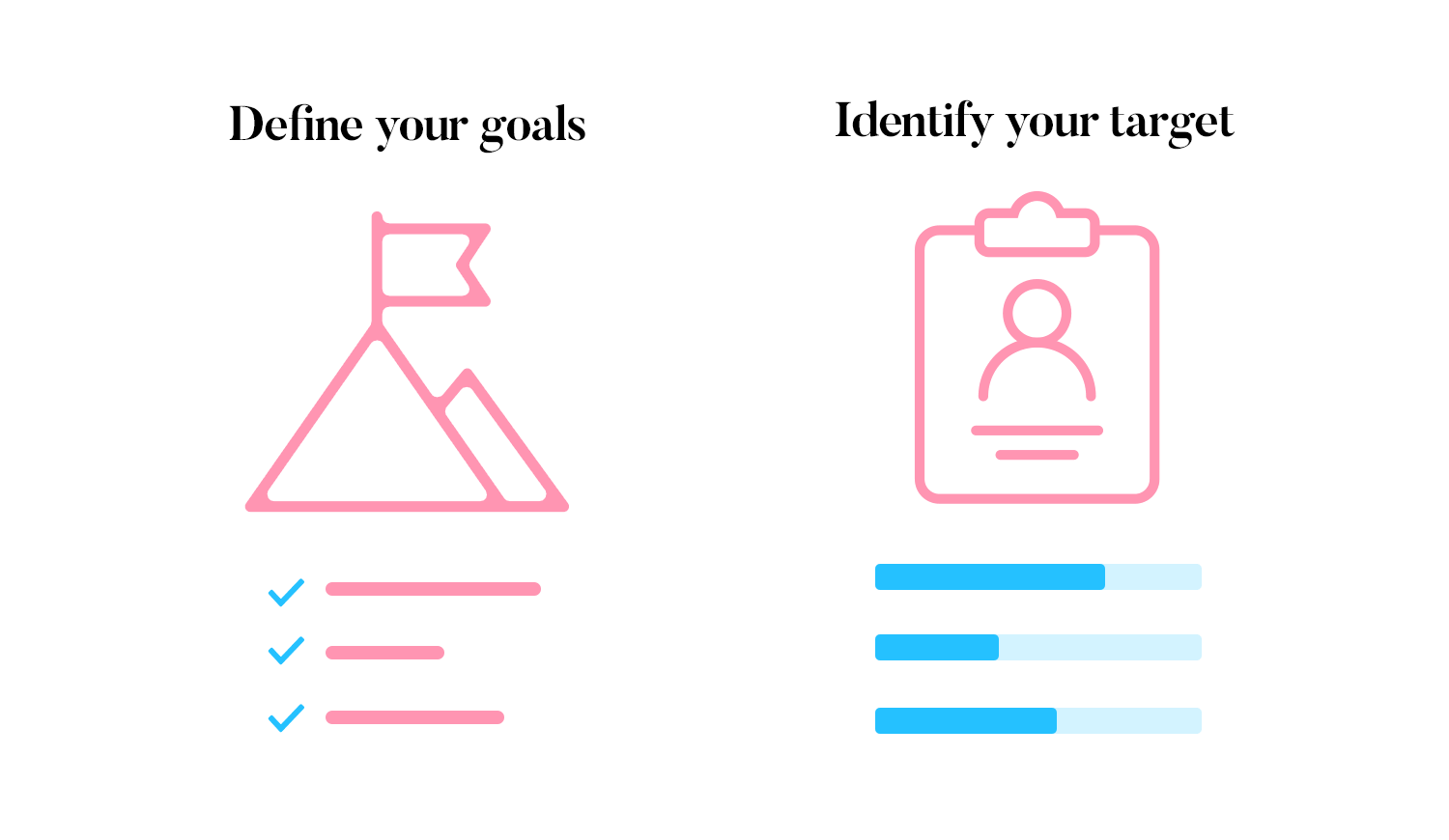
Remember, good planning is the key to a successful survey. When you know your goals and understand who your audience is, you’ll create a survey that people want to answer. A well-designed survey makes it easier to get the useful information you need. Now, let’s move on to the next steps.
Creating a survey that people find easy to answer takes a bit of thought. Here are some best practices to help you design effective questions.
Different types of questions can help you get different kinds of answers. Here are a few common ones:
- Multiple-choice: these questions let respondents pick from a list of options. They are great for getting clear, specific answers.
- Open-ended: these allow people to answer in their own words. Use them when you want detailed feedback.
- Likert scale: these questions measure attitudes or feelings on a scale, like from “strongly agree” to “strongly disagree.”
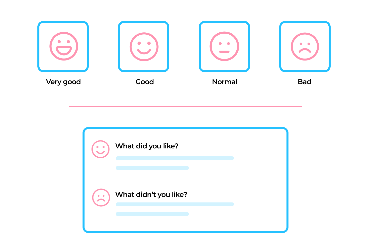
Now that you know the types of questions, let’s talk about how to write them well.
Keep your questions short and to the point. Avoid using complex words or long sentences. For example, instead of asking, “What is your overall opinion of our new product and its various features?” you could ask, “How do you like our new product?”
It’s also important to make sure your questions are unbiased.
Make sure your questions don’t suggest a particular answer. For example, instead of asking, “How amazing do you think our service is?” ask, “How would you rate our service?”
Using the right language is crucial for getting honest responses.
When you ask questions, try not to suggest what answer you want. For example, instead of asking if something is amazing, just ask for an opinion.
Choose words that are calm and unbiased to get honest answers. For example, instead of asking, “Do you think our amazing customer support is helpful?” go for, “What do you think about our customer support?”
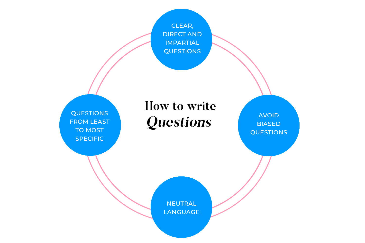
The order of your questions matters. Start with easier, more general questions to make respondents comfortable. Then, move to more specific ones. This natural flow keeps people engaged and makes the survey easier to complete.
Design awesome surveys that users will love to answer

Once you have your questions ready, it’s time to think about how to structure your survey and design the response options. Here’s how to make it easy for people to follow and answer your survey.
Introduction and instructions: start with a friendly introduction. Explain the purpose of the survey and how long it will take. Clear instructions at the beginning help people understand what to expect.
Grouping questions by topic: organize your questions into sections by topic. This helps respondents follow along easily. For example, group all customer service questions together and all product feedback questions in another section.
Using logical question progression: make sure your questions flow in a logical order. Start with general questions and then move to more specific ones. The survey will feel like a natural conversation.
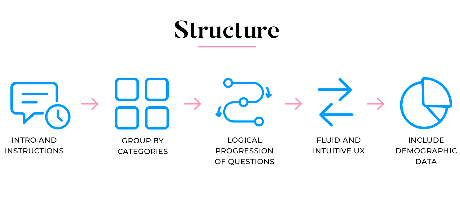
Ensuring a smooth user experience: keep the survey simple and easy to navigate. Avoid too many questions on one page and use clear buttons for moving between sections. This keeps respondents engaged and reduces drop-offs.
Including demographic questions: at the end of your survey, include some demographic questions like age, gender, or location. This information can help you understand different perspectives but keep these questions optional to respect privacy.
Crafting appropriate answer choices: provide clear and relevant answer choices. Make sure they are easy to understand and directly related to the question.
Ensuring mutually exclusive options: make sure your answer choices don’t overlap. Each option should be distinct to avoid confusion. For example, for age ranges, use “18-24” and “25-34” instead of “20-30” and “30-40.”
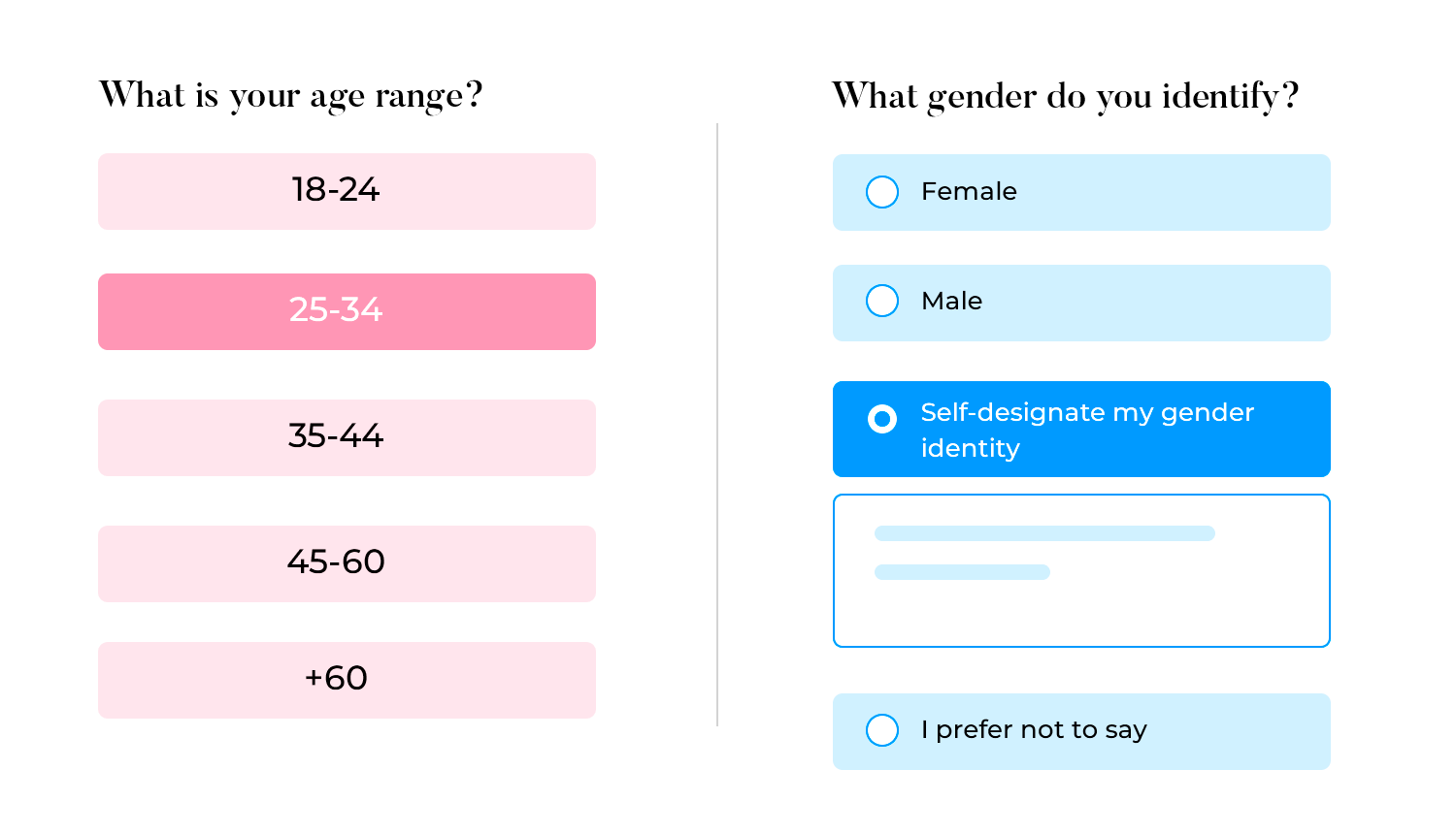
Covering all possible responses: try to include all possible answers that respondents might choose. This makes sure you get comprehensive data.
Including “other” and “prefer not to answer” options: for questions where you might not cover all possibilities, include an “other” option with a space to write in an answer. Also, consider a “prefer not to answer” option for sensitive questions. This shows respect for the respondent’s privacy.
Designing the structure and responses of your survey well creates a smooth and engaging experience for your respondents. This makes it more likely they’ll complete it and provide valuable insights. Now, you’re ready to finalize and distribute your survey.
To get the most responses, it’s important to design a user-friendly survey interface. A good UI makes it easy and enjoyable for people to complete your survey. Here’s how to do it.
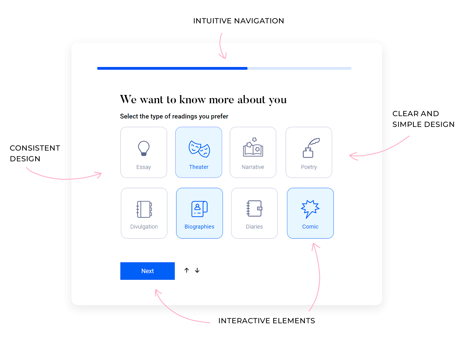
Clear and simple layout: keep your survey layout clean and uncluttered. Use plenty of white space and avoid cramming too many questions on one page. This helps respondents focus and reduces feelings of overwhelm.
Consistent design: use a consistent design throughout your survey. Stick to the same fonts, colors, and button styles. This will create a professional look and make the survey easier to navigate.
Intuitive navigation: make it easy for respondents to move through the survey. Use clear “next” and “previous” buttons, and show a progress bar so they know how much is left.
Interactive and engaging elements: incorporate interactive elements like sliders or star ratings for some questions. These can make the survey more engaging and fun to complete. For more resources, check out this post about survey UI kit.
Other options: sometimes, respondents might have an answer that isn’t listed. Including an “Other” option with a text box allows them to provide a unique response, which can give you valuable insights.
Checkboxes: use checkboxes when you want respondents to select more than one option. They’re ideal for questions like “What activities do you enjoy?” where multiple answers are possible.
Radio buttons: radio buttons are best when you need respondents to choose just one option. They’re perfect for questions where only one answer is needed, like “What’s your preferred payment method?”
Dropdown menus: if you have a long list of options, like selecting a country or state, use dropdown menus. They save space and keep your survey looking tidy.
Sliders: sliders are a fun and interactive way for respondents to rate something on a scale, like rating satisfaction from 1 to 10. They make the survey more engaging and help gather precise data.
Text fields: text fields are essential for open-ended questions where you want respondents to express their thoughts in their own words. These are great for gathering detailed feedback or suggestions.
Toggle switches: toggle switches are perfect for yes/no questions or other binary choices. They offer a quick and visually appealing way for respondents to make selections.
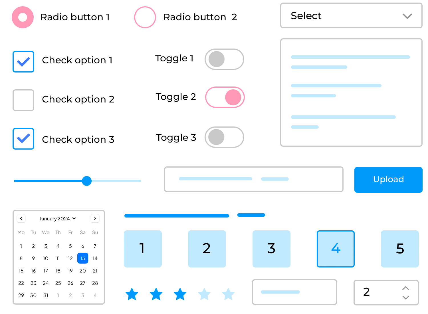
File uploads: if you need respondents to attach files, like images or documents, including a file upload option can be really useful. This is handy in feedback forms or surveys where additional content is needed.
Date pickers: date pickers are useful when you need respondents to select a specific date or range of dates. They make it easy for people to input accurate information and keep your data consistent.
Rating scales: rating scales allow respondents to rate something on a scale, like 1 to 5 or 1 to 10. These are commonly used for measuring satisfaction, likelihood to recommend, or the quality of a product or service.
Image choices: if your survey has visual preferences, image choices can be more effective than text. Respondents can select from images, making it easier for them to express their preferences.
Responsive design: lastly, make sure your survey works well on any device, whether it’s a phone, tablet, or computer. A responsive design adjusts automatically to fit different screen sizes, making it easy for everyone to participate, no matter what device they’re using.
Before you finalize your survey, create a prototype to test it out. Justinmind is a tool that helps you build interactive prototypes without any coding. It offers a UI kit for surveys, which includes templates and components designed to make your survey look professional and user-friendly.
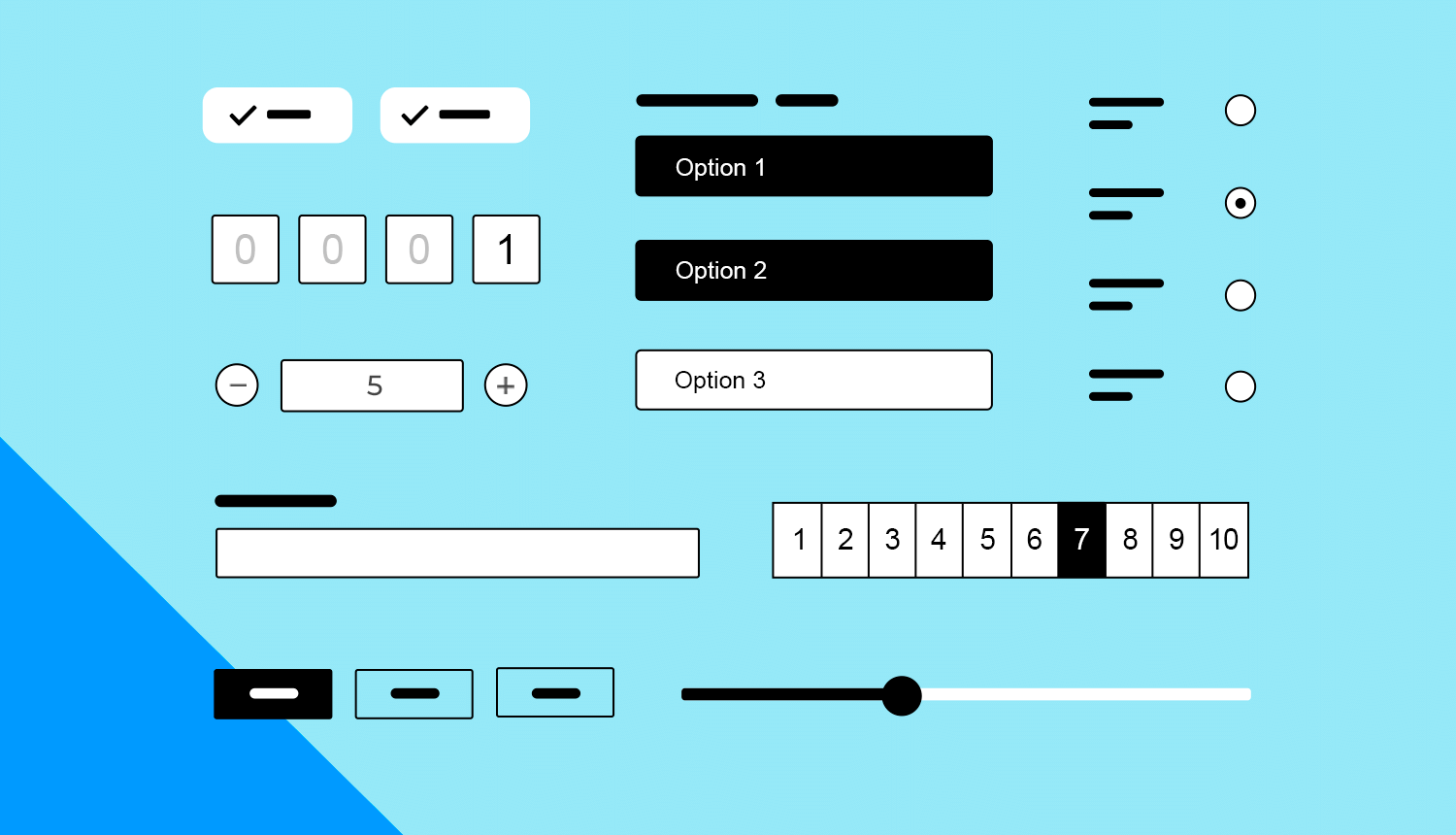
Steps to prototype and test your survey:
- Create a prototype: use Justinmind to design a prototype of your survey. This helps you visualize how your survey will look and function.
- Test the prototype: share the prototype with a small group of people to get feedback. Ask them to complete the survey and note any areas where they get stuck or confused.
Refine based on feedback: use the feedback to make improvements. Adjust the layout, change any unclear questions, and make sure the navigation is smooth.
Booking.com is an excellent example of an effective survey design. It asks guests about their stay at a property. This survey design is easy to fill out, with simple questions about your trip, such as why you were there and who you were with.
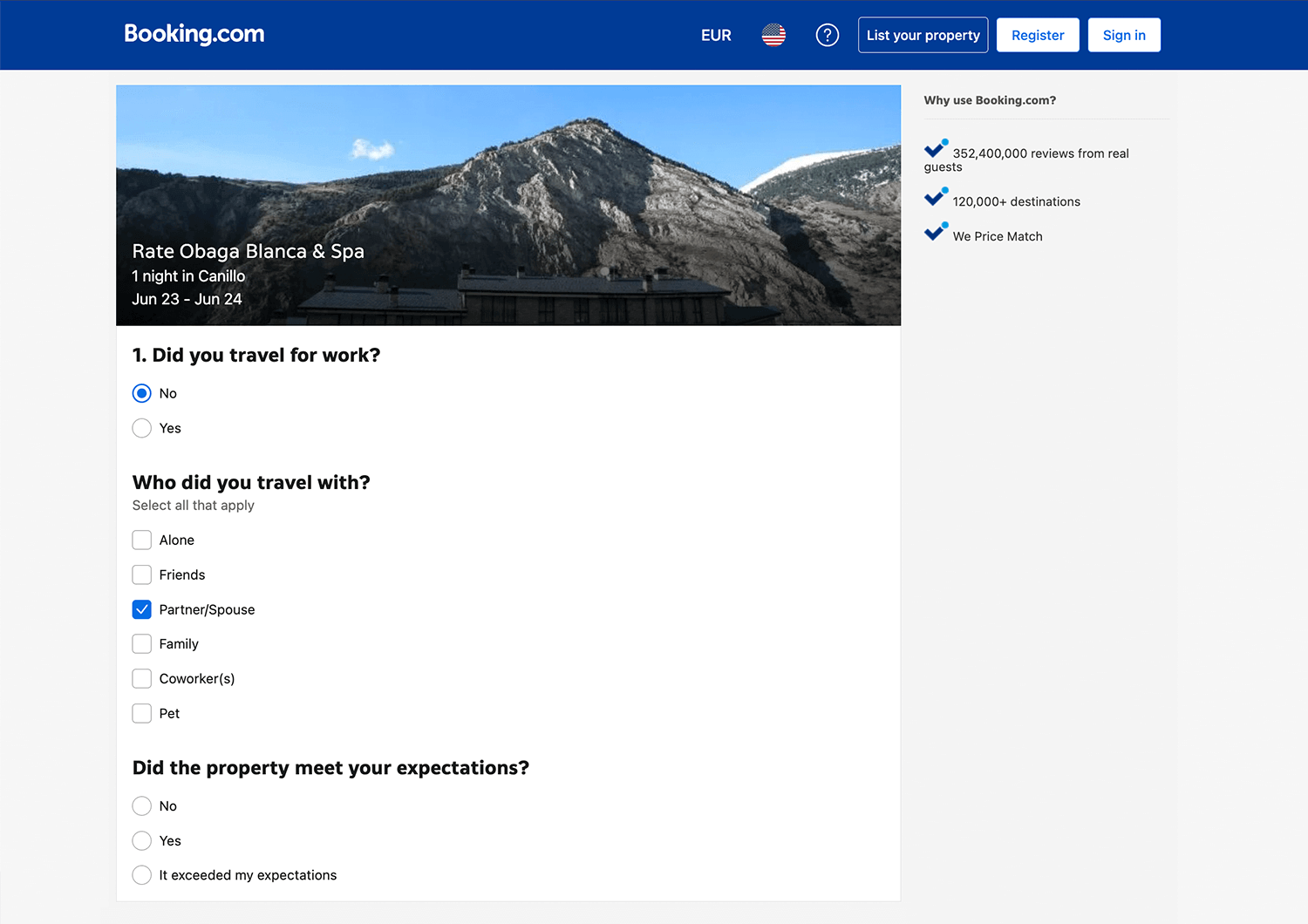
It also wants to know if you liked your hotel and how you would rate your stay. This helps Booking.com learn what guests think so they can make things better.
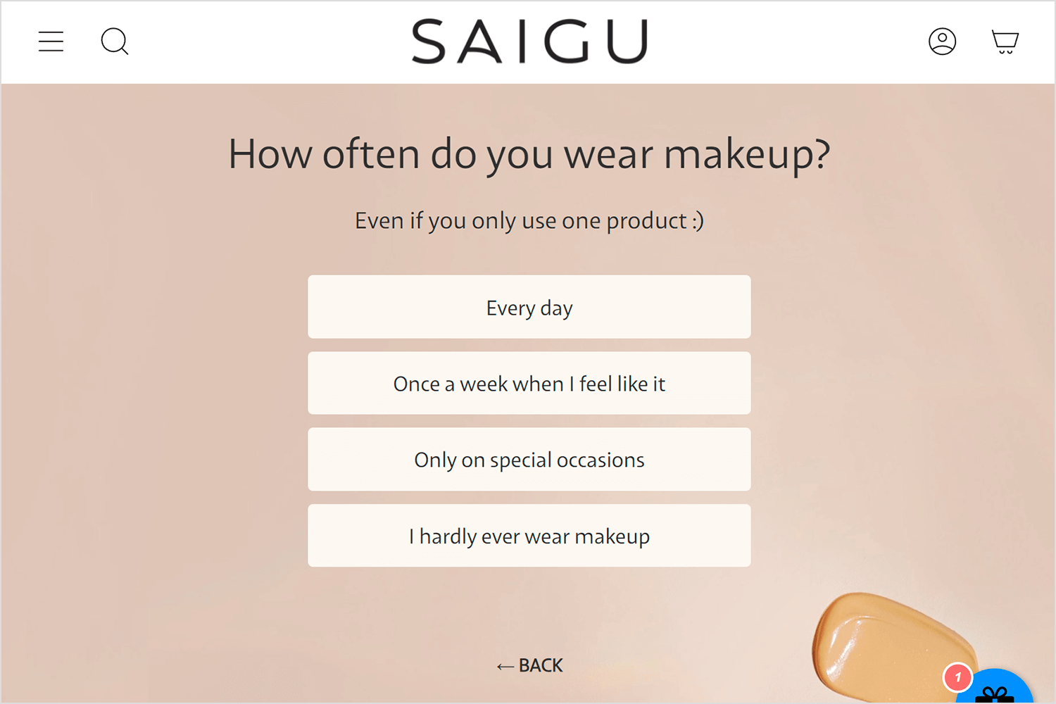
This is another fantastic example from Saigu. This survey helps users find the right makeup products by asking about their makeup habits. The layout is clean and visually appealing, making it easy for users to respond quickly.
Saigu gets to know how often their customers use makeup, which helps them offer personalized product recommendations. This makes shopping more fun and ensures customers find exactly what they need.
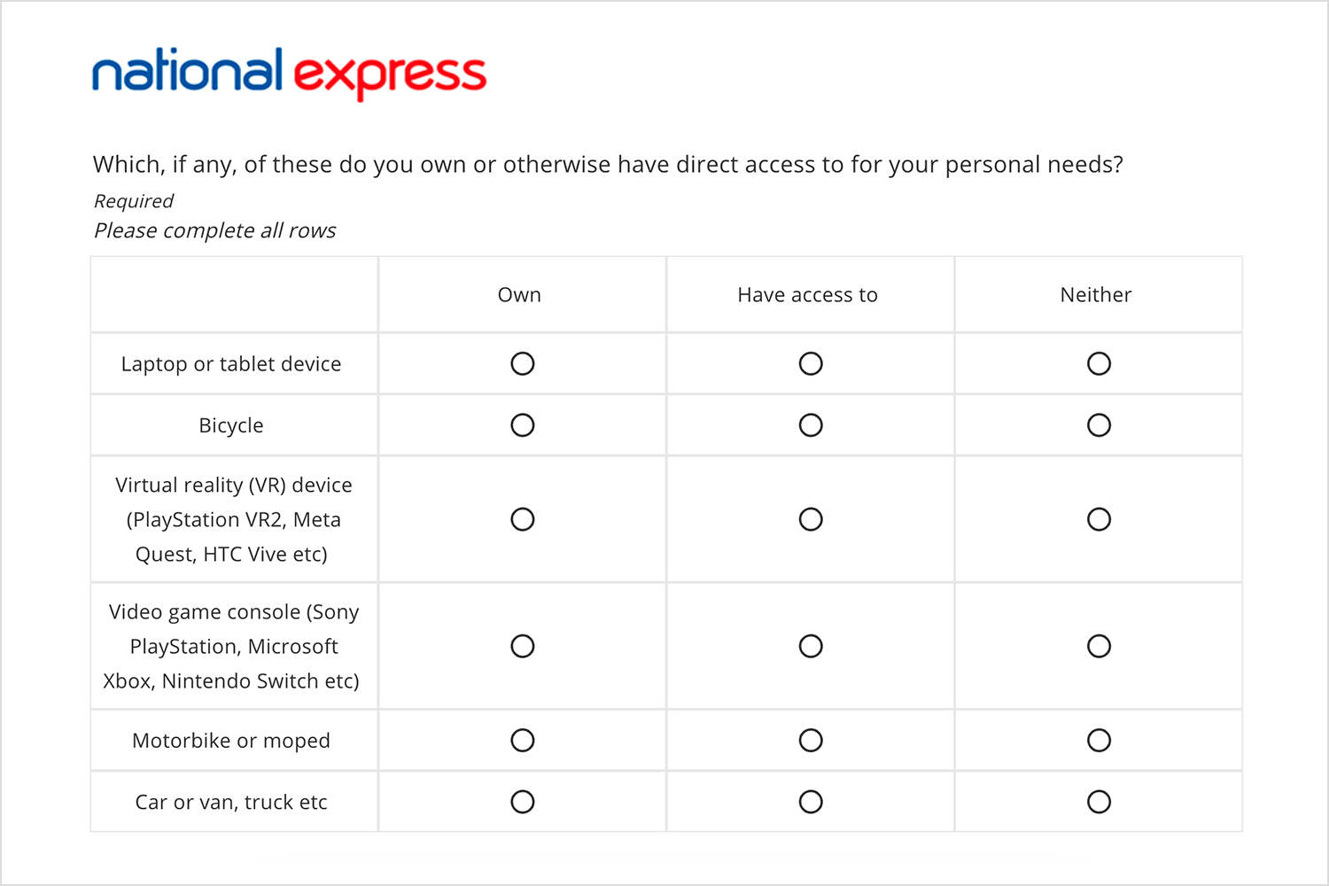
The survey design example of the National Express is simple and easy to fill out. It asks if you own, have access to, or don’t have items like laptops, bicycles, VR devices, game consoles, motorbikes, and cars. The layout is clean, and the questions are clear, making it quick for people to answer.
This straightforward design helps get honest and accurate responses, giving National Express useful information in a friendly and efficient way.
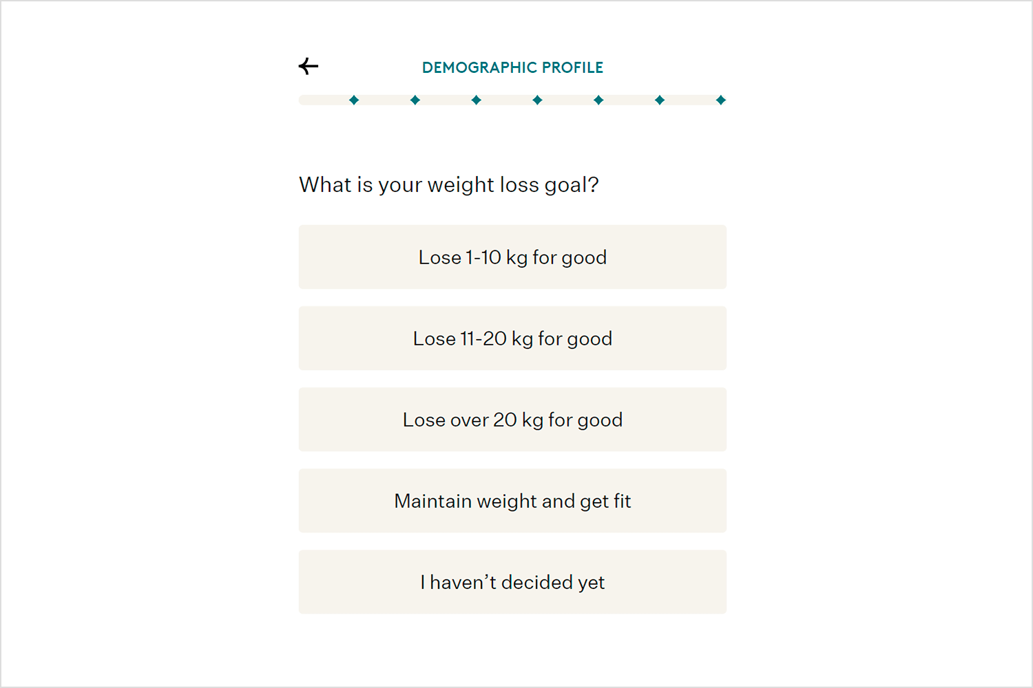
The Noom survey design example is pretty easy to follow with questions like “What is your weight loss goal?” and gives you simple choices like losing 1-10 kg, 11-20 kg, over 20 kg, maintaining your current weight, or if you haven’t decided yet. This makes it quick to answer and helps Noom tailor their program to fit your needs.
The clear, straightforward options make you feel understood right from the start, making the whole process smooth and engaging.
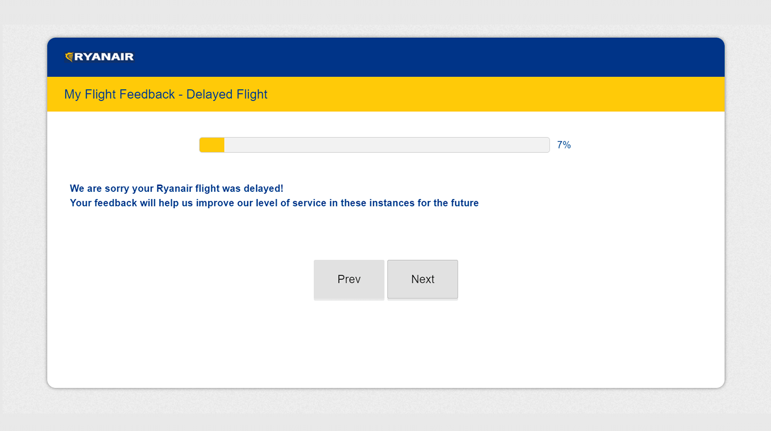
The inclusion of a progress bar helps users know how much of the survey is left, and the “Prev” and “Next” buttons provide easy navigation. This thoughtful approach makes sure that passengers feel heard and are more likely to complete the survey, giving Ryanair important insights to enhance their service.
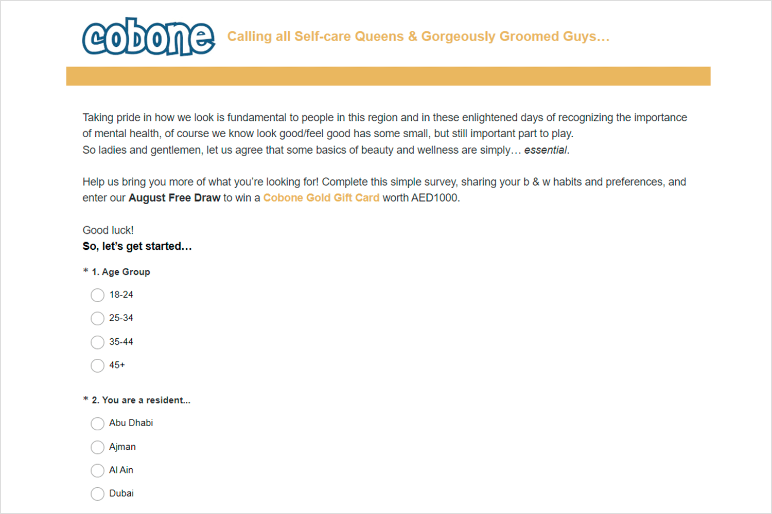
We have here another great example of a well-designed survey, the Cobone Beauty and Wellness. It starts with a friendly introduction that explains why beauty and wellness matter, making it relatable.
There’s a motivating incentive with a chance to win a Cobone Gold Gift Card worth AED1000. The questions are simple and clear, asking about age and residence, which helps Cobone understand their customers better. The layout is clean and easy to navigate, making it a smooth and pleasant experience for participants.
This combination of clear purpose, motivating rewards, and user-friendly design makes it engaging and effective.
Next, we have a survey example from Renfe. This survey asks passengers if they would recommend traveling with AVLO based on the schedules, prices, and the purchasing process on the Renfe Mobile app. Participants rate their likelihood to recommend on a scale from 0 (not at all) to 10 (absolutely).
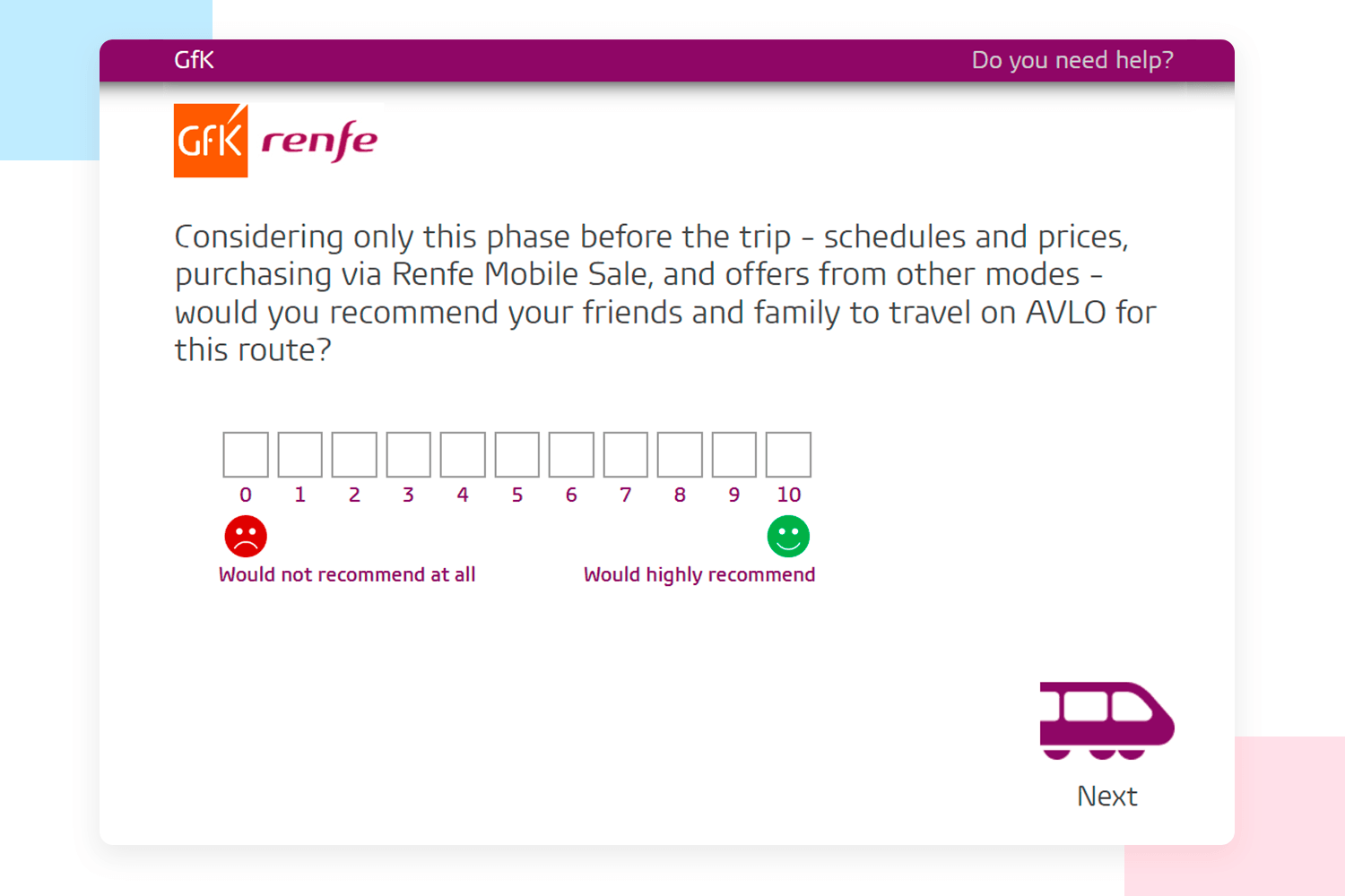
The question is direct and easy to understand, and the rating scale with smiley and sad faces makes it simple for users to respond quickly. This straightforward design helps Renfe gather valuable feedback to enhance their services and ensure a better customer experience.
Design awesome surveys that users will love to answer

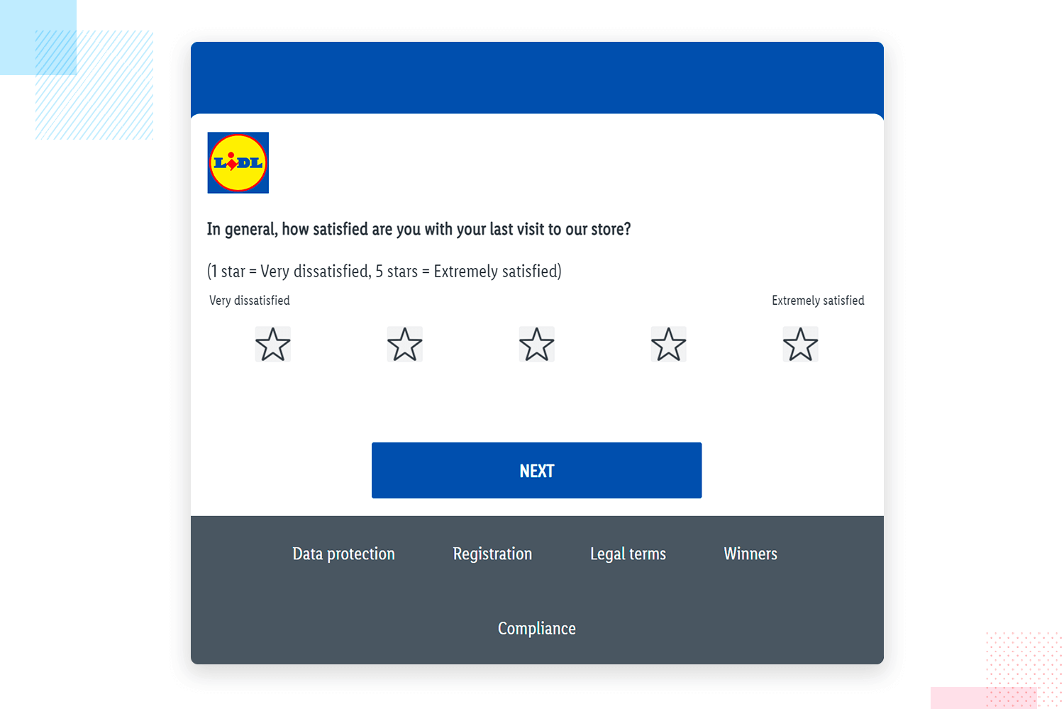
Just like Renfe wants to know how your trip went, Lidl is curious about your shopping experience. Their survey is significantly short and easy. It just asks you to rate your overall experience on a scale of 1 to 5 stars. Simple! This helps Lidl understand what you liked and what could be improved.
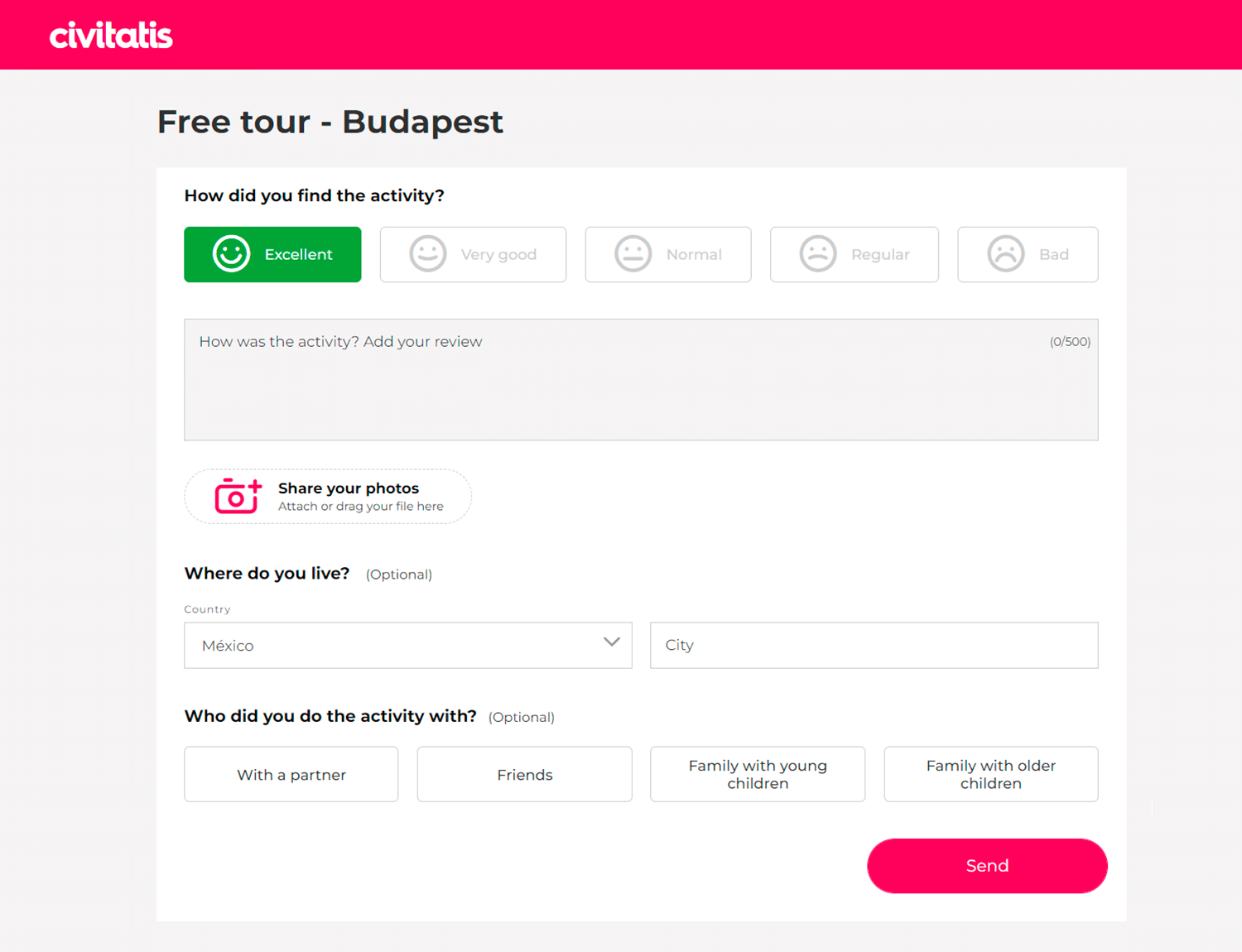
Civitatis makes it simple in this example of survey design to share your thoughts about the free tour of historic Budapest. The survey is easy to fill out and asks you to rate the tour, write what you liked or didn’t like, and choose how you want your name shown. You can also add pictures. Plus, there are quick questions about where you’re from and who you toured with. It’s a great way to help Civitatis make their tours even better.
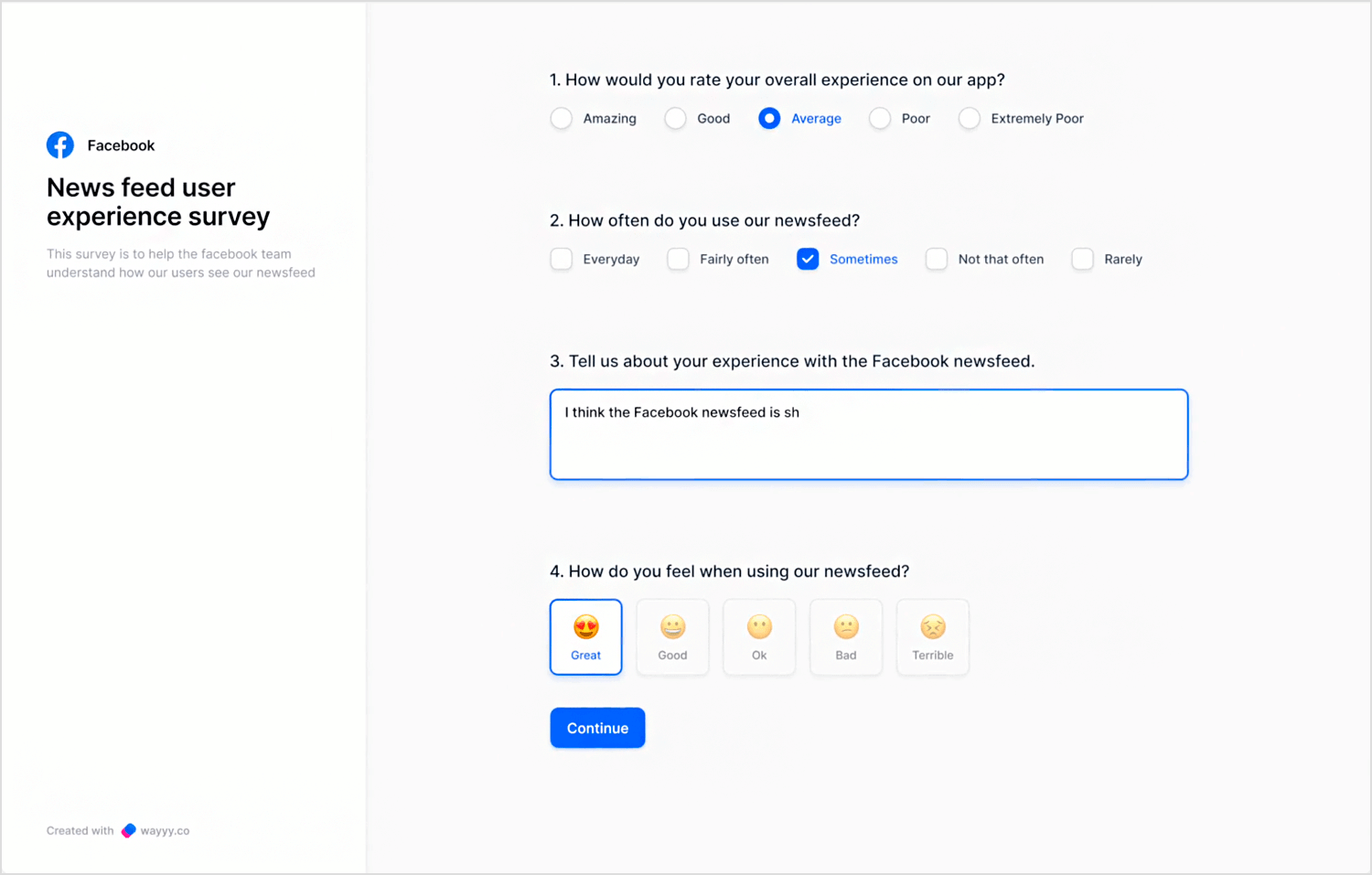
Now, let’s switch it up with this great design from Dribbble. It features a clean layout with straightforward multiple-choice questions, making it super easy to follow. Progress indicators keep you engaged by showing how much of the survey is left. This thoughtful design boosts the likelihood of people completing the survey, ensuring valuable customer insights for Facebook.
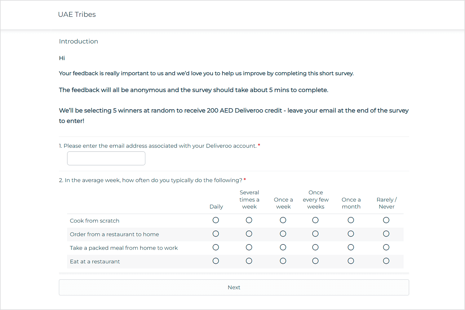
The Deliveroo survey is a great example of how to make giving feedback quick and easy. They start with a friendly message, letting you know your opinion matters and offering a chance to win 200 AED credit. This makes you feel valued right from the start. They ask for your email to connect your feedback with your account, ensuring they get real insights from real users. The questions are straightforward and easy to answer.
This design not only makes it simple for you to share your thoughts but also helps Deliveroo understand how to better serve you. It’s a win-win!
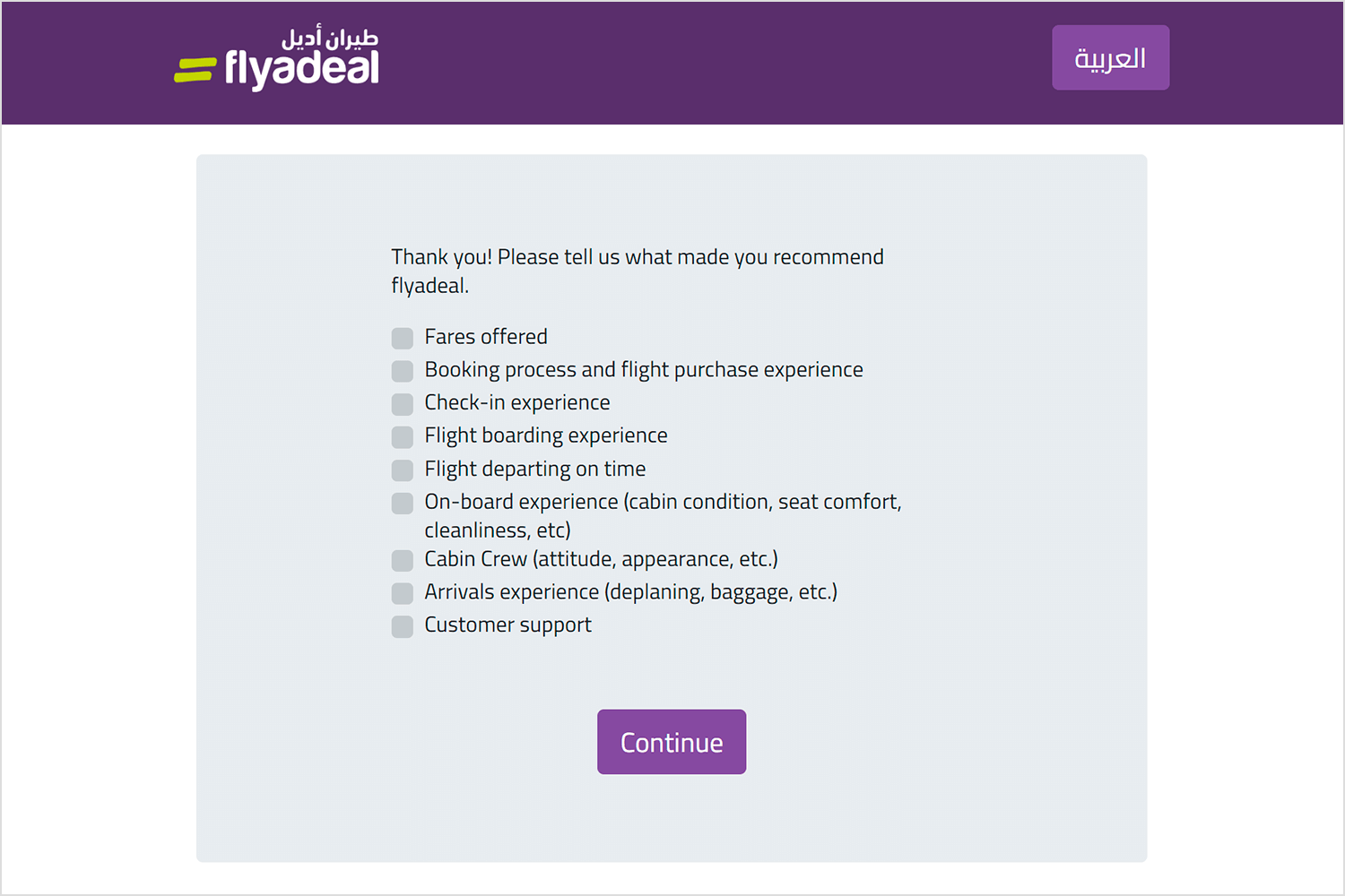
We have in front of us a very simple and straightforward example with the Flyadeal post-flight survey. It asks one clear question: how likely are you to recommend Flyadeal to a friend or colleague based on your recent flight? You rate this on a scale from 0 to 10. This design makes it uncomplicated for passengers to quickly share their opinions.
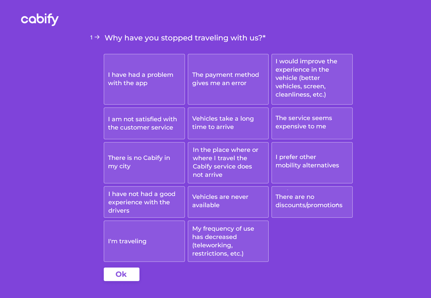
Now, let’s check out this survey example from Cabify. It’s great because it directly asks users why they stopped using the service. The design is simple and offers many options, making it easy for users to give quick feedback. This method helps Cabify spot specific issues that need fixing, like app problems, payment errors, or preferences for other services.
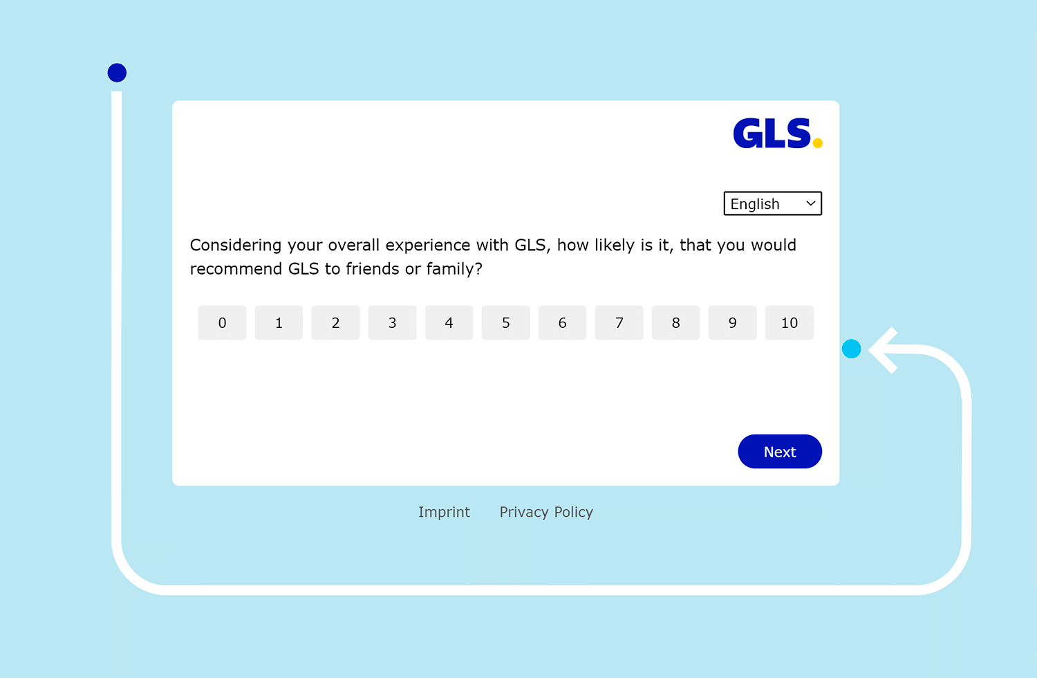
The GLS survey design is very simple and to the point. It asks about your overall experience with GLS and how likely you are to recommend them, using a 0 to 10 scale. The layout is clean and easy to navigate, making it quick to fill out.
This survey is great because it focuses on one key question, so it doesn’t take much time to complete. The straightforward design helps customers easily share their feedback, which GLS can use to understand and improve customer satisfaction.
We’ve explored some great examples of web surveys. Now, let’s jump into the world of mobile app surveys. These little question sets can be a powerful tool to understand what users think and make apps even better.
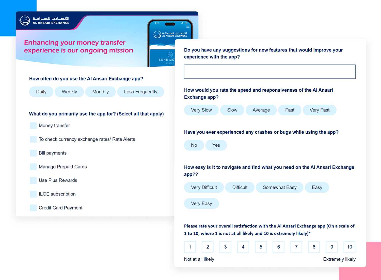
Al Ansari Exchange wants to make their app even better, so they ask you a few quick questions. They want to know how often you use the app and what you mostly use it for, like sending money or checking rates. The survey can be easily completed, and your answers help them improve the app for everyone.
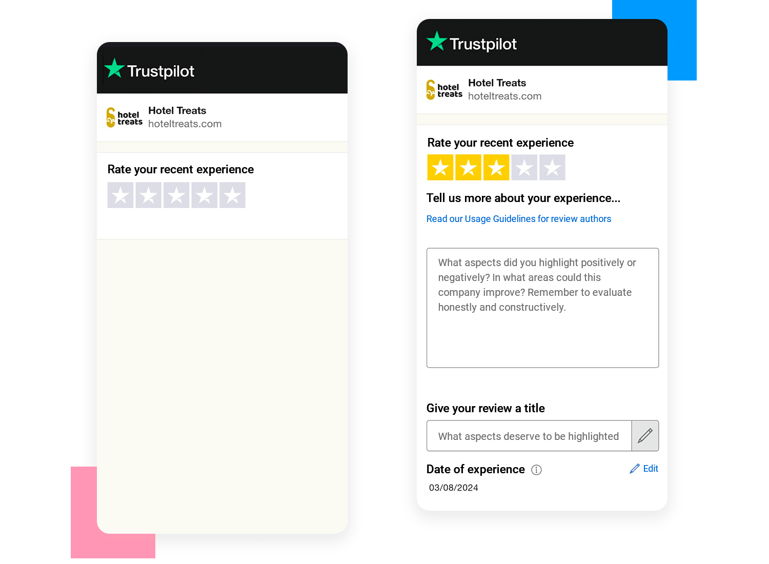
Let’s take a look at the Hotel Treats survey UI design. It’s very easy to use. First, you rate your experience with stars. Then, you can write more about what you liked or didn’t like and how they can get better.
This survey works well because it’s simple and lets you give quick feedback with stars or write more details if you want. It’s user-friendly and helps Hotel Treats understand what they’re doing right and what needs improvement.
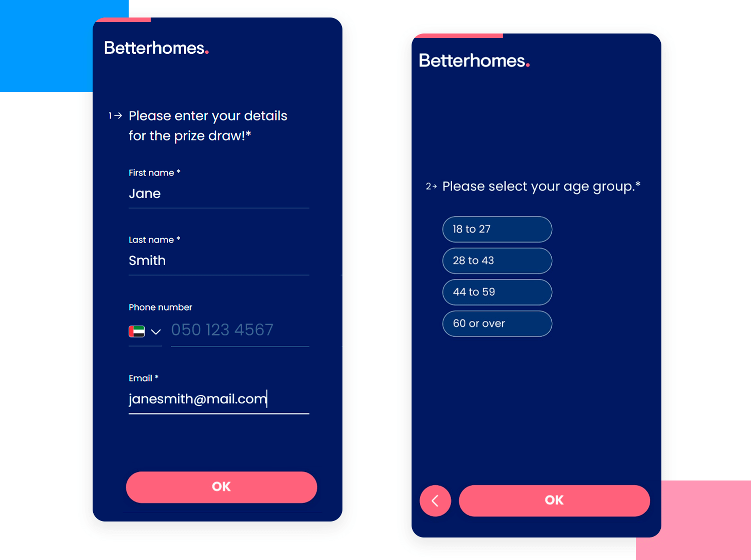
The Betterhomes survey is effortless, asking simple and straight-forward questions and including large buttons that are easy to tap. The design is clean and perfect for mobile users. It’s quick and to the point. This makes it easy to answer and helps Betterhomes get the information they need smoothly and efficiently.
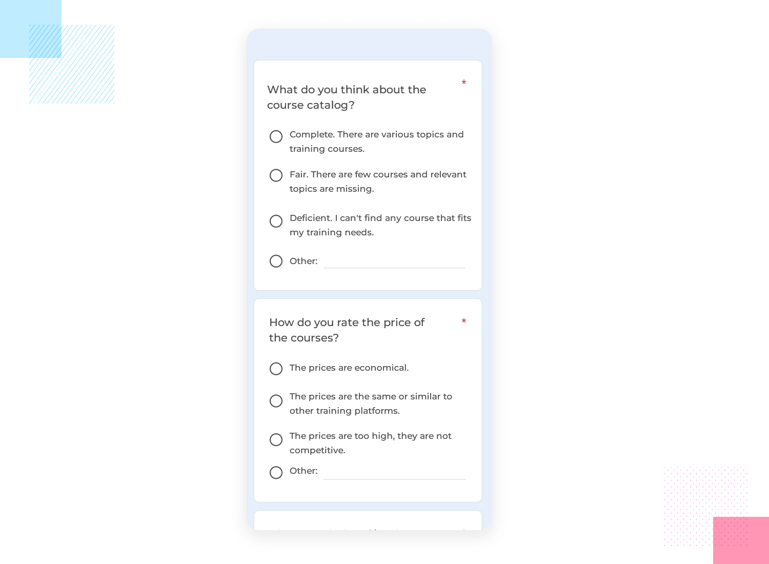
Here’s a look at a survey from the Additio app. It’s user-friendly, asking straightforward questions about the course catalog and pricing. The UI design makes it easy for users to share their thoughts, helping Additio understand their needs better. The survey’s simplicity and clarity are its strengths, making it hassle-free for users to give feedback.
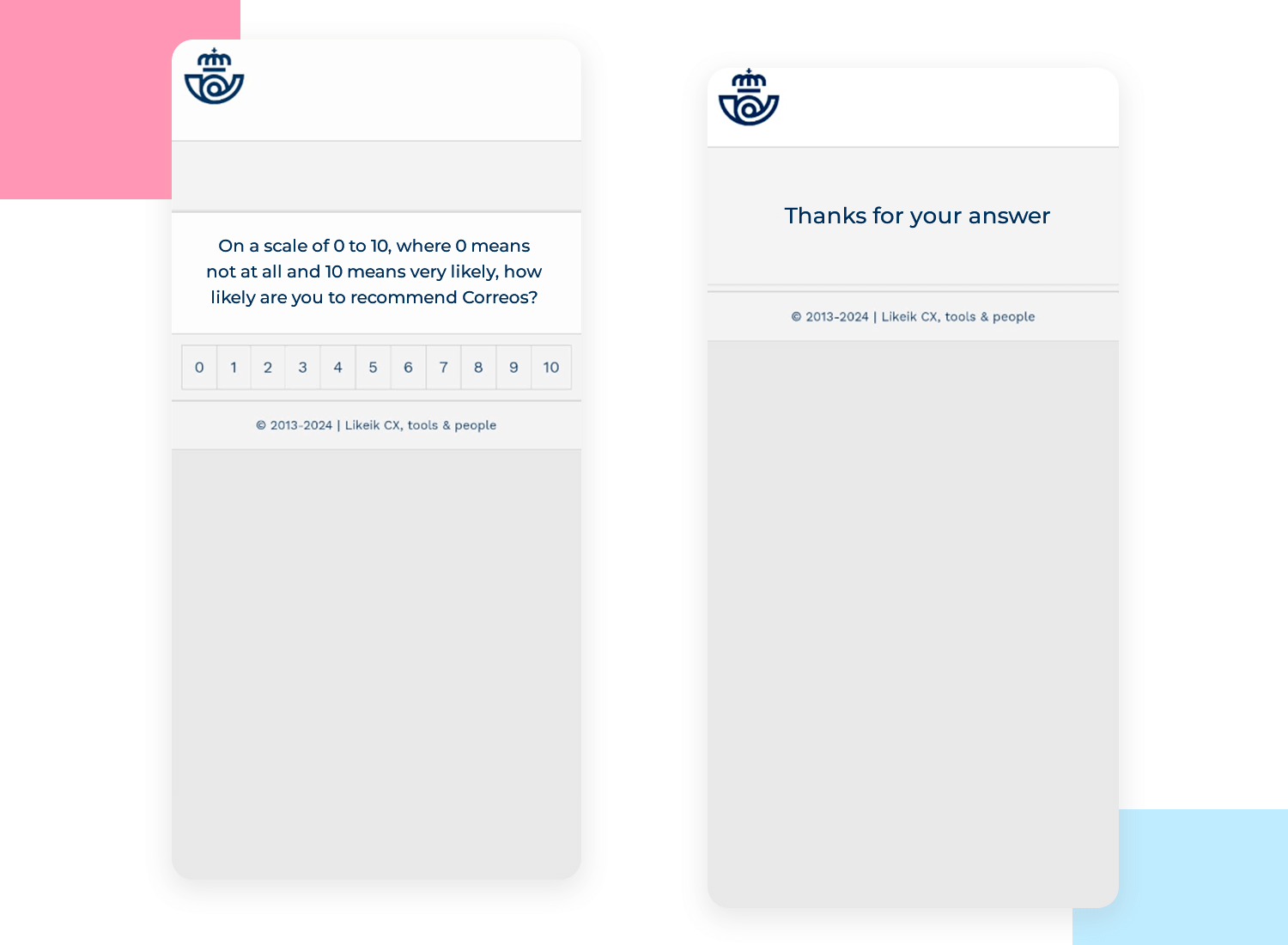
Here’s a simple app survey design from Correos, Spain’s national postal service. It asks users to rate how likely they are to recommend Correos to others on a scale from 0 to 10. This straightforward design makes it quick and easy for users to give their feedback, which helps Correos understand customer satisfaction and find areas to improve.
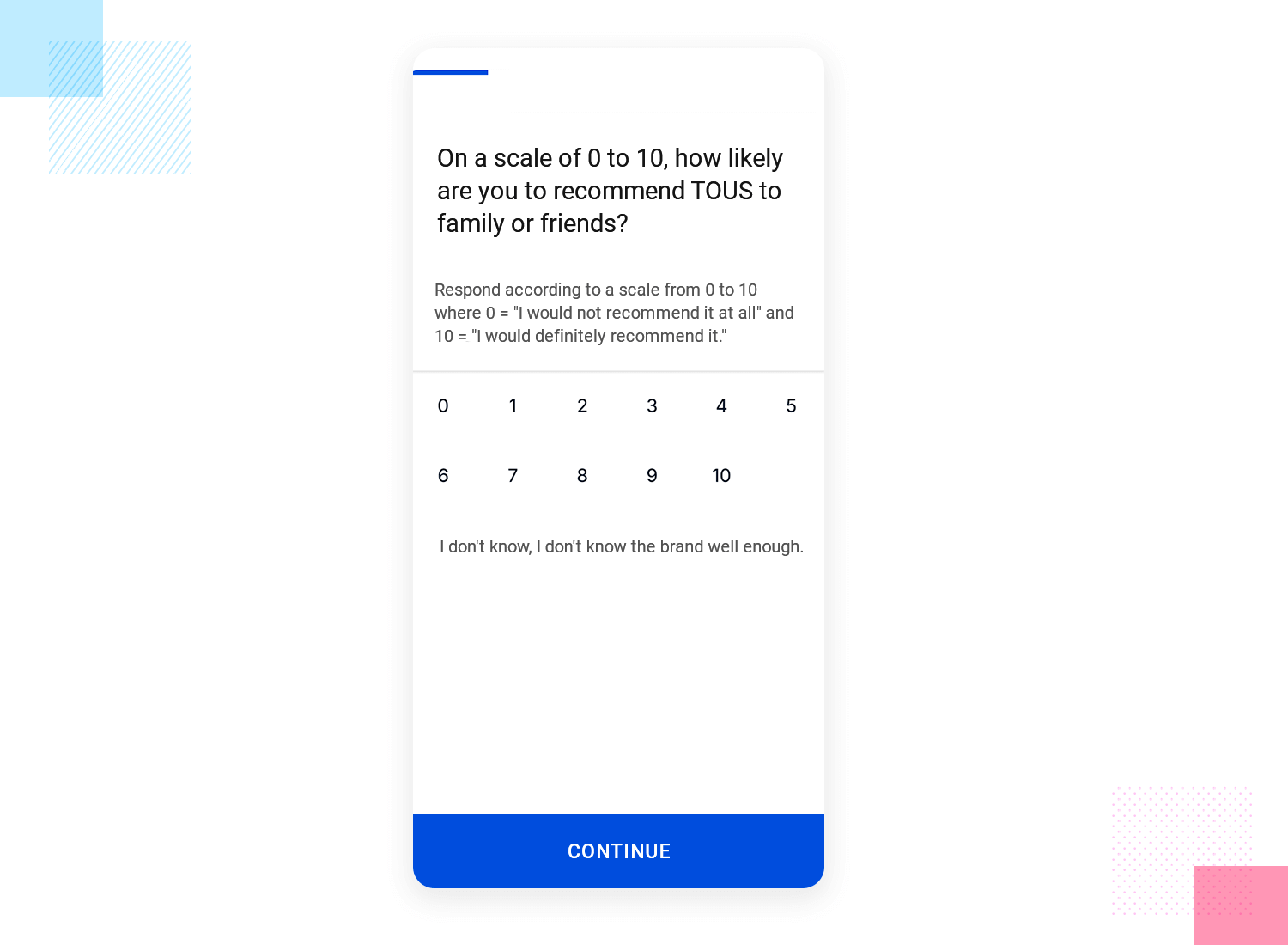
In this survey UI design from TOUS, customers are asked how likely they are to recommend the brand to friends or family. Users rate their likelihood on a scale from 0 to 10, with clear instructions for what each number means. This straightforward and simple design helps TOUS quickly gather feedback to understand customer satisfaction and identify areas for improvement.
Let’s look at the next example from Leroy Merlin. This survey design is all about simplicity. It asks if you know about their online purchase and in-store pickup service. The design is clean, with bright green buttons for easy answers.
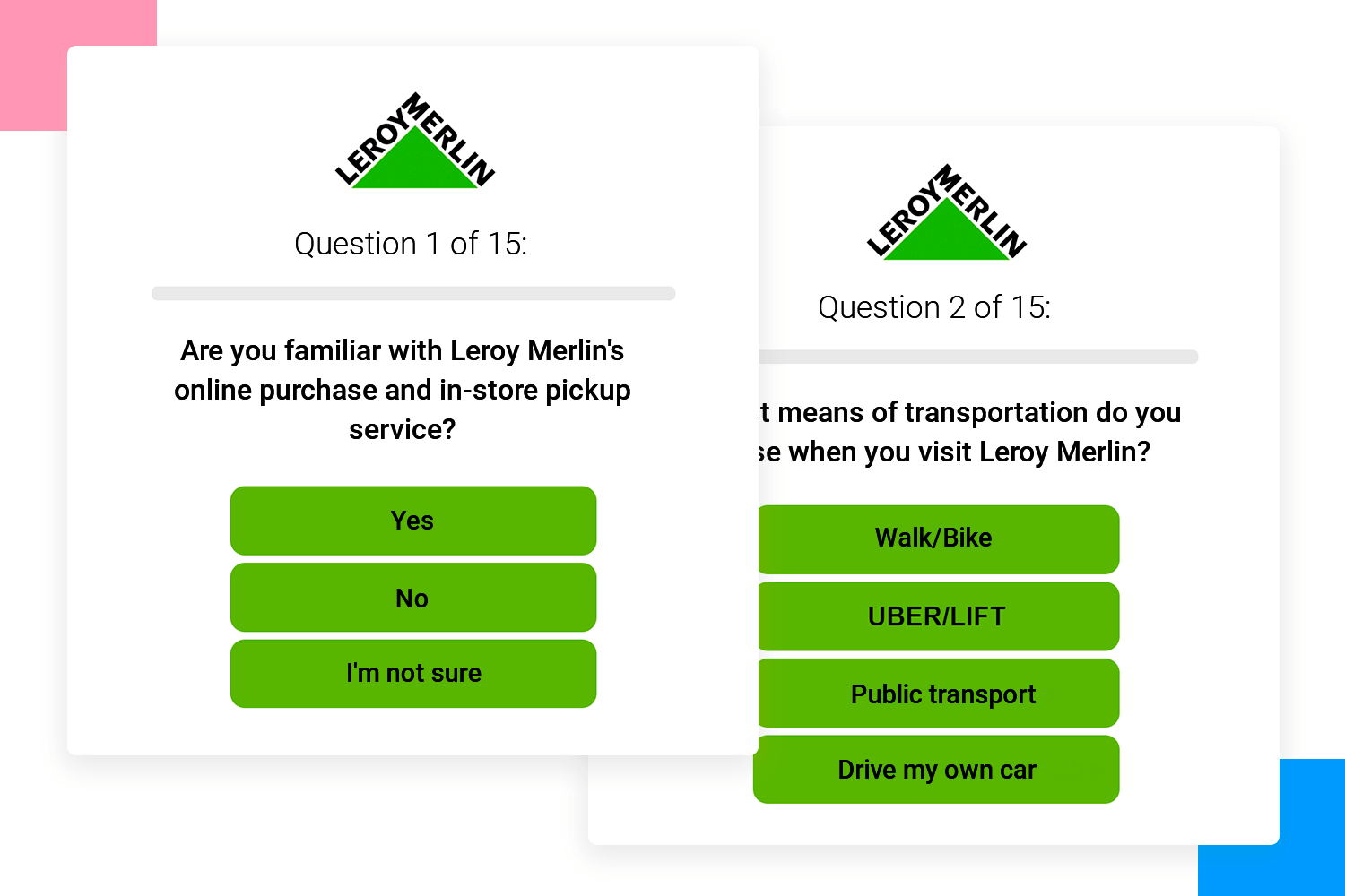
This method quickly captures how well customers know their services and can help Leroy Merlin improve how they communicate this option. It’s a straightforward and effective way to gather useful feedback.
Design awesome surveys that users will love to answer

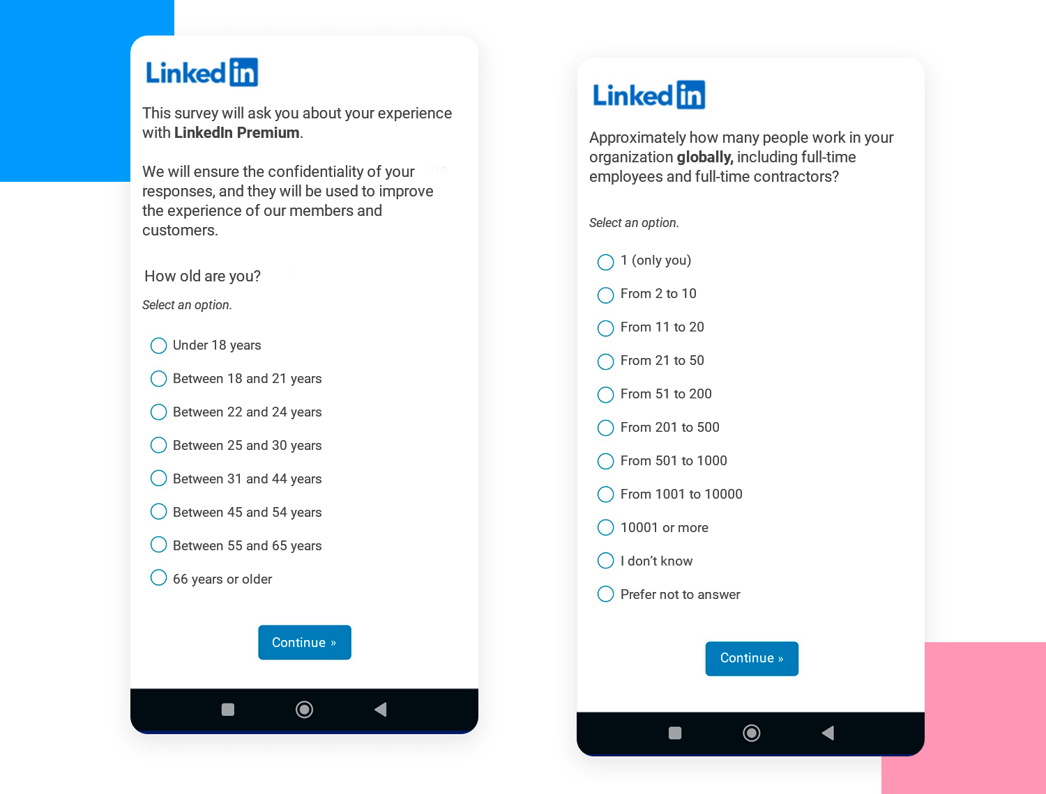
LinkedIn Premium makes this survey UI design interesting. It asks about your LinkedIn Premium experience and promises to keep your answers private. The first question is about your age, helping LinkedIn know more about their users.
The survey is simple and easy to use, making it quick to give feedback. This helps LinkedIn make their service better based on what users think.
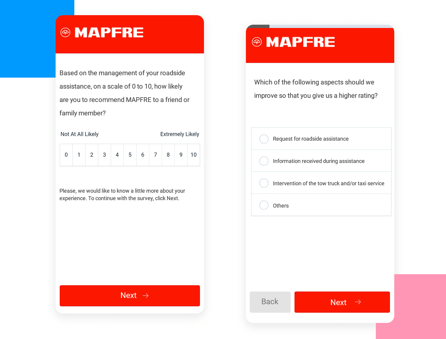
Mapfre’s UI design survey about their roadside assistance service is a great example of keeping things simple. It asks you to rate how likely you are to recommend their service on a scale from 0 to 10.
This makes it super easy for customers to share their thoughts. The layout is clear, and the big “Next” button helps guide you through the process quickly. This design ensures that even if you’re in a hurry, you can still provide your feedback without any fuss.
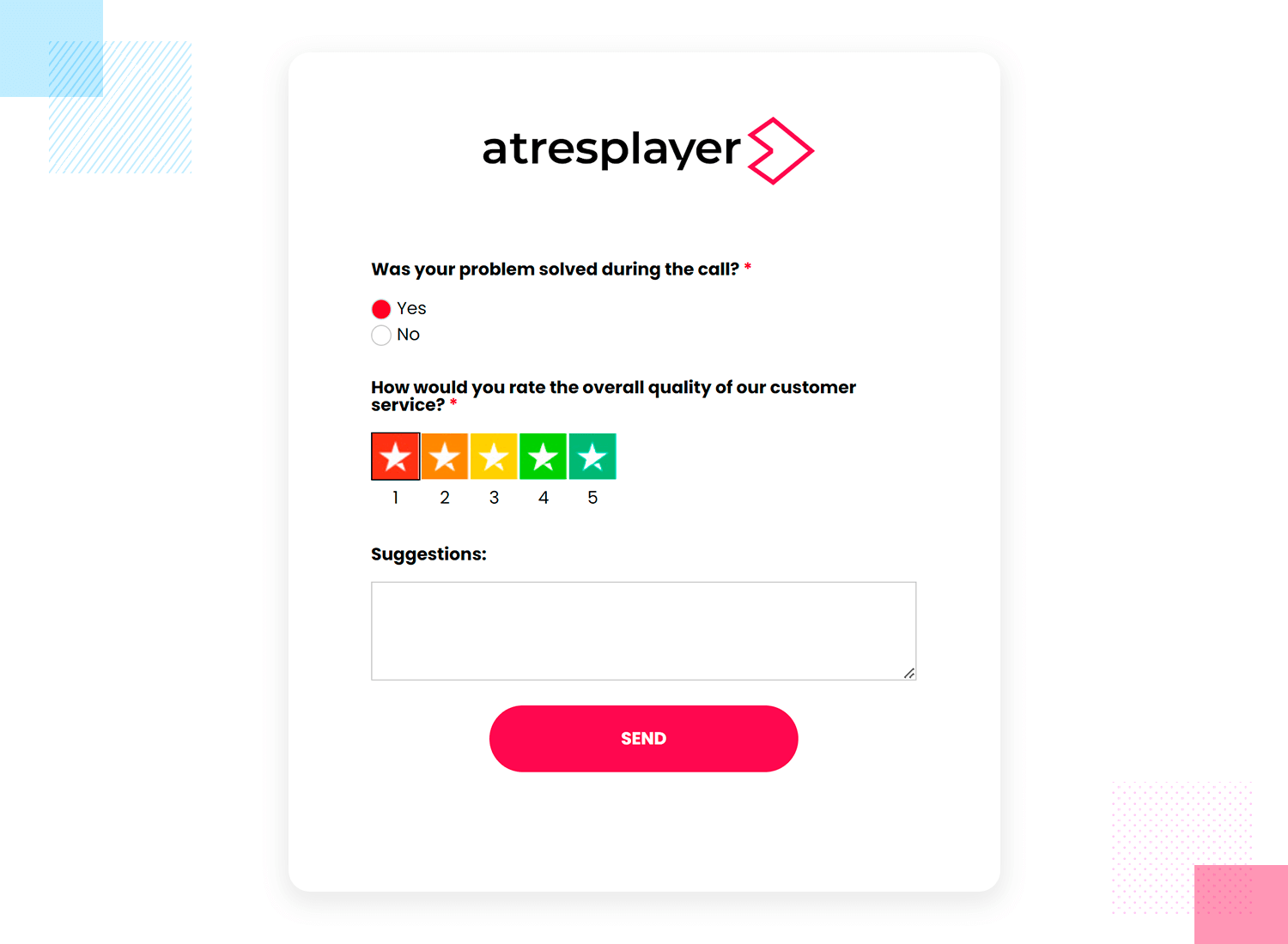
Let’s talk about the survey UI design from Atresplayer. Simple and to the point, they simply ask if your problem got fixed during the call – just a yes or no. Then, you rate their service quality with some colorful stars from 1 to 5, like giving a quick thumbs up or thumbs down.
Finally, there’s a spot for any suggestions you might have. The whole thing is quick and feels easy, just like chatting with a friend about your experience. It’s a really user-friendly way to get feedback.
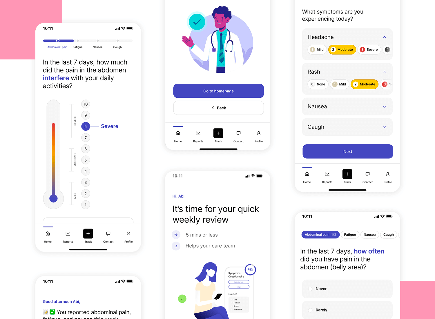
Here’s another interesting survey UI design from Dribbble, called “Forms, forms, forms” by Nicolas Solerieu. This design stands out because it’s really clean and easy to use. It makes filling out forms simple and quick. There are progress indicators and clear questions, which help users know how far along they are and keep them engaged.
This kind of thoughtful design is great for making sure people finish the surveys and give their feedback.
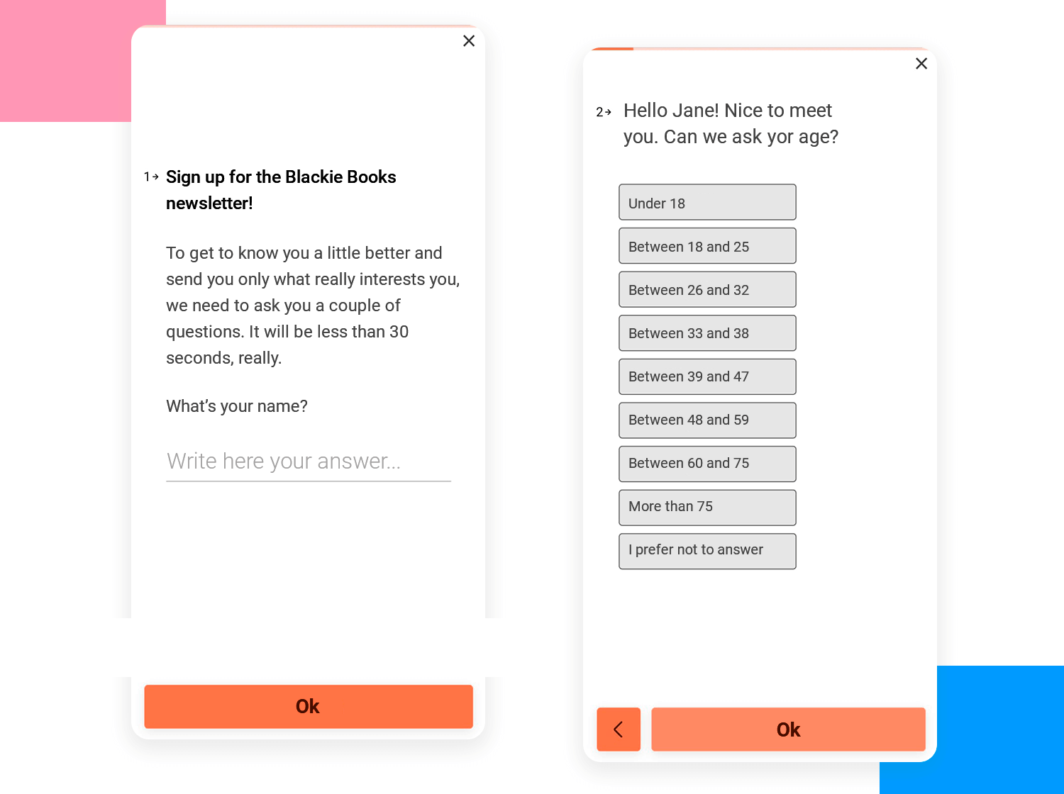
This example from Blackie Books is a great way to encourage user engagement. It’s not just about signing up for a newsletter; it’s about creating a connection. The form asks for your name, promising it will take less than 30 seconds to complete.
The straightforward design and friendly tone make the process feel quick and personal. It’s a smart approach to making users feel valued right from the start.
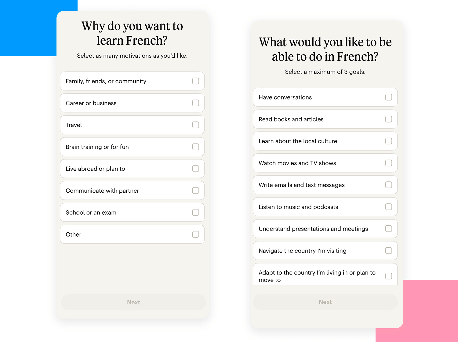
The next example of a UI design survey is from Babbel. Here, the survey design is all about understanding the specific goals of its users. It’s straightforward and user-friendly, asking users to select up to three goals they have for learning French.
Options include having conversations, reading books and articles, learning about the local culture, and more. This method helps Babbel tailor its content to meet the diverse needs of its users, ensuring a more personalized learning experience. It’s a great way for Babbel to make sure they provide the most relevant resources to their learners.
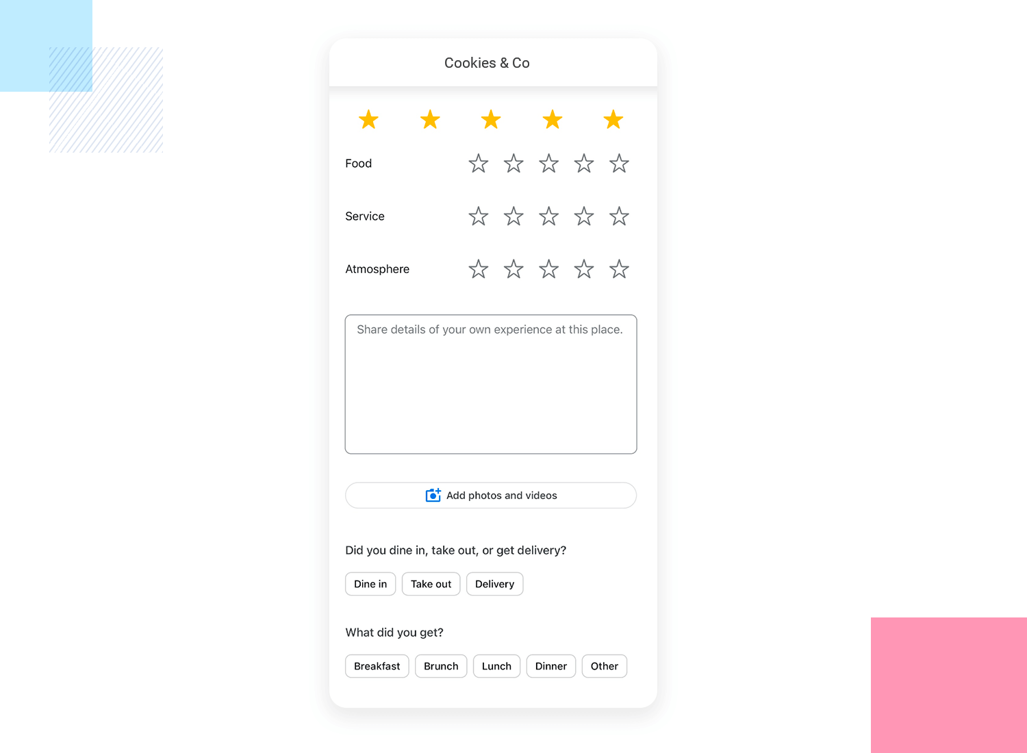
This survey example from Google Maps makes it really easy for users to give feedback on their dining experiences. It’s direct, asking about food, service, and atmosphere with star ratings.
There’s also a space to add comments, and options to specify if you dined in, took out, or got delivery, plus what meal you had. This design is super intuitive and lets users quickly share detailed feedback. Google Maps can then use this info to help others make better dining choices.
This is the last survey UI design example, and it comes from Dribbble. This is one of the best survey examples of how to get detailed feedback. It asks about the food, service, and atmosphere in a clear way. You can even share your experience with photos or videos. This helps businesses understand exactly what you liked and what they can improve. Plus, it’s easy to fill out and looks nice.
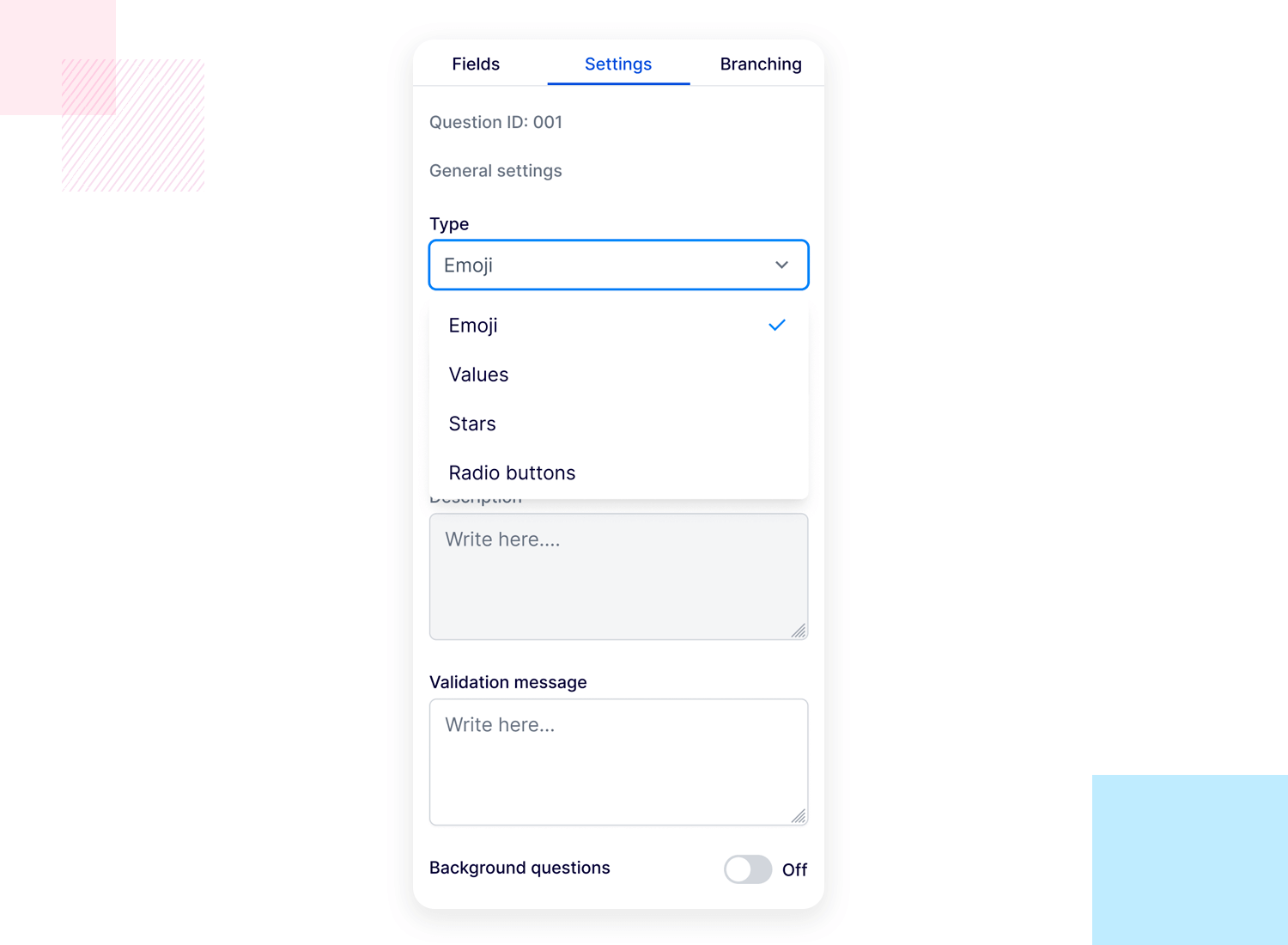
After exploring various survey examples and how they are designed, you might be wondering how to create your own surveys. Whether you’re looking to gather customer feedback, conduct research, or improve your services, the right tools can make a big difference.
Let’s check some of the best tools available for creating and managing surveys.
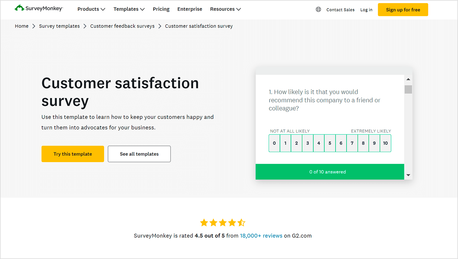
SurveyMonkey is a great tool; it has many templates you can pick from, making survey creation a breeze. It’s perfect for businesses of all sizes because it offers strong analytics to better understand the collected data. For an in-depth look, check out this SurveyMonkey study.
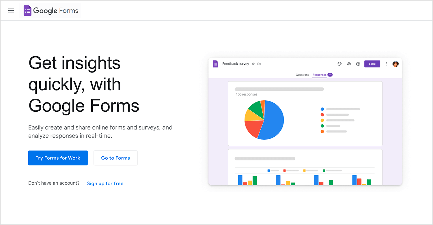
Next up is Google Forms, which is completely free and integrates seamlessly with other Google apps. It’s perfect for quick surveys, whether for personal use, small businesses, or educational purposes. Sharing and collecting responses is hassle-free, making it a popular choice.
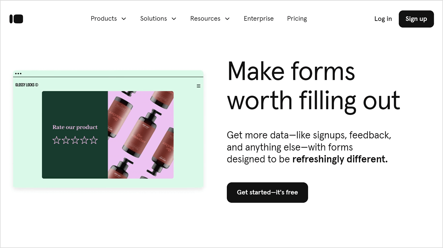
Typeform stands out with its engaging and interactive survey designs. It makes them feel more like a conversation, which can keep people more engaged and willing to complete the survey. This is a top pick for businesses wanting to make a strong impression.
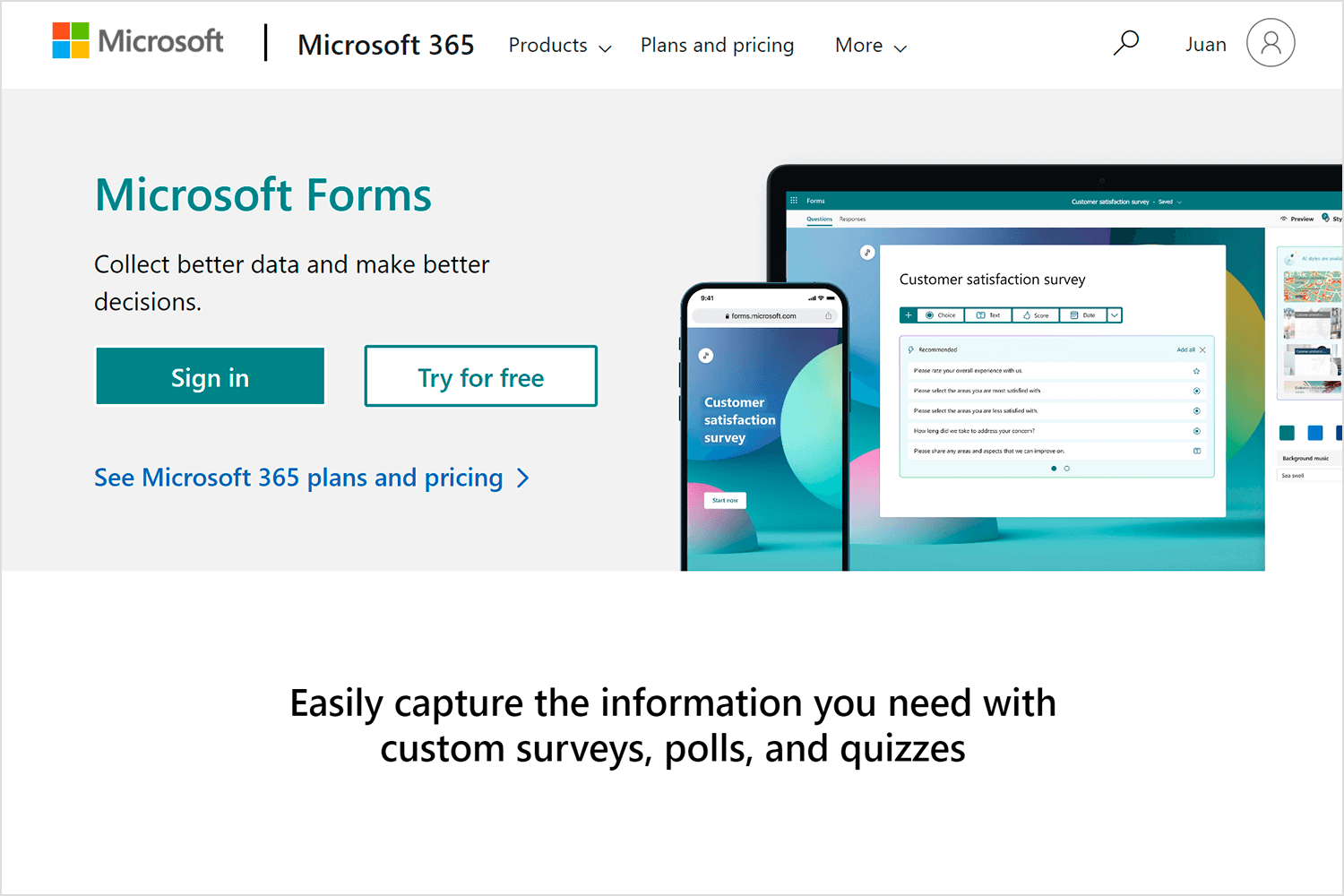
For those who are already using Microsoft products, Microsoft Forms is an excellent choice. It integrates perfectly with Microsoft 365, making it easy to create surveys and collaborate on them within your team. It’s straightforward and effective for internal feedback.
Zoho Survey is fantastic if you’re already using Zoho CRM and other Zoho apps. It’s highly customizable and integrates smoothly with other Zoho products, making data transfer easy and enhancing overall functionality.
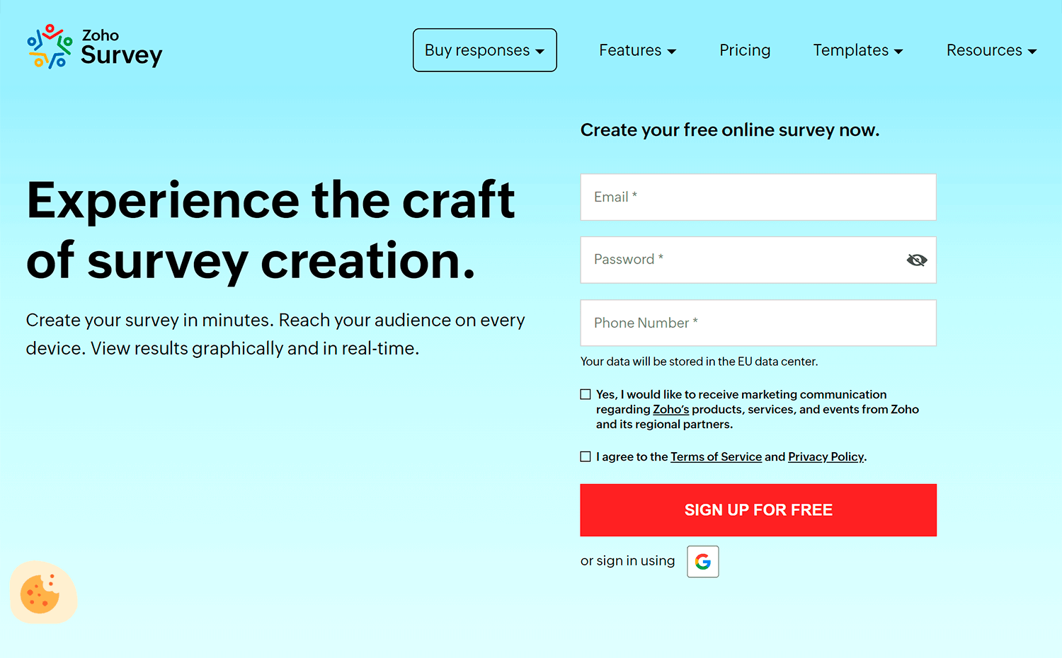
Plus, its user-friendly interface and powerful analytics tools simplify the creation of insightful surveys. Zoho Survey makes sure you get the most out of your data while keeping everything in one cohesive ecosystem.
Design awesome surveys that users will love to answer

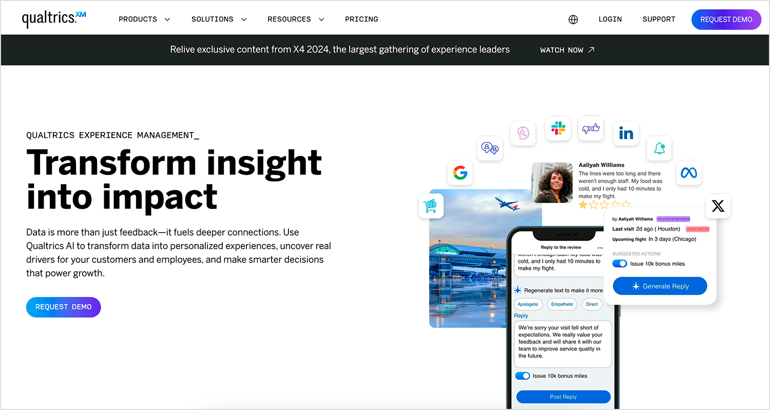
For advanced survey needs, Qualtrics is the way to go. It’s widely used by large businesses and academic researchers because of its powerful features and in-depth analytics. It’s perfect for handling complex surveys and detailed data analysis.
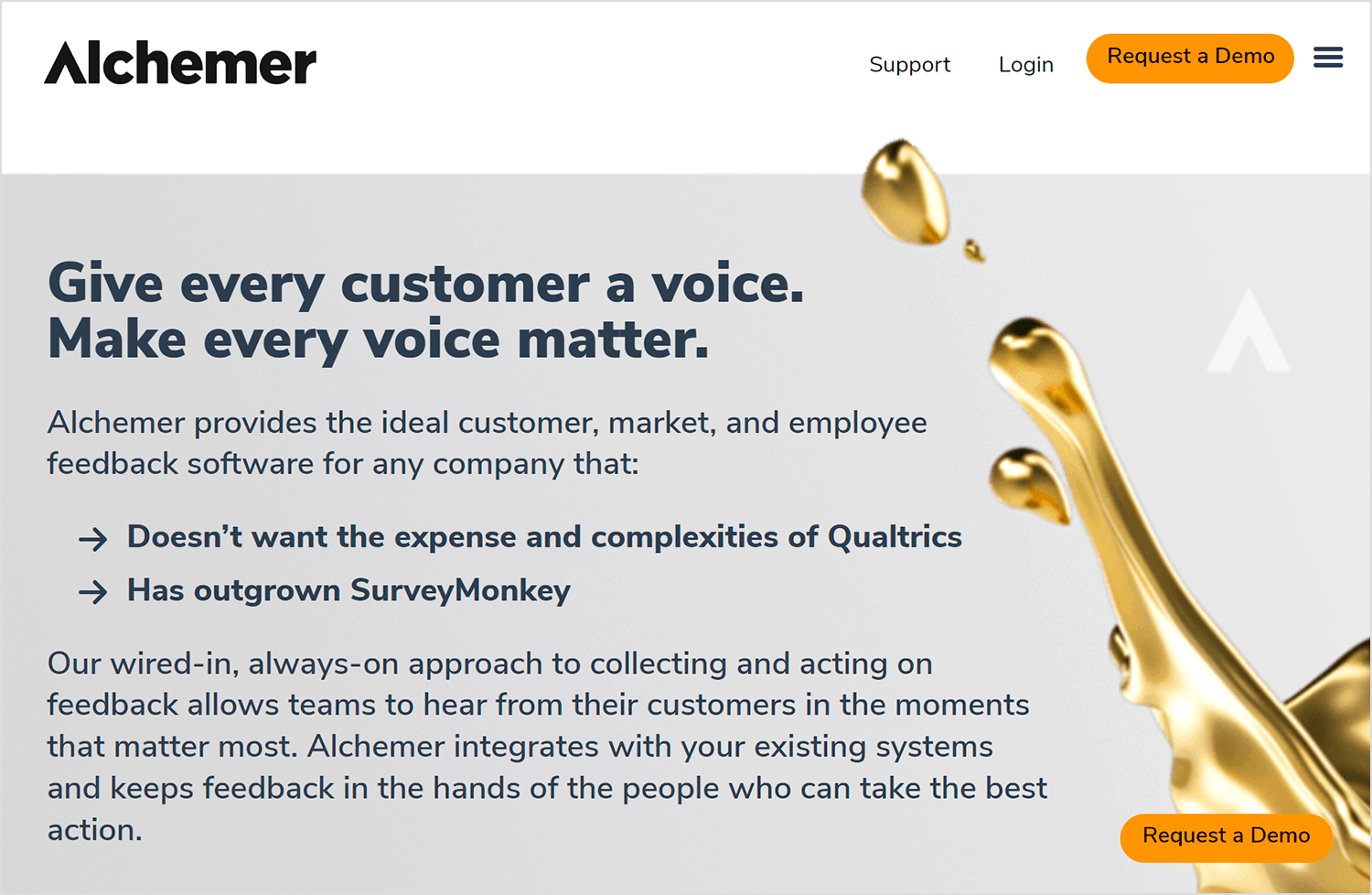
Alchemer offers extensive customization and powerful features. It’s backed by excellent customer support, making it ideal for businesses needing deep customization and advanced functionalities.
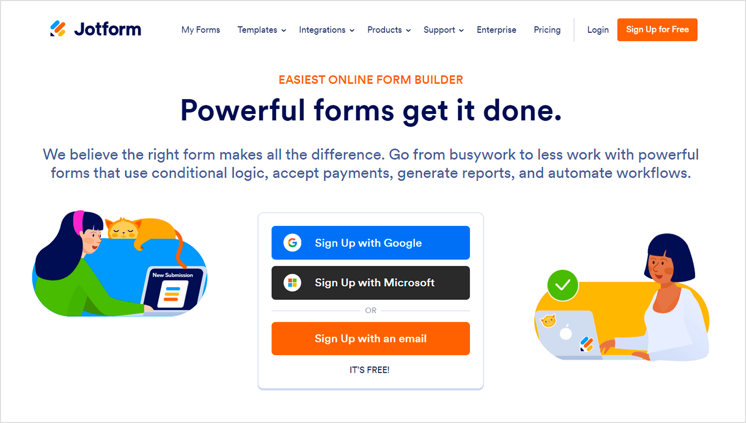
JotForm is very user-friendly, with a drag-and-drop interface and numerous templates. It ensures surveys are mobile-friendly, which is great for small businesses and nonprofits looking for an effective survey tool without a steep learning curve.
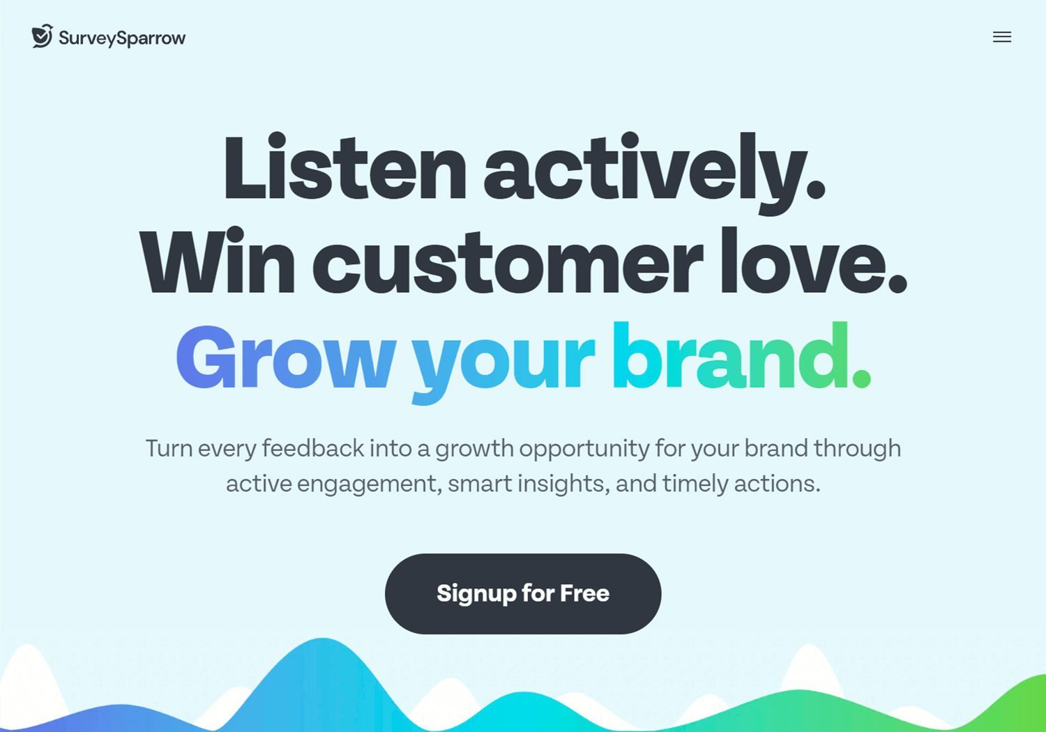
SurveySparrow makes surveys more engaging with its conversational format, boosting response rates. It integrates well with various tools and supports recurring surveys, which is perfect for businesses aiming to enhance participation.
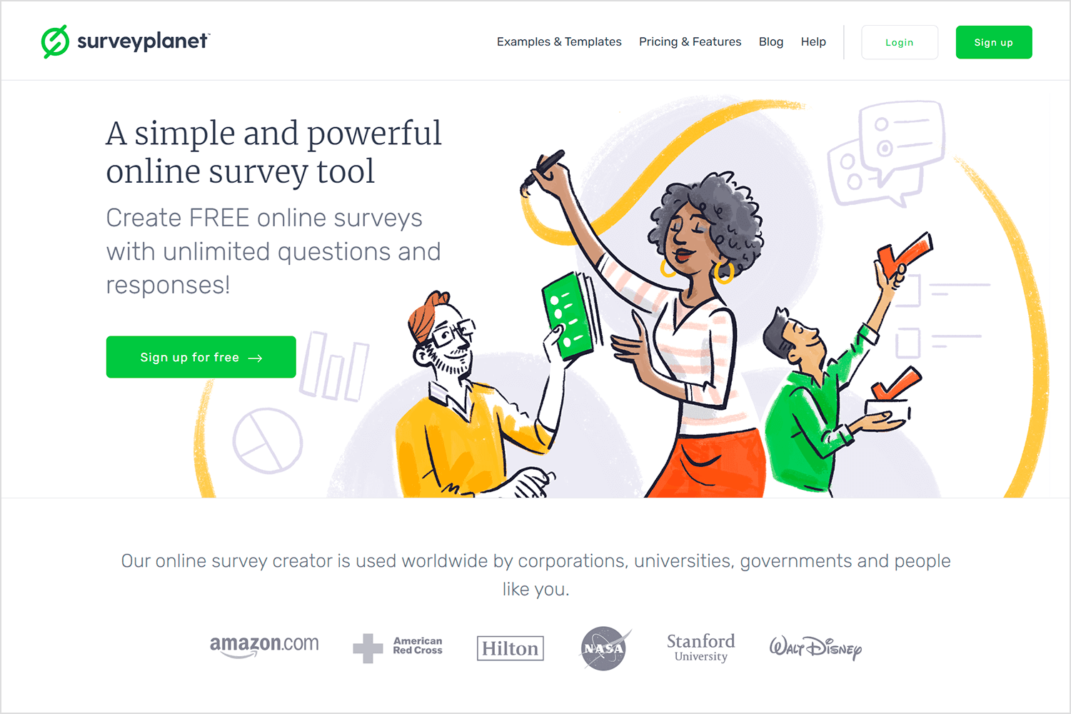
Lastly, SurveyPlanet is great for basic survey needs. Its free version allows for unlimited surveys and responses, making it particularly useful for educators and small businesses. The simple interface ensures anyone can create surveys easily.
These tools have unique features for different needs, so you can easily find the right one for your survey creation and management.
PROTOTYPE · COMMUNICATE · VALIDATE
ALL-IN-ONE PROTOTYPING TOOL FOR WEB AND MOBILE APPS
Related Content
 We see dropdown menus everywhere. But what makes a good dropdown? What changes when designing for mobile screens? We got the full run-through for you!13 min Read
 UI design examples that bring some serious inspiration. From parallex scrolling to delicate animations - this list has it all to get you inspired!8 min Read
 We created a list of the top UI design principles that capture some of the most interesting faces of digital design. Check them out!10 min Read
