We got together with Taron, PM at Yelp, to talk about how his team manages to deliver the same experience on such a large scale - all while keeping their flexibility.
Yelp is a massive review forum which has helped both people and businesses since 2004 and has taken off since then. Today, Yelp is publicly traded and has reached over 170 million users – across 32 different countries.
While it was originally a review-only platform, it has since expanded to offer users a variety of services. Aside from reviewing that cool new pizza joint a few blocks down the street, you can now book manicures, spa days, order food to your house or even book hotel rooms.
All this expansion sure is impressive, but it illustrates a major challenge to any diverse platform: how do you ensure consistency when you’re that big? How can Yelp make sure that users will go through the same experience when reviewing a restaurant as when searching for the perfect hotel room?
We were super excited to get together with Taron Ghazaryan, Product Manager at Yelp, to hear all about how his team dealt with this challenge – and what he’s learned from the journey. As it so happens, Yelp had the tough task of establishing a system that offered both consistency and flexibility. Let’s dive into Taron’s inspiring class on UX design at a large scale.
In SF with Yelp’s Product Designer!!!
Posted by Justinmind Prototyping Tool on Wednesday, 25 April 2018
Being such a large company, Yelp employs over 300 engineers and about 25 designers. These same employees need to work in perfect harmony if they hope to deliver the same style so as to offer a consistent experience to all users – as Taron told us, that requires planning as well as some trial and error.
The design system has two main audiences, Taron tells us:
- Users: Yelp consumers who need the experience to be predictable across all services and platforms
- Employees: designers and engineers who need to the ability to design and build efficiently
Taron points out that even though Yelp has about 170 million visitors on a monthly basis, their design team consists of only 25 people. That creates a large ratio of designers to everyone else, making the need for efficiency something they can’t overlook. But what about their goals? We know the design system is meant for two audiences but the real purpose of the system touches several aspects of design.
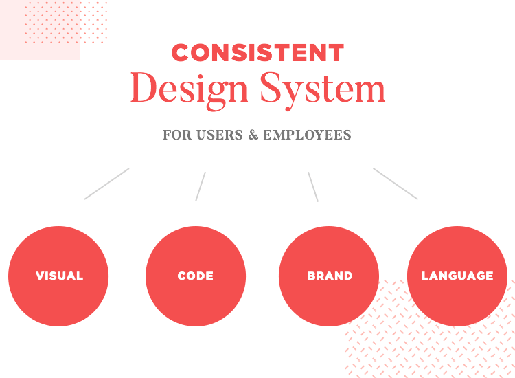
To define what the design system needed to deliver, the team found that the very definition of consistency needed work. Are we dealing with a consistency in visual elements, such as UI components? Yes. Is that all we need? No.
Taron defines that the design system helped Yelp deliver a standard product because it unified 4 different aspects of the platform into one single space, for everyone:
- Visual
- Code
- Brand
- Language
The only way to deliver real consistency, even with such diverse services, is by making sure all 4 factors are in agreement – and within reach. Taron walks us through the realization that a design system was a necessary building block of Yelp.
In the presentation, Taron shared with the audience the look and feel of the original Yelp website, from way back in 2004. By then, the platform had a completely different idea of how people wanted to find recommendations – it relied on asking the user’s friends for their opinion.
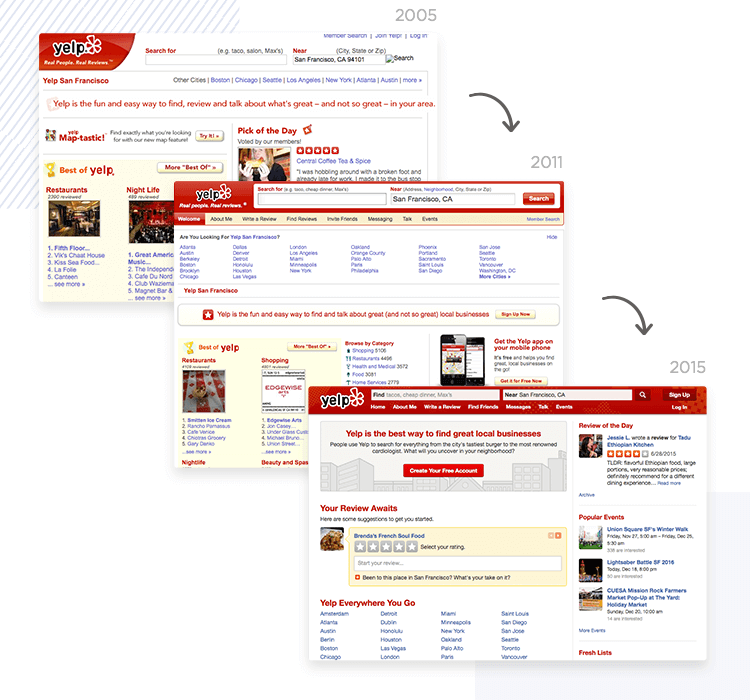
In contrast, we see the second edition of the platform, in which there’s a change in the philosophy behind the service. No more asking your friends for reviews but placing an emphasis on the searching and reviewing of places – by everyone, for everyone. Upon realizing this key change in concept, the need for a change in design became evident.
This is the moment that things clicked. On trying to scale the new design for the website, Yelp’s team came to a crucial conclusion that would shape the company’s future: the need to design for a system as opposed to design for a single page. To plan for the whole, and not just the individual parts of the website.
The classic trait of consistent UX design. This is what most of us think of when confronted with the concept of design consistency and that of a design system. It’s vital that these elements are all in the same spot, properly organized along with all the variations necessary.
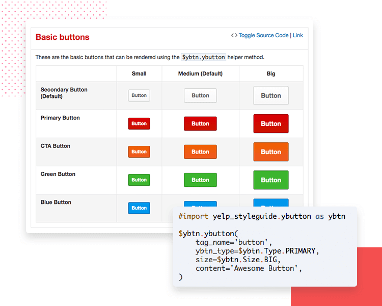
For example, a button may have several variations both in size and color – which is fine, as responsive design and different operating systems will have different requirements. It is important, however, that each variation is properly cataloged and used in the right situation.
“Visual consistency is the glue that holds it all together.”
Taron Ghazaryan - Product Manager at Yelp
Aside from the classic UI components such as buttons, icons and typography, Taron shared with us that even the basic layout of Yelp pages is in the system. The bare bones of different pages are there so designers can jump straight into the more flexible part of the design process, where they have more margin to get really creative.
The cool thing about this design system concept is that the more simple elements in it are used as building blocks for more complex elements, which can also be stored in the system for further use.
Taron makes an interesting point on visual consistency: it can’t stand alone. It needs to be accompanied by an equally consistent code. Yelp discovered this hard truth when trying to update a few buttons across the platforms, and finding that the code corrupted the visuals.
To gain a bit of perspective on why this turned into a problem, consider the fact that Yelp has over 100 buttons and button variations for iOS alone. Fixing each of them individually didn’t seem like a good use of people’s time or effort.
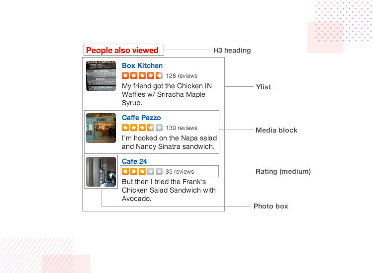
The team came to realize that their original assessment on visual consistency wasn’t wrong – it simply wasn’t the entire picture. Something needed to be done not just to fix the original button issue they uncovered, but to ensure that the entire platform delivered consistency on both sides.
And so, the actual code that accompanies each visual element also became a part of the design system – one system to rule them all, if you will.
The brand identity is another key part of why many platforms choose to invest in a design system. It refers to those crucial UI elements or component behaviour that can become closely associated with the brand.
Taron gives us the classic example of Facebook’s like button, which can be found on other platforms but does have a closer association to Facebook than any of the other ones. For Yelp, the most important branding element is the star rating scale.
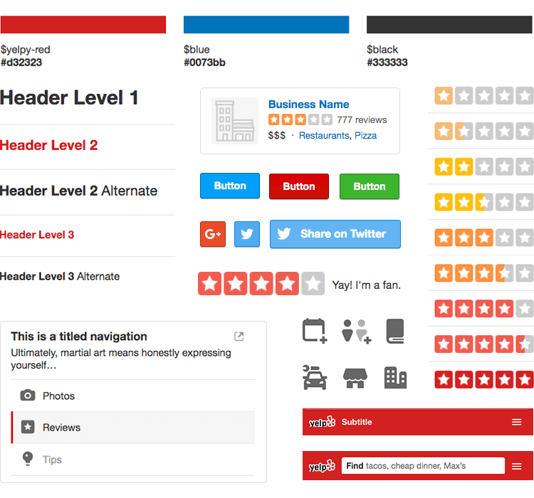
Taron’s team created a UI library with all the icons, knowing that those linked to branding were given special care and thought. This library made Taron’s team confront another challenge that haunts many design teams out in the world: the much feared developer handoff.
The designer-developer handoff is known by all and feared by many. And it’s for a good reason, as Taron explains: when sending off components such as icons, the exchange of hands can be awkward. Emails pile up faster than any of us is ready to admit, and a platform such as Slack can only go so far when keeping components organized.
Their solution was to rethink the whole concept of handoff. From Taron’s point of view, the very idea that designers must create a product only to have developers create that very same product using code – is effectively the same work being done twice. So what’s the alternative?
In Yelp’s workflow, designers create an item such as an icon; and, instead of sending that icon to developers in any way, all designers are instructed to place this icon into a repository. The repository itself then generates all the required variations of that icon according to the pre-established rules, and is stored in an organized file system.
Once the icon and all its variations are properly stored in the repository, it becomes accessible to everyone, including developers. There is no margin for anything to get lost, to diverge from the established style, or the need to be redone. In fact, one could argue this system eliminates the actual handoff.
While this handoff aspect wasn’t included as its own key factor in the design system, it is important and it touches on all previous 3 factors. The last factor, however, can be slightly trickier to deal with – and it’s more about the people who use the system rather than the system itself.
Last but not least: actual human language. The reason why this is a part of the puzzle is for the human factor – people can be more difficult than computers! Just when Taron’s team thought that everything had been figured out, they noticed something amiss.
Even though they had managed to get all the necessary material into one place, they found that their workflow was still not as efficient as it needed to be. Turns out, the reason was that even though both engineers and designers had everything they needed, they would often not be able to find the item they wanted within the repository.
Vocabulary, it seemed, differed too much from one person to the other.
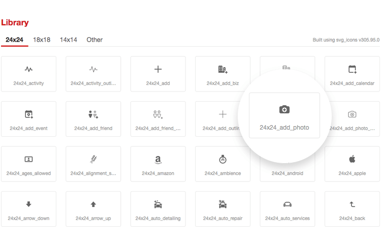
Upon searching the repository for what they needed and not finding it, people just assumed the item didn’t exist. The result was that both designers and engineers did the same work repeatedly, unaware that everything was already at their disposal – at the cost of the efficiency of the entire workflow.
Since several people had different ways of referring to the same item, cataloging the items in the repository became a real challenge. Unifying the language of everyone in the Yelp team seemed like an even bigger challenge. Taron’s team came to identify the only way they could overcome this particular bump in the road: effective communication across the entire team.
Taron does a great job of illustrating how communication plays a key part in UX design at Yelp. He gives the example of how, originally, code bases for web, iOS and android were all kept separate from their visual counterparts . Not only that but, in the absence of a better system, the team had to manually care for the consistency between the visuals in Sketch and the actual coding.
The result was, of course, that there were inconsistencies in the Yelp platform across those different systems. Keeping consistency in check for 10 icons? Walk in the park. But once we start talking about hundreds and hundreds of items, the whole thing becomes a complex issue.
Getting everything in one platform was the right move. Yelp’s team decided to go even further and create a platform where teams could not only store the code or items – but actually carry out tests and experiments.
The great thing about it was that everyone could see and participate in the experiments – which in itself is a win for communication in the department. People could also check to see any changes made last minute or identify the latest version of a particular design. Confusion was cut by a considerable margin.
This platform they created, the actual system, is an open-source resource that uses SWIFT code and can be accessed by all. This new system was meant to go by the name of “Ally” – but Taron’s team wasn’t all too excited for that. They wisely chose “Salsa”, to the delight of our audience during the presentation.
Salsa became Yelp’s tool for exporting iOS components to Sketch. You can find a nice overview of the tool on the Yelp Engineer Blog.
Taron also touched on the fact that precisely due to its public nature, this open resource might represent a liability to the company. After all, by putting all this information out there they did make it that much easier for the Yelp platform and design to be copied. But Taron had an interesting counter argument: the recruitment factor.
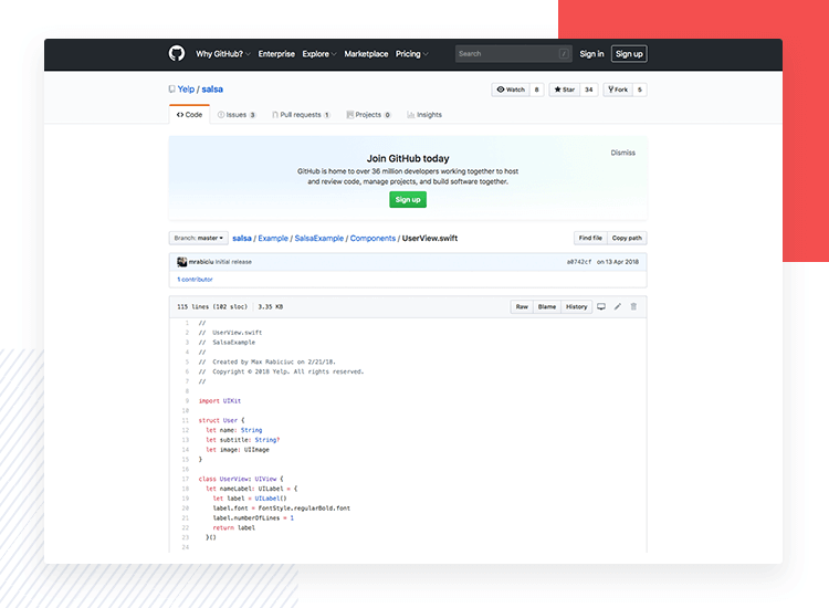
By putting all this exciting material out there, Yelp effectively attracts people who are hungry for that type of excitement. Engineers and developers who share a real passion for this design or show particular talent will explore this resource and actively contribute to its improvement – aside from expressing interest in becoming a part of the team.
According to Taron, it’s all about finding the right balance. Putting all this out there does come with its risks but it pales in comparison to what they stand to gain. With that said, he does recognize that in the future, some changes might be made as to what is allowed to the public and what becomes internal material.
No system is perfect. In truth, no one is ever done perfecting they way they do things. Taron is aware that they’ve come a long way, but that the journey towards true efficiency continues.
Yelp knows where it wants to go. The company wants to get to a place where no work needs to be done twice. Ideally, developers and engineers shouldn’t have to build things after they’ve been designed. Ideally, they ought to be a part of the entire design process, present and active from the start.
Engineers are encouraged to come forward and voice questions as opposed to assuming what designers want from a wireframe or mockup. It’s a recurrent problem that engineers will feel the need to create items and components from scratch so they match exactly what they thought designers wanted.
Yelp is a wonderful example of how planning and careful implementation can have a huge impact on results!
With all the trouble the design team went through, they managed to achieve a level of efficiency and consistency in their product that would have otherwise been impossible. Perhaps even more impressive is the fact that they achieved their goal while still maintaining the flexibility they need to operate.
We all loved Taron’s presentation and it’s safe to say we’ve learned the real importance of getting everyone – and everything – on the same page.
PROTOTYPE · COMMUNICATE · VALIDATE
ALL-IN-ONE PROTOTYPING TOOL FOR DESIGN SYSTEMS
Related Content
 Microcopy may be mini, but it can have a macro impact on user experience. Check out these 15 examples and start writing great UX microcopy16 min Read
 UX design has changed all of our lives forever - but what does it entail, exactly? What do designers do to create incredible products? Read on and find out!15 min Read
 Progressive disclosure is about helping users get invested before getting to the nitty gritty. Read this post to discover a new way to approach complex features!8 min Read


