Progressive disclosure is about building user engagement step by step, introducing complexity only when it’s needed. It’s a smart, user-focused way to tackle complex features. Let’s explore how it works!
Every user wants a product that helps them achieve their goals and complete tasks efficiently. They crave a sense of control, the freedom to navigate and make choices up to a point. Too much freedom, however, can quickly turn overwhelming. The paradox of choice reminds us that more isn’t always better; sometimes, simplicity is the key to a great experience.
Design and prototype progressive disclosure for web and mobile

That’s why progressive disclosure is such a trusted tool in design, it acknowledges that throwing too much at users all at once doesn’t work. It’s overwhelming, frustrating, and not the kind of experience anyone wants to create. By breaking things down and introducing information step by step, users can explore at their own pace, making the journey feel intuitive and rewarding.
Starting with a well-thought-out wireframe can help designers visualize and refine how progressive disclosure unfolds in their product. But how do you bring this approach to life in your designs? Let’s dig into it.
In the UX design world, it’s no secret that users want power. Not only the power to do what they need to do, but to do it in their own way. At the same time, users crave simplicity and clarity. This balance is especially important in responsive web design, where navigation must remain clean and features intuitive across devices.
All the best products are designed in a way that gives users power but doesn’t burden them with endless options. It’s all about striking that balance and making sure you’re not overwhelming users.
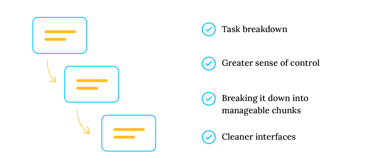
Progressive disclosure ensures simplicity without sacrificing functionality by breaking down tasks and hiding less essential information initially. This approach allows users to engage with features step by step at their own pace. It all started back in the 80s when IBM carried out a study on highly technical specifications. Their conclusion was simple but groundbreaking: hiding complex details until users were ready made all the difference. And so, progressive disclosure was born.
Think about it; nobody wants to be hit with a tidal wave of options and information right off the bat. Progressive disclosure lets users take things one step at a time, keeping interfaces neat and experiences enjoyable. Whether it’s expandable menus or staged settings, it helps people move forward at their own pace, reducing stress and making complex products easier to use.
That said, progressive disclosure isn’t one-size-fits-all. Over the years, designers have found clever ways to tailor it to different needs. One example is staged disclosure, where users are guided through tasks step by step, like following a friendly wizard who makes sure you never feel lost. Let’s take a closer look at how that works.
Another type of progressive disclosure UX is staged disclosure. This is when users are shown a step-by-step guide in a linear fashion. Think of this as a “wizard,” guiding users through tasks like setting up responsive websites or creating a new Justinmind prototype. Staged disclosure is a great way to ensure users stay focused and achieve their goals without unnecessary confusion.
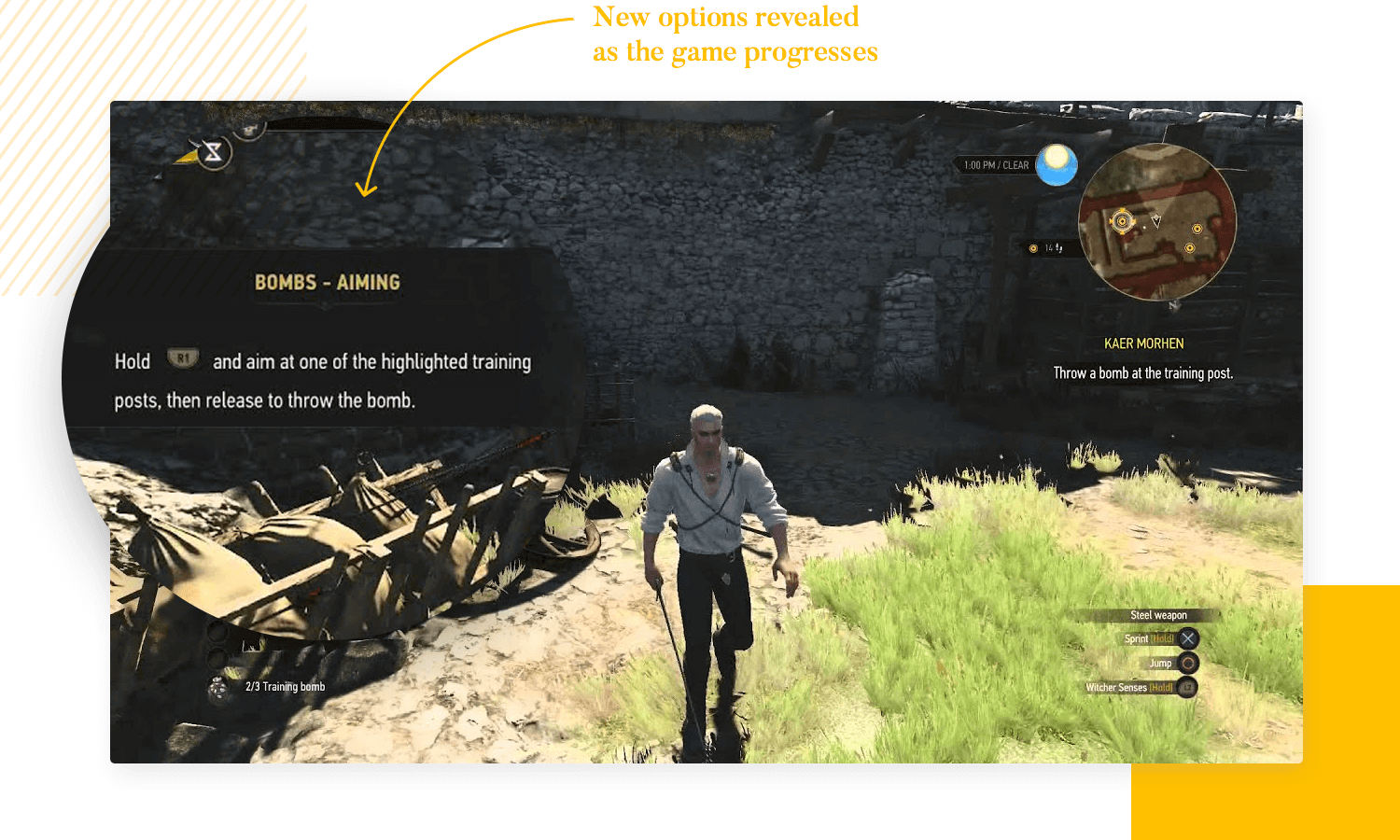
Consider an elaborate video game that places users in a completely new universe. This universe will have its own characteristics, rules and specifics. This goes to show that simply pushing all that information on a user is a recipe for disaster. People would be overwhelmed by so many details, so many things they need to keep in mind – taking away from the gaming experience.
It’s no coincidence that so many of these complex games offer information bit by bit. By disclosing information in a progressive way, we can allow users to become invested in the game before they get to the nitty gritty. This is true not just for elaborate video-games, but all sorts of UX products.
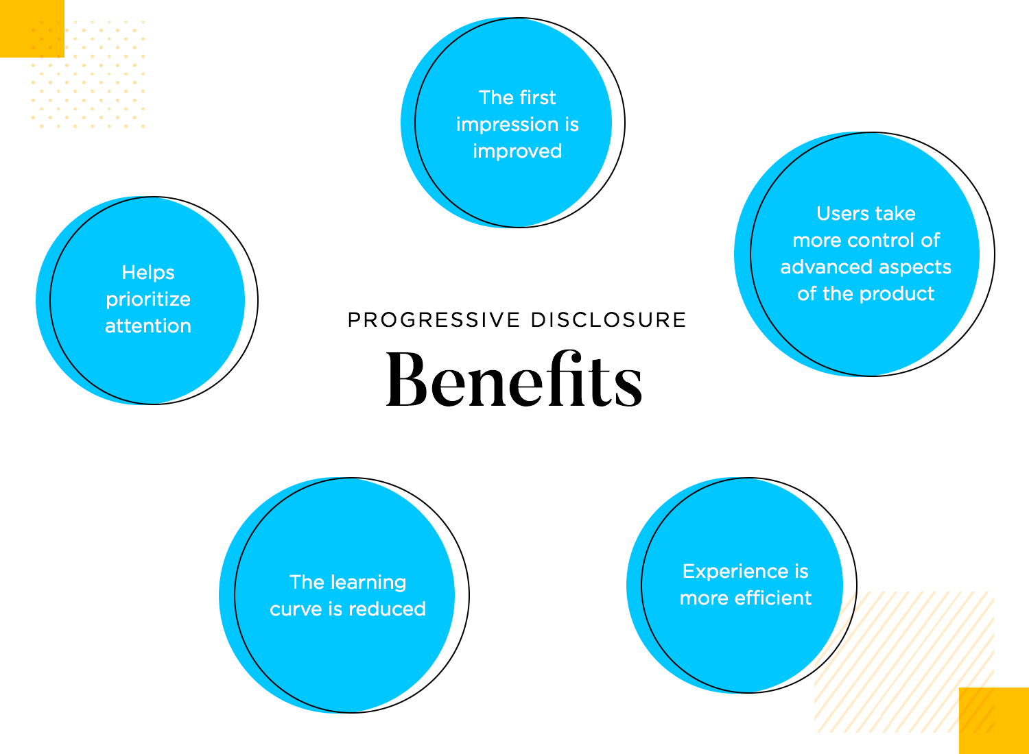
For brand new users, the progressive disclosure as a pattern helps them prioritize their attention. They have enough time to familiarize themselves with the basics of the design before moving on to more elaborate features or tasks. In terms of usability, this makes the entire product easier to explore and improves the learnability.
Progressive disclosure improves the first impression of a design by helping users navigate the learning curve. This approach streamlines the experience, making it more efficient for all users.
Design and prototype progressive disclosure for web and mobile

Progressive disclosure works because it respects the user’s time and attention. By prioritizing information and simplifying interfaces, it creates a user experience that feels intuitive rather than overwhelming. But how does this really work? Let’s break it down:
At its core, progressive disclosure is about showing users what they need when they need it. This means starting with the most essential information and keeping additional details out of sight within reach. A well UI design can make this process smoother, making sure the right information is presented at the right time without overwhelming the user.
For example, in responsive web design, a clean homepage might show key features, while secondary options are tucked away in expandable menus or under “advanced settings.” It’s all about helping users focus on what matters most at the moment.
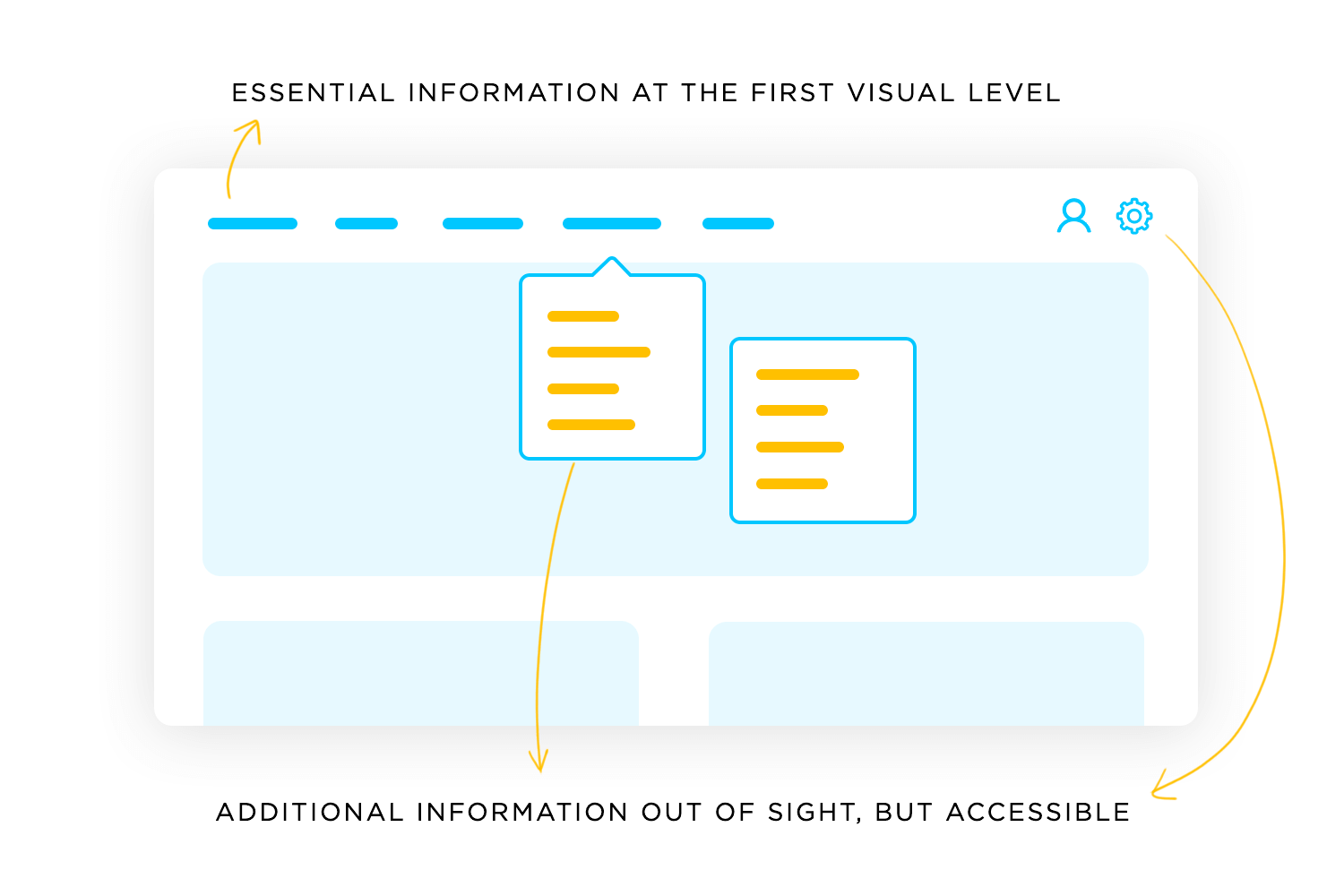
People like to feel in control of their experience. Progressive disclosure allows them to decide when and how they engage with additional information. Whether it’s customizing settings or diving deeper into advanced features, users appreciate having the choice. In responsive websites, this often takes the form of collapsible sections or clearly labeled links that give users flexibility without cluttering the interface.
The best designs don’t make users think too hard. Simplifying the interface ensures that users aren’t bogged down by too many options or irrelevant details. For example, responsive website examples like Duolingo or Noom excel at progressively revealing features in a way that feels natural, keeping the experience light and enjoyable.
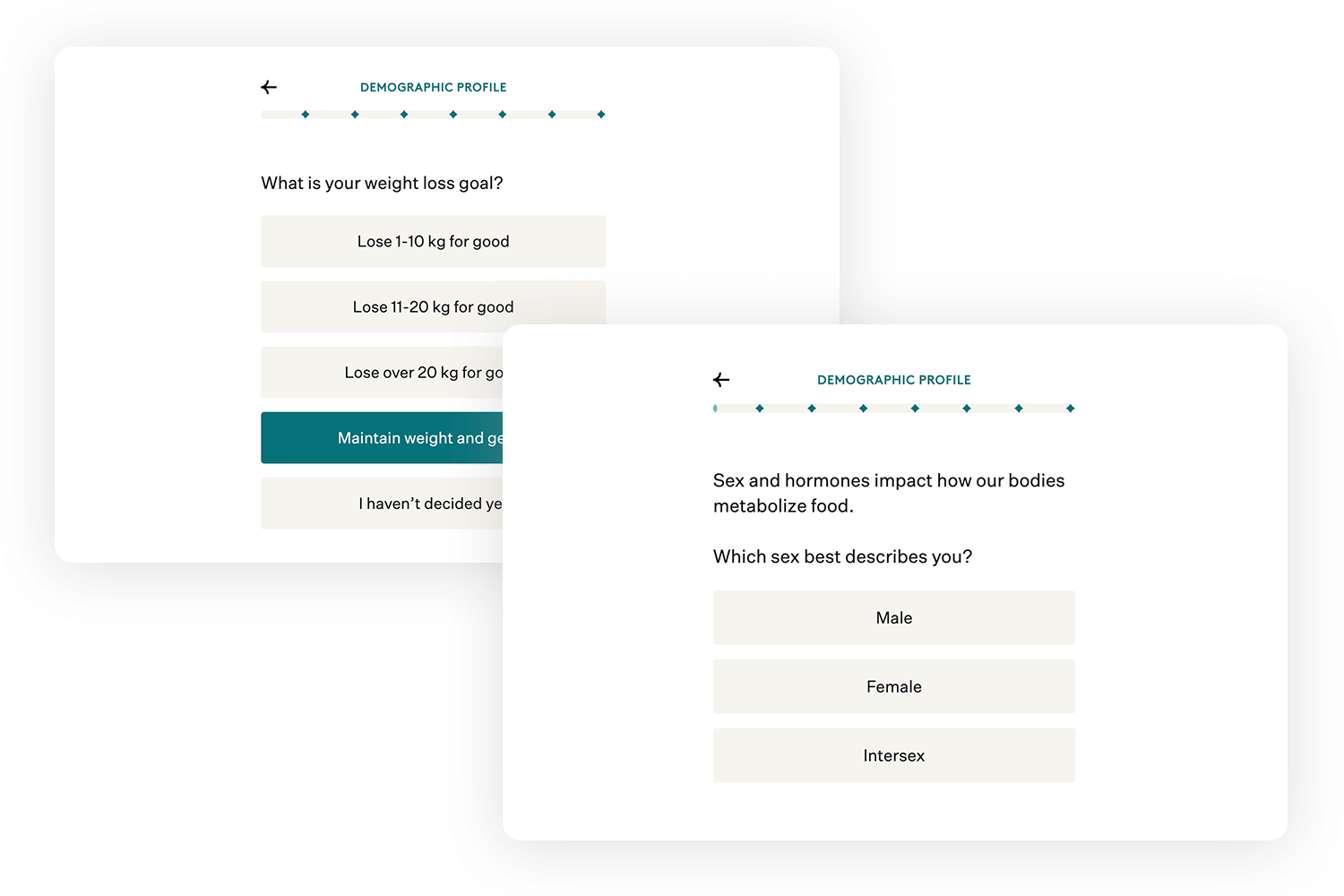
Of course, no approach is perfect, and progressive disclosure comes with its own set of challenges. To make it work, designers must strike the right balance:
- Potential overuse: one common mistake is hiding too much information or making it hard to find. While the goal is to reduce clutter, users shouldn’t have to hunt for important details. If key actions are buried, even the most polished responsive websites can frustrate users.
- User frustration: progressive disclosure requires thoughtful execution. If users can’t easily access the information they’re looking for, they may feel confused or annoyed. For example, advanced settings should be clearly labeled and reachable with minimal effort, not hidden behind multiple clicks or vague labels.
- Balancing user expertise levels: not all users are the same. Some are beginners who need guidance, while others are experts who want quick access to advanced tools. The challenge lies in designing an experience that caters to both groups. Responsive web design examples, like Google Chrome’s advanced settings, achieve this balance by presenting basic features upfront while keeping advanced options just a click away.
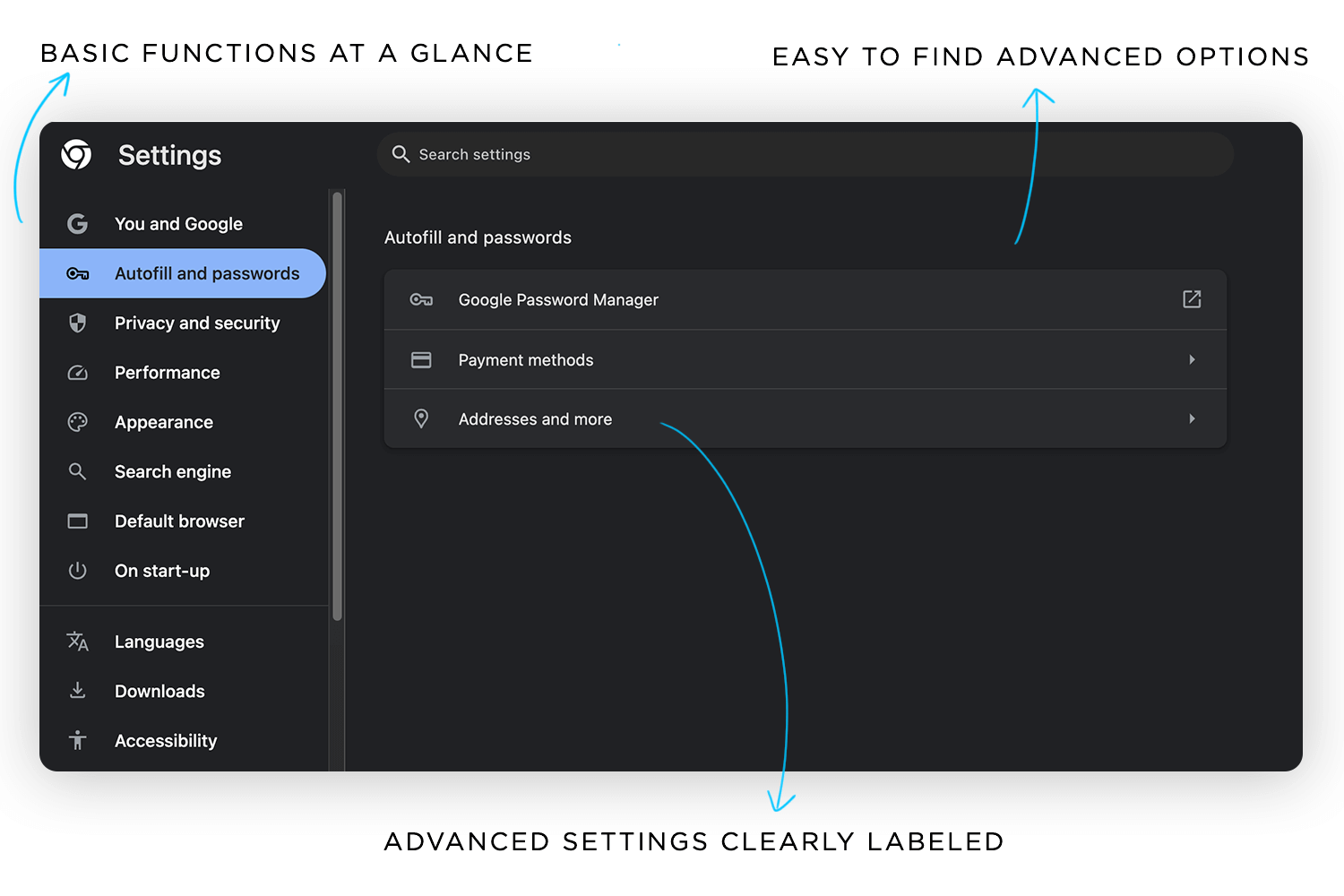
While progressive disclosure offers numerous benefits, it isn’t without its challenges. Striking the right balance is crucial to avoid user frustration or hidden information. Fortunately, there are several types of progressive disclosure that can help designers tailor this approach to meet user needs effectively.
Design and prototype progressive disclosure for web and mobile

Progressive disclosure isn’t a one-size-fits-all solution. Depending on the design and the user’s needs, it can take different forms, each tailored to simplify the experience while keeping users engaged. Let’s explore some of the most common types and how they work.
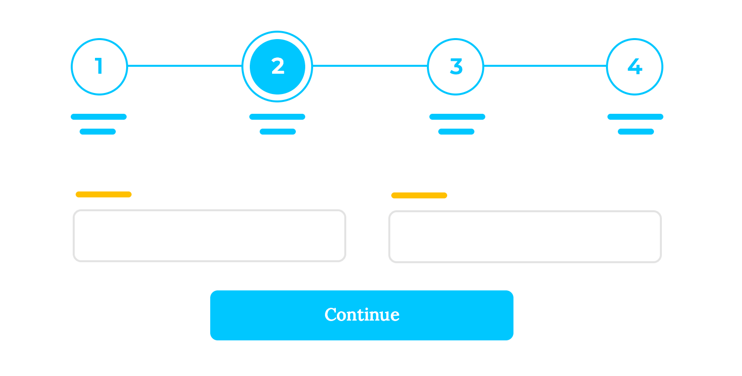
When users face a complex task, breaking it into smaller, manageable steps can make the process less intimidating. Think about wizards or multi-step forms that guide users through one section at a time. For example, when creating a prototype or setting up a profile on a responsive website, users are shown only the current step, with each successive step revealed as they progress. This keeps users focused and prevents overwhelm.
Sometimes, users just need a little extra detail when they want it. Expandable sections, like dropdowns, “read more” links, or accordions, allow users to access additional information without cluttering the interface. This is especially effective in responsive web design, where screen space is limited, and clean layouts are crucial. Think of it as a way to offer more depth without sacrificing simplicity.
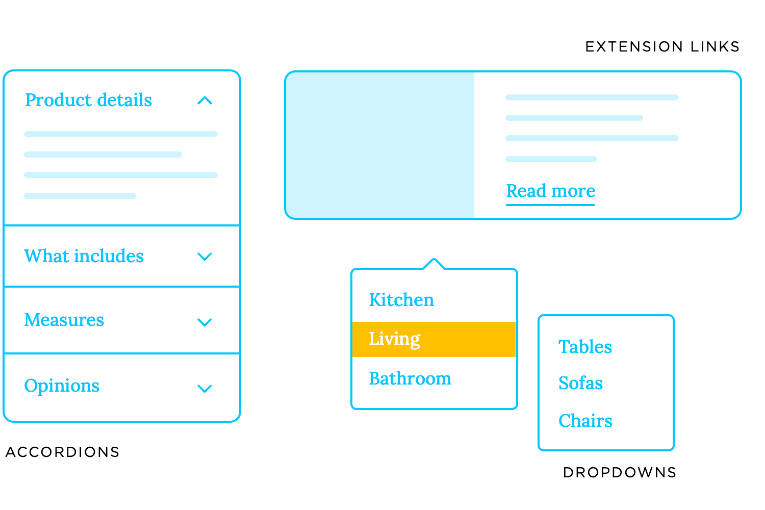
Tooltips and pop-ups that appear on hover or click are great for providing context without crowding the interface. For instance, a pricing table on a responsive website might include an icon next to each feature. When clicked or hovered over, it reveals an explanation, helping users make informed decisions without overwhelming them with text upfront.

Menus that reveal more options as users dig deeper are another classic example of progressive disclosure. Start with top-level categories, and as users explore, they’re shown subcategories or additional layers of options. Some of the best responsive websites use this approach to keep navigation intuitive, ensuring that users can find what they need without being distracted by unnecessary details.
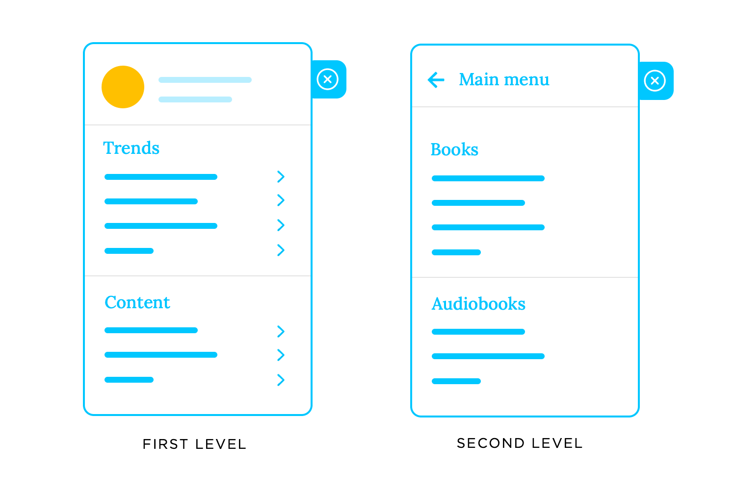
Now that we’ve covered the types of progressive disclosure, let’s see how to design one that truly improves the user experience. It’s not just about hiding information, but about presenting it in a way that feels logical and intuitive, while keeping users in control. A successful responsive web design strikes the perfect balance between simplicity and functionality, guiding users without overwhelming them.
The first step in designing effective progressive disclosure is knowing what’s essential and what can wait. Core features, the ones users need right away, should be front and center. Advanced features, on the other hand, can take a backseat, revealed only when users are ready to dive deeper.
For example, think about responsive websites that cater to both beginners and experts. The primary navigation might highlight basic tools, while advanced customization options are tucked away in a settings menu. This approach ensures new users aren’t intimidated, but power users still have access to everything they need.
How you visually structure information matters just as much as what you choose to show. Clear visual hierarchies, like larger buttons for primary actions or icons that hint at additional options, help guide users naturally through the interface.
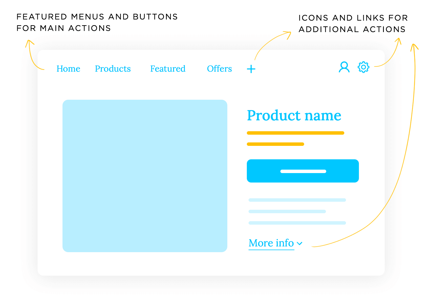
For instance, in responsive web design examples, subtle animations or expanding sections can provide cues without disrupting the flow. A clear dropdown or a “Learn More” button signals to users that there’s more to explore if they’re interested, without demanding their attention upfront.
Progressive disclosure is about simplifying the user’s journey but not at the expense of key functionality. The challenge lies in making sure your interface is approachable without stripping away important features.
Apps like Duolingo or Noom, which we mentioned earlier, continue to be great examples of progressive disclosure done right. Their responsive designs cater to beginners with clean, approachable interfaces, while gradually introducing advanced tools as users become more confident. This balance ensures users can grow with the product without ever feeling overwhelmed or stuck.
Our blog on Justinmind makes great use of progressive disclosure, giving readers a quick preview of each post with short snippets right on the homepage. It’s a way to help you decide if a post is worth your time before you click through, and let’s be honest, who doesn’t appreciate a little guidance?
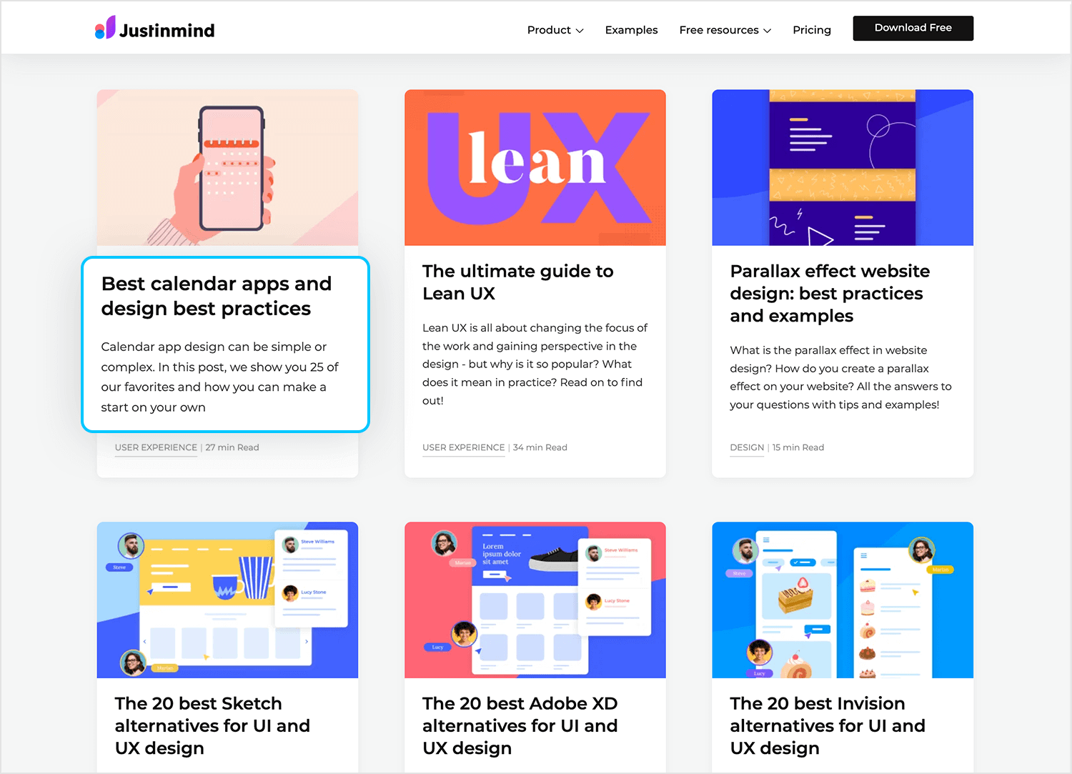
Now, you might wonder, “Why go through the trouble when it’s accessible to click back to the homepage?” It’s not just about convenience; it’s about making sure you find content that really resonates with you. Those previews act as a filter, helping readers connect with what they’re genuinely interested in and creating a better overall experience. That’s the magic of progressive disclosure at work!
ClickRank exemplifies how progressive disclosure can make complex tools more approachable. Its dashboard simplifies the user experience by presenting key metrics, like total clicks, impressions, and CTR, in clean, concise cards. Other details remain accessible but out of sight until needed, making sure the interface feels focused rather than overwhelming.
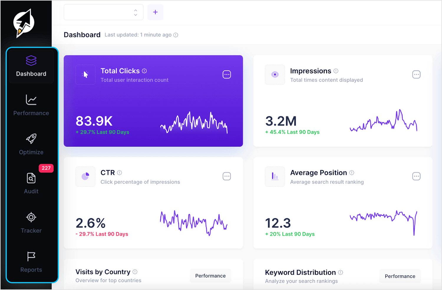
The design’s strength lies in its intuitive navigation. A collapsible sidebar categorizes features logically, letting users explore at their own pace without clutter. Whether viewing performance data or going into deeper optimization insights, the layout adapts to meet the user’s current needs. ClickRank shows how progressive disclosure can turn detailed processes into something clear and easy to handle.
Face Yoga is a great example of step-by-step guidance paired with expandable details to keep the experience intuitive. From the moment users open the app, it feels approachable with no long lists of features or confusing menus. The design stays basic, revealing advanced tools naturally as you continue to explore.
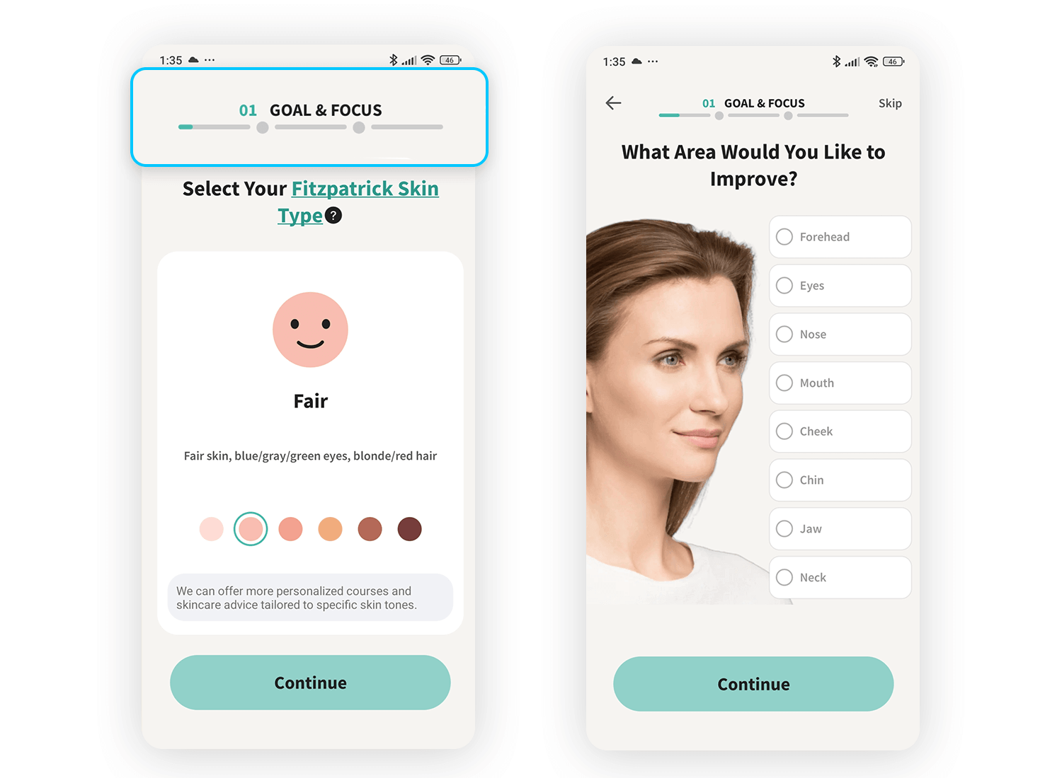
This thoughtful design makes it convenient for users to engage at their own pace, balancing simplicity with functionality which is a hallmark of progressive disclosure.
This design from Total Battle uses click-to-reveal details in such a straightforward way. Instead of overwhelming players with every single bonus or reward at once, it lets them focus on the big picture, like the main offers, and gives them the option to explore the finer details, like rewards and bonuses, only if they’re curious.
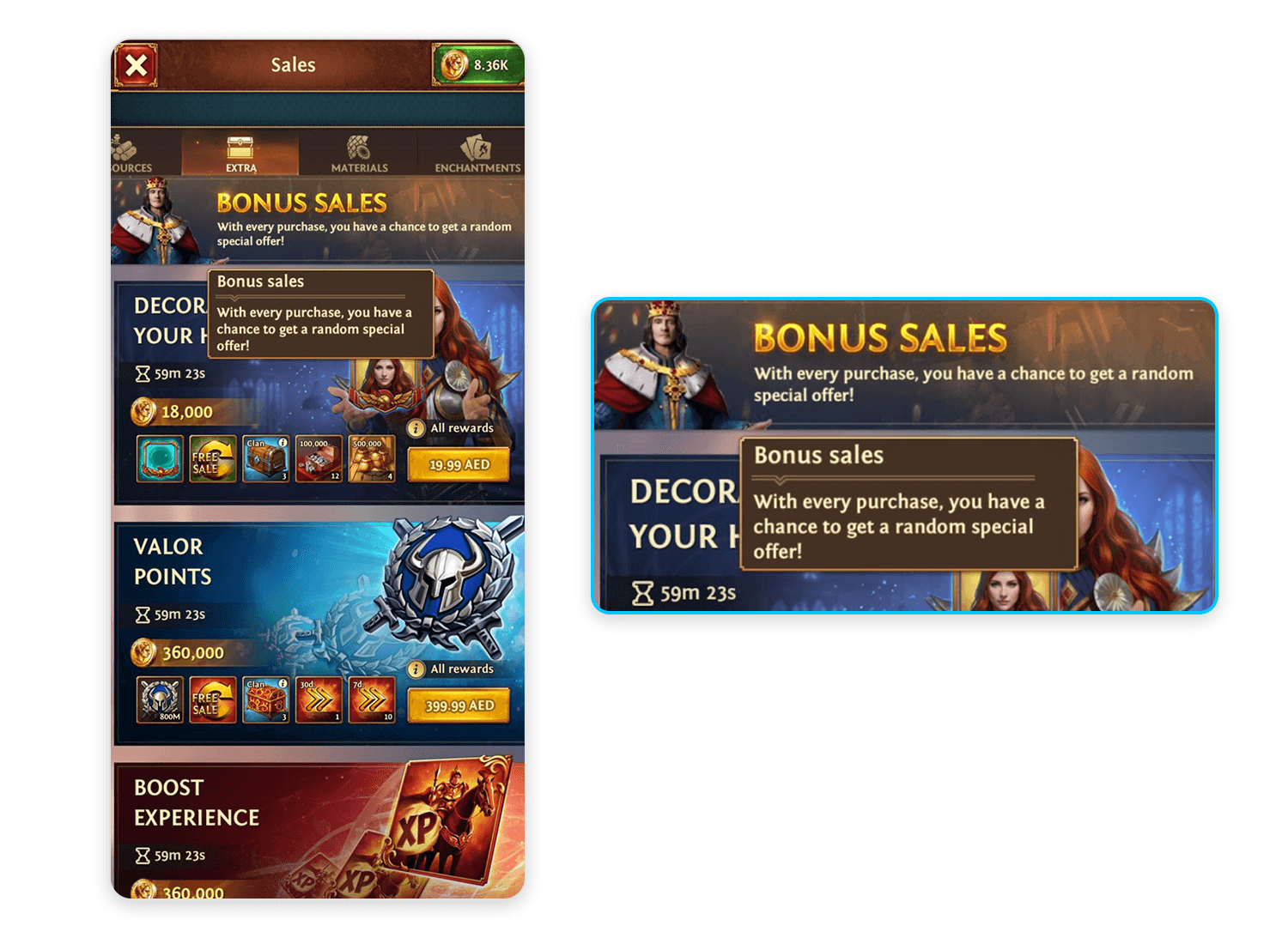
It’s a thoughtful approach that feels intuitive because you’re only diving deeper when you’re ready to. Perfect for a game where there’s already so much to take in!
Here we have another expandable section type of progressive disclosure, and it’s executed perfectly. Amazon’s product pages prioritize the essentials such as product name, images, price, and key options like size and color, right at the top. This helps users quickly find the most important details.
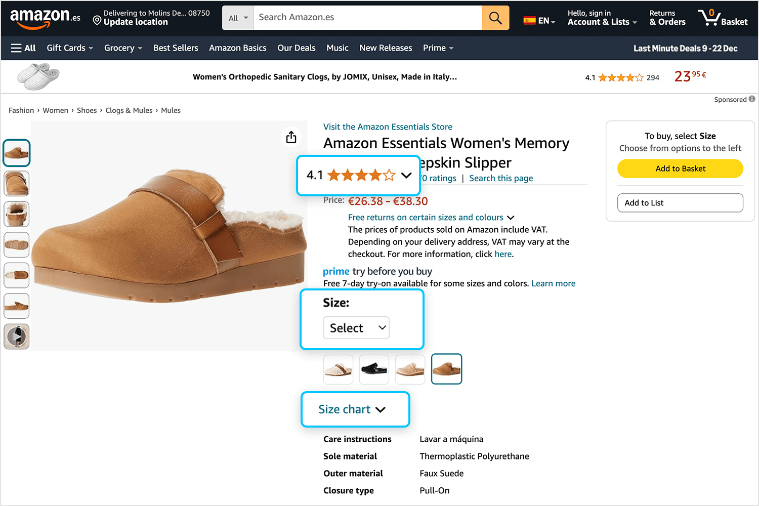
As you scroll down, you find sections offering more in-depth information but only if you want to dive deeper. By organizing content this way, Amazon makes sure the design remains organized and user-friendly while still providing all the details someone might need to make a purchase decision. It’s a smart, scalable design that works for millions of users daily.
On ASOS, finding what you love feels effortless, thanks to progressive disclosure. Their navigation feels less like a search and more like a guided tour. Start in the “Vintage” section, and you’ll see just enough to get oriented. The more you explore, the more you discover, all in a smooth and simple way.
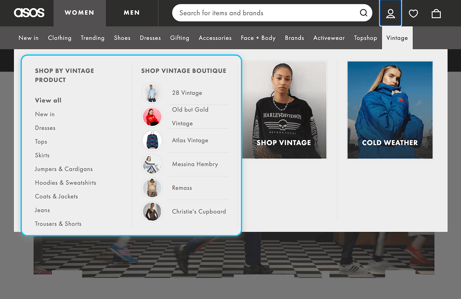
This responsive website design makes shopping feel uncomplicated and enjoyable, letting you explore at your own pace while everything stays clear and straightforward. ASOS really gets how to make browsing a breeze.
This LinkedIn post is a perfect example of click-to-reveal details, a type of progressive disclosure. Long posts are initially truncated, showing only the most engaging part to catch the reader’s attention. If users are intrigued, they can click “See More” to expand and view the full content.
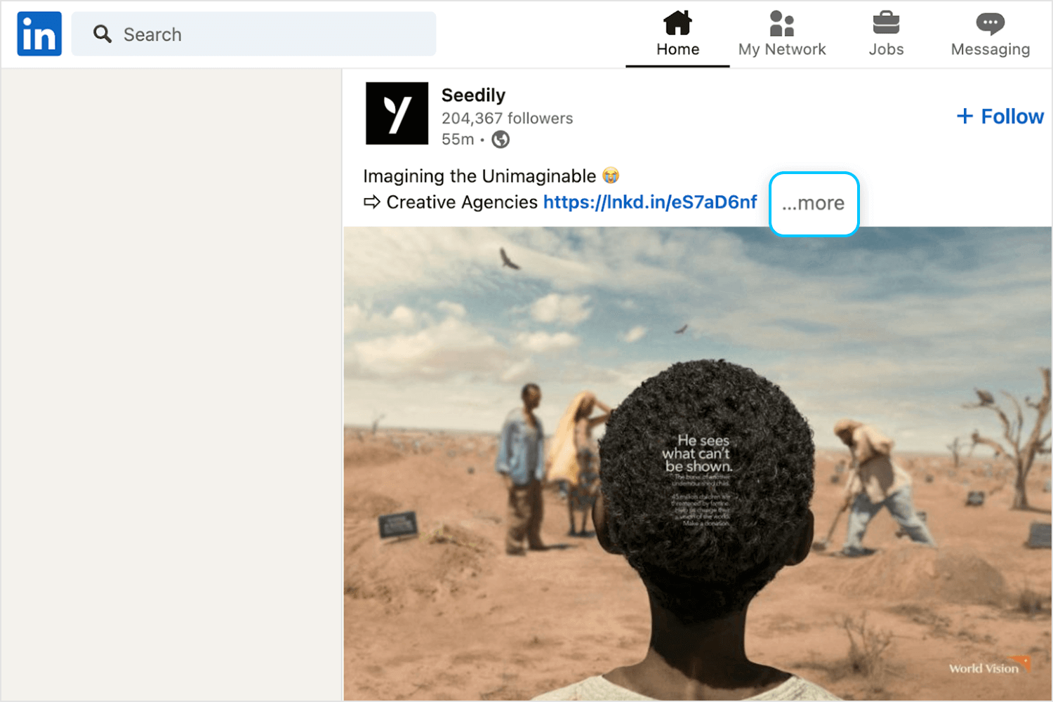
This design maintains the feed organized and scannable, allowing users to focus on what interests them while still providing the option to dive deeper into posts they care about. It’s a clear yet effective way to balance information density and user control. LinkedIn gets it right with this thoughtful approach.
Ryanair’s booking page is a great example of progressive disclosure in action. Right away, it gives you the essentials: your flight time, destination, and booking details. But it doesn’t overwhelm you with everything else upfront.
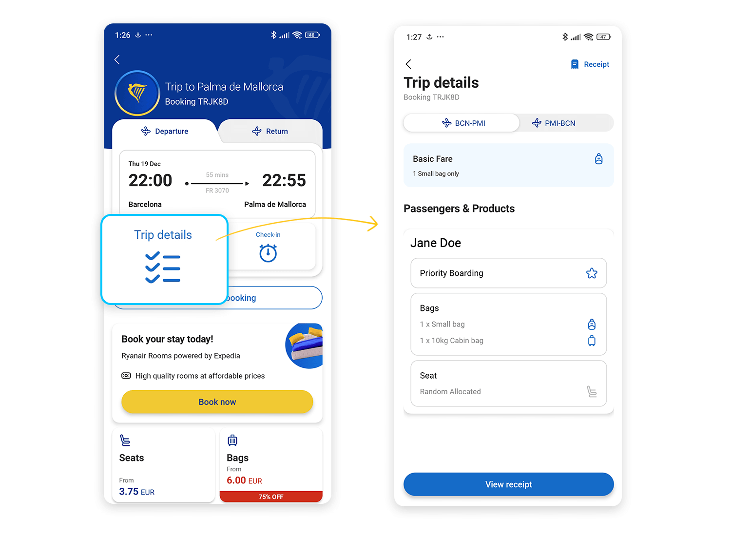
Need more info? You can tap on “Trip details” or “Check-in” to reveal specifics like flight instructions or further steps for your trip. Want to add extras like seats or luggage? Those options are there too, but they stay compact, only showing prices until you click to explore further.
This design makes sure everything is simple to find and navigate, while still giving you access to all the options you need. It’s a smart way to help travelers focus on what matters most without making the page feel cluttered. Classic Ryanair efficiency.
Scrolling through Trendyol feels effortless and engaging. Instead of throwing everything at you at once, it highlights festive deals, free shipping offers, and categories with just enough detail, like starting prices, to spark your interest.
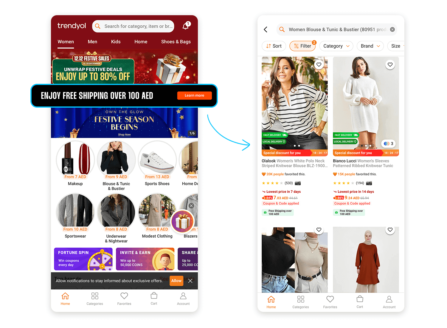
When you’re ready to explore, tapping on a category opens up more options, letting you browse deeper without any clutter. It’s a straightforward, intuitive way to keep things organized while making sure you can find exactly what you need. Trendyol strikes the perfect balance between excitement and ease.
Spotify knows how to make exploration exciting, and their Wrapped section is a great example of progressive disclosure. You’re greeted with a preview of playlists, but the details stay hidden until you’re ready to dive in.
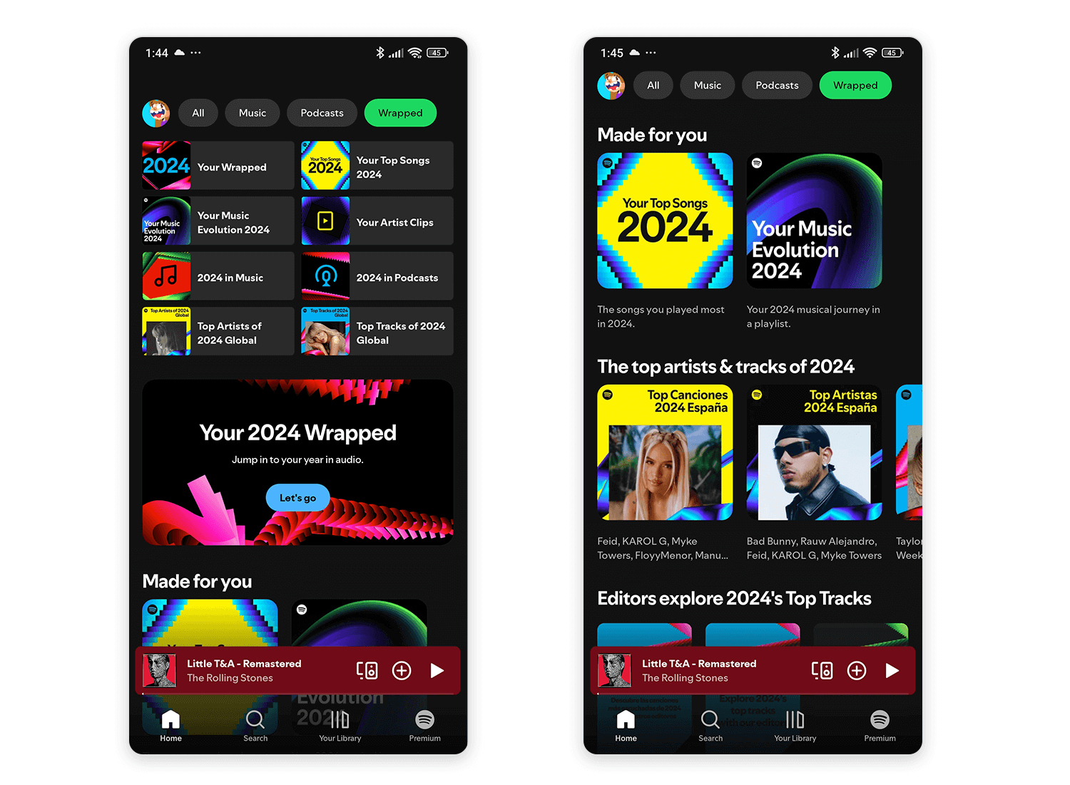
Tapping on “Your Stories” or “Your Feed” opens up more personalized stats and highlights from your year in music. It’s playful and keeps things neat, letting you uncover more at your own pace. Spotify turns discovery into an interactive, user-friendly experience that feels tailored just for you.
Care to Beauty uses click-to-reveal details and carousel navigation to keep browsing intuitive. The categories section displays a few options upfront, with more hidden until you swipe or tap.
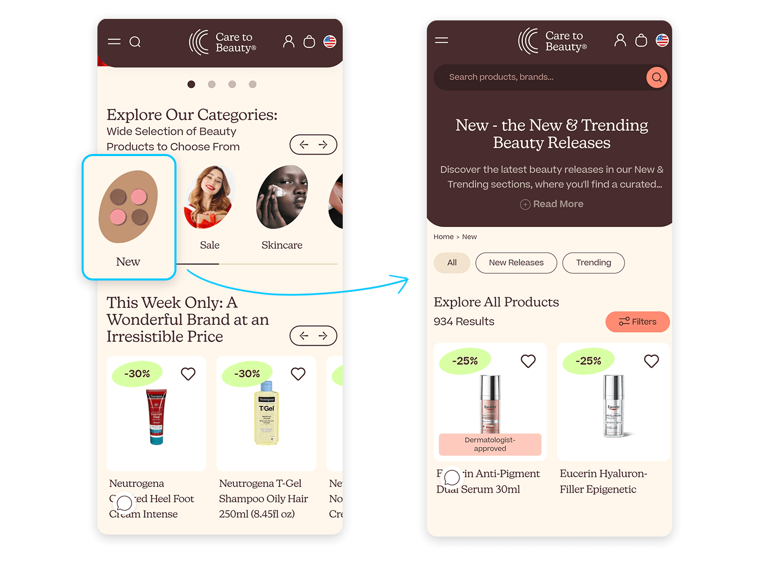
This approach keeps everything neat and reachable, letting you uncover more only when you’re ready. It’s a thoughtful use of progressive disclosure that makes exploring beauty products something easy.
We love this example for how it balances bold design with functionality. This interface uses responsive web design through progressive navigation and click-to-reveal details to create a clean yet engaging experience.
The navigation menu stays hidden until you interact with the icon, revealing the options in a bold, visually striking layout. This keeps the main screen focused on the content, allowing users to explore only when they’re ready.
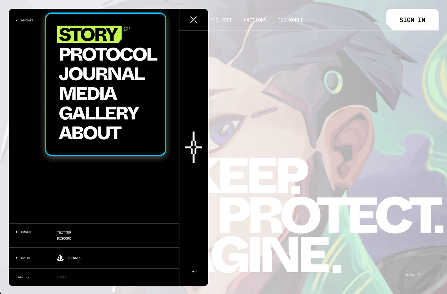
It’s a great reminder of how progressive disclosure can enhance usability, while things stay uncluttered and still offering depth and discovery when needed. The KPR’s approach makes the interface both functional and visually impactful.
This layout from Be Wedding’s website does such a great job of keeping things minimal while still offering plenty of details if you want them. Each section gives you a brief introduction with a beautiful image. But it’s not overwhelming; you can explore more about any section by clicking to dive deeper.
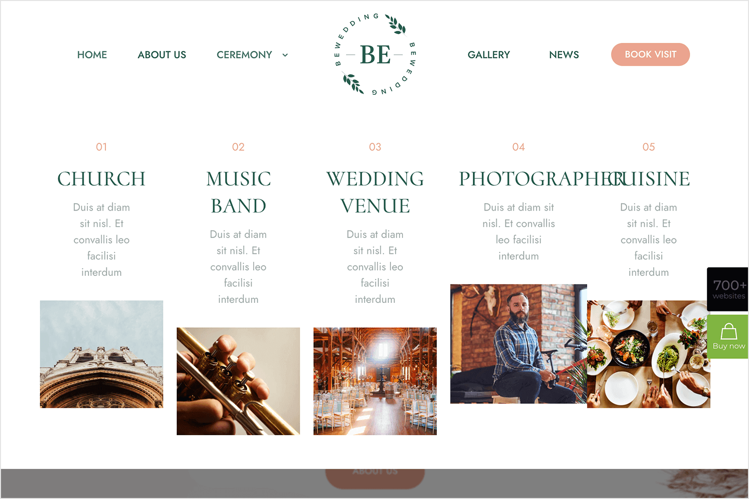
It’s a great use of progressive disclosure with click-to-reveal details, letting you stay focused and explore at your own pace. Everything feels organized and smooth to navigate, which is exactly what you want when planning something as big as a wedding.
McDonald’s knows how to grab attention and stay simple at the same time. The page highlights key promotions, like the return of the McRib and a $0.50 cheeseburger deal, without bombarding you with details. Instead, each offer includes a clear next step like “Order in the App” that lets you dive deeper if you’re interested.
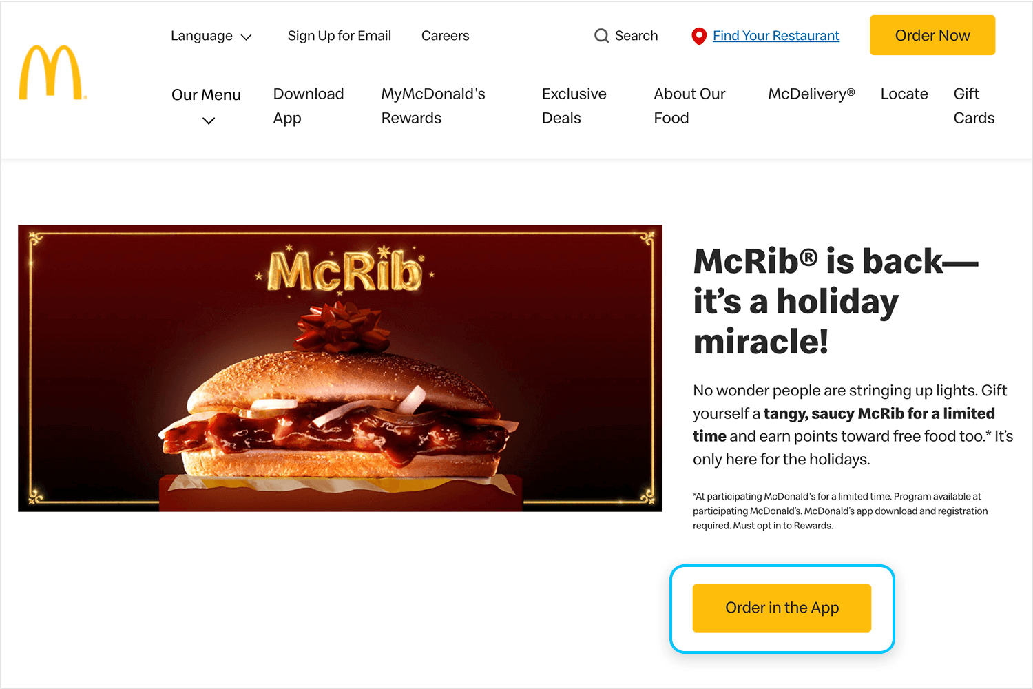
This use of click-to-reveal details as a progressive disclosure, makes the experience clean and focused, guiding users toward the information they need while keeping the page visually appealing and simple to explore. It’s an effective way to balance excitement with usability.
And here we have the last in our list—a great example of responsive web design from Pinterest. This page perfectly uses progressive disclosure with carousel navigation and click-to-reveal details to keep things inspiring and simple.
The banner cycles through different ideas, showcasing one at a time to keep the focus clear and engaging. Below, the “Here’s how it works” section invites you to click and learn more, revealing extra details only when you want them.
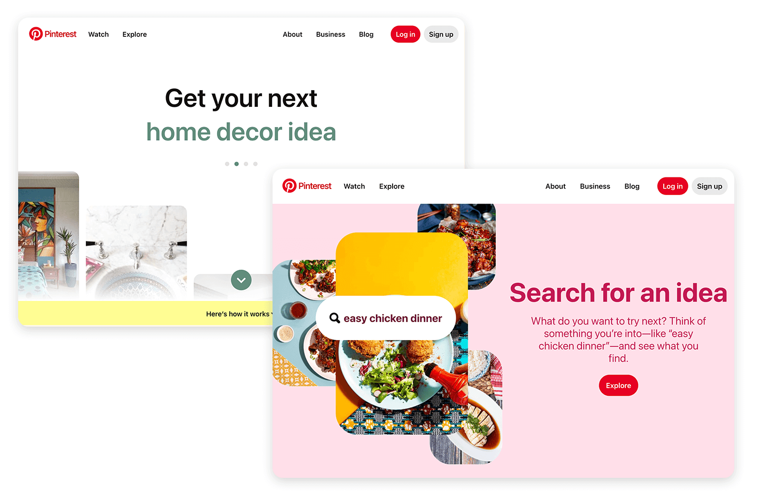
It’s a beautifully minimalist design that balances creativity with usability, ending our list on a high note with a touch of inspiration. Pinterest makes discovering ideas feel effortless and fun!
Design and prototype progressive disclosure for web and mobile

Progressive disclosure is all about understanding users and designing experiences that feel natural, not forced. It’s not just about hiding complexity, it’s about guiding users through it, step by step. By revealing the right information at the right time, you create a product that feels intuitive, welcoming, and convenient to browse.
The real beauty of responsive web design lies in its versatility. Whether you’re designing responsive websites, a feature-rich app, or even a learning platform, this approach ensures that users aren’t overwhelmed. Beginners can feel confident, while advanced users still have the tools they need to dive deeper.
In the end, progressive disclosure helps you strike that delicate balance between simplicity and functionality. It’s not just a design pattern, it’s a philosophy that puts users first, allowing them to take control of their experience while keeping things clear and focused. When done right, it transforms complex systems into approachable, enjoyable tools. That’s the power of thoughtful design.
PROTOTYPE · COMMUNICATE · VALIDATE
ALL-IN-ONE PROTOTYPING TOOL FOR WEB AND MOBILE APPS
Related Content
 Microcopy may be mini, but it can have a macro impact on user experience. Check out these 15 examples and start writing great UX microcopy16 min Read
 UX design has changed all of our lives forever - but what does it entail, exactly? What do designers do to create incredible products? Read on and find out!15 min Read
 Step into a world of innovative UX ideation techniques to help you get your creative juices flowing. We explore a range of methods to help you generate fresh ideas and solve complex design challenges through mind mapping, role-playing, dot voting, and more.19 min Read


