Interface or no interface, it all starts with a web wireframe. Golden Krishna tells us more…
Golden Krishna is a leading UX designer, UX guru and author of design essay “The best interface is no interface”, which has earned over 200,000 page views. We at Justinmind recently had the pleasure of speaking to Golden about his love-hate relationship with the user interface. In our chat, we talk about the consequences of screen beings everywhere and the power of the user interface – in this case, the lack of one.
Thanks for taking the time to speak to us today, Golden! Can you tell us a bit more about yourself and what you are currently involved in? Oh! And how much time in a day do you spend staring at a screen?
It strikes when you least expect it. And when it’s happening in the most intense way, being a screen zombie removes you from awareness of anything and anyone around you.
It’s awful. Terrible. Tech companies may not be polluting the air like the factories of the industrial revolution, but the societal pollution of this technological revolution is real, and like the coal-stained faces of those industrial revolution workers, the effects are just as visual at nearly every urban street corner, cafe, and home for this revolution.
Buzz.
And like that air pollution ruined our lungs, the overuse of screens is having negative effects on us too. According to studies, have less empathy today then we did before because we spend less time looking at other human faces. The alone time we’re avoiding by staring into our phones and tablets means we have less creative, original thoughts. Studies show that staring into the light of our devices at night is robbing us of regular sleep cycles, and may even be a cause of breast cancer because the color temperature of our screens when viewed up close suppresses melatonin, a potential cancer-fighting agent.
Gulp.
I have to confess, I’m part of the problem because I work in tech. I started my technology career at Cooper, then I worked at an R&D labs for Samsung to create new products and services, then at an R&D group working on the future of Zappos, and now I’m at Google working on the future of Android.
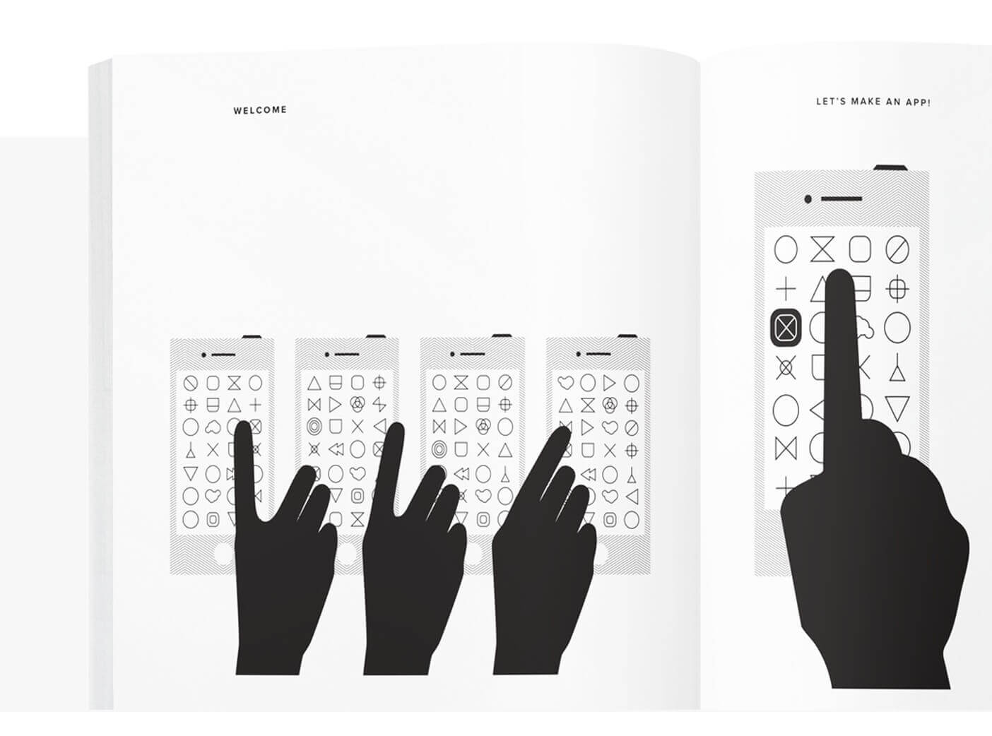
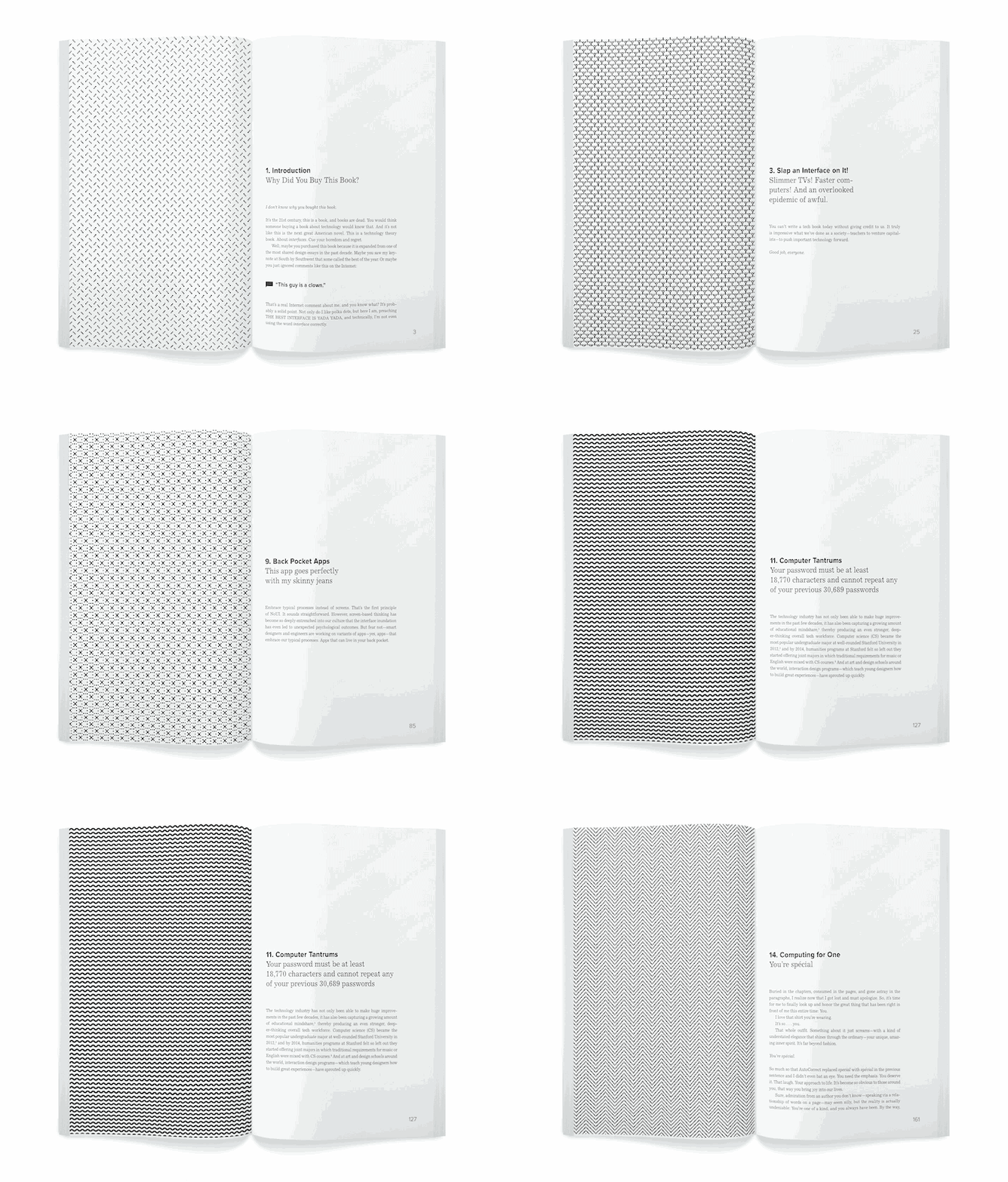
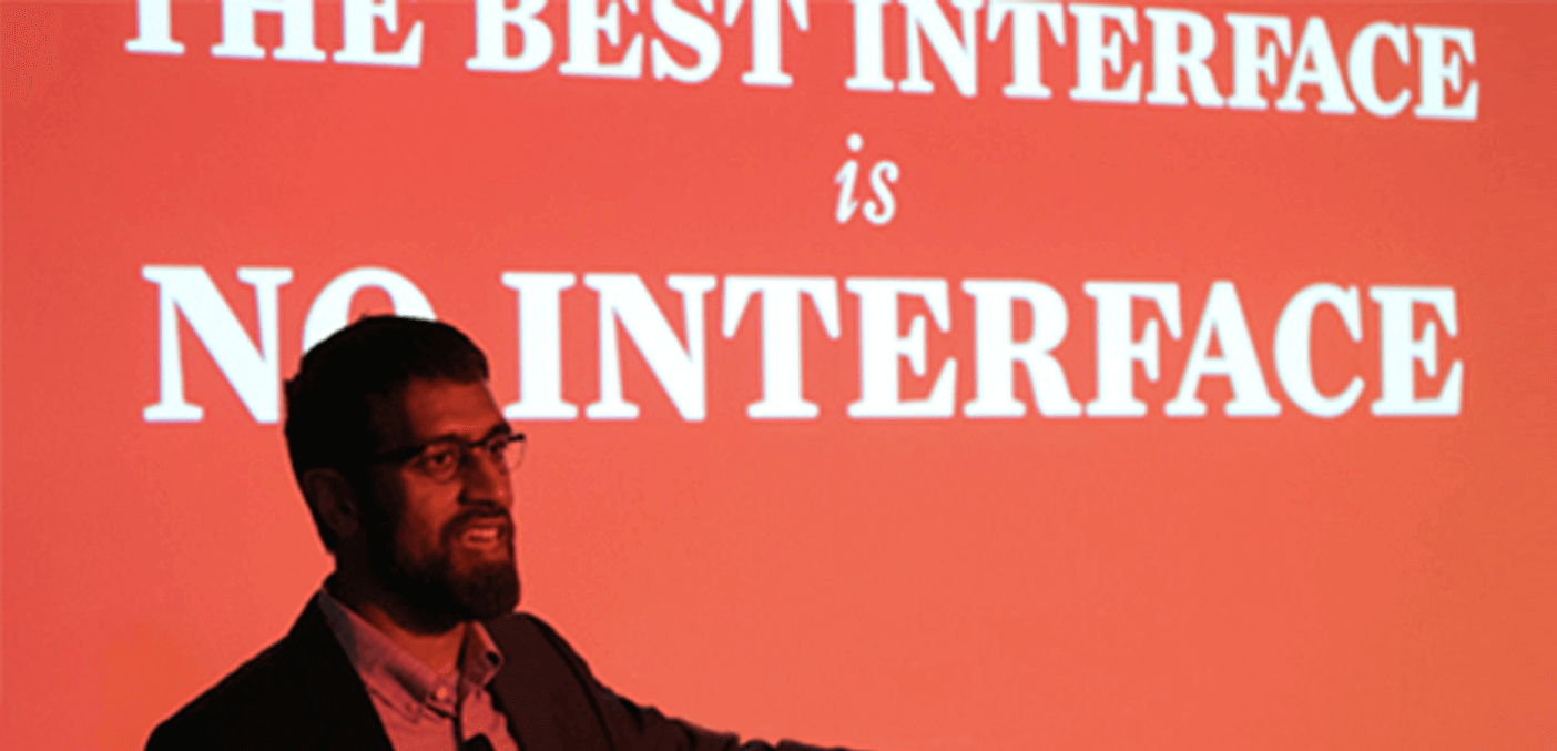
For the past few years, I’ve been trying to redefine our approach as an industry. I’ve been trying a better way to make technology than we do today. I’ve written this book, The Best Interface is No Interface, about what I’m trying to accomplish. It describes how and why we can do something better than make a world of screen zombies. How and why we can solve real problems in more profound, elegant, and brilliant ways.
Sounds a bit nuts, but I think it’s utterly possible.
You talk about our ‘obsession with screens’, and I totally agree. How do you think we got to the point where things got so out of control? When did UX design start getting blurred with UI? Essentially, when and why did we start making our lives more difficult rather than making them easier?
In the late 1970s, the smartest people at Xerox had a fantastic idea: replace command line with point-and-click. With What-You-See-Is-What-You-Get (WSIWYG). Drag and drop. It was amazing.
But in the nearly 40 years since that grand invention we’ve hardly evolved the primary interaction we have with computer. That’s sad. Opposite to the kind of innovation the technology industry is known for delivering. While progress with things on the backend and infrastructure that have created rapid Internet connectivity, fast cell networks, and incredible processing power; progress around the front end — what we do see, the graphical interface — has been devolving into psychological tricks.
I don’t know when things really got out of control. Perhaps, we reached peak screen shortly after, as I identify in the book, six beautiful trademarked words were uttered in a 2010 advertising campaign that became a limitation for this generation’s creativity:
There’s an app for that.
Before you knew it, major media was reporting that there was an app for nearly everything in our lives, including, yes a real New York Times exclusive about an app for the weather “that works.”
A miracle!
Today, being an app maker has gotten incredibly difficult, I think, because most consumers have started coming to the realization that they don’t need or want more taps and swipes in their lives. According to Quartz, the average American smartphone user downloads zero… yes, zero apps per month. People seem to download a few key apps — like email, maybe a social network, and perhaps a game — when they purchase their phone, and then never really download anything ever again.
But I don’t think this behavior is symbolic to aversion of technology. I think it is symbolic of an aversion to awful, addicting technology that so many people in technology have been convinced that they need to make in order to be successful.
I think there’s room in the market for something better. For something truly valuable. Products and services that are genuine. That want to solve problems in your life without the nefarious attempts to drive taps and clicks to their notifications.
If solving problems with screens is not the answer, what is? In your own words: “Reframe the design context to our natural course of actions”. Can you expand a little?
Yes.
I often argue that companies should be focused on solving their customer’s problems, not making more screens. But for the past few decades the processes taught in schools, the jobs posted, employee evaluations, and even company evaluations have been largely tied to the same way of thinking. And here I am asking all of those things to change to something better. You might be thinking, “Can you stop ranting and tell us how the fuck that’s supposed to happen?”
If so, good point and question.
The first of three principles outlined in the book is to “Embrace Typical Processes Instead of Screens.”
For the last few decades in making digital products, we’ve been drawing rectangles (screen representations) and wondering how we can solve problems inside these lazy rectangles. Instead, a more interesting sandbox is to start with the typical process of our customers.
This starts with observation. You see someone doing something and you create a system that works around that. If that sounds straightforward to you, that’s a good thing.
For example, recently, a few Ford designers observed that when some drivers returned to their car trunks with their hands full — with things like grocery bags or coolers — they stuck out a leg to try to open the trunk. An impossible task. Well, until Ford designers embraced their customer’s typical process and put in a set of sensors under the bumper to detect a shin and then a leg kick, which opened the trunk. When customers first tried that experience it felt like magic, and when it eventually shipped, the cheap sensor set became one of the most requested features of certain Ford models.
A trunk that drove in more sales. Impressive. And much better than another app with swipes and taps to open your trunk.
In addition to the book, I also wrote about how you can execute on this kind of thinking over at UX Booth.
Observation as a principle. It’s fascinating how we’ve lost sight of this prerequisite to all sorts of projects. Can you tell us a bit more?
Sure. Technology today has a tendency to take us away from what we’re doing. Interrupt our lives. Reduce the time we can spend doing things beyond screens like hanging out with friends.
In the book, I introduced the idea of Digital Chores. A term I coined to describe the chores we undergo for our digital lives. Things like updating operating systems, sorting computer files and folders, archiving email, checking-in for flights, and other chores we have to do today on top of traditional chores.
By embracing our typical processes instead of screens, I hope to guide makers of technology away from these kinds of things and towards the notion that technology, like Mark Weiser once said, should fade into the background. You should be able to do what you normally do and have technology work around that.
What do you mean by “leveraging computers”? Are we talking about the Internet of things and big data?
Yes, partly.
The second principle of “The Best Interface is No Interface” is to “Leverage Computers Instead of Serving Them”.
There are things machines do much better than us. And we should be focused on taking advantage of those wonderful things.
The incredible rate of processors, low cost of sensors, growth of big data, and development of predictive analytics and machine learning have enabled our machines with powerful methods for solving problems. Yet, what a good chunk of software today attempts to utilize is the graphics card. We’re missing out. What we’re looking at hasn’t changed that much since 1978, the magic that can happen in the background has changed dramatically.
I do love beautiful typography, and relevant information conveyed clearly, but I think we need to look beyond the screen to really embrace these powerful things in our pockets that are vastly more capable than room-sized supercomputers from not long ago.
Eliminate buttons by utilizing the sensors already baked into most smartphones. Get rid of location drop downs by using radios that are prolific, like GPS. Enable data science on design teams to enable smart defaults rather than making form fields.
I’ve actually assembled a free worksheet about how you can implement this kind of thinking with plenty of examples of how sensors are being used today. You can download that PDF supplement to the book for free here.
As you’ve mentioned, we’ve spent the past decade trying to go paperless. Do you think the next one will be spent trying to go screen-less? If so, what are the challenges going to be?
The move to go paperless started long ago. As far back as the late 1960s I’ve been able to find publications discussing the idea of ridding the office of all paper. They found their lives filled with paper and they dreamed of a paperless world. And yes, as you’ve mentioned, that took until the most recent decade to really start happening.
Today, instead, our lives are filled with screens. And I think it’s time to dream of a screenless world. Although I may be the one that’s shouting it most loudly today, there have been many others who have written about similar thinking in the past. People like Alan Cooper, Mark Weiser, and Donald Norman. In modern times, others like Amber Case and Josh Clark.
I think it’s an important conversation today because now it’s actually possible with contemporary technology. Even a simple radio, like an accelerometer, can empower entire experiences.
That said, there are going to be some enormous challenges. In the book, I discuss how companies will need to consider roles like Data Scientists as being a part of design teams, companies will need change the way they recruit and evaluate roles, and leaders will have to consider new processes. Schools will have to teach new ways of thinking. Policy makers will have to find the right balance of privacy and data collection that enable some of these experiences without being intrusive.
In the end, we could have a world with very little screen time, and that would a wonderful thing.
How can designers think in a non-UI way? Do you think conversational/invisible apps are the future?
If you read Bloomberg Business, you may have seen that I predicted the rise of conversational apps way back in 2012. I like conversational apps that operate through simple channels like text messaging because they reduce the burden of using technology. You don’t have to install anything, you don’t have to learn a new digital routine, it just works within a system you likely use every day.
But I do think conversational apps are just a mid-step to a completely invisible future.
An analogy:
When electric cars were first introduced they promised something awesome. But it was scary to buy the first electric cars because they were so different. There are a number of reasons why fully electric cars didn’t succeed right away, but one was consumer confusion. There was no infrastructure to support them yet and no education for people to understand them. Many consumers understood gas mileage, but not electric mileage. They understood gas stations, but weren’t familiar on where and how to recharge their car. Some knew how to fix their gas engine if it broke down (or at least had a mechanic that did), but had no idea how to fix an electric engine.
It was too much a leap for the everyday person. So, instead, not surprisingly, hybrid cars (part gas, part electric) emerged in popularity. Consumers appeared to be comfortable with a mid-step.
That’s what conversational apps are. Just a hybrid, a more comfortable step towards a fully screenless world to come.
The book and its three principles are a guidebook for designers to figure out how to build this coming paradigm. We’re going to be slowly ridding ourselves of UI. From heavy apps to light apps to conversational apps to UI just as a backup to eventually #NoUI.
UI as a backup: what does this mean for designers?
Ha! You know, once I gave a lecture in Portland, and afterwards a young designer told me that he enjoyed my lecture but hoped that I ultimately fail. Because if I succeed, it means he’s out of work. I actually had a lot of fun recounting this story on the design podcast on Boagworld.
Yes, I do think UI has a place as a backup, as a place to go under the hood in these automatic solutions and see what’s happening.
But what I told that designer is that if you want to be working in technology you always have to be ready for change. The tools we use today are completely different than what we used 10 years ago. Many of the processes have radically changed. And the mediums that we design are new.
Designers should have empathy for customers. That should aim to understand common, everyday problems and then solve them. That purpose will never change.
In one part of the book, I describe what I think we’re here to do, which has been tweeted a number of times and even made into a poster.
Have you ever used a prototyping tool? Do you think they can help in the design phase (i.e. detecting when there are too many screens)?
I love prototyping. I’ve prototyped with sheets of paper, with sticky notes, with cardboard, by acting out experiences, with video, and yes, with software too. 🙂
Among many benefits, there are two big reasons why I love prototyping:
a) Shared conversation: It’s easy to have a conversation about a real thing, and sometimes very hard to evaluate an idea in the abstract.
b) Validate ideas: I use prototyping to validate ideas. There’s a lot of arrogance and overconfidence in tech that leads some to believe their ideas are correct, and that user research is only necessary to figure out tiny things like button placement. Prototypes can help you validate an idea before you’ve done much real work at all.
Have you tried out Justinmind? How’d you find it?
Yes. I love prototyping tools! And I think the fact that people can put prototypes together without even knowing code on Justinmind is fantastic.
In the years to come as some of the brightest people in tech continue to explore screenless solutions, I wonder how the ability to loop in triggers — like the state of certain sensors or radios — could loop into prototyping tools. Could someone make a Justinmind prototype that launches a certain widget when you walk into a grocery store? Communicate with something via Bluetooth?
Right now accessing those powerful tools are a bit too complex and out of reach for the everyday designer, especially in prototype form, but as the field shifts from software that is all about UI (user interface) to being more about larger UX (user experience) I wonder if we’ll be seeing more and more prototypes that are less and less about buttons.
Here’s to hoping.
Thanks so much for your time, Golden!
Alright, thanks for the fun chat! This was a good cup of coffee. Can’t believe I said so many words in 30 minutes. Shouldn’t have ordered a Grande. I need to go pick up my kids now. Ciao!
Related Content
 Microcopy may be mini, but it can have a macro impact on user experience. Check out these 15 examples and start writing great UX microcopy16 min Read
 UX design has changed all of our lives forever - but what does it entail, exactly? What do designers do to create incredible products? Read on and find out!15 min Read
 Progressive disclosure is about helping users get invested before getting to the nitty gritty. Read this post to discover a new way to approach complex features!8 min Read

