Digital experience leader at Wells Fargo, Serafina Frongia, joined us to discuss tools, techniques and ways of speaking to boost UX design in business
Serafina joined us for an enlightening session on the role of content in UX design and the intrinsic relationship between UI and UX design, two branches that are separate, yet whose paths always inevitably cross.
As Serafina took the mic, humbly introducing herself as a loud Italian American, she reminded us that, although she comes from the world of UX, her professional expertise lies on the content side of design. She informed us that she is responsible for delivering an end-to-end content experience at Wells Fargo, harnessing the power of the company’s software to deliver in their marketing vision.
5 things Digital Experience Leaders need to know about UX
Live from San Francisco with Wells Fargo
Posted by Justinmind Prototyping Tool on Wednesday, November 7, 2018
Serafina launched into her presentation by explaining that her world involves looking through a content lens that has its roots firmly in a marketing and business mindset. She reminded us that she came to Galvanize to talk about how content is an integral part of the design process.
“It’s like everyone speaks a different language when trying to align to one business objective”.
In Serafina’s view, content may at times assume a “factory mentality” in the content design process whereby it becomes a routine, mechanical process of plugging in the odd word here and there. However, it’s when we touch on the areas of localization and translation that it becomes a noticeable player in the design process.
By localization and translation, Serafina means that content can stand as a common meeting point across different disciplines. Whether people in Wells Fargo are coming from marketing or whether they’re digital experience leaders, everyone is well versed in the many facets of design.
However, she also cites the real struggle of communication between interdisciplinary teams: “it’s like everyone speaks a different language when trying to align to one business objective.”
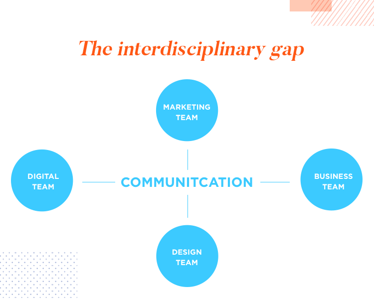
How do they overcome this obstacle? They bring tools and ways of speaking to help influence and promote the values of design at Wells Fargo and to illustrate what design means when it comes to achieving business goals.
In order to understand how UI and UX overlap, and how cross-functional teams reach that common ground in Wells Fargo, Serafina establishes the notion of what she calls a “UX galaxy”.
Displaying an image of a galaxy on her presentation slides, Serafina described her “UX galaxy” as representing an interconnection or network of UIs. These UIs represent what she referred to as “touch points”, which are where users and customers interact with your brand.
She further illustrated this concept with an example of a company’s Facebook page. There you can take ownership of part of the customer experience, but not entirely. She gave another example of a topic thread in a discussion forum where someone might look for the best floor mop on the market (we think this is a great example). In such a case as this, you won’t have any control over the customer experience as it is based entirely on word of mouth.
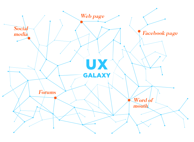
Regardless of the degree of control, you can consider both of these examples as touch points. They are part of an omnichannel, “an entire plethora of touch points that a user has with you.”
One of the ways Serafina lists for unifying the Wells Fargo design values and aligning the visions of all teams across the company is with the wellspring of the brand.
She defines the wellspring as basically what a company has, what it’s achieved and what it stands for. It’s the goodwill of a company, it’s the thing you can offer that no one else in the world can. It’s from this deep place that Serafina and all her colleagues conscientiously try to reflect on how Wells Fargo markets itself.
The wellspring influences how they think about their role alongside segmented groups that might either be in branding or in PR. It’s the one place they can tie their language into how they think and feel, and unify their objectives and goals. It’s about expressing the core proposition of the brand.
Wells Fargo funnels this philosophy into offering one complete experience for their users. From a marketing point of view, your brand exists as one entity in the users’ eyes.
However, trying to imagine the customer’s experience isn’t easy. This is because there are often multiple contexts or scenarios and a customer or user will more than likely have a different context each time they interact with the company.
To get around this, Serafina gives an example of how Wells Fargo takes advantage of the storytelling technique, citing it as a powerful tool to engage people and communicate with them. It helps colleagues understand the user’s point of view and memorize their pain points more easily. According to Serafina, the way to unify teams into working around the user, is to tell that user’s story.
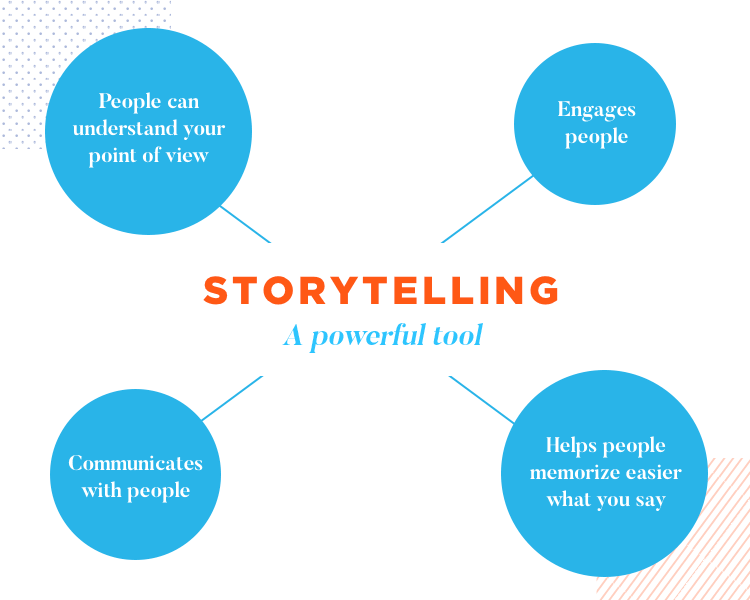
She gives an example of a loan process where the user used the app, called the bank and went into a branch. To them it’s not a set of departments, but one whole company. There might be several things going through the customer or user’s head:
- Where am I?
- Am I close to being done?
- Am I at risk of not getting my dream home?
She points out that this is the reality of many people’s contexts when looking for a home loan. She then went on to provide a tear jerking real life example of one of her friends who had lost her mother and who needed to end the deceased’s cable subscription. She called up the customer service rep who inadvertently and insensitively went on the upsell, trying unsuccessfully to pique her interest in other offers and discounts they had.
According to Serafina, it’s the way you respond to each of these differing contexts that can make a world of difference to how each individual perceives your brand.
As demonstrated, understanding the user’s context is an integral part of the design process and to get it right, we must accept that UI and UX as being both unique but inextricably related.
According to Serafina, as designers we’re all guilty as charged of using UI and UX interchangeably. However, to convey this difference to other teams, Serafina finds it helpful to describe UI in the sense of a user interface, something tangible, that people can see and touch.
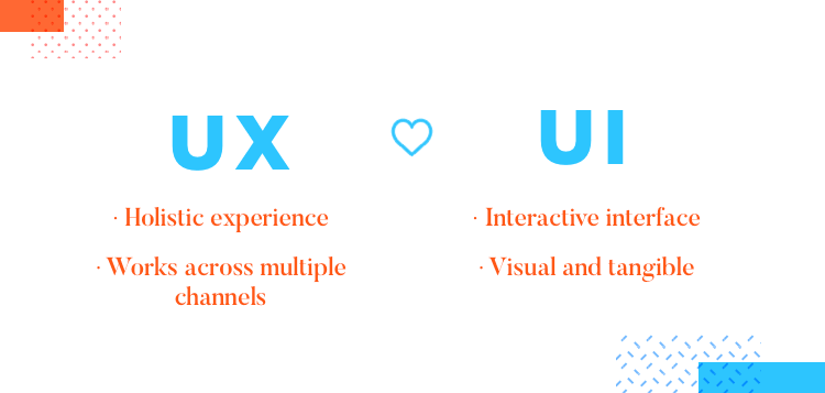
On the other hand, when speaking about user experience, it’s best to articulate it as being the end-to-end experience the customer has with your company. It’s indicative of the intent and the emotion behind the design. In terms of UX there are multiple channels and as the above examples show – it’s more than just the user interface that someone interacts with – it’s a truly holistic experience.
So how does Wells Fargo implement a user-centric approach when designing software and experiences? Here are some of the methods Serafina mentioned in her talk.
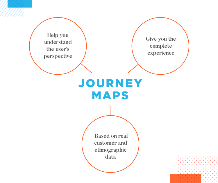
Serafina testifies to the usefulness of journey maps to help people understand the user’s perspective. She showed us an example on one presentation slide of a project she was working on at the time to transform Wells Fargo’s business loan experience, based on the example mentioned earlier. They constructed their journey map based on real customer and ethnographic data.
Serafina maintained that the key is in understanding and feeling the complete experience: both the highs and the lows. The journey map can then be used to show how the UX is set up through a number of user interfaces.
According to Serafina, people are people wherever they are and journey maps help convey that there is never a perfect answer. The customer journey is never a straight line: people have limitations and make mistakes. They can go back and forth and go through the same path repeatedly.
She points out that most ordinary people don’t expect to have to work or think harder with any software or service. She stresses that people don’t only judge a company like Wells Fargo based on other banks – they’re also judged by how the likes of Uber or Amazon do things, meaning that the ease-of-use of their UIs must match up to the consumer industry standards, which grow ever higher as time goes on.
Another example of a method the Wells Fargo design team use for communication are mental models. In a nutshell, mental models are based on the idea we have in our minds of how things are supposed to work.
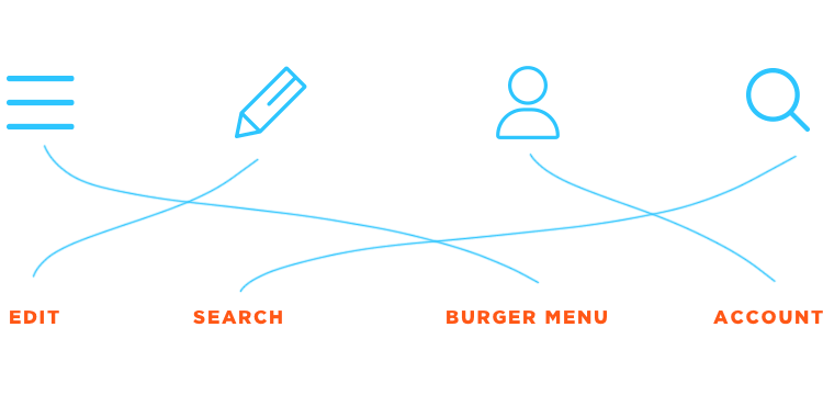
When translating that into UI, Serafina and her team focus on design heuristics, having people creating mental models. An example of this might be an icon – a square with three horizontal lines. If you’ve guessed that it’s a hamburger menu then you’ve probably grasped the concept of mental models.
The concept of the hamburger, for example, is a paradigm or a pattern that exists in the world. Creating brand new models for your users, according to Serafina, would be counterintuitive – you should instead try to leverage things that already exist.
That leads into recognition – a user might think “I recognize this thing and I know what to do with it” or they might think “how do I get to this screen and then how do I go backwards?” Design natives, in Serafina’s opinion, often take this stuff for granted but it really can make all the difference to the user.
For Serafina and her team, one of the most important tools in their arsenal is plain language. Maintaining consistency between terms is imperative to keep all cross-functional teams speaking the same language.
She states that the emphasis should be on a design system, on creating building blocks and always using consistent terminology. She exclaimed with a wry smile that banks love using terms that many lay people don’t recognize.
To get around this, Serafina and her team maintain a library of consistent terminology. When talking to other teams, she clarifies that it’s not that their terminology is wrong, per se, but that they have a definition that has already been established and validated with the user. Serafina and her team maintain these validated terms in the library, providing multiple contexts where they can be used.
Serafina draws on this technique to illustrate the extent of connection there is between UX design heuristics and the specifics that are used in UI design.
Prototyping at Wells Fargo is similar to many other companies that develop front end software. However, according to Serafina, prototyping can achieve two things:
- It can be used for iteration to innovate and improve existing software and processes, as well as for invention.
- It can benefit internal users as well.
The second point is very interesting. Serafina states that a “broken team member experience equals broken customer experience” and we couldn’t agree more. For her and her team, including back office people in the prototyping experience helped shed light on how critical the internal worker is to the success of any kind of user experience. Discovering this important fact led Wells Fargo to put more emphasis on the UX of their back end software as well.
Prototyping brings us on to what Serafina considers to be the Minimally Delightful Product, something that Wells Fargo aims on achieving instead of the typical Minimum Viable Product.
You don't just have to eat the banana at the bottom of a sundae, you can have a bite of banana, get some ice cream...some chocolate sauce...and you don’t have to lose the cherry on top.
What she meant with this was that, instead of just aiming for a bare bones prototype or product, Wells Fargo aims for something that can provide some sort of delightful experience for the user.

The reason? Because prototyping is about usability, it’s about creating something that makes sense for the user, it’s about designing something that they’ll enjoy using.
In case people were confused about what this meant, she began her elaboration by heartily booming into her mic the following metaphor: “you don’t just have to eat the banana at the bottom of a sundae, you can have a bite of banana, get some ice cream…some chocolate sauce…and you don’t have to lose the cherry on top.”
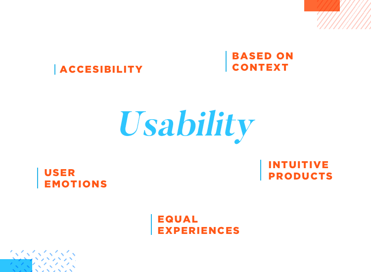
A delightful experience wouldn’t be complete without good usability – and good usability, according to Serafina, depends largely on contextualizing scenarios, as we mentioned earlier. It’s our job as designers to make something intuitive by constantly asking ourselves “is this as useful as it could be?”
Consider accessibility. This is usually a contextual goal that depends on understanding each user’s situation. Serafina chuckled as she pointed out a possible example of her own case where she’s trying to run on a treadmill at the gym while, at the same time, watching her favorite crime show. She stated that, as she sometimes had difficulty understanding what people are saying in that show, subtitles would eliminate the problem, not just for her but for deaf people as well.
On a similar note, as designers, Serafina stresses that we should always aim to provide an equal experience to each user, regardless of their situation.
An example of this might be a visually impaired person navigating your website by use of a screen reader. Here, instead of having the reader list out 15 tabs by default, you could give more control by allowing them to skip the ones that aren’t interesting.
Another example to further illustrate the point of delightful usability is the real-life sign in form that Wells Fargo worked on to make the login process quicker. They worked on a new angle to increase usability: biometrics. They started using eye prints to allow users to sign in to the portal, as the pattern of veins in each person’s eye is unique, like a fingerprint.
The eyeprint scanner worked so well that people actually couldn’t believe that it was so fast and were suspecting that maybe it hadn’t really read the print properly. She uses this to illustrate the point that a little friction in your designs can sometimes be good if it gives the user more confidence. In this case, they slowed down the loading process a little, to make it seem more trustworthy.
The above goes to show why usability testing is so important, even when we have amazing and innovative ideas. It’s as much about the user’s perception as it is about accessibility and functionality.
The fact that there are so many connected devices in the world at the moment and that the number is constantly rising, shows we have to keep an eye on people’s attention spans more than ever. Why? Because, even though each of these devices are connected, there’s so much content and software out there that users have become ever more discerning.
Serafina then drew on a quote from Seneca: “present time is brief, so brief indeed that to some there seems to be none, for it is always in motion, it ever flows and huries on, it ceases to be before it has come.”
This quote points to something innate to the human experience. Since the dawn of time, humans have felt as if they’ve never had enough time. And even though we’re living longer, we’re hindered by the increasing demands on our time in the modern world. For this reason, we should not mess around with or take for granted the time our users will want to spend on our apps or website.
One mitigating technique Serafina points out that we can test in the prototyping and UI design stage are micro-moments.
Micro-moments help us capitalize on the user’s time, which is scarce. They are best explained by an example Serafina provided about how we can squeeze more time out of webforms.
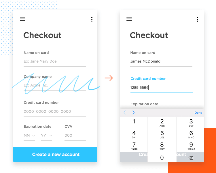
Her example is of a credit card form with several fields. The most obvious way to save time might be to have the keypad or number pad brought up automatically, which, depending on the device, can save up to one or two taps – a “slice” of a second, as Serafina calls it. We can save up more second slices by removing any unnecessary fields.
A slice here and a slice there can eventually add up to a minute. A saved minute in form design, is like hitting the jackpot! It can make a huge difference to users who are prone to bailing out and not completing that flow. As most salespeople can attest to, whether people go through that flow has a big impact on your company.
Prioritizing content by creating an information architecture is another way we can keep things short and sweet to entice the user in. If we think about how we might translate information architecture into sales and marketing goals, that might be putting the most important headline first, followed by a paragraph of supportive evidence.
When it comes to UX / UI design, this is the exact same context, it’s just another way of looking at it. In the same way we devise headlines to pique the reader’s interest, your copy should grab the user’s attention.
Coming away from this talk, we’ve learned that, even though we use UI and UX interchangeably, it’s always helpful to talk about them as distinct concepts that both feed each other and stand alone.
The other point we can take away from this talk is that we are not our users, period. We cannot decide for them, but we can observe them, we can see things from their point of view. We don’t create experiences on their behalves, instead, we should think of the user as a co-creator.
Lastly, in Serafina’s words – if “we make something useful, then we’ve achieved a human goal. If we make something usable, we’ve achieved a humane goal”. Whether it’s ethical design, or just the right thing to do, a user-centric approach is at the core of what good design is.
PROTOTYPE · COMMUNICATE · VALIDATE
ALL-IN-ONE PROTOTYPING TOOL FOR WEB AND MOBILE APPS
Related Content
 Microcopy may be mini, but it can have a macro impact on user experience. Check out these 15 examples and start writing great UX microcopy16 min Read
 UX design has changed all of our lives forever - but what does it entail, exactly? What do designers do to create incredible products? Read on and find out!15 min Read
 Progressive disclosure is about helping users get invested before getting to the nitty gritty. Read this post to discover a new way to approach complex features!8 min Read

