Ever had a brilliant mobile app idea but felt stuck on where to begin? You're not alone! Starting with wireframes is the perfect way to bring your app concept to life.
Think of wireframes as simple sketches that map out your app’s structure and functionality. They help you visualize the layout and flow without getting bogged down in design details.
Create your app wireframes and user flows

In this guide, we’ll walk you through creating effective mobile app wireframes that ensure a smooth user experience, making the whole process easier and more organized.
Imagine you’re building a house. Before you start picking out the paint colors or deciding on the furniture, you need a blueprint. This blueprint shows where all the rooms will be, where the doors and windows go, and how everything connects. In the world of mobile app development, this blueprint is called a mobile app wireframe.
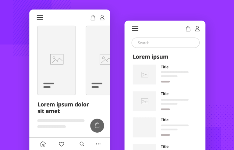
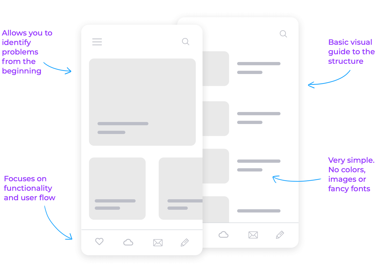
A mobile app wireframe is a basic visual guide that outlines the structure and layout of your app. It’s like a rough sketch that shows where all the important elements will be, like buttons, menus, and content areas. But instead of focusing on the design details, it zeroes in on functionality and user flow. This helps everyone involved in the project see how the app will work and how users will interact with it.
Wireframes are usually pretty simple. They’re often in black and white and don’t include colors, images, or fancy fonts. This simplicity is actually a good thing because it helps keep the focus on how the app will function rather than how it will look. You can think of it as laying the foundation before you start decorating.
Creating a wireframe for your mobile app is a crucial step. It allows you to plan and test the user experience before you dive into the detailed design work. By sketching out the main screens and user interactions, you can identify any potential problems early on and make sure the app will be easy and intuitive to use.
No matter what you’re working on, starting with a mobile app wireframe can save you a lot of headaches down the road. It’s all about making sure the structure is solid and the user experience is smooth before getting into the nitty-gritty of design.
Before jumping into the exciting task of creating a mobile app wireframe, there are some important steps to take. These preparatory tasks help ensure your wireframe is effective and user-friendly. Let’s look at the key tasks: user research, user flows, and app navigation.
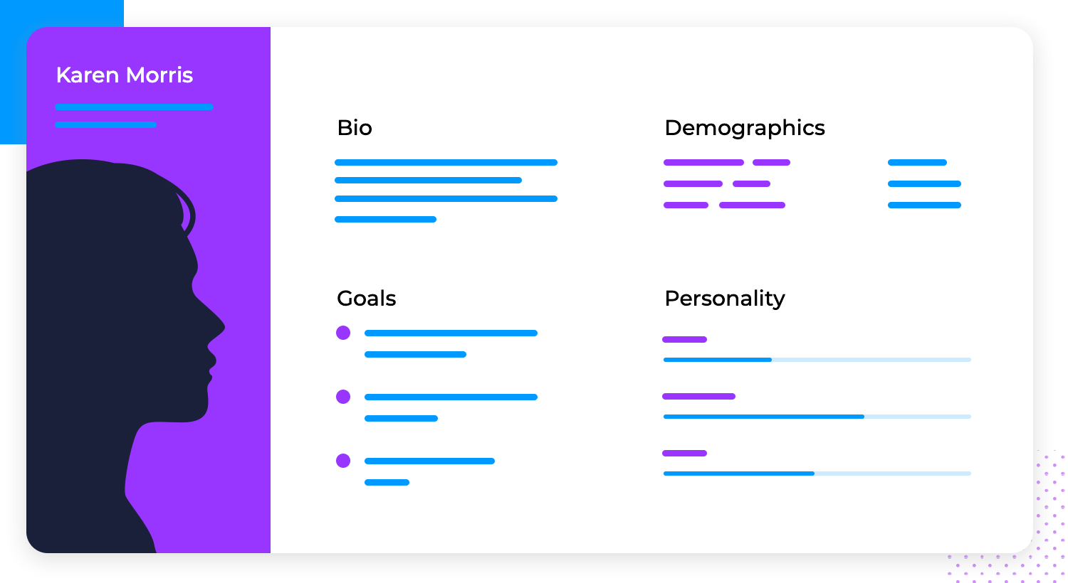
The first thing you need to do is understand who will be using your app and what they need. This is where user research comes in. Think of it as getting to know your audience before designing something for them. You can gather information through surveys, interviews, or analyzing existing data.
User research helps answer important questions like:
- Who are the primary users of your app?
- What problems do they need your app to solve?
- What are their habits and preferences when using mobile apps?
When you really get to know your users, you can create an app that fits their needs perfectly, making sure they love it.
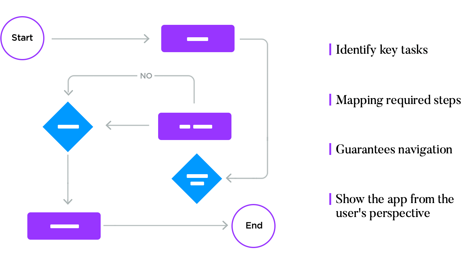
Once you know who your users are, the next step is to map out their journeys within your app. This is done through creating user flows. A user flow is a visual representation of the steps a user takes to accomplish specific tasks in your app.
Creating user flows involves:
- Identifying key tasks users need to complete (signing up, making a purchase, or sharing content).
- Mapping out the steps required to complete each task.
- Making sure each step makes sense after the one before it, and leads you to the next one.
User flows help you see the app from the user’s perspective and ensure the navigation is smooth and intuitive.
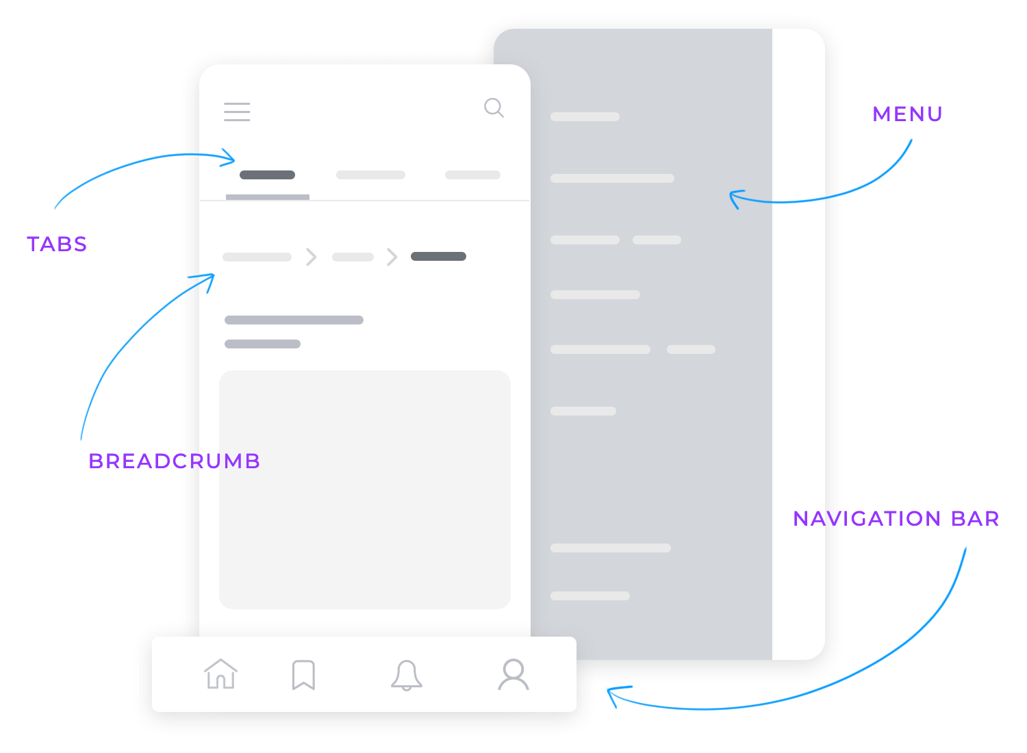
With user research and user flows in place, it’s time to think about how users will move through your app. Good mobile app navigation design makes it easy for users to find what they need without getting lost or frustrated.
Keep these elements in mind when designing the app navigation:
- Navigation bar: typically located at the bottom or top of the screen, this bar includes key sections of the app.
- Menus and icons: these allow users to quickly access different parts of the app.
- Breadcrumbs: these show users where they are within the app and how they got there.
- Tabs: used to switch between different views or sections within the app quickly. They’re usually placed at the top or bottom of the screen and help in organizing content into categories or functionalities.
Effective navigation makes sure that users can easily and seamlessly move from one screen to another.
Before you start sketching your app, take a few important steps. First, research your users to understand their needs. Next, map out the steps they’ll take to use your app and plan how they’ll navigate through it. This ensures your wireframe is user-friendly and well-organized.
By doing these tasks now, you save time later and create a better-designed app that meets users’ needs. Understanding your users, their journeys, and how they’ll move through your app sets you up for success.
Create your app wireframes and user flows

At Justinmind’s mobile wireframing UI library we have a comprehensive collection of pre-built, mobile-ready UI wireframe elements, icons, layouts, and templates. These elements are specifically crafted for mobile devices, ensuring that whether you’re designing for iOS, Android, or both, you have the right tools to start your project efficiently.
Our library includes over 150 UI components, headers and footers, content blocks, navigation menus, layouts, templates, and complete examples. Each component is designed with mobile devices in mind, following common mobile UI patterns and interface guidelines. This focus on mobile-specific elements means you don’t need to adapt the components for mobile use, saving time and effort.
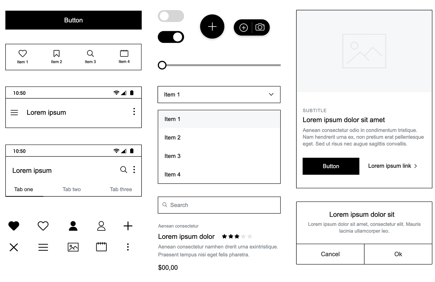
The library is organized into several categories, making it easy to find exactly what you need:
- Basic components: popular headings, buttons, slide menus, carousel cards, headers, and navigation bars.
- Headings: various sizes for titles and subtitles.
- Buttons: a variety of buttons, including dark and light options, social media login buttons, and buttons tailored for specific layouts.
- Forms and controls: sign-up forms, registration forms, search fields, toggles, different types of select boxes, slide bars, and a map widget, along with fully functional popular cards that are ready to use or customize.
- Headers and footers: a range of mobile headers and footers, from simple display headers to larger headers with search options and additional functionality.
- Menus: various menu types, including slide menus, dropdowns, and lists.
- Navigation: different navigation bars and content tabs.
- Cards, lists, and grids: cards and blocks for feature displays, list options for various list elements, and readymade screens that include images and buttons.
- Banners and carousels: slideshows and carousels with interactions.
- Reviews, notifications, and dialogs: rating elements, notification displays, dialogs, and popups.
- Chats: chat boxes for creating chat screens in mobile apps.
- Icons: commonly used mobile icons and symbols, such as hamburger menus, social networking icons, like buttons, and search icons.
This extensive library allows you to mix and match different UI elements, layouts, and screens to create the perfect wireframe for your mobile app. It supports wireframing for all mobile platforms, ensuring versatility and ease of use.
All components in the Mobile Wireframing UI library are 100% customizable. They are created using atomic design principles, which means you can break them down into smaller parts and build them up again according to your specific design needs and the mobile device you are designing for. This flexibility allows for precise and tailored designs that fit various screen sizes and operating systems.
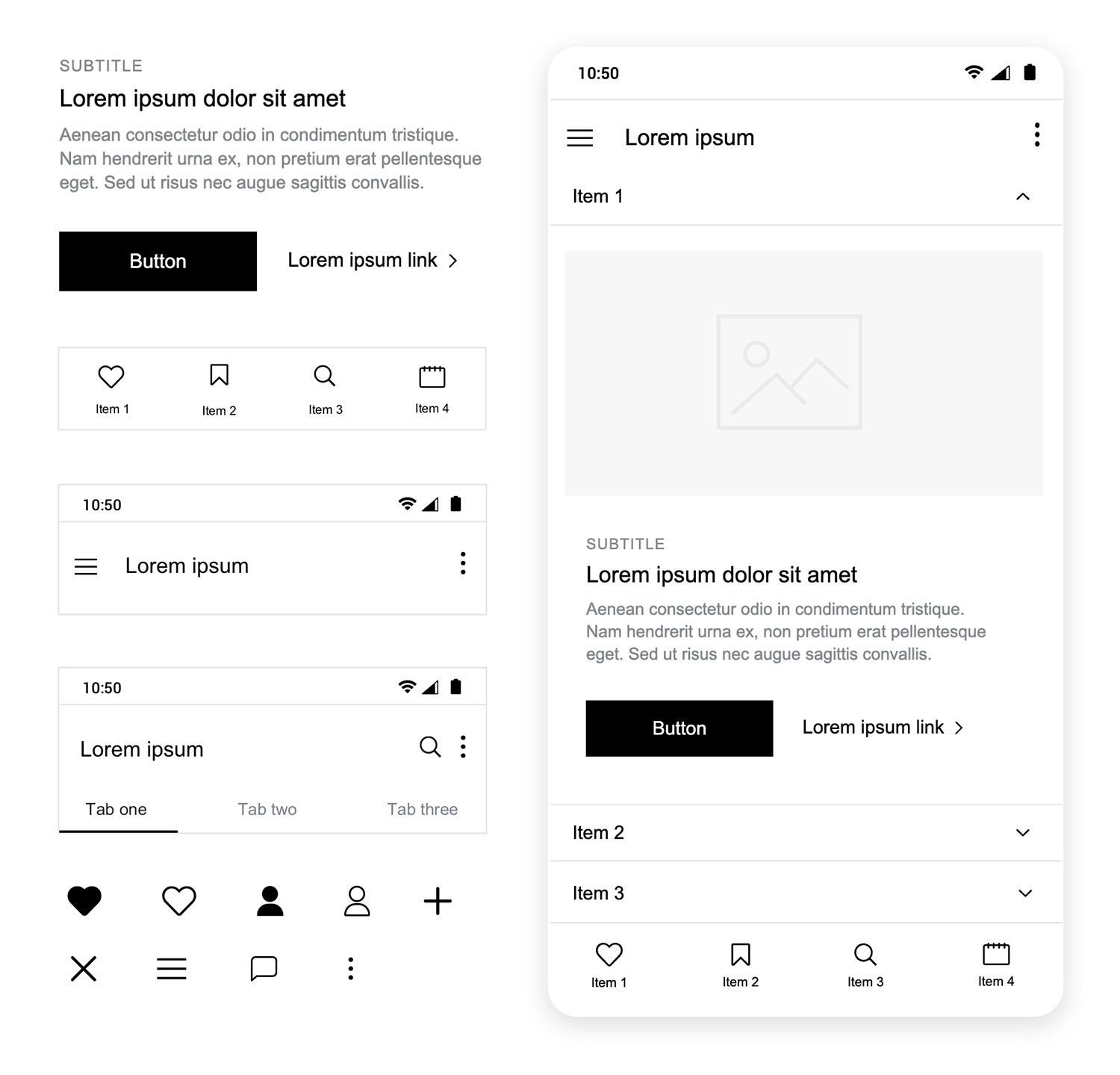
To keep standard and customizable icons and UI elements, the library was created using iPhone 11 Pro dimensions. This choice provides a balanced size that can be easily scaled up or down depending on the operating system you’re working with, whether it’s a larger device like the iPhone X or a smaller Android device.
By using Justinmind’s Mobile Wireframing UI library, you ensure that your wireframes are optimized for mobile use from the start, for a more efficient and effective design process.
Now that we’ve covered the basics of mobile app wireframing, let’s talk about some specific things you should keep in mind to make your design truly user-friendly and effective. Here are a few key points to consider.
Mobile devices come in all shapes and sizes, from small smartphones to large tablets. Your wireframe needs to adapt to these different screen sizes. Make sure your layout is flexible and responsive so it looks great and functions well on any device. Using fluid grids and flexible images can help maintain a consistent experience across various screen sizes.
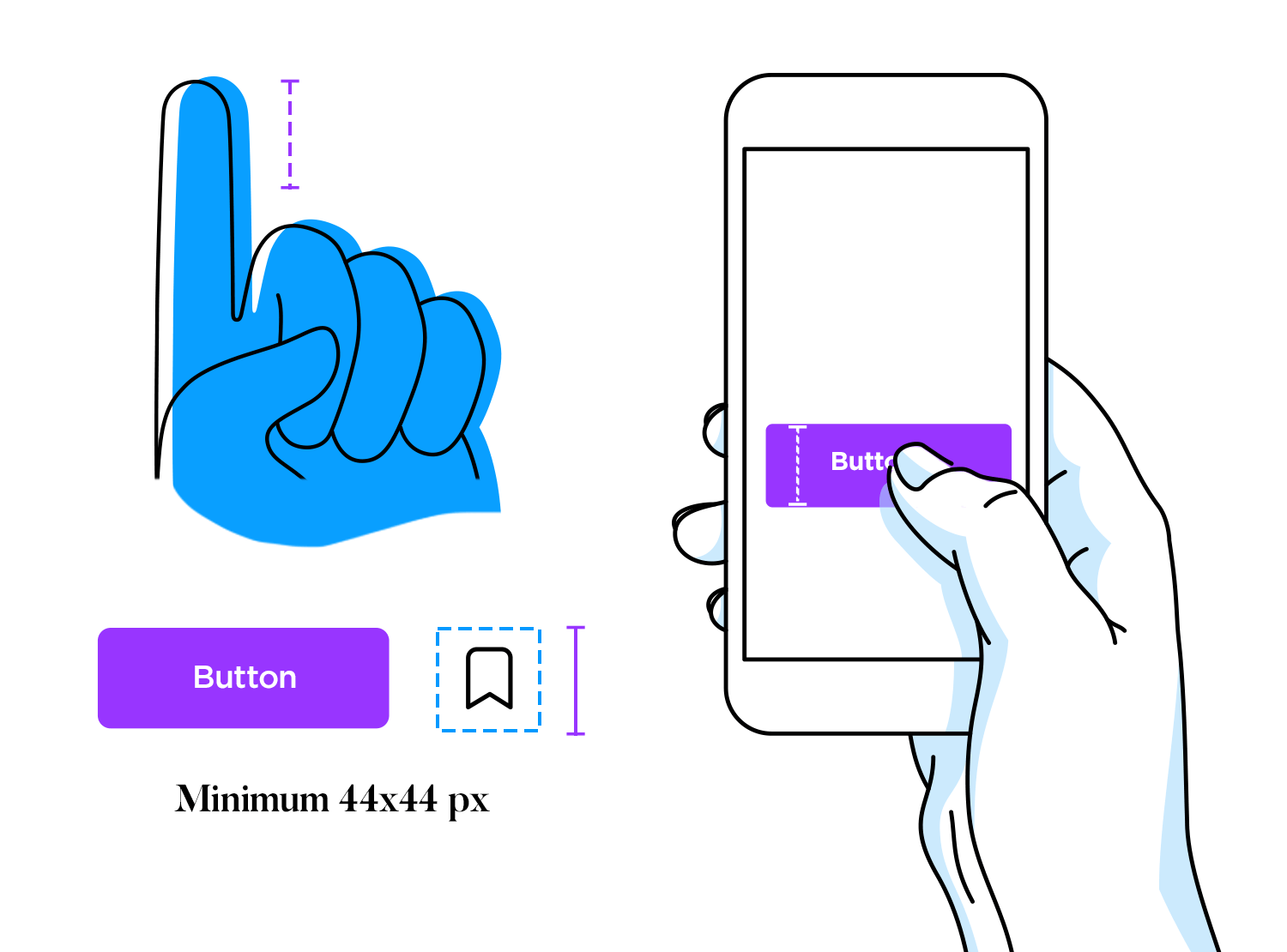
Since users interact with mobile apps through touch, it’s really important to make sure that touch targets (like interactive buttons and links) are big enough to tap easily. A good rule of thumb is to make touch targets at least 44×44 pixels. This helps prevent frustrating mis-taps and improves the overall user experience.
With limited screen space on mobile devices, intuitive navigation design is key. Think about using navigation bars, hamburger menus, or tab bars to help users find their way around your app. Make sure these navigation elements are easy to access and consistently placed throughout the app.
Because of the small screen size, it’s important to prioritize the most essential content and features. Use clear visual hierarchies to guide users’ attention to the most important elements first. This can be achieved through strategic use of size, color, and placement.
Nobody likes a slow app. Optimize your wireframe for performance by designing with fast loading times in mind. Use smaller image sizes and minimize the number of elements that need to load. A faster app keeps users happy and engaged.
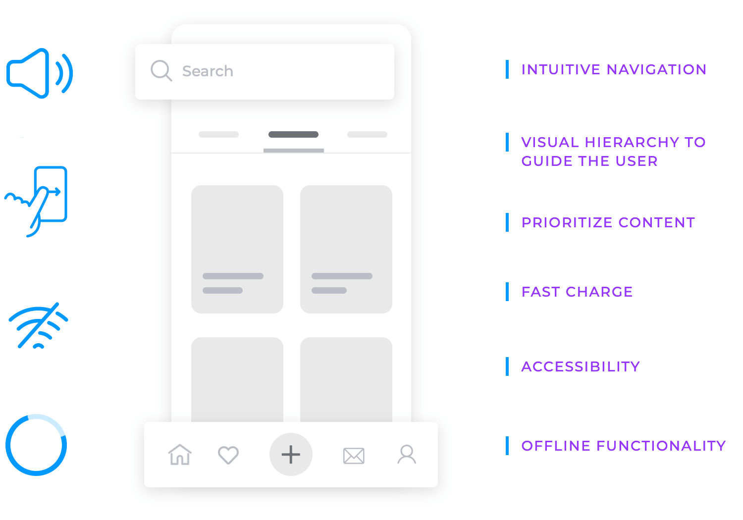
Consider how your app will work without an internet connection. Designing wireframes with offline capabilities in mind ensures that users can still access core functionalities even when they’re offline. This could include local storage options and syncing data when the device reconnects.
Mobile devices support a variety of gestures like swiping, pinching, and tapping. Incorporate these gesture interactions into your wireframe to make the app more intuitive. Make sure the gestures are easy to perform and align with common mobile app practices.
Designing for accessibility is essential to ensure all users, including those with disabilities, can use your app. Consider features like high contrast ratios, readable font sizes, and compatibility with voice-over functions. Including these elements in your wireframes helps create an inclusive app.
Create your app wireframes and user flows

With the fundamentals of mobile app wireframing in mind, let’s explore some practical examples to help you get started. Here are a few popular app wireframe templates that can provide you with some inspiration for your own projects.
If you’re working on a healthcare app, this health services mobile wireframe is a fantastic example. It maximizes limited screen space with a smart grid system, ensuring that vital information is well-organized and easy to navigate.
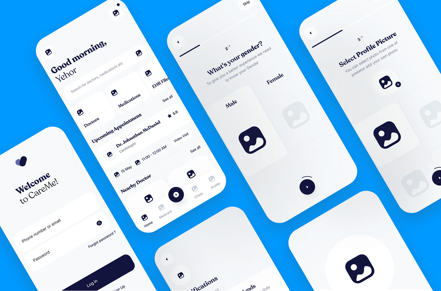
The clear visual hierarchy makes user flows intuitive, helping users book appointments, access patient records, and get health tips effortlessly. This template is perfect for presenting complex health information in a user-friendly manner.
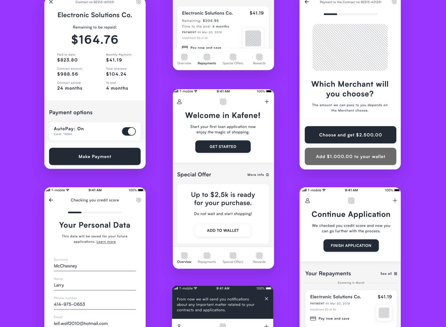
If your next project involves financial services, take a look at this loan app wireframe. It makes complex data easy to understand by breaking it into small, manageable pieces. This wireframe is great for helping users navigate loan applications, payments, and tracking. Its clear and simple design helps users feel in control and confident throughout their financial journey.
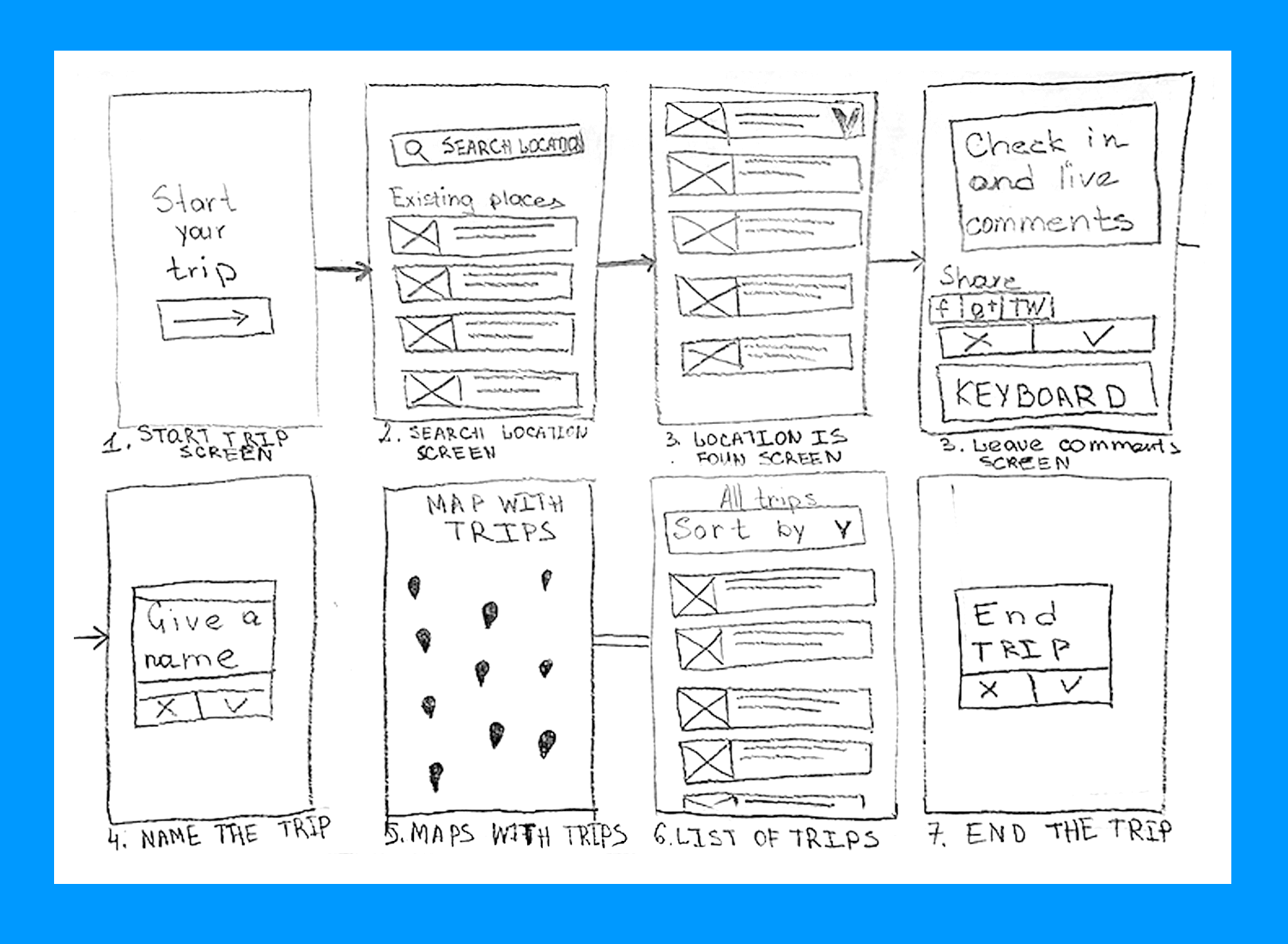
For a project focusing on travel, the trip tracker app sketches are a great starting point. These initial sketches focus on the user journey, from starting and ending a trip to everything in between. They’re simple yet functional, perfect for early discussions to outline the main features and interactions.
These sketches make it easy to see the core functionalities and user interactions right from the start. By using basic shapes and straightforward designs, you can create a user-friendly app that guides users through their travel experiences smoothly.
For those working on an online grocery shopping app, this wireframe example is an amazing choice. It sets a high standard in functionality and user-friendliness. It includes helpful homepage descriptions, a smart side menu, quick social media login, and efficient search options.
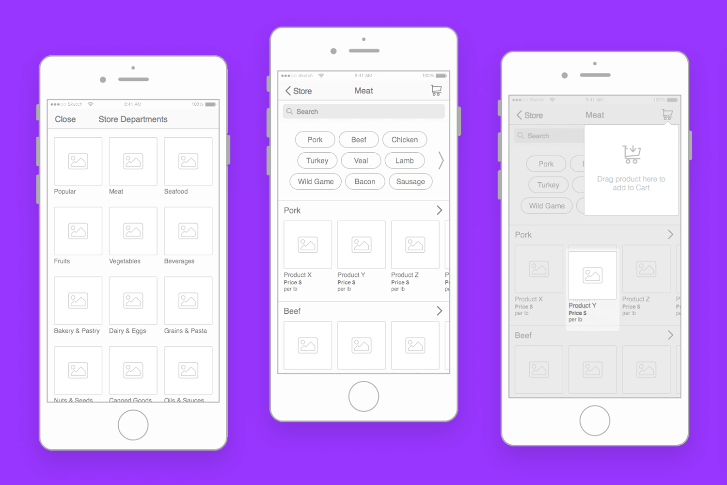
This template is great for simplifying the grocery shopping experience, providing users with easy navigation and quick access to their favorite products. It’s designed to compete with many existing online grocery store apps, enhancing the overall user experience.
For more inspiration and a wider variety of templates, check out our selection of wireframe examples. You’ll find a vast collection of wireframe templates and prototypes that can help bring your app design to life.
Let’s move on to the crucial part of ensuring your wireframe meets user needs: user testing and gathering feedback. Here’s a simple and effective way to do it.
First, start by turning your wireframe into a clickable prototype. This doesn’t need to be a polished version; even a basic interactive model will do the trick. Justinmind makes it easy to create these prototypes, helping you simulate the actual user experience effectively.
Next, get some real users to interact with your prototype. You can invite a small group of people who represent your target audience, and ask them to perform specific tasks, like signing up, finding a product, or making a purchase. Then, watch how they use the app, note where they get stuck, and listen to their thoughts.
- Prepare tasks: define clear, straightforward tasks for users to complete.
- Observe and record: watch how users navigate your app and take notes on their actions and comments.
- Ask questions: after they finish, ask what they found easy or difficult, and gather their suggestions for improvement.
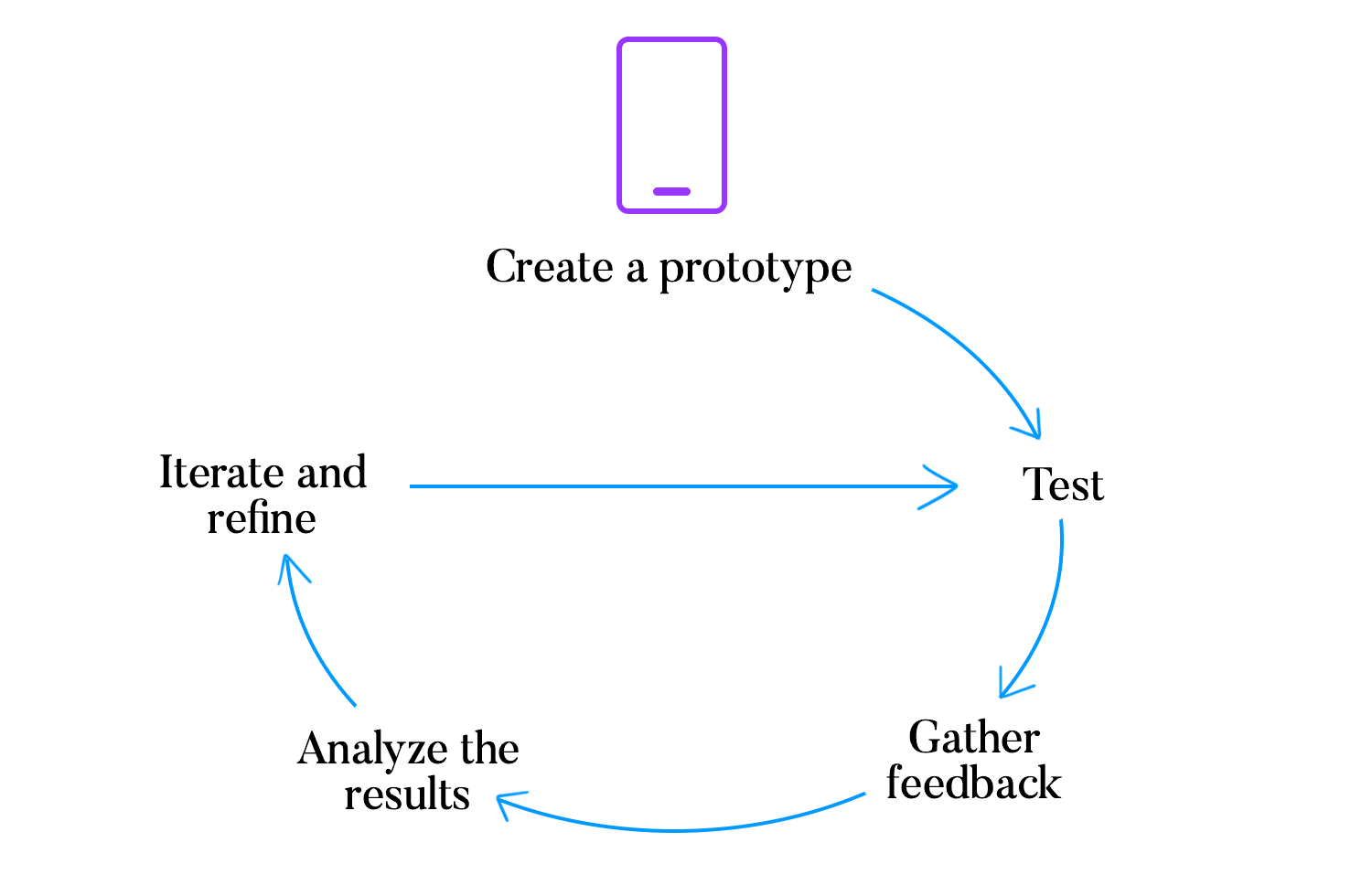
Collect feedback from your users through surveys, interviews, or casual chats. Ask them:
- What was confusing or difficult?
- What did they like the most?
- How can the experience be improved?
Look at all the feedback you’ve gathered and identify common issues. Find patterns that show what changes are needed to help you understand which areas to prioritize.
Use this feedback to make changes to your wireframe. Adjust layouts, improve navigation, or simplify features based on user input. Then, create a new prototype and test it again.
Create your app wireframes and user flows

Since we’ve already discussed how bringing your brilliant mobile app idea to life begins with effective wireframing, Justinmind is the perfect tool for this task. Our platform is designed to make the wireframing process smooth and efficient with its comprehensive UI kit.
As mentioned earlier, Justinmind’s UI kit includes hundreds of pre-built, mobile-ready elements like buttons, icons, menus, and navigation bars.
Creating a wireframe with Justinmind is straightforward. The drag-and-drop interface lets you place these UI elements exactly where you want them, helping you visualize the user experience from start to finish. Plus, the UI kit is fully customizable, so you can tweak elements to match your specific design needs.
If you’re not sure where to begin, Justinmind offers a variety of design templates to kickstart your project. These templates provide a solid foundation, allowing you to build on existing designs and focus on what makes your app unique. From login screens to product pages, our templates cover a wide range of common app features.
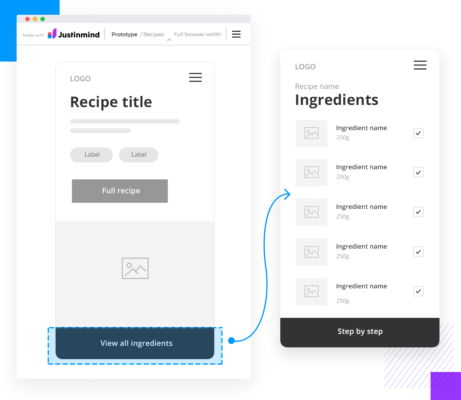
Once your wireframe is ready, Justinmind makes it easy to create a clickable prototype. This lets you test the user experience and gather feedback before moving on to development. By simulating the actual app, you can identify any issues and make necessary adjustments early in the process.
Designing app wireframes with Justinmind is all about bringing your ideas to life in a way that’s both fun and practical. With our extensive UI kit, intuitive design tools, and robust testing features, you’ll have everything you need to create a user-friendly and visually appealing app.
Ready to get started? Jump into mobile app design with Justinmind and see how easy it is to make your vision a reality.
PROTOTYPE · COMMUNICATE · VALIDATE
ALL-IN-ONE PROTOTYPING TOOL FOR WEB AND MOBILE APPS
Related Content
 Progressive disclosure is about helping users get invested before getting to the nitty gritty. Read this post to discover a new way to approach complex features!8 min Read
 Step into a world of innovative UX ideation techniques to help you get your creative juices flowing. We explore a range of methods to help you generate fresh ideas and solve complex design challenges through mind mapping, role-playing, dot voting, and more.19 min Read
 Calendar app design can be simple or complex. In this post, we show you 25 of our favorites and how you can make a start on your own27 min Read
