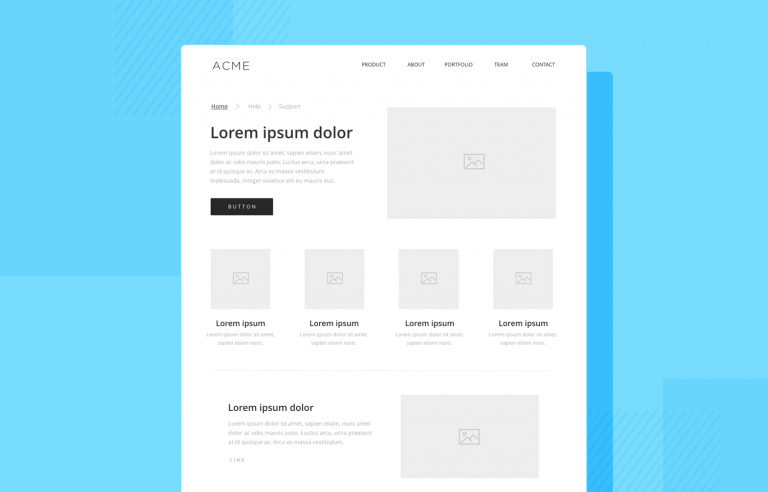
Wireframes can help us create a solid foundation for the product design, but what do they look like? What should be included? Discover it all in this guide!
Wireframes are a common topic of debate in the UX design community. Are they meant to have any visuals at all? Do we need to have real content? Do we make several wireframes or just the one? Do we use wireframes with our design teams and stakeholders too?
Make wireframes simple with Justinmind

They’re meant to be ridiculously simple, but there are still a lot of factors to consider when making one. That’s why we decided to make a one-stop-shop for everything you need to know regarding wireframes. Read on for a complete step-by-step guide that covers both the theory and practice of wireframing!
A wireframe is a basic visual guide used to suggest the structure and layout of a digital interface. Think of it like a blueprint for a building, but for digital products. Just as an architect sketches a house’s layout before adding details like paint and furniture, a UX wireframe sketches the layout of an interface before adding visual design elements like colors and images.
Wireframes are typically drawn with basic shapes, lines, and placeholders. They stick to black and white to keep things straightforward and to focus on the layout instead of the look. This simple approach lets designers zero in on where everything should go and how users will navigate the interface.
Wireframes come in two main types: low-fidelity and high-fidelity. Low-fidelity UX wireframes are very basic, often hand-drawn or created with simple digital tools. They focus on the overall structure and layout without delving into details.
High-fidelity wireframes, on the other hand, are more detailed and closer to the final design. They include more precise placements, annotations, and sometimes even color to indicate different elements.
Wireframe help organize content and features clearly and logically, making sure the interface is easy to understand and use. UX wireframes serve as a great communication tool, helping designers share their vision with team members, stakeholders, and clients, making feedback collection easier.
Additionally, wireframes are excellent for spotting potential issues early, helping designers catch problems with navigation, content placement, or user experience before detailed design work begins.
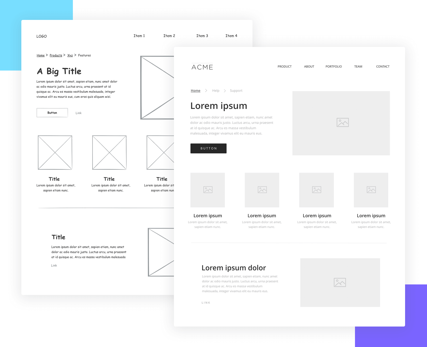
Simply put, wireframes are the backbone of any digital design project. They take abstract ideas and turn them into solid plans, making the final product well-organized, functional, and user-friendly.
If you’re not entirely sure of the lines that separate wireframes from other UX materials, check out our post about the difference between wireframes and prototypes and mockups.
Make wireframes simple with Justinmind

Now that we understand what wireframes are, let’s jump into why and when they are important in the design process.
Wireframes are like the unsung heroes of the design process. They give you a clear picture of your project’s structure before going into all the fancy details.
Firstly, wireframes help you see your design vision more clearly. Sketching out the basic layout lets you visualize how different parts will fit together. This is crucial for creating a logical and user-friendly interface. Plus, making changes is a lot easier at this stage than when everything is already polished.
Wireframes also make it easier to share your ideas with others. When you show a wireframe to your team or clients, everyone can see the same thing and get on board with the design direction. It’s a fantastic way to gather feedback early and make sure everyone is aligned. This kind of collaboration can save a lot of time and prevent misunderstandings down the line.
Another great thing about wireframes is that they help you spot potential problems before they turn into big issues. By laying out the structure and flow, you can catch problems with navigation, content placement, or overall usability early on. This proactive approach ensures that the final design will be more effective and user-friendly.
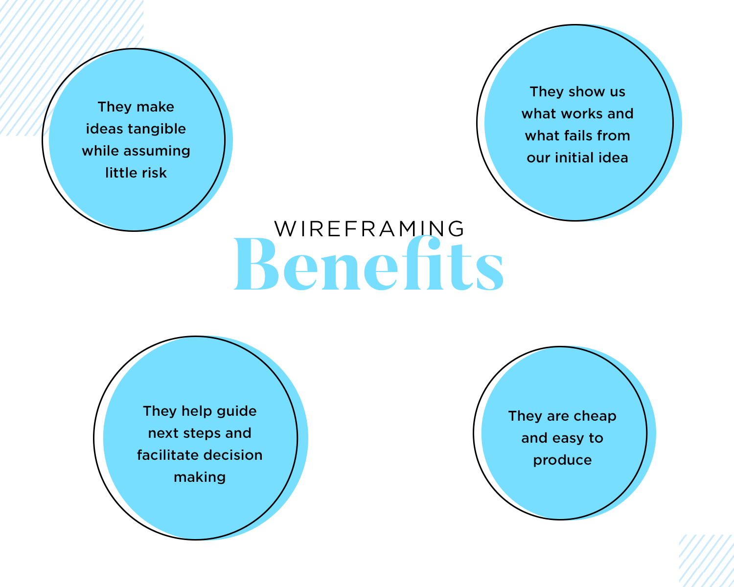
You should start creating wireframes right at the beginning of the design process. It’s an essential step that lays the groundwork for everything that follows. Whether you’re starting a new project or redesigning something existing, wireframes help you plan and organize your ideas in a clear and efficient way.
In short, UI wireframes are a powerful tool for visualizing, communicating, and refining your design ideas. They help ensure your project starts on the right track and stays there, leading to a better and more user-friendly final product.
Since we understand why wireframes are crucial, let’s explore what you need to do before you start designing your wireframe.
Wireframes don’t tend to have too much detail, but there’s a lot of calculated components in them. This means that design teams need to do a lot of work before they can start wireframing, so that each move has a direction. Aimlessly placing components on a blank canvas is a recipe for disaster.
Let’s take a look at some key materials you want to have at hand, so you can wireframe your ideas in a goal-oriented way.
The gathering requirements stage is all about defining the scope of the product and the basic things it needs to do. Often, this will mean spending a lot of time with the client, seeking to understand what criteria is relevant to the question: what does the product need in order to be successful?
This is a list of everything the design needs to include, from components to pieces of information, acting like a checklist so we don’t forget anything important. A silly example is that if an app wireframe means to sell items, you’ll need a checkout button, the correct forms as well as a way to disclose shipping information.
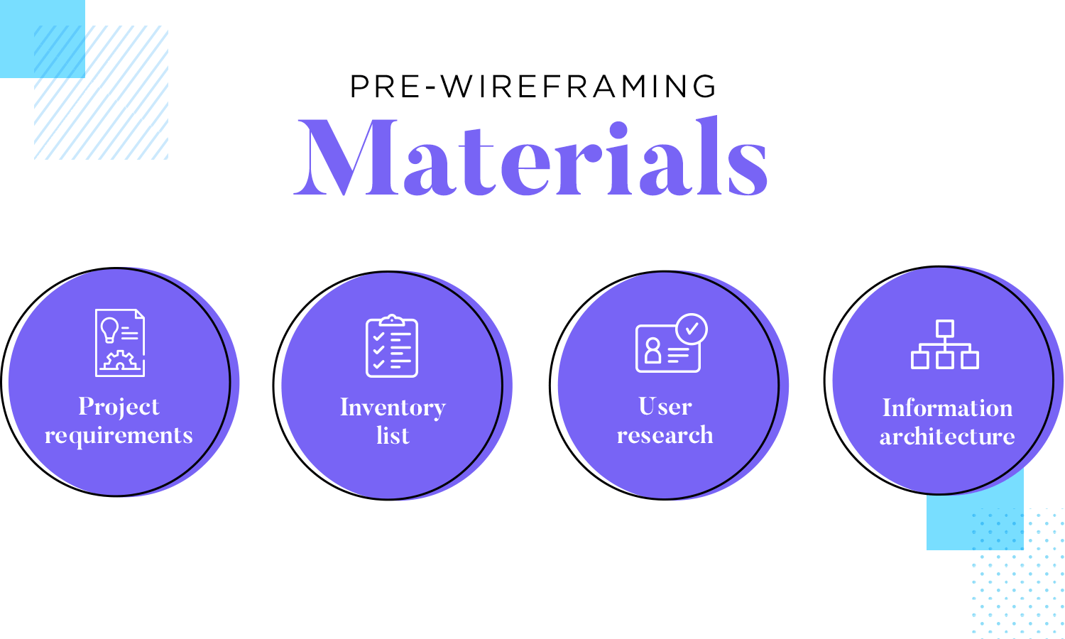
Wireframing is a directed activity, which means we need to know what we’re creating and for who. Your final users will have a great impact on the design, touching everything from the chosen navigation to the choice of buttons. You want the design to be tailor-made for the users, which means you need a very good idea of who they are and what they need.
Once you know everything that needs to go into the wireframe, comes the time to define how each of them relate to one another.
Your navigation patterns don’t need to be final and precise at this stage, but you want to have a good idea of the main pathways that users will use to get around the product – things like what goes into the primary or secondary navigation.
The information architecture (IA) of the product manages all the content of the design, as well as the navigation aspect of the product. It’s all about structuring the information, so it’s easy to both grasp and interact with.
Much like other aspects of UX design, there isn’t a one-size-fits-all approach to IA. You’ll need a good organization system that helps users understand and navigate the entire design.
Organization systems: a structural framework that lays down the connection between different pieces of content so it can be understood logically.
With that said, most design teams will go for one or a mix of the following:
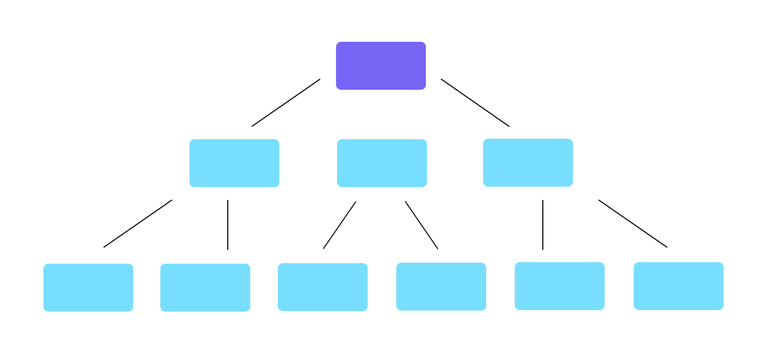
Hierarchical structures: places broad and most important categories at the top, presenting other smaller categories in a trickle-down effect. Also known as tree structures. This can help users find bits of information when there is a lot of content.
Sequential structures: creates a more narrow path that restricts the choices available to users, making navigation much simpler. This is a more controlled take to both information architecture and navigation design.

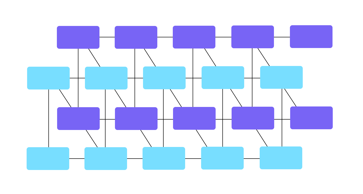
Matrix structures: creates connections between most features and content, and allows the user to navigate the way that suits them best. It’s complex to design and can lead to overwhelmed users by presenting too many options. If you go down this route, you need to be careful to not give users too little structure, resulting in a confusing user experience.
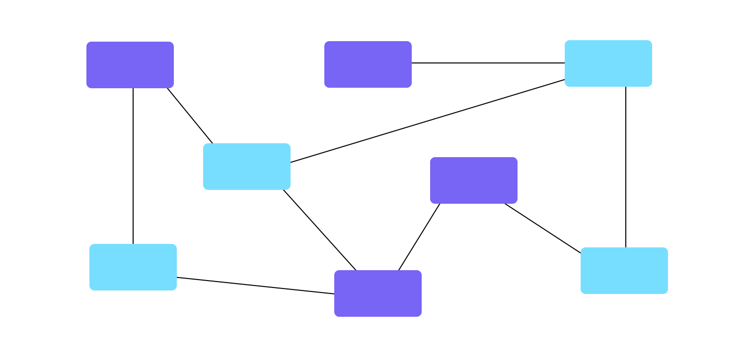
Organic structures: forsake any defined notion of “structure” or “sections”. The connections between content are done on a case-by-case basis, being more appropriate when the relationship between the content isn’t clear. This can be a fun way of exploring, but fails to offer users any indication of where they are in relation to the rest of pages or screens. This can result in a confusing experience for users.
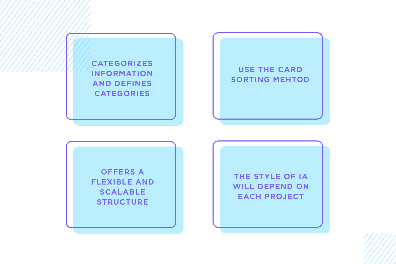
Categorize information as early as possible, then refine your categories. Mixing different content blindly and expecting the user to sort it out is bad practice, to say the least. Test your categories on real users using card sorting, then refine your wireframe. If you can simplify something, do it. You want users to be able to find what they are looking for without much effort, so they can focus on how great the product is.
This face of wireframes is particularly important when we’re dealing with products that hold a massive amount of content. The more content you want to put into the design, the more important it becomes to organize it properly. You want to make sure that no matter how much information there is, every user can find what they need quickly and easily. You need a hierarchy and structure that makes sense.
Many times, designers need to deliver a static product that doesn’t need to hold too much information or products that aren’t likely to change over time. However, the true challenge arises when facing a large product that is bound to grow over time. This is the case for platforms like Amazon or Medium, which have thousands of pages of content that will change quickly from one year to the next.
This is when you’ll need a structure that helps users navigate that sea of content while still allowing the organic growth in content to happen – a structure that offers flexibility to adapt.
The degree of adaptability or the style of information architecture will depend on the characteristics of the project.
This is a good way to take your ideas and put them down so you can see it for real. This is a popular approach for two key reasons. Firstly, it allows you to get many ideas down so you can compare them and see which one is the best option. Secondly, drawing out your ideas on paper costs nothing and yet adds a lot of value to the entire project.
Having a UI sketch done on paper is a good move. It allows you to draw many different options and simply choose the best one. From there, you can start to create a digital wireframe in order to refine the ideas that you first drew on paper.
Before looking into wireframing, make sure you understand the basics of the project. This prep work gives your wireframe direction. Gather essentials like user flows, user personas, mental models, and a rough map of the information architecture. These materials help you understand the main goals and the users. Without them, your wireframe might miss the mark.
Following these steps ensures your wireframes are well-structured and align with the project’s goals and user needs. This groundwork sets you up to create effective and user-friendly wireframes.
Make wireframes simple with Justinmind

With your prep work done, it’s time to start designing your wireframe, step by step.
There’s always a debate surrounding the visual aspect of wireframes. You see, if they are meant to help you visualize things such as navigation and information architecture, they can’t be focused on issues like colors and typography.
Especially when it comes to the initial design stages, low-fidelity wireframes need to focus on the key structural frame of the product and little more.
Your wireframe is a tool that helps in navigation, in making your design coherent and testing the rough usability of your design. Things such as what treatment or filter to use on the images are issues for your high-fidelity prototype.
Regardless of if you would rather use a real image for your wireframe as opposed to a square placeholder – there is one side of visual design that needs to be applied to wireframes from the get-go. That is the layout. It will have a massive impact on the readability and general usability for the interface design and needs to be carefully thought out.
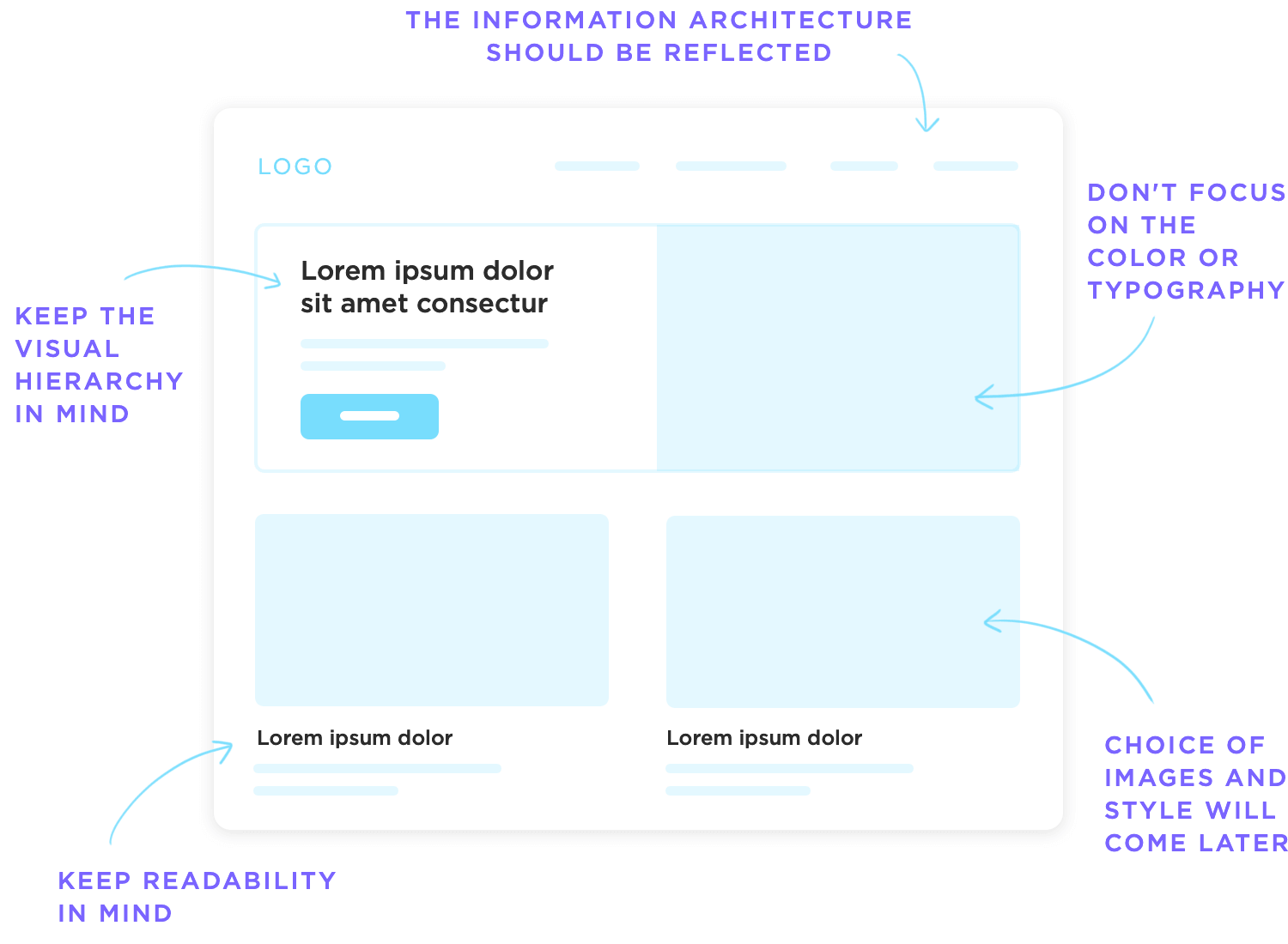
You can draw from your visual hierarchy in your information architecture to specify which elements will be displayed where, making sure you don’t contradict the original plan of content display. Consider other visual design concepts such as:
The Gestalt theory: dictates that the proximity between elements will lead users to believe those elements are somehow connected. Use the proximity to create sub-hierarchies of icons and other elements in the wireframe, making navigation easier for the user.
Whitespace/negative space: can be a powerful tool in guiding the eye of the user to the content or element that really matters, such as CTA. Use the white space between elements to de-clutter the screen and make sure you don’t overload the user at any point in time.
Sizing of each element: logically, when you create your low-fidelity wireframe you still need to account for how you can reflect the visual hierarchy of your content, or how you can improve the readability of that one screen by rearranging the elements in both size and placement.
Repetition/predictability: having a consistent design can be tricky, which is all the more reason to start checking that your design is consistent from the very start. In your wireframe design, try to create a certain pattern of how elements are displayed and lay the foundations for a uniform design – you can build on that as you advance.
Apply your design guidelines or system: if you work for a large company you may already have a guide or set of rules that will help you in creating a product that is compatible with the company. This can take some of the pressure away, as you won’t be starting from scratch but rather on a foundation passed to you from the design system.
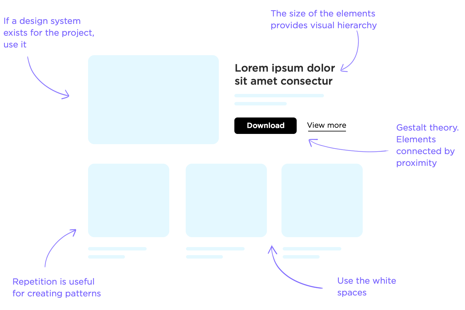
These are some basic design rules that you are probably already familiar with, but keeping these in mind will spare you the trouble of making large changes and adjustments to your design at a later stage in the game. That is because it can be easy to forget what those boxes in your wireframe design represent, and how it will all come together in the end.
One thing that UX designers everywhere still debate is the old question: which came first, the chicken (the content) or the egg (the layout)? Well, you can make an argument for both sides.
Placeholders and lorem ipsum speed up the design process as you won’t have to wait for the real design and copy to be created by other members of the team.
The problem with lorem ipsum is that while it does give us a better idea of what the design will look like once the real content is included, it can also be misleading. Once designers start to depend on lorem ipsum in their design, they can be tricked into having unrealistic expectations of the product when real content comes into play.
If you copy and paste the same lorem ipsum into all slots – they will all line up, they will be the same length and the effect will be of a tidy and clean design. But you can’t expect that to remain the case once you start to insert the real text in those slots.
Here are some crucial concepts to bear in mind when building your wireframe regarding lorem ipsum:
Text overflow and alignment: writing copy doesn’t always lead to a perfect match in terms of space required for text or text alignment. It’s also incredibly challenging to account for this variable without the real content.
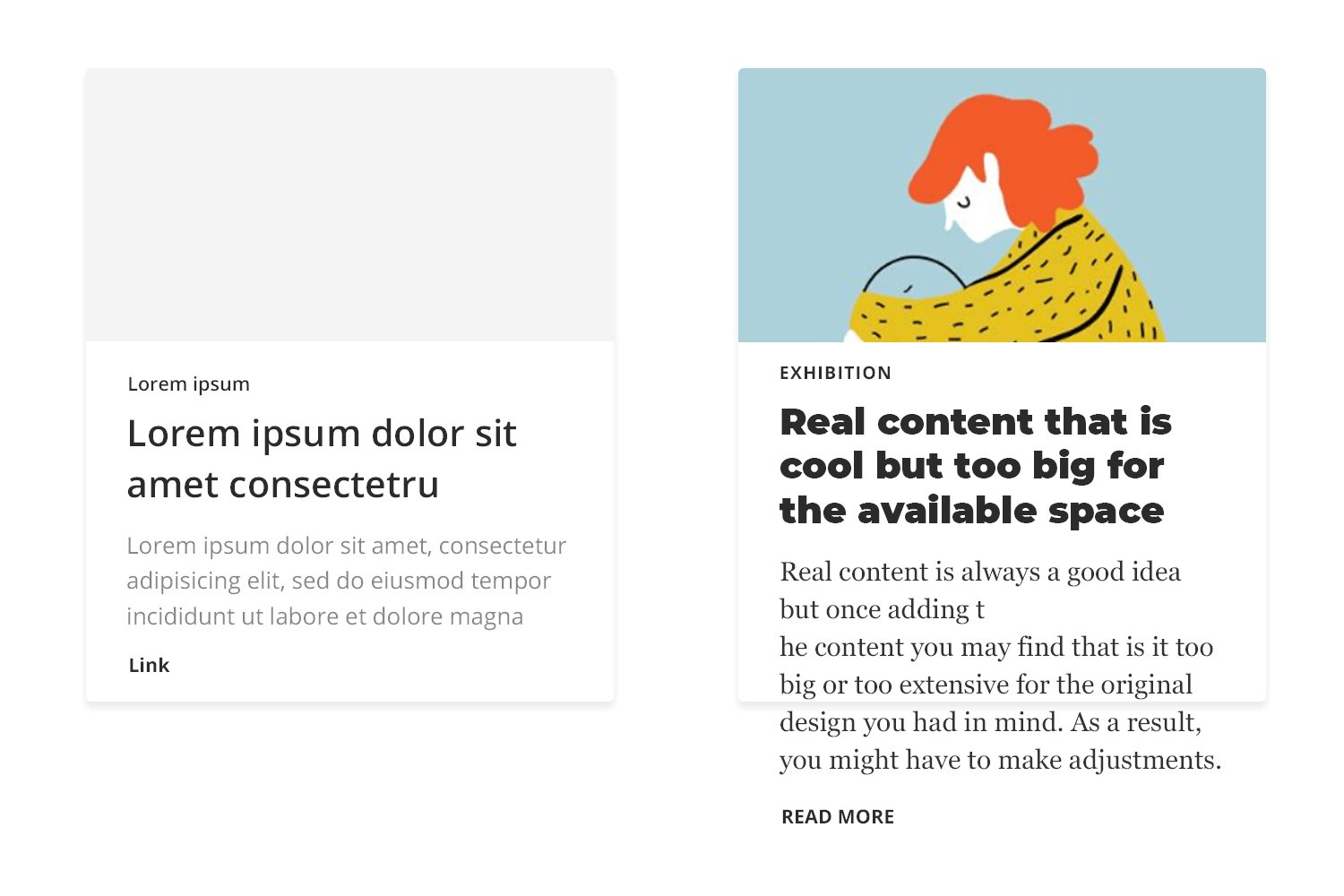
Sometimes, your designated slot for text in that one particular screen ends up empty of content – which leaves you with the question: do we delete that slot entirely or do we find some superficial content to fill in that space?
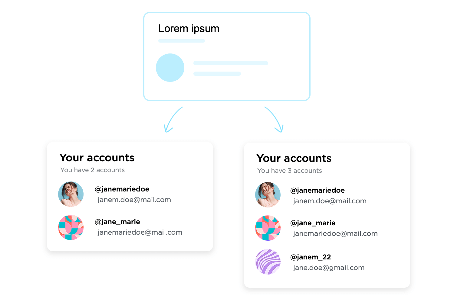
The effect of content on UI layout: creating a screen in which there are 4 boxes with the same amount of text seems straightforward. But what happens if one of the boxes has a lot more text than the others? Ensuring symmetry and consistency isn’t always easy when it comes to written content.
Hence, the real setback of using lorem ipsum in your wireframe: once you have the real content, you’re bound to have to make adjustments in your design at a later stage – when those adjustments will likely be troublesome, expensive and complicated to orchestrate.
Some designers aren’t confronted with these issues until most of the design is done and presented to the respective stakeholders.
In this debate, there is a clear winner: real content. Content plays a central part in the product, and this needs to be reflected in your wireframe design process. It’s much better to spot these troubled areas of your design as early as possible, so you can iterate when the project is still easily adaptable.
Unfortunately, things aren’t always that straightforward. Obtaining the real content can be tricky, particularly if your project includes large teams or if you work for a design agency – making it nearly impossible to obtain the content ahead of the wireframing stage.
If you’ve defined the information architecture of your design, you have probably already touched the navigation system design.
In order to organize your content, you’re forced to consider things such as the labels of each piece of content and how it fits within the wireframe. And you have to present that content a certain way if you want the product to have good usability.
This is very challenging, as navigation for its own sake isn’t something users wish for.
When was the last time you enjoyed surfing around an app, looking for that one piece of information you wanted? Looking for things in the product is never fun, and can get really frustrating within seconds.
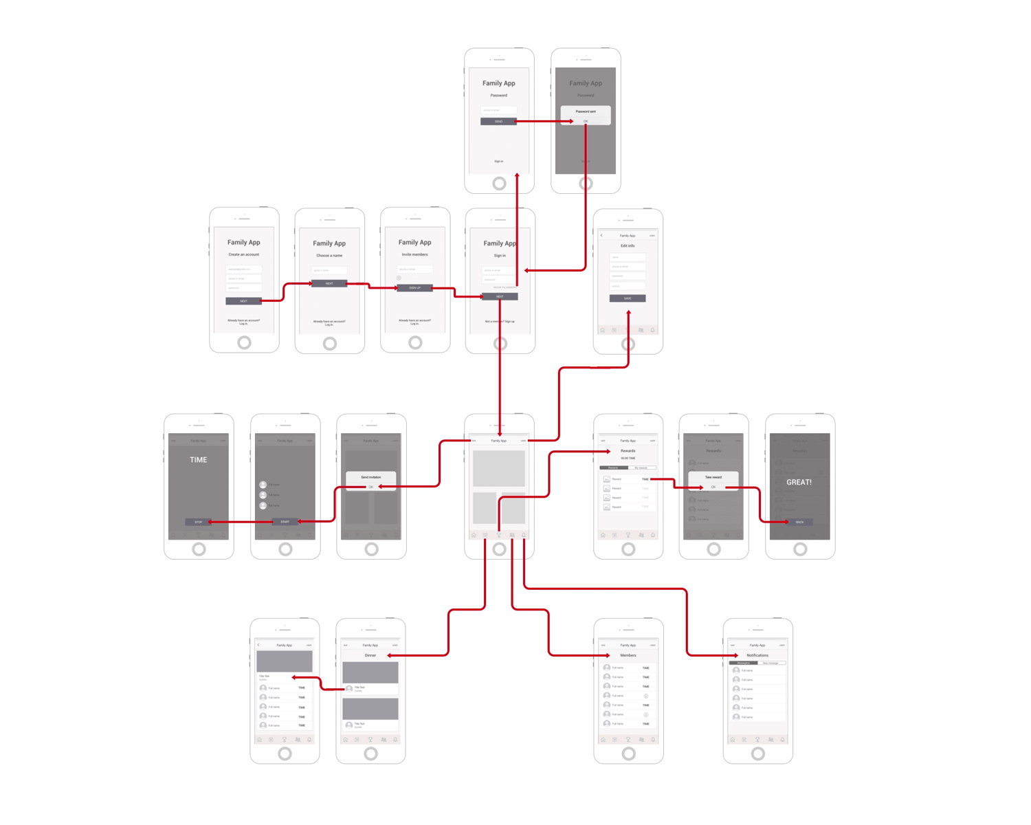
Even though there is no one-size-fits-all recipe for what makes for good navigation in your wireframe, the general rule is that your navigation needs to promote good usability. This has a few consequences that should be reflected on your navigation flow:
People can feel lost in a virtual product: you want to let users know where they are at all times, even if you just let them know the general branch of the product they are in.
You want the navigation to be consistent and coherent, to the point where users can predict where certain things are based on the general interface design. This will help your product be more learnable and discoverable for new users.
You want clear goals: you don’t want to get from point A to point B on the least possible amount of clicks. You want to get there in the most fluid, logical way possible – that is what marks a truly good navigation system.
This should make it clear that your homepage or home screen, for example, shouldn’t have a link to every possible page in your product. Make roads that users can follow and don’t focus so much on shortcuts.
Have primary and secondary navigation menus: navigation design is complicated and it must take the user to every corner of the product – which means that extensive products will likely require two menus.
The primary should be the main road for most users, touching all the key features and important areas. Secondary menus can lead to other, less central parts of the product. Card sorting can be quite handy in defining these menus.
Some of the most commonly used patterns have helped countless UX designers create good navigation systems for their designs. These can be seen as handy tools that can help users make sense of the product, allowing them to make the most of it. Here are the classics:

Try leaving breadcrumbs for users: not quite as literally as Hansel and Gretel, but still a way for users to find their home, or any of the previous stops they made along the way to their current screen.
These are used mostly by large that have a big amount of content in a hierarchical system. These should be considered a secondary navigation system, so you shouldn’t rely on them as the primary means of guiding users.

Feed users hamburgers: hamburger menus are quite popular in smartphone applications, even though they have been on the receiving end of quite a bit of criticism from the design community.
Among the arguments against hamburger menus is the fact that many of the features listed there can be easily overlooked and left unused by the user. While that may be true, burger menus are still a practical way to lay options at the user’s feet without eating away too much screen space (something crucial for smartphone applications).

If hamburger menus aren’t for you, the biggest alternative are tab bars. Usually placed at the top or the bottom of the screen, these are classic bars with icons which sometimes include microcopy.
These are scalable, especially when we consider vertical navigation. Tabs can help the user have a better understanding of where they are or where they want to get to – Facebook combines both tab bar and hamburger menu by making the burger one of the icons on the bar. Smart, eh?
Another side of wireframe design that tends to stir up debate among the UX community, and for a similar reason as visual design. Just like there is no clear-cut answer as to whether your wireframe design should be high-fidelity or low-fidelity, the right level of interactiveness will depend on several factors.
One argument that has been gaining popularity is the case for interactive wireframes as a way to progress rapidly.
Many designers make the mistake of labeling wireframes as extra fat, as they don’t add much and represent an extra step. But you can completely mitigate that misled assumption by creating wireframes that are more than just another static file – that’s when designing interactions comes into play.
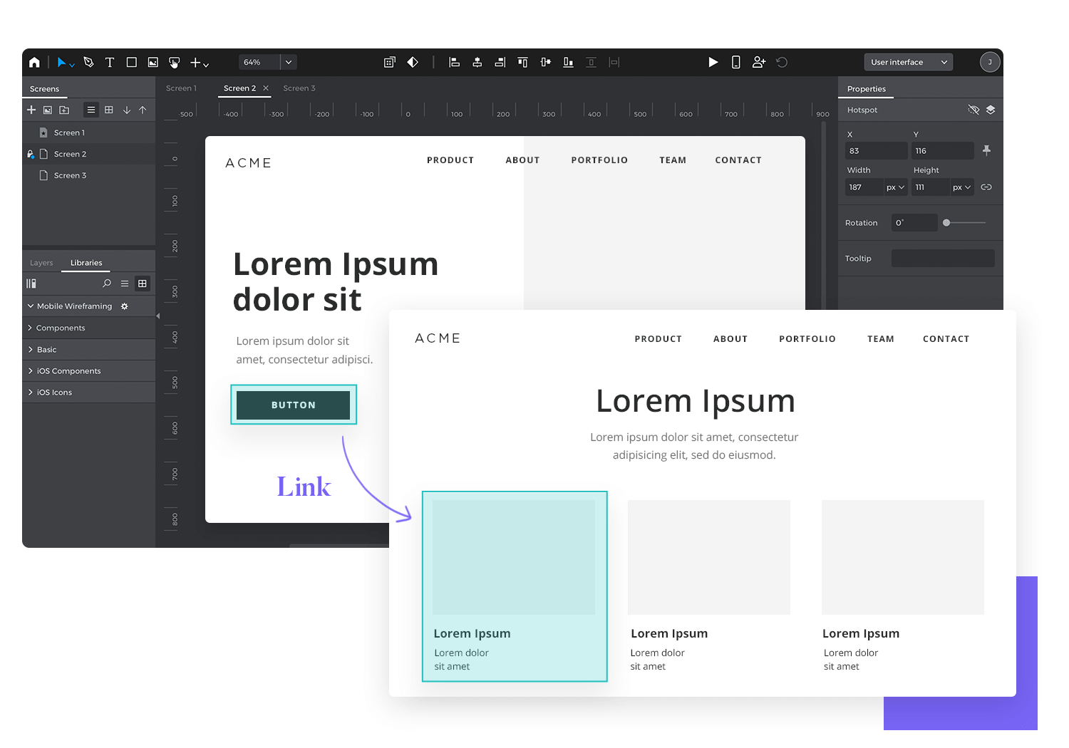
Even with a low-fidelity wireframe, including the most basic interactions will help you verify their usefulness by testing at the early stages. By leaving most details for later, your wireframe will still be relatively easy and quick to create – but will allow you to reiterate on elements that can be improved from the start.
If you’re confronted with having to decide between a few navigational options, you can create separate interactive wireframes for each one and test them with real users.
That way, you ensure that you choose the best possible direction when it comes to the usability of your product – before you come to a point in the project where any changes to navigation would represent a massive additional cost.
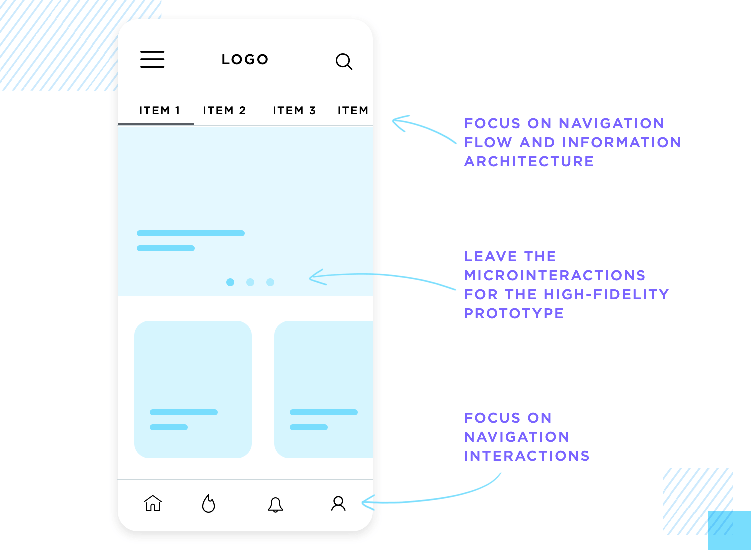
With all that said, you must draw a line when it comes to the interactions you’ll include in your wireframe design. Wireframes are meant to be a practical and quick tool, not a full-on high-fidelity prototype.
You want to focus on the interactions that are crucial to the product and leave all the others for a later time. Things such as microinteractions are added later, when you already have a solid base upon which you can build.
Make wireframes simple with Justinmind

Carry out user research. This is a cardinal rule of any product development project. By the time you start to create wireframes to transform a conceptual idea into a tangible design, the research needs to be done and available to the entire team. Despite the initial simplicity of wireframes, they still need to be tailor-made for your users.
Build navigation patterns into your very first wireframes. It’s important to work the navigation into the design from the start. Users need to be able to find what they want, to be able to discover and explore. This is the last thing you’d want to be rushed or flawed. Besides, users like to know where they are at all times, making this a serious usability matter.
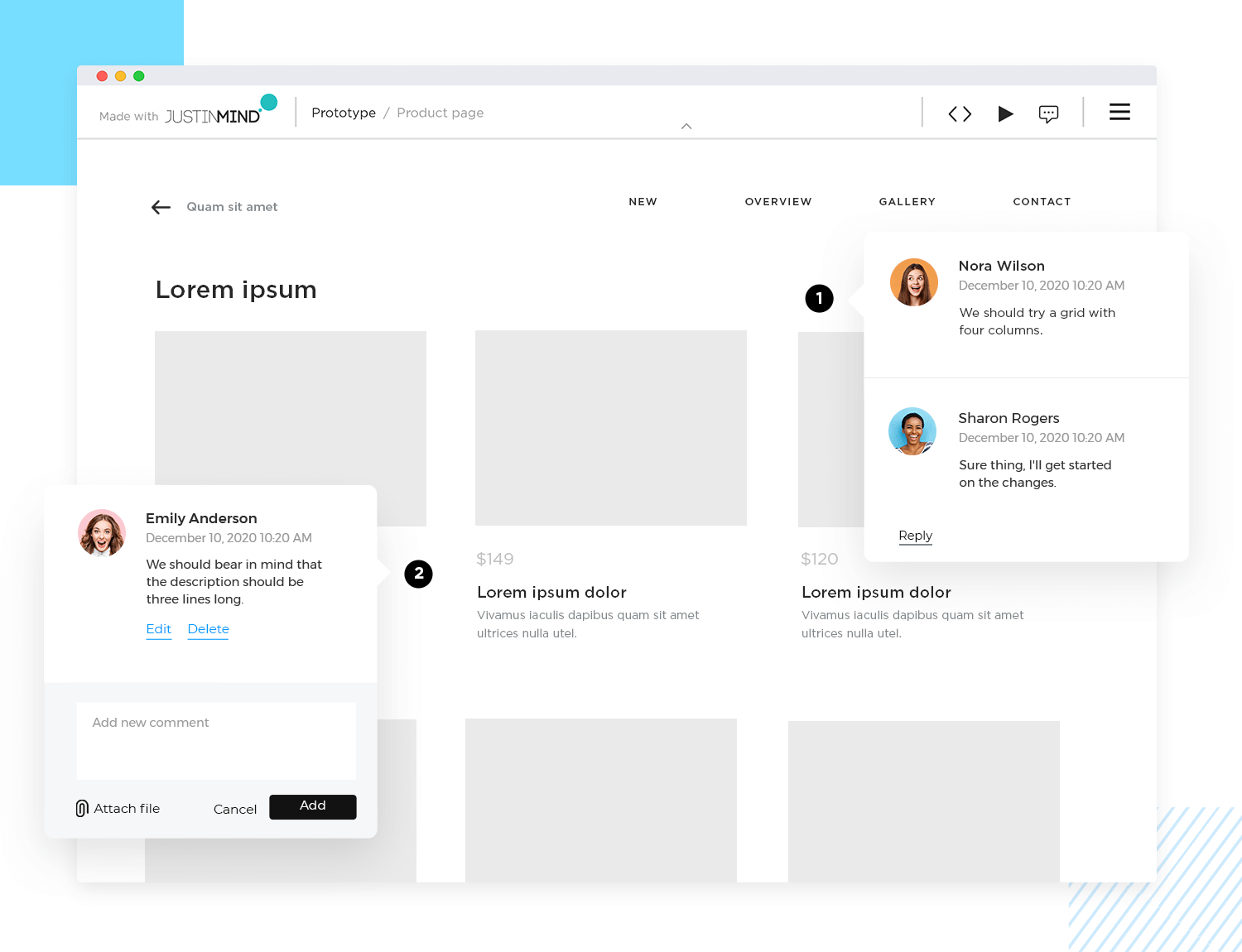
Collaborate and listen. Wireframing software improves team collaboration and facilitates the collection of user feedback. Use your wireframe tool to work simultaneously on online wireframes, comment on them and make them shareable on any browser or device. Listen to what people have to say about your work and then go back to the wireframe. Hive-mind collaboration is a great way to rapidly iterate and refine the design.
Keep it simple! Take advantage of a wireframe to validate basic functionality and make it as strong as it can be. Your team will be able to deliver better results if they are sure of the foundations of the design instead of constantly changing things about the layout, navigation or general IA. You want to create a solid foundation with a low-fidelity wireframe, then move on to finer details.
Don’t elevate style over substance. The wireframing stage is not the moment to waste precious time debating things like colors or images or anything strictly visual. Leave that to the final stages of UI wireframing, when you’ve got the base of the product down. Validating basic functionality before aesthetics will greatly improve your workflow, with much less re-work being necessary.
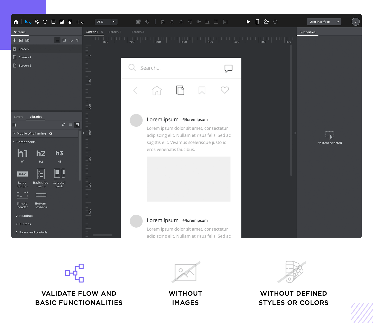
Don’t skimp on content. Yes, wireframes are meant to be quick and dirty. But using real content can avoid having to do huge reworks later on in the design. It’s true that this isn’t always possible, but it’s always preferable to placeholder content. We’ll look into this topic further on in this guide.
Don’t forget to test wireframes on key users. They may be kind of basic but early-stage validating can break open the design process and shine light into dark product corners. Even if all you have is a static wireframe with the bare bones, you want to get users face-to-face with the product and see how they react. The validation is meant to be done constantly as you develop the wireframe, not once you think the design is done.
Don’t use low-fidelity wireframes to convince stakeholders. This is particularly dangerous in the first stages of the design, when all you have is shapes and boxes. If the stakeholder isn’t a designer, it can be difficult to look at the wireframe and see the final design. That imagination jump doesn’t come easy to the average business analyst and can leave people feeling underwhelmed with the progress made so far.
Wireframes are essential for any digital design project. They help you organize content, visualize layout, and spot potential issues early on. By taking a structured approach, you ensure your wireframes are clear, functional, and aligned with your project’s goals.
Start by understanding the basics: gather project requirements, list essential components, conduct user research, and map out the information architecture. Sketch your ideas on paper first to explore different options easily. When you move to digital wireframing, focus on layout and navigation rather than visual details.
Wireframes also serve as fantastic communication tools. They help teams collaborate, gather feedback, and make sure everyone is on the same page. Use tools like Justinmind to create interactive wireframes and make your design process smoother and more efficient.
Remember these key tips: prioritize user research, build navigation patterns from the start, collaborate with your team, and keep your wireframes simple and focused. Don’t get bogged down by visual details too early, and use real content whenever possible to avoid major reworks later.
Follow these principles to create wireframes that lay the groundwork for a successful, user-friendly final product. Happy wireframing!
PROTOTYPE · COMMUNICATE · VALIDATE
ALL-IN-ONE WIREFRAMING SOFTWARE FOR WEB AND MOBILE APPS
Related Content
 Microcopy may be mini, but it can have a macro impact on user experience. Check out these 15 examples and start writing great UX microcopy16 min Read
 UX design has changed all of our lives forever - but what does it entail, exactly? What do designers do to create incredible products? Read on and find out!15 min Read
 Progressive disclosure is about helping users get invested before getting to the nitty gritty. Read this post to discover a new way to approach complex features!8 min Read
