Prototypes are a UX designer’s best friend. They provide an extensive list of benefits to product development teams, clients and users.
Start prototyping your web and mobile apps today
However, to reap these benefits, you’ve got to do it right. In this guide, you’ll learn what a prototype is, the benefits, the different types, how to make one and what you should look for in a prototyping tool.
- What are web and mobile app prototypes?
- Types of prototypes
- Why design website and app prototypes?
- Tasks before starting a prototype
- Step-by-step to designing a prototype
- Prototyping a website: things to take into account
- Prototyping a mobile app: important points
- Best practices for designing prototypes
- Collaborative prototyping
- The iterative cycle
- Typical profiles in prototype design
Prototypes are a close replica of what the end result of a product will look like, usually without code. They incorporate most of the final UI design and interaction that the finished product will have. Prototyping is one of the most powerful tools in a UX designer’s inventory.
They’re a powerful way of designing any digital product because they help us experiment and test out assumptions without them erupting into costly mistakes later on down the line. Prototypes are also an ideal way to communicate functionality, interaction and UI design to all those involved. This kind of communication leads to what’s called the “iterative cycle”.
Paper prototyping is a fast and easy way of illustrating a concept of your product by using nothing more than a pen and paper. It’s also the least costly method of prototyping. That’s if you include the cost of paper, the pen, and well, a coffee for your users if they need an incentive!
With paper prototyping, you can sketch out the main screen layout, along with basic elements and shapes. You can create several sheets of paper that represent the different screens.
Paper prototypes allow you to sit down with your user and give them tasks to complete, pretending that what they see on paper is a real website or app. They can use a pen as a mouse if it’s a website or their finger if it’s a mobile app. When they tap a button, you replace the sheet with the next screen that the button would lead to.
A low-fidelity prototype generally consists of a bare-bones version of the final product. It typically contains the following:
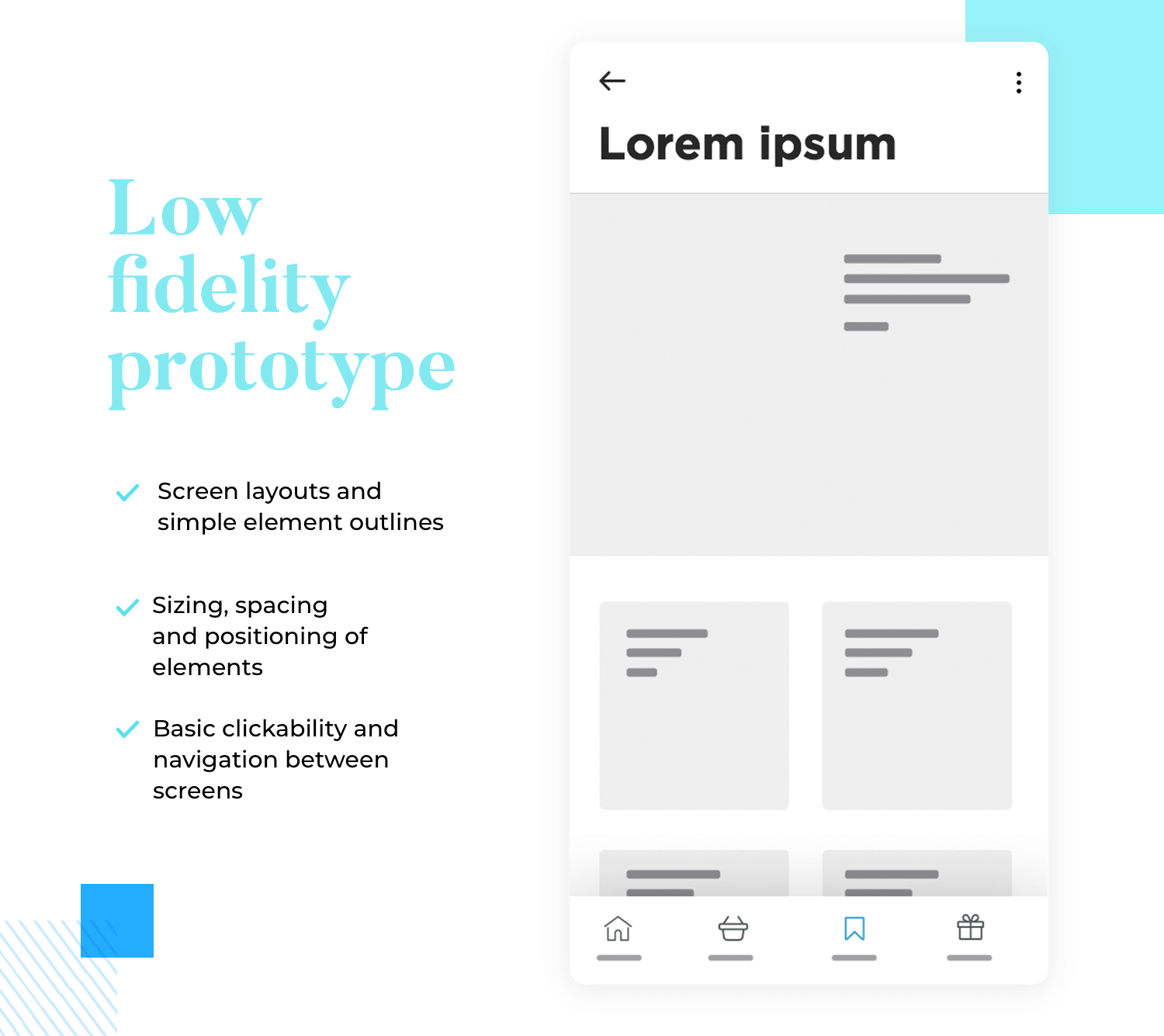
- Screen layouts
- Simple element outlines
- Sizing, spacing and positioning of elements
- Basic clickability and navigation between screens
The reason for simplicity at this stage is to solely keep the focus of attention on fundamental screen layouts, information architecture (IA) and navigation. This helps to conceptualize the product’s basic functionality without extraneous distractions. It’s also useful for early user testing and obtaining crucial stakeholder buy-in, before any advanced interaction and UI design is added.
Check out this post and discover the differences between a prototype and an MVP.
With a high fidelity prototype, you should be close to having designed all but the finished product. High fidelity prototypes will contain all of the layouts, spacing, element positioning and navigation of the lo-fi prototype, but with a lot of extra details.
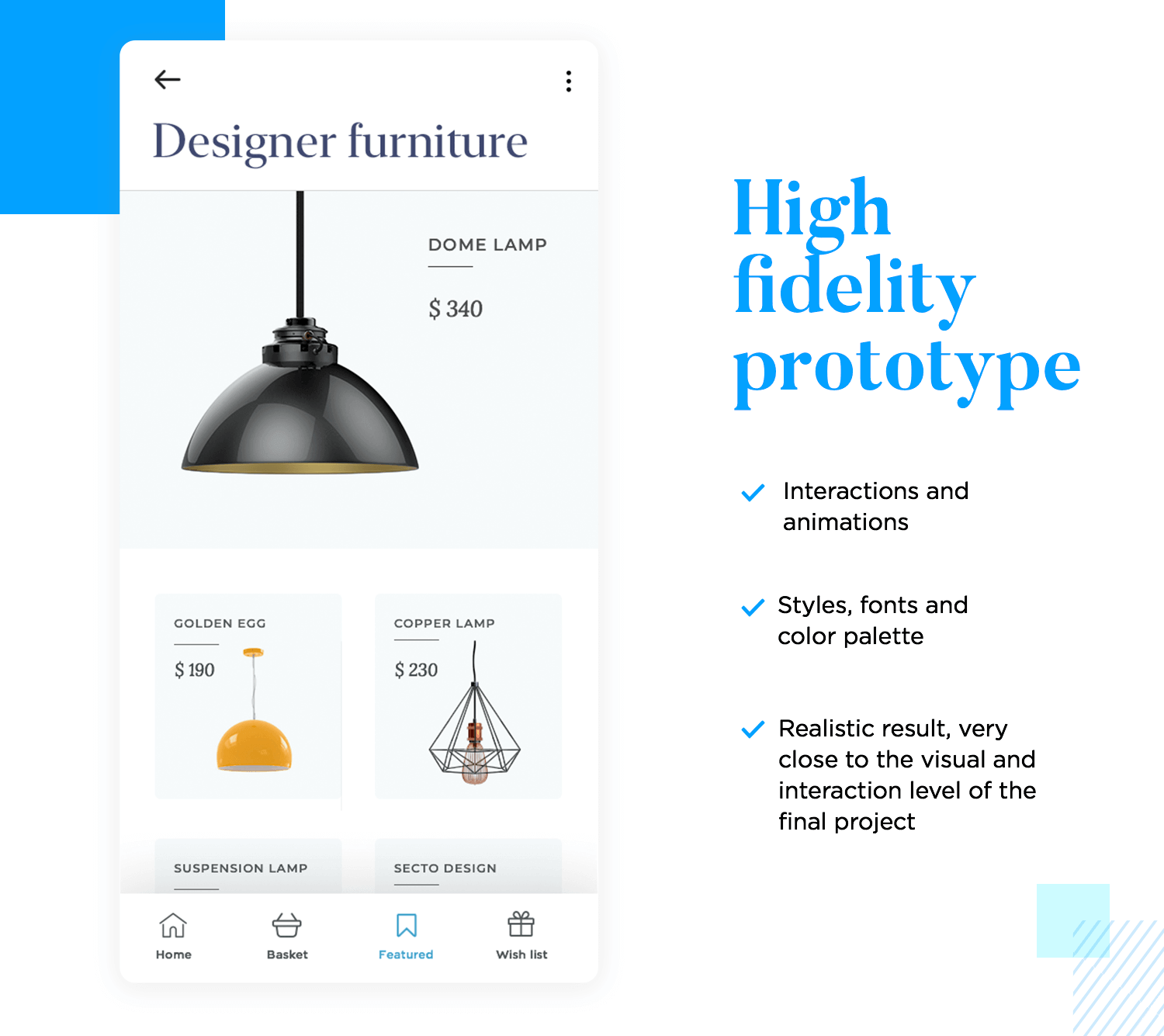
You can usually identify hi-fi prototypes from the following aspects:
- Interaction
- Advanced UI design
- Real content
- Data visualization
As a natural progression, the basic navigation in the hi-fi prototype gets further iterations to create more advanced interactions.
Examples might include page scrolling, mouse over microinteractions for a website prototype, or an icon changing color when tapped on a mobile prototype. Other interactions might include onscreen navigation between dynamic tabs and in accordion menus; even parallax scrolling.
In addition to this, high fidelity prototypes will contain more advanced element design, colors, unique fonts, high definition images and real content. They are also more likely to demonstrate the functionality of data visualization which we’ll discuss in further detail below.
High fidelity prototypes will be used to show clients and other stakeholders the functionality and visuals of the product so that they can validate the design before you hand it off to the developers. Getting stakeholder feedback on a design before handing it off to the developers is crucial, as any reworks or design errors will be expensive and time-consuming to fix once the coding starts.
Testing your prototypes is of utmost importance before it comes to developer handoff. After all, the prototype isn’t just to show to stakeholders and developers, but also to your users. If users are able to navigate the product well and accomplish the tasks you’ve set for them and if they like the design, you’re ready to hand it off to the developers.
Start prototyping your web and mobile apps today

If you’re designing a website, check out this awesome tutorial on how to create a responsive website prototype in less than 10 minutes. Alternatively, you can also just choose your pick from these wonderful website design templates to get a head start.
Prototyping your designs and testing out your assumptions and ideas early on is a great way to prevent hiccups down the line. If you go directly to code without testing your ideas and make a mistake, a rework will be much more costly, not to mention time-consuming to fix.
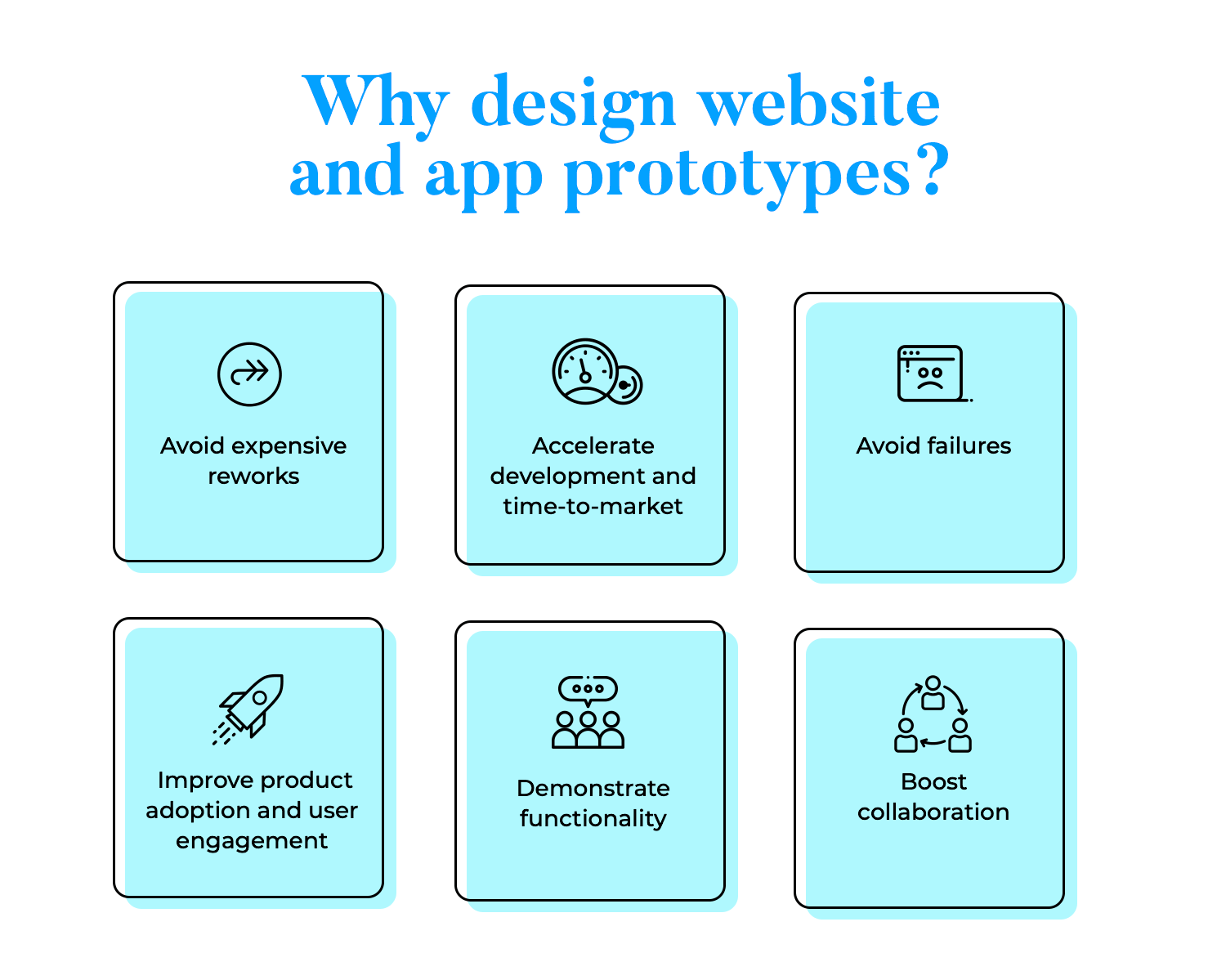
By deploying rapid prototyping and using the fail-fast method, you’ll be helping to speed up your product’s release. This is because stakeholders will be able to validate design decisions much faster and there will be less ambiguity at the development stage.
It’s no secret at this stage that designing high fidelity, pixel-perfect prototypes to test out on your users leads to a more user-friendly product. It also means that you’re far less likely to make design mistakes that only get spotted after costly development work has begun.
It’s also no secret that a more user-friendly product leads to much higher adoption and activation rates, while also leading to increased user engagement.
On top of that, prototyping is also a great way to demonstrate your app or website’s functionality to clients and stakeholders. By presenting them with a prototype, you’re saving hours of long meetings, extensive technical documents and misunderstandings.
Sometimes to get your point across and obtain buy-in, you need to demonstrate it visually, otherwise things can get lost in translation. Like those “you’d need to see it to understand” moments. What better way to explain a product concept, than to show the product itself?
Prototyping helps you to efficiently share your design ideas with a team. Let’s say you have a suggestion for the client on how a particular feature should behave in the product. What better way to demonstrate that idea than to prototype it? Then you can go ahead and test out that feature on your users and see if it’s for keeps.
Prototyping is never done in isolation – it’s always for someone else – the user. Carrying out the appropriate user research to find out who they are and what their pain points are is paramount to not only a successful prototype, but a successful product. Carry out user research will not only help inform your product’s design and functionality, but will also help you identify whether there’s a real need for your product on the market.
The requirements gathering stage is all about defining the direction the product will take, along with its core features. Usually, this means spending time with the client and listening carefully to their ideas, having presented them with your user research data. This allows you to unanimously consider the best way to design the product.
Pinning down basic click-through navigation in a lo-fi prototype and establishing a firm IA lets us move on to a more refined prototype. At the high fidelity stage, you’ll be building on that navigation and creating more complex interactions, such as:
- Scrolling
- Tabbed menus
- Accordions
- Dropdowns
- Hamburger menus (on mobile)
- Carousels
- Parallax scrolling effects
Adding this degree of fidelity to the end product allows you to conceptualize and demonstrate the functionality that the end product would have to stakeholders and developers, and to test them on users. This is also the stage where you’ll try to enhance the user experience, so that your end-product is more than just usable, but also gets your users hooked.
A wireframe is a straightforward portrayal of an item’s design. They’re unimaginably helpful at the start of any design process since they help to rapidly conceptualize ideas. Wireframes generally zero in on the central issues like element spacing, positioning, general screen layout and user flows. They help designers center around the more practical part of the design before proceeding to advanced design and interaction.
Start prototyping your web and mobile apps today

Before we get into the general steps that go into creating a prototype, take a look at some concrete tutorials that our team has created over the years. These are much more specific and work well as practice before you start getting your ideas down into a prototype. Check them out:
- How to protoype a chatbot
- How to prototype and validate forms
- How to prototype a grocery app
- How to prototype login forms
Once you’ve spoken to the client, nailed down some user research and devised your product requirements, you’re ready to start creating a lo-fi prototype.
Now you can start to build your screen layouts, along with UI element sizing and positioning. Additionally, this is where you’ll implement a basic navigation flow and cement a core UI design. There’s no need to delve into too much detail at this stage. You’re essentially just building out a basic outline of your product’s screens that lets clients, stakeholders and users click through and test the water.
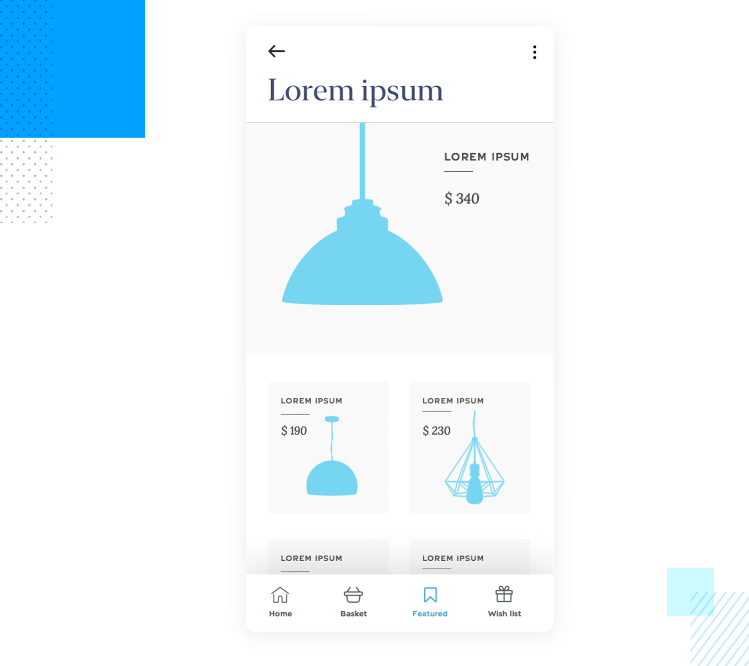
As you move on to a high-fidelity design, your prototype should start to demonstrate more profound functionality. An example of this would be creating a search bar that retrieves data stored in the prototype based on input from the user, accordion menus, dropdown lists and other similar elements.
A further aspect that distinguishes hi-fi prototypes from the lower end of the spectrum is that they often store both numeric and text data, as well as certain settings the user enters. These settings can be stored and affect other elements in the prototype, either on the same screen or different screens.
For example, imagine you’re prototyping a sign up form and want the user’s email address to be saved and appear on another screen, such as the account page. The variable would allow this to happen, making the experience more meaningful and realistic during testing.
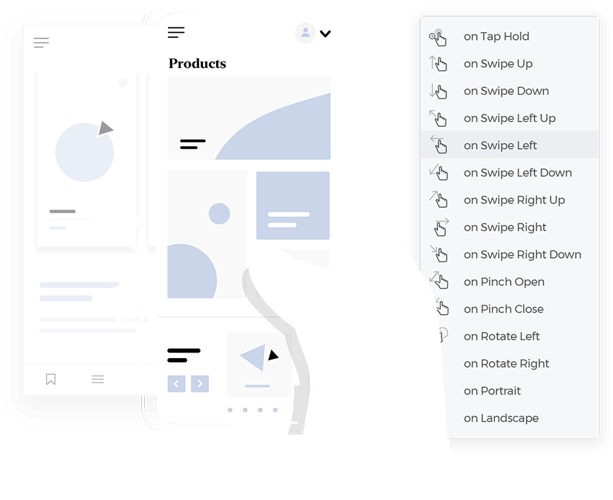
Microinteractions are a crucial aspect when it comes to refining the design at the hi-fi prototyping stage. A microinteraction usually consists of a trigger initiated by the user or the system, followed by some sort of feedback.
An example of this could be adding mouse over effects to change the states of various elements like buttons, links and images to show they’re clickable. A menu that slides in when the hamburger is tapped is also a microinteraction.
These small but significant interactions help improve the user experience and make your product more intuitive and usable.
Think about adding in transitions when it comes to loading new screens or appearing/disappearing elements. We’re talking fade-in-fade-out transitions and exploding elements. These types of interactions not only add some pizzazz to a UI, the fractional delay they cause helps the user’s eyes readjust.
When you get to the high fidelity stage, most prototypes will have an advanced level of UI design. At this stage you should implement your chosen color palette based on brand guidelines as well as advanced styles for elements, such as tones, gradients and shadowing.
Make sure the color combinations you use provide good accessibility and usability, while also accentuating your brand. That is, adequate contrast for visually impaired users while also consistently reserving colors like red and green for error and success messages.
Choosing the right typeface and font to use in your prototype is important as it will be the closest reflection of the final result, making it an important element to note while testing. Why? Because it’s crucial when it comes to the UX and basic usability. If users can’t easily scan and read your font, you’ll be less likely to activate and retain them.
Lastly, in the high fidelity stage we’ll want to be working towards a pixel-perfect representation of our end-product. That means refining the spacing and positioning of all UI elements to the exact pixel. Defining this type of information in the prototyping stage will make it easier when it’s time to develop the product.
At the low fidelity prototype stage, you’ll more than likely be using placeholders for images, as the focus will be simply on layout, navigation and the type of content displayed on the screen.
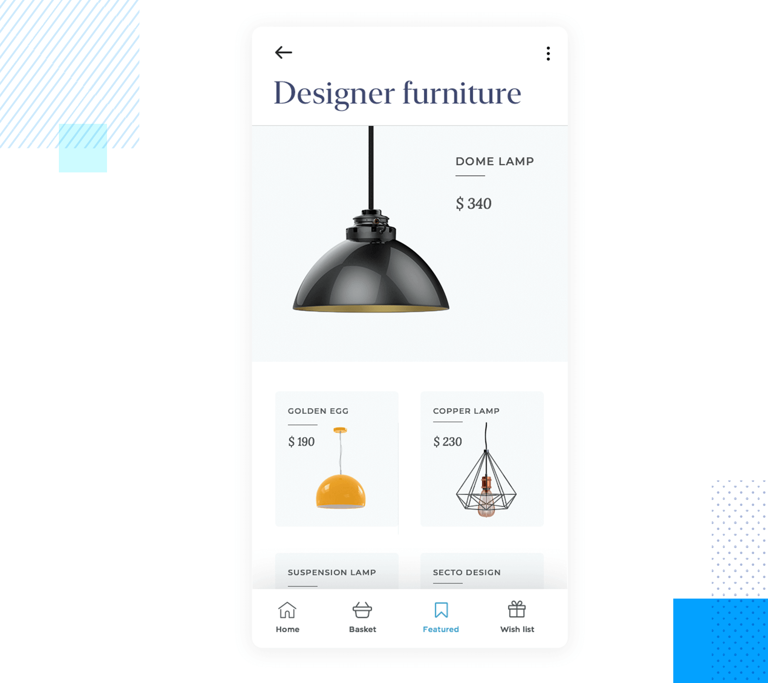
However, all high fidelity prototypes will use quality images with a high definition. Using this type of content at this stage is important for a few reasons:
- It helps obtain validation from the client
- It moves your prototype closer to the real product
- It boosts intuitiveness during user testing
- You can hand off image assets to developers with your prototype
Adding high quality images, in addition to interaction is one way of moving up the fidelity chain and edging closer to the end product.
Placeholder text like Lorem Ipsum, as we’ve mentioned above, is fine for wireframes, as long as it doesn’t affect navigation and orientation within the simulation. Nonetheless, in your high fidelity prototype, you should aim to include all real text and copy in your design where possible, including paragraphs of text that aren’t related to finding one’s way around the prototype. Here’s why:
- It helps add more meaning to the prototype
- It helps you discover if certain content works on certain pages
- When your prototype is developed, your product will need a minimum level of real content
For these reasons, we should always try and include real content in our prototypes.
Form design is a crucial part of a product’s UX. Forms have an interaction cost on the part of the user. Unnecessarily long forms, or forms that are over-complicated, hard to understand or glitchy can cause users to abandon your product and never return.
For this reason, prototypes are very useful for validating and testing forms. At the high fidelity stage, your prototype’s forms should include conditional interactions and error messages and inline validation. An example of this might be displaying an error message if anything other than an email is typed into a field.
Finally, a high fidelity prototype will more than likely contain real data visualization to simulate the functionality of the final product.
Imagine you’re creating a prototype of a web app that manages employee shifts. You might want to create a list of employee names, roles and contact details.
At the high fidelity stage, it should be possible to view this kind of data in the following formats:
- Lists
- Cards
- Grids
Ideally, the user should be able to make changes, such as adding or deleting employees, changing times, etc. and have these changes repeated throughout the prototype. When prototyping data visualizations such as these, you should always include the following possible interactions:
- Applying filters
- Sorting data
Visualizing and interacting with data helps demonstrate product functionality to stakeholders and developers, while also providing an opportunity to test whether the interactions make sense to the user.
Start prototyping your web and mobile apps today

When prototyping a website, there are a few important factors that distinguish it from prototyping a mobile app. Here are some of the important factors to consider:
The difference in the screen resolution of various devices like laptops, desktops, tablets and smartphones means your website needs to be responsive. It’s always better to start your responsive design from the smallest device first. This is called “mobile first design” and is considered a best practice throughout the design world. Why? Because scaling up a design is always less complex than the other way round.
You should therefore ensure that your prototype is responsive and can be viewable and testable on different devices. There are different ways that you can do this. One of those ways are with liquid layouts.
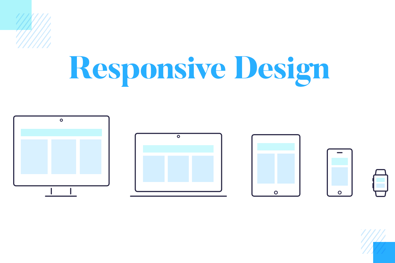
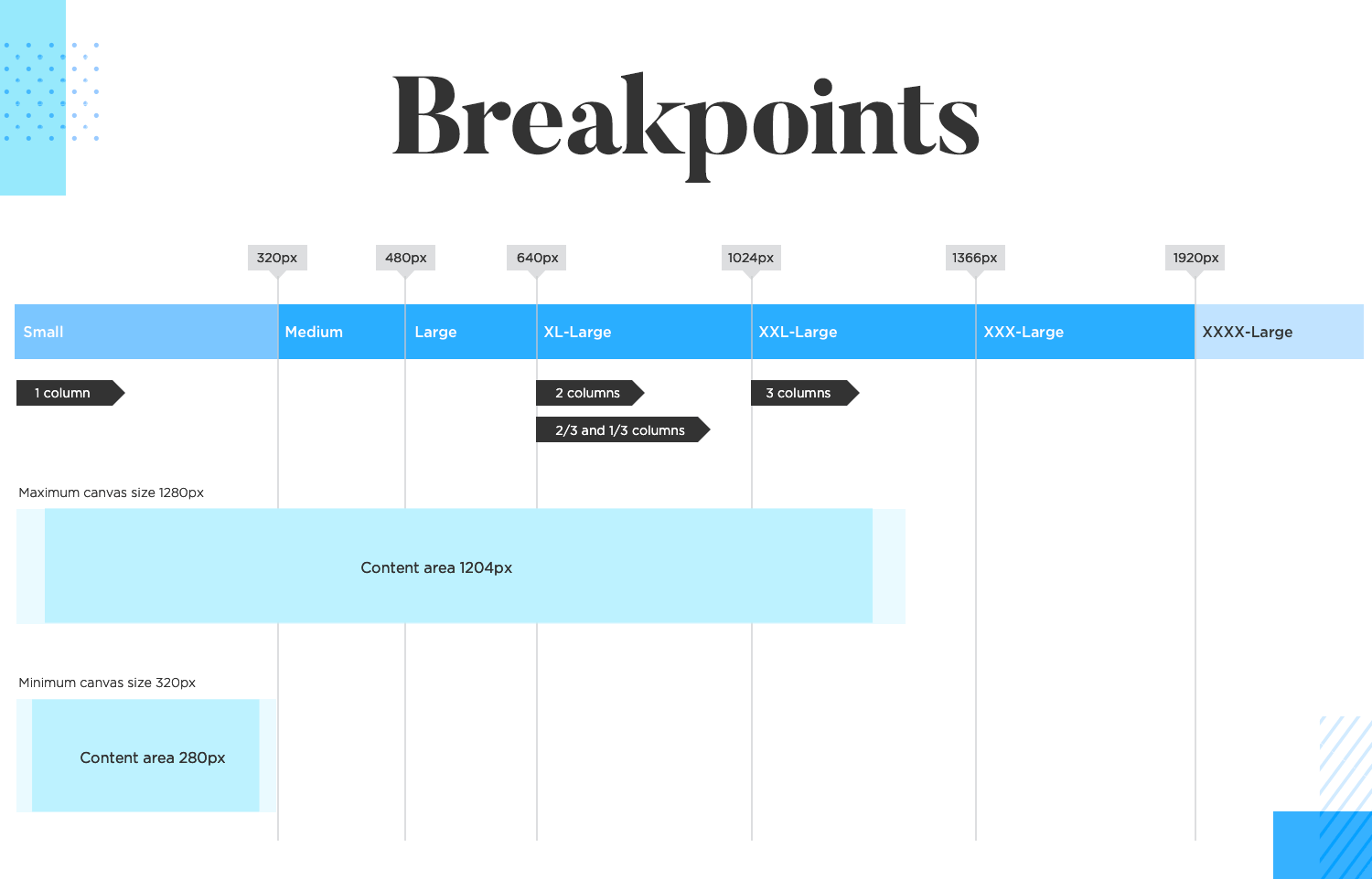
For liquid layouts, you can set events for your prototype’s content on the screen to shift and reposition when the browser’s pixel dimensions are resized. In tools like Justinmind, you can set events to make this happen automatically so that the content on the screen of your prototype is rearranged accordingly using breakpoints.
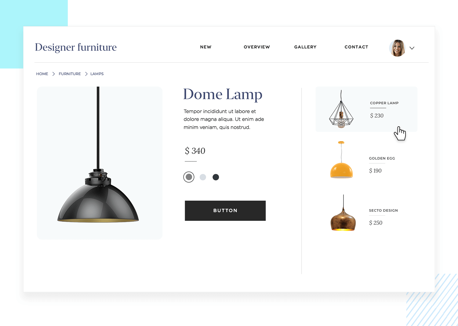
The next part you have to take into account when creating a website prototype is how users interact with websites. The most important difference here is that on desktop they’ll be using a mouse to click on elements and gestures will be limited. You can make a website more interactive by adding in microinteractions and parallax scrolling.
Adding microinteractions might be as simple as a button changing color on mouseover, a cursor changing style, an element popping or exploding when clicked or a steady page fade when transitioning to another.
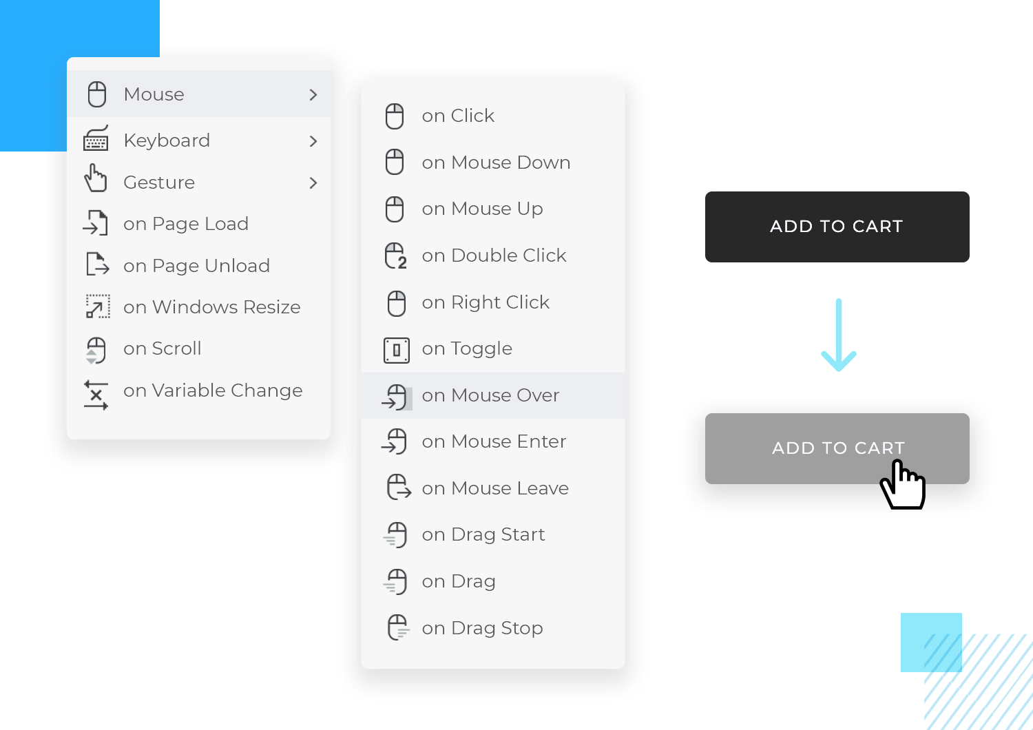
Finally, we cannot stress enough the importance of making elements look clickable on a website. Make sure that links have adequate contrast with the surrounding font or background. Ensure that buttons have adequate contrast and look like buttons. Make CTAs larger than other buttons to draw attention.
When it comes to prototyping a mobile app for a native mobile platform, you’ll need to make sure that you design it in accordance with the iOS’s design specifications. For example, make sure that you adhere to Apple’s Human Interface Guidelines and Android’s Material Design.
For Android, make sure your app’s navigation responds to the docked native navigation bar at the bottom. Make sure that when you’re prototyping an android app, that you include this native menu to demonstrate how the app can be navigated by the user.
For iOS, there’s no such menu so you’ll have to build the navigation into the app that corresponds to Apple’s best practices.
For a great user experience, you should also leverage the platform’s other native features, such as native dropdown lists and menus. Justinmind’s downloadable UI kits also include elements and components with these features, as well as the typical icons that agree with the respective platforms’ design systems.
You can and should also take advantage of features like Apple’s haptic touch. By doing this, you’re ensuring that your app is providing a recognizable experience to Apple and Android users, something that always scores usability and UX points.
When dealing with a less screen real estate, you need to be even more careful about which content you present to the user and the way in which you present it. This implies having a well-defined content hierarchy. Mobile users are often on the go and will abandon your app if they can’t find the information they need or perform whatever action is needed.
Dealing with these limitations sometimes means hiding certain elements, less important menu and navigation options behind a slide-out hamburger menu. It means ensuring text is legible and that paragraphs fit the screen while leaving enough lateral white space.
Additionally, when it comes to buttons, be aware that the human finger doesn’t have the same precision as a mouse cursor and therefore you’ll need to ensure that your buttons are large enough to be tapped by the average index finger, which has a diameter of 15mm.
Start prototyping your web and mobile apps today

Rapid prototyping is among the most powerful techniques that exist in the agile methodology. You don’t have to worry about being careful: the fact that you’re creating a prototype to test out on your users means that you’re already being careful.
So go ahead, fail fast, test out all your assumptions, keep the good ideas and quickly weed out the bad ones. Bad ideas are not punished in the agile environment, just discarded. And each bad one helps push the entire team toward the right direction.
Keep your prototypes lean and focus on one feature at a time. Getting bogged down in multiple different features at a time can be chaotic and reduce the quality of important core features, as well as muddy test results.
Don’t fall into the trap of jumping headfirst into a complex product design. Instead, draw up a list of product requirements from your user research and decide which core features will make up your product. If you were trapped with your users in an elevator for 60 seconds, which features would you list off about your product?
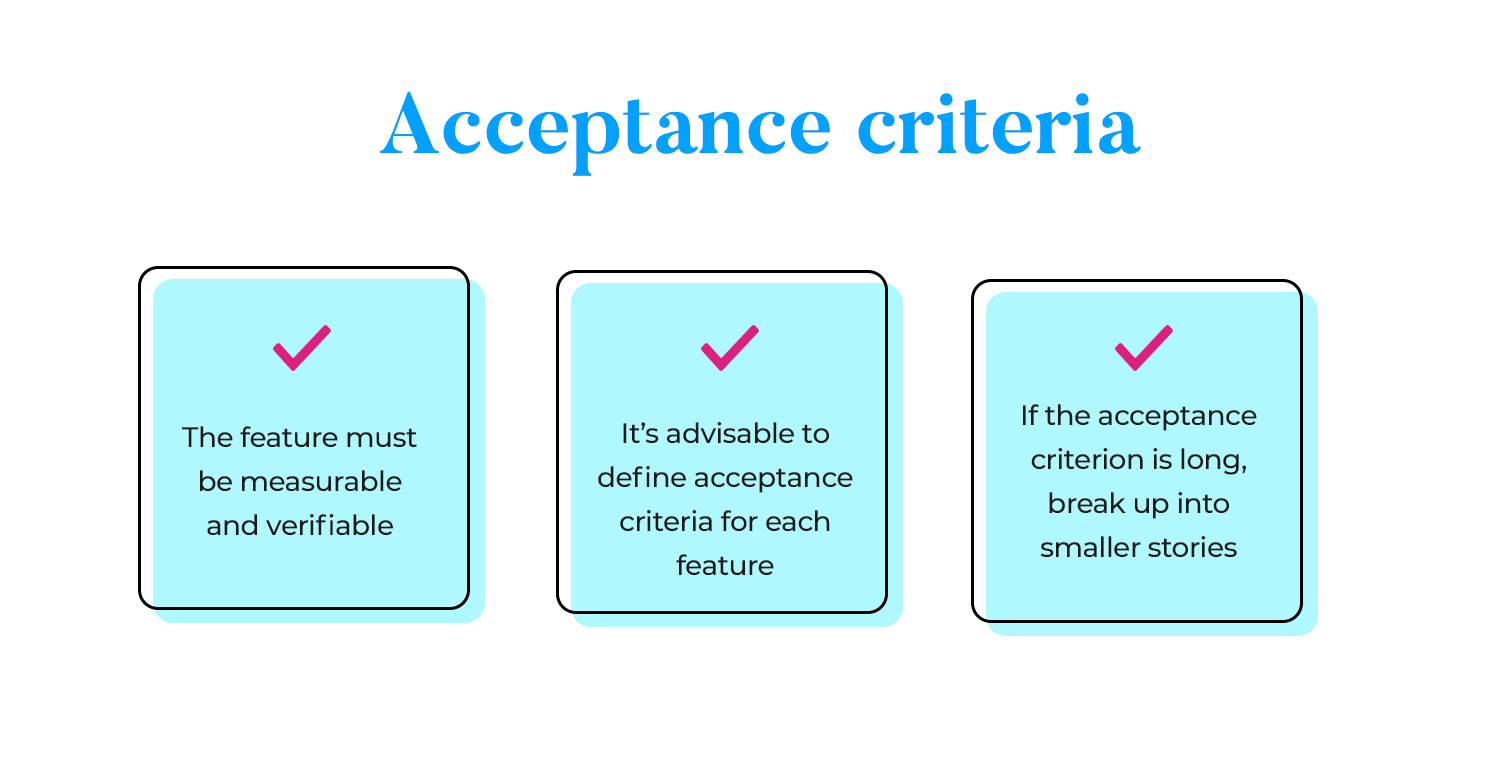
Design them first, test them out, then progress to the secondary features. Make sure that the acceptance criterion for each feature is satisfied.
Regular testing should be on your product roadmap and be one of your most important goals when it comes to prototyping. Test out each and every feature. You’ll see below that it’s an important part of the iterative process in the agile methodology. Testing helps you explore ideas and reveal flaws so that you can rule out what doesn’t work and continue running with what does.
All team members should be working from a single source of truth – a design system. A shared design system can take the form of a guide with UI styles and specifications, in addition to widget libraries containing the elements to be used throughout the product.
Lorem Ipsum is great for low fidelity prototypes when establishing and testing fundamental features like page layout and navigation. However, when it comes to buttons, menus, forms and other elements your users need to successfully navigate your prototype, you’ll need to use real content.
Furthermore, with high fidelity prototypes, you should try and include as much real text as you can to make the prototype more meaningful for users and stakeholders.
The beauty of prototyping is that you can share them with both clients and project owners in order to obtain crucial feedback throughout the design process.
When you have a prototype, it’s easier to convey your design ideas as well as to obtain client and stakeholder buy-in for the direction you want your design to take. Prototypes, whether low fidelity or high fidelity are great for bringing to meetings to present to the client but you can also send them to the client so they can be kept within the feedback loop.
Get your developers onboard from the start. This is because certain designs might require complex coding solutions that could take longer, pushing a project past its deadline or budget. Having developers on board from the start and obtaining their buy-in is crucial for avoiding friction when it comes time for the handoff.
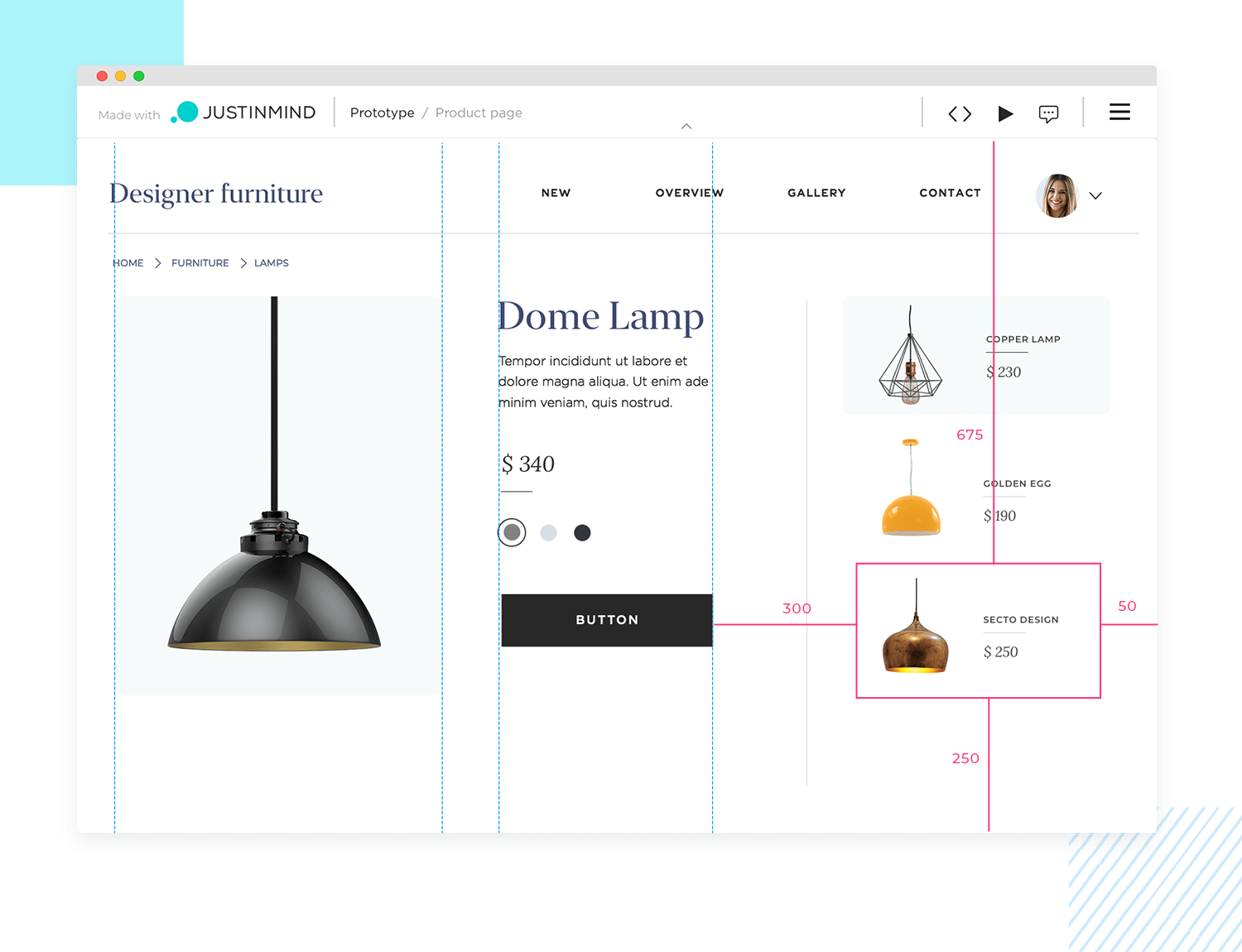
Lastly, when it comes to the perfect designer-developer handoff, the best thing to give developers is a high fidelity, pixel-perfect, interactive prototype. It helps you communicate the following:
- Intended functionality
- Interactions for defining code like Javascript
- Required assets, HTML code and CSS styles
It acts as a solid guide as to what’s required on the coding side. Providing them with such a deliverable, along with assets, HTML code and CSS styles is as helpful as it gets. It prevents them from having to take liberties with the design and avoids misinterpretation. Furthermore, you reduce the risk of expensive reworks.
While it’s possible for just one profile to work on a prototype, such as a UX designer, the reality is that it’s often a collaborative process.
UX designers are usually in charge of the user flow, the interaction design and IA of the prototype, whereas UI designers take care of the visual part. On the other hand, product managers may also take part in the prototype design process, as they are the ones ultimately responsible for ensuring all of the interactions and functional requirements gathered in the early stages are implemented.
As the name suggests, moderated user testing involves having a trained facilitator or moderator help with the following:
- Guide participants
- Manage tasks
- Answer doubts
- Register behaviors
Unmoderated user testing is typically faster and cheaper than moderated testing. It’s done in the user’s environment and the session is often recorded. There are a few downsides, though, including the fact that there’s no real-time support for participants and it also rules out the use of low fidelity prototypes due to lack of context.
- Eye tracking: uses a software that follows the user’s eye around the screen and helps to identify moments of interest and friction.
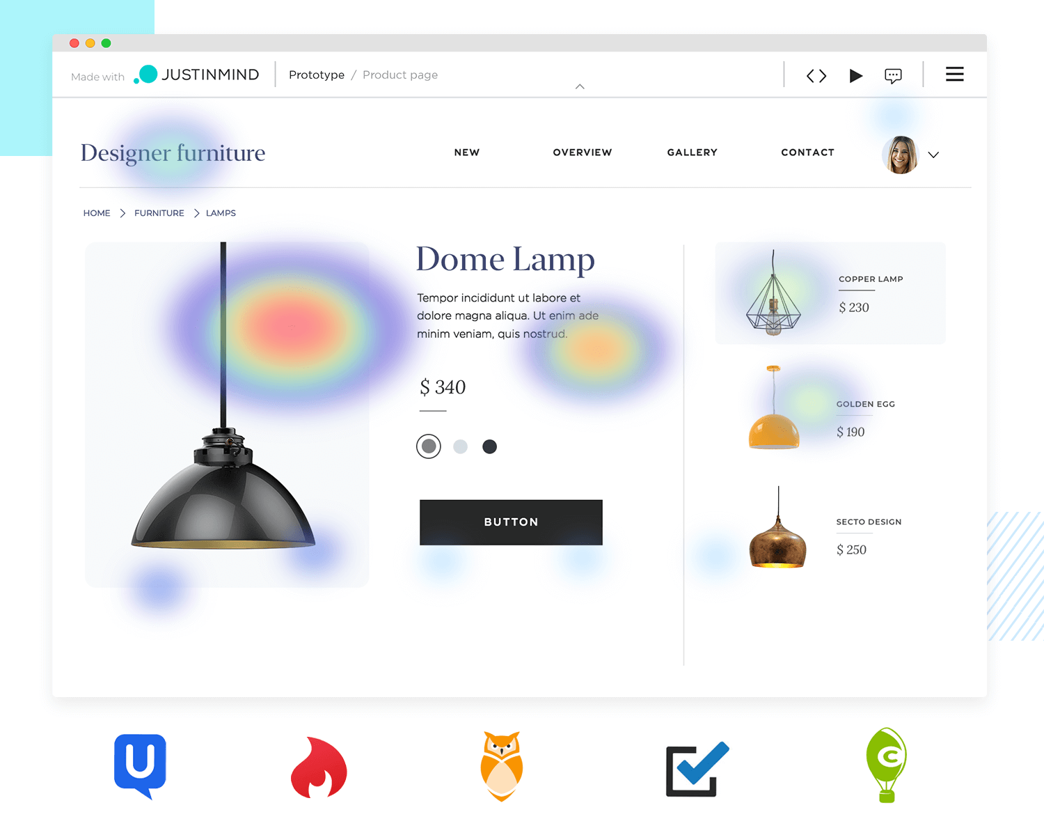
- Website heatmaps: tell you which part of the webpage your users are devoting more time and attention to.
- Card sorting: helps you establish the most user-friendly IA for new and existing products
- AB testing: involves testing two versions of the same page or screen, measuring one variable at a time
Start prototyping your web and mobile apps today

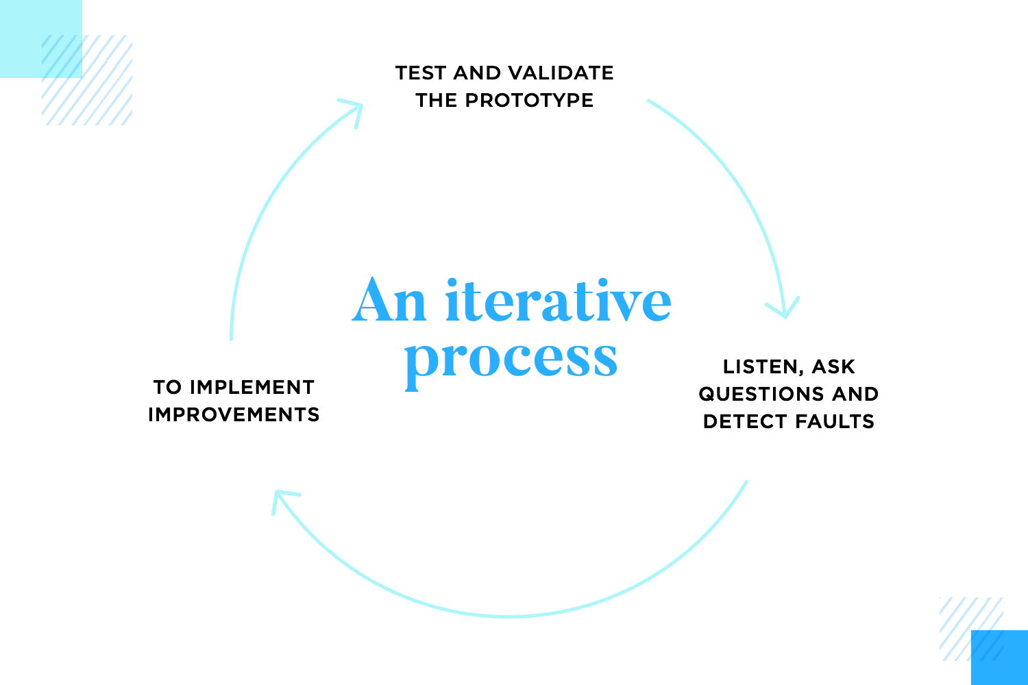
The idea is to communicate and obtain regular feedback from the client, in addition to carrying out user testing and obtaining regular feedback from your users. This all then feeds into the following cycle:
- Design
- Test
- Iterate
- Perfect
Prototypes can boost collaboration, especially with a tool like Justinmind. This is because you can share your prototypes with the whole team, leave comments and obtain feedback. They’re also useful for presentations with the client in addition to being a great way to demonstrate why your team opted for certain design paths.
A qualified UX designers will help organize your user research and interviews to define user personas and product requirements. They will be specialized in building and devising a design system, then implementing that system in prototypes.
They’ll then be able to provide expert user testing on prototypes to gain user feedback for further iterations through the use of moderated and/or unmoderated sessions.
UI designers are the ones who add the real bells and whistles to your product’s screens. They often work hand in hand with UX designers to ensure that the product has a UI design that is not just appealing, but on-brand and accessible to users. Often, it’s possible to find UX/UI designer hybrids in the design world, however, it’s still important to make the distinction between the two concepts.
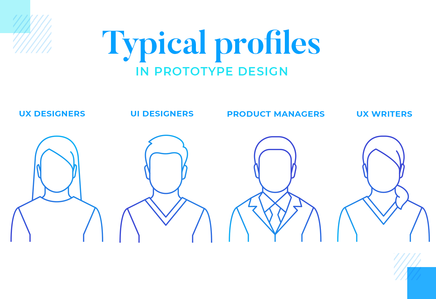
A product manager’s role is the glue that holds all the other important roles together. They’re the ones who devise and develop a roadmap for the entire product, from ideation, to MVP, to final product. They’ll schedule each product release and ensure it goes as smoothly as possible.
Ideally, they’ll have a technical background, such as computer science, development, UX design or even a business background.
Ultimately, the penny falls with the product manager when it comes to responsibility for the product so they’ll be the ones pulling rank if there’s an issue that isn’t getting solved.
This one’s a no-brainer. Wherever there’s a prototype, there should be users involved. In UX design, prototyping without involving the users is like having a yin without a yang. Involving your users from the start of your design is crucial to your product’s success. That means including them in every step and in all fidelities of the prototype’s design. Remember, test, iterate and test again!
Any web or app development team will need someone who knows how to write intuitive and captivating copy for a website. UX writers, and indeed content strategists, can plan out the content that an app or website will have and help you decide on a content hierarchy.
These are the people you’ll turn to when your prototype needs a little something more than Lorem Ipsum.
There are different ways to go about designing prototypes and when it comes to choosing one, there’s no size that fits all. You need to find the method that works best for your situation or company.
Prototypes can vary in fidelity, and in reality, you can begin at any stage. However, we recommend starting with a wireframe first and nailing down the basics before progressing to more pixel-perfect designs.
Lastly, the agile approach is unbeatable when it comes to getting a successful product to market quickly. For best results, adopt an iterative approach to your prototyping, failing fast and testing often until you get on the right path.
Remember: mistakes are not punished in agile, as long as they’re made early. They will help guide you to where you need to be.
PROTOTYPE · COMMUNICATE · VALIDATE
ALL-IN-ONE PROTOTYPING TOOL FOR WEB AND MOBILE APPS
Related Content
 Microcopy may be mini, but it can have a macro impact on user experience. Check out these 15 examples and start writing great UX microcopy16 min Read
 UX design has changed all of our lives forever - but what does it entail, exactly? What do designers do to create incredible products? Read on and find out!15 min Read
 Progressive disclosure is about helping users get invested before getting to the nitty gritty. Read this post to discover a new way to approach complex features!8 min Read
